
Vanilla Chi is an illustrator, designer, and independent publisher known for her distinct maximalist style and the incorporation of her East Asian heritage into her work.
Vanilla Chi
How to develop a distinct illustration style with organised chaos and visual noise
“In a world that often seeks neatness, I've found beauty in the chaos of maximalism.”
Transcriptmay contain minor errors or formatting inconsistencies
Hi hi good evening everybody and welcome to to the talk and yeah I'm still really nervous CU I'm the first Speaker here yeah yeah thank you thank you for that yeah yeah. So like firstly I I would like to express my great gratitude to ISA for this year supporting I I met so many amazing artists and editors and art directors there. And I'm also very grateful this inclusive community where we can share our experience maybe there is some hidden truth behind the thing and also I have long time struggling with imposter syndrome.
But I'm trying my best to do the talk and here. I am yeah thank you thank you for supporting yeah.
So I'm going to do a brief introduction of myself for maybe those people who doesn't know me so my name is vanilla Chi and I was born in Shenzhen China and I study illustration in school of vual New York and this is our theater when I in my BFA and I'm currently pursuing my MFA degree in graphic design at year school of art so over the past few years I have this honor of working with various publication newspapers such as New York Times the New Yorker Bloomberg Etc I'm also create illustration U for Brands and compaigns so in addition to my professional work. And illustration I also engage in self-publishing writing and ceramic I also funded a monthly podcast to talk about the creative phenomenal in the Contemporary context so I consider myself now as a multidisiplinary art practitioner so as an illustrator I was often asked by people in the interview that where you get your personal style form and where is your inspiration from so I found this question is very difficult to answer in a few simple sentences so when I first recognized this issue of style I thought what is my personal language what's my visual vocabulary and what's my preference and what kind of concept do I want to dive into so I'm like a baby going to learn to talk first I need to learn how to pronounce then the words then the words from sentences then the sentences are organized into essay so that's the process so I I think it will be best to take a look at some shifts I've made in my illustration process over the past few years and how I come to understand the relationship between my personal style and also my experience during this process so like my illustration Journey become with comic and graphic novels I love this very linear continuous storytelling I also love the the the the hand drawing like water color pencil texture yeah when I sted in SBA so this is my first thing I made is about a story about a boy was Booty by his classmates yeah and then.
I went to I I keep developing my handdrawing illustration Style with this pinkish color tone and this is the project personal project called called Don't Cry Inc corporate it's a fake product in company about the product of our tears and I become realized to combine some my CH traditional Chinese packaging cuz I was born in shinen where it's very close to Hong Kong so I was like very in inspired by the Hong Kong traditional package and advertisement yeah and there's another comic during my BFA and this is some poster I did and when in 2020 I went to my junior year I created this long format illustration based on the novel The the adventure of Pinocchio so the original novel is very art and like dark fairy tales for adults it's not like the very sweet stories we have heard about. And in this format I develop my hand drawing with some like watercolor texture acrylic painting and also with some digital touching yeah that's my thesis I also I I keep doing this comic storytelling Style on ♪
that yeah. So like after Theses I'm get a little bit tired of hand drawing I designed and during that time it was like quarantine and our school the studio are shut down.
So I have to stay at home like the only thing I have to in front of is my computer so I want to shift my workflow to the digital drawing and this is the the the the first poster I did inspired by vintage paper doll so I I Tred to do the experimental technique combining my illustration and my graphic design skill yeah and this is other poster I design as a Simon I also very aware of my identity as a EAS Asian Chinese people.
So I did a lot of research on the like religions Chinese folk and some native beliefs and since 2020 I did lot of work with is asan topic especially Chinese elements as the thing which is the outbreak my Nostalgia and my thinking and my identification with Chinese culture after several years study in us.
So I used to be a person who was very silent in various occasion the art education I received in the US also made me very passive obey the Western Discord system to create however like in 202 the Asian hate crime has made me unable to keep silence and made me realize that creating Chinese landscape by using my own language is no longer a lonely act and it is more difficult and more powerful that I imagine after I begin to do that.
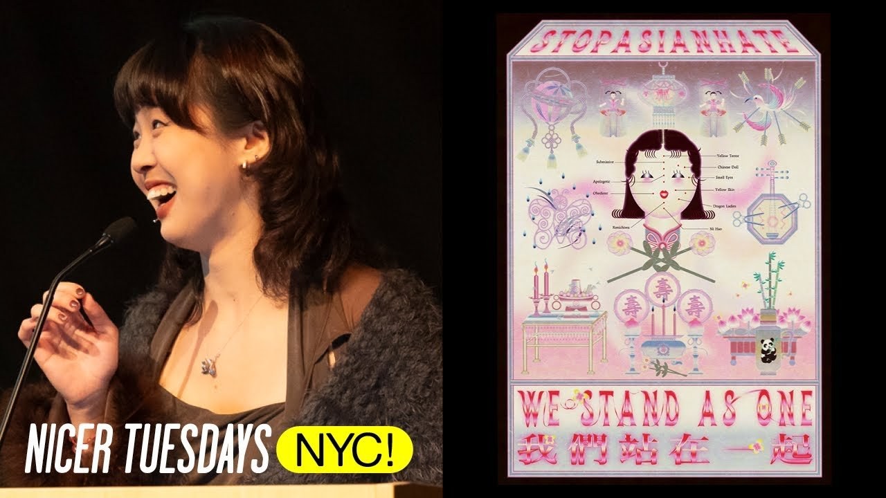
So I build this Garden Gardens blot illustration including the blood dripping offerings to As a matter for for the Asian hate crime. And I want to express my stop Asian hate attitude to that thank you yeah and this is another project I make I started to make like a funeral closet for myself and it's like also what was inspired by the Chinese funeral so I want to use this illustration to as the record to to tell what kind of people I am and yeah and some afterlife imagination I also design some paper money and there's a flag so very luckily I back in 2021 jie on the previous editor of is nasta come to me and he want me to create a a poster in reacting to the Asian hates activities so I create this free to download poster in support of the Asian Community During the covid period as a visual statement response to the rising incident of racism targeting the Asian Community particularly during the challenging period of the covid-19 pandemic so the poster serve as a symbolic code to action aiming to flourish a very Wess and unit voices against discrimination. And I used this approach called object based narrative I interview some of my friends and people Asian people around me about the implicit discrimination because you know like s of the racism is not that obvious it's very like very minor and you you maybe didn't notice that so so like in this illustration the puppets is a metaphor for the modern Asians and the face rating is the appear appearance discrimination of Asian and the H part depanda is the Discrimination of Chinese food culture bias surrounding the food preferences and there like broken broken instrument is the expectation to be silen particularly women to remain silent or submissive oh sorry and this is in injured Magpie and funeral alter is depicts the harsh reality of violence against Asians lastly is the ltin and lucky bows it express my blessing for the Asian community and the final work is published on the creative platform is NAD and open to free free to download and encourage widespread distribution engagement so after graduation I'm I was very lucky to to work with different brand and publication. And this is my first commission is for Olympic and Coca-Cola so I was commissioned to create a flag to reflect their Spirits so I choose fish swallows and butterflies as the main imagery and they're composed together to show the beautiful wish that we can re respect each other no matter what our statue is so I also choose the lily flowers which is the language of beautiful TRS and respect this is another commission for removal Chinese Valentine's Day sticker Set and the five sticker expressed the love between paths family friends nature and Beyond and my first publishing commission comes from the New York Times I did a book cover book review cover for then it's about the flipp in the scripts also there's another editorial illustration Ed did for the Japanese magazine about coffee I also collaborated with some independent magazines like mod and so this is one of my favorite series so I work with an architect to do the illustration for his academic field researches and this is for a while and this is for the wi we we transfer by we present this is for we present by we transfer and the article talks about how gen Z is breaking free of 925 the workflow and also talks about the creative burnout working at home and New Media Trend Etc yeah I found this article is very interesting because here's what I'm going to talk about next so yeah.
So as the article mentioned and as my illustration career step into the freelance stage and I like in order to apply for a legal work visa in the US I have to take on so many commissions not only exhaustion. But also in terms of losing the sense of fulfillment that comes from completing the work also like freelancing I mean like work in home can be very longly and frustrating so I often see other creative people on the social media complaining that they're always doing repetitive work receive unequal pay and don't know the meaning of their work and why they work over T add thing. So in response to deal with this dilemma I decid I did to broaden my media so I co-funded the Pearl slack studio with my other three friends and we do soft publishing things artist book and magazines so I become more involved in the graphic design in the process but basically I'm just teaching myself typography and layout with the help of YouTube and my friends yeah. So but so far we have successfully published more than 10 books in including five issues of magazine and here's the catalog I also engage in book making and there's there's the book making kit I design for those beginner who want to make small things and books so also by designing studio poster for each The Book Fairs I attend I explore I keep exploring the visual experimentation and typography in very in different ways so I wanted I I want the studio post to be very experimental but at the same time have some sequence Insight this is the book fair yeah.
So I like maximalism I like the tricky balance between the organized chaos and the visual noise so but for me like maximal Lon is in my case is not just simply decorative or like stuff stuffing things inside it's rather a diverse Dynamic it's a like a maze way of communication and a large part of the work in the studio is production of raing magazine so raing is a bilingual independent art magazine published by Pearl slck studio and each issue we have a theme.
And invited eight artists in different media to talk about it I got a lot of fulfillment out of making art book anding I'm starting to feel like isolated and more connected to some communities instead of being very arrogant about discussing me my ego in my work I look out the window and outside to talk with people and supporting people.
This is s spread from the magazine and also I was very interested in interviewing other people.
And this is our newly added colum to introduce the bookstore around our community so I interview with the E bookstore employees and discussed the dilemma and the transformation of local traditional bookstore I also I keep doing comic and book making and since last year I started to do ceramic I'm also experimenting with some very random reaction and trying to let this out of hand a little bit it's like out of control out of imagination too sometimes I get failure but always embrace the surprise so it's a series of work born very naturally from the body and Clay under the stram of Consciousness so but so from this year I I decide to go back to school.
So I want to bring create can 10 rules for College art department so I so I'm now more Define myself as a student not literally just a student but I will be a practitioner for Life who learns new things and tries new things I will never stop experiments and the Only Rule is work yeah I know I'm hard to Define like most people know me because my illustration.
But I'm also do other things and to be honest I don't want to be defined I think the c c colorization and the difference between the media can be across through my practice I'm looking forward to see what I'm would would do in the future who knows yeah I'm still in my way yeah thank you. That's it
Latest Talks
-

Murugiah
Why you should reject the formula and make art about things you love
Watch -

Amber Weaver
How does contemporary type design translate into the wider world?
Watch -

Delali Ayivi
How does photography give us the right to imagine our futures?
Watch -

Will Anderson and Ainslie Henderson
Bringing stop motion sorcery to BBC’s Small Prophets
Watch -

Ollie Babajide Tikare
The importance of not flattening the complexity of observation
Watch -

Marina Willer
Design thrives when you find poetry in the simple things
Watch