
Amber Weaver
How does contemporary type design translate into the wider world?
“When you design a typeface, you're not just choosing how something looks. You're deciding how something speaks.”
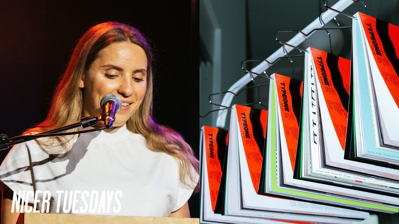
Hello everyone. Um, so first of all, thank you so much to It's Nice That for the invitation to speak at Nicer Tuesday. My name's Amber Weaver and I'm the founder of Type 1. So I think this is the first time that I'm actually talking about Type 1 as a whole. So I hope for many of you it's good to put a face to a name.
So yeah, I run a platform called Type 1. So, we're first and foremost um a media company that just absolutely loves type and um a term I often use for it is an ecosystem of sorts. So, that's going to make a lot of sense um in just a moment. But before I dive into the the drivers that sort of power the engine, um I'm going to share a brief summary of where it all began.
So I was only introduced to what graphic design was when I was 19 doing a foundation year at UAL Campbell and I did a fine art um I did fine art at college only because they didn't have graphic design as an A level where I went. So I was definitely late to the discovery of the discipline. But once I learned what it was, I was instantly hooked which led me to do a BA in graphic design communication at UL Chelsea. And then after 3 years of training to be a graphic designer, I came out the the other end and thought I don't want to be one.
And I remember feeling at the time, without being too dramatic, so um so far behind everyone else. And I probably felt the most lost. Sorry, can I just can I bring this down? There you go. That's better. And yeah, so I felt definitely felt lost. And some of my classmates had been dabbling in graphic design since the age of eight and you know had aunts and uncles who had connections with agencies and just knew exactly what kind of designer they wanted to be. And I knew I loved graphic design and it was my calling to work in this space but I just didn't know my place yet. So over the next two years, I
worked as much as I could within the industry that I loved, picking up skills in e-commerce, um, customer service, marketing, sales, operations, and all that fun stuff. So, and so I didn't have a clear path. And basically what led me to in 2020 where I started building the foundations of type 1 in the middle of the COVID pandemic like so many other successful projects and it was actually founded as a natural progression from a book I authored called FEMA. So a publication that spotlighted women in the type design industry with the purpose of increasing the recognitions of their modern-day contributions.
So type itself has always fascinated me. So this is actually a really small snapshot of my personal uh type specimen collection. I have hundreds at home and I don't know if it's the directiveness of its messaging or its ability to create sort of powerful contrasting shapes that I'm just completely drawn to it. But essentially, type one just started as another avenue to sort of explore my creative curiosity around type. I was 24 years old when I first started type one. So I didn't have this sort of deep mature sort of developed perspective whatso whatsoever on the subject. So there was just this unsated
curiosity. And this is the first six posts that I ever posted on Titan's Instagram. I had to scroll back for so long to get to the bottom. Um, but it's just a reminder that everything sort of starts from somewhere and it can literally start as posting things that you that you like. And then fast forward to today and type one has become something so much bigger than I thought it could be. And I think what's really kept it going is that same curiosity that I mentioned and realizing that a lot of other people shared that with me. So whether that's just wanting to learn more about type in general or
different processes, creative code, technology, font production, essentially I found that a lot of people wanted to know more about the subject and that sort of curiosity has manifested in many ways. So it's taken on different forms over time, including sort of editorials where we explore what other people's approach is to type and their sort of typographic sensibilities.
or compared to you know finding um exploring more sort of about cultural trends and then also diving into sort of studio practices as well and again about their sort of typographic sensibility. So all just finding more about type really. And you know now that we we're maybe like 5 years on we now have this huge sort of um capsule of typographic culture which is really exciting. And then also that transpires into our physical magazine as well which we publish you know once a year now. So that's sort of like an a physical artifact because as much as um creating something digital, it can be quite
fleeting and leaving your mark I think is really important. So having something physical that people can touch and smell and I mean who smells books in here? I know some of you do. Um for the paper, not cuz you're weird, but yeah. [laughter] Um and then so having that magazine people also sort of cultivate you know creative spaces and you know have it in their homes and it's just really exciting to see how people have taken taken that product and then sort of taken it into their personal lives and expressed it in a way and then sometimes it's about actually creating type ourselves and what I mean
by that at a certain point observing and creating type wasn't enough for me anymore. more and I wanted to understand it from the inside out. So we decided we when I say we I don't say me. I didn't actually design the type faces, but I wanted to learn the sort of font production process from start to finish and create these things not as standalone uh products, but as tools that can sort of carry ideas, tone, and behavior across entire sort of identities, whether that's in brands or sort of visual identities as well.
Because when you design a type face, you're not just choosing how something looks. You're deciding how something speaks. So, how sharp or soft something feels or how serious or playful. And that's where it started to click for me that type isn't just a visual layer. It's a narrative device as well because it can hold tension and rhythm and it can really guide someone through an experience without them even realizing.
So when we work with type now, whether that's a custom type face or a retail font, we're always asking the same question, which is what is this type trying to say and how should it feel when it's said? Instead of starting with visuals or layouts, we often start with the typographic voice and build everything outwards from there. Because if the system if the type system is doing its job properly, it gives everything else a kind of logic. So rather than type supporting the story, it becomes the story.
So as an example that I'm pulling here is alt erogynous which was developed by Taiwanese type designer in use su gosh I hope I'm saying that right. And that was released through um alt type foundry which used to be the fem type project. So, Herogynous's sharp edges and central curves become the sort of primary informer of the narrative that we built around the campaign and set the tone for the entire sort of world around it.
So, instead of layering a concept on top, we followed what the type was already suggesting. And that's where the shift happened for us from designing around type to designing from type. But it all comes back to the same idea, exploring what contemporary type is and what it can be and the sort of endless conversations that we can have around it. And more recently, the exploration has really started to move into the wider commercial spaces for us as well, which brings me onto something that I think about a lot, which is how contemporary type can translate into the wider world. Because type to me isn't
just functional. It's something that you feel often before you've even registered what it says. And it shapes how we interpret things on a subconscious level. The same word can land completely differently depending on how it's set. And because of that, it becomes just as important as color or imagery or visual language when it comes to building a brand. So it's almost like a design language in its own right. And the thing is, we interact with type constantly, but we rarely notice it unless something feels off. And it has this sort of quiet power to either reinforce a message or completely undermine it. And I generally
think it's one of the most powerful tools that we have as designers, but one of the easiest to overlook. So to make that a bit more tangible of everything that I've just talked about is I want to show a few examples of how that plays out in real projects where type isn't just supporting but actually shaping the experience.
So one of these projects is a custom type face for China's League of Legends pro league division. God that's a mouthful. Um working with a further agency which was formerly known as designer studio and their client Riot Games. And the starting point of the type face was adapting one of our exist pre-existing ones called T1 cororeium which was developed by Valerrio Monopoly making it more legible for their audience first of all but also developing an itallic style that really expressed this idea of tension and eruption tied to the slogan crazy is our game which was um a concept sort of developed by further agency. So the type
wasn't just a function but it was designed to reflect the movement and intensity of the gameplay itself. And then the next example is where we've worked um closely with Radley Yaldahar who has developed a refreshed brand identity for the company Entain which I believe actually goes live today. So thank you Radley Yaldar for letting me share this project.
So we were brought on by Radi Yard to um by by their creative team to develop a bespoke display type face based on their vision that they had for this the type element of the brand and determination display introduces these subtle cuts in the letter forms which I think yeah you can see um echoing the sort of play symbol located at the center of the brand's refresh. So the typography became a direct sort of extension of that idea of interaction and motion.
And then lastly we have glass door sounds. So a few years ago we worked with the Cotto LA team with Julia Bio where we customized one of Julia's um tight faces called Fabio XM into a sixeight type family designed for flexibility, scalability and sort of just general integration across glass doors UI, web and print. So, we were really helping to build a more consistent typographic voice across the entire platform, which helped reinforce its shift towards a more sort of communitydriven brand.
And across all of these, what became really clear is that type isn't just a layer you apply at the end. It's fundamentally shapes how something feels and how it's understood. But just to sign off on a less serious note, this may seem like a clear sort of upshot to the upside, but in reality, in my opinion anyway, is that building anything worthwhile is going to be a rocky ride. So here's a visual representation of some of my thought patterns. So at my lows, I have, is this even worth it? Or what am I doing? You know, I could have done that better.
I've made so many mistakes, it's unbelievable. And then on my highs there's, you know, wow, I love my job or you go girl or yay, new client. So the only way I can describe it is a complete sort of roller coaster that you you built and you can't get off. So like you're having the best time, but then sometimes you feel like you're just going to come off the top. But I think that's kind of the point. If it wasn't unpredictable, it probably wouldn't be worth doing in the first place because everything type one has become is from this, you know, unsated curiosity that I mentioned. You know, nothing more
structured than that. So if there's anything that I can sort of sign off with is to trust that curiosity a bit more and definitely explore it because you don't always need a clear plan or path to turn you know some something into you know something meaningful. So thanks guys. [applause] [applause]
Latest Talks
-

Murugiah
Why you should reject the formula and make art about things you love
Watch -

Delali Ayivi
How does photography give us the right to imagine our futures?
Watch -

Will Anderson and Ainslie Henderson
Bringing stop motion sorcery to BBC’s Small Prophets
Watch -

Ollie Babajide Tikare
The importance of not flattening the complexity of observation
Watch -

Marina Willer
Design thrives when you find poetry in the simple things
Watch -

Lizzy Stewart
The hundreds of drawings and writing-on-a-whim that goes into comic novels
Watch