
Templo is known for building a successful cause-led agency that challenges the establishment's expectations.
Templo
How to build a successful cause-led agency, against the establishments expectations
“Building a cause-led agency means prioritizing purpose over profit, challenging the expectation that success is measured only in dollars.”
Transcriptmay contain minor errors or formatting inconsistencies
Hi everybody thank you all for joining I'm anishka co-founder and managing director of tempo and I'm P co-founder and creative director of tempo what we thought we do today is give you a little bit background about who we are as an agency talk about some of the key learnings and insights that we've picked up over the last 10 years of running Tempo and weave in some case studies so as Matt said we are a causel branding and Communications agency committed to using the positive power of design for social change it's all we've done it's all we'll ever do and to really understand why we're hellbent on being caus L we need to kind of go back a little bit into our migration Journeys so my I'm ethnically Armenian my ancestors experienced genoside in Turkey U my Nana was born in Aleppo in Syria and my mom was born in beut in and and was forced to flee during the Civil War and from my side I felt this real disconnect being in the industry with the industry doing design for good good and really my my experience is growing up as a child Refugee so my first experience with Charity was receiving charity so you can see you can imagine my perspective was very different and I wanted to find out where I could use that experience and that lived experience and put it to something to good use starting off firstly with I wanted to expose and tell the story of the human rights violations going on in Sri Lanka predominantly it was basically ethnic cleansing being carried out by the the Sri Lankan Army and government which is essentially a dictatorship so what I did was I quit my job.
And I went on on a ffy mission to Sri Lanka and so this is a photo I took in the north north of Sri Lanka in jaffna this is my cousin holding my Steve Jobs book in absolute fear as two army tanks roll up so to to quote the famous Bob Gil who's no longer here he had this famous quote if you're going to design something for the laundr go to the launder well I took this a bit too extreme obviously now I'm not saying you go and book a ticket one way to a wtor country but you can see what I'm trying to say here you know like being there firsthand I could feel it it was palpable and I could feel the oppression I wanted to do something about it so on a really noisy and bumpy and dangerous bus ride night bus ride across from the East to the north I had this sort of thought that maybe I could use typography and fuse the different languages together to connect culture and tell it and amplify to a larger crowd and it was this sort of kickstarted a a body of work spanning a decade so through this work we were able to change votes at the United Nations starting off with launching a the stop torture Campaign which we went which went Global and then we've been working still to this day on investigations exposing the collusion and Corruption of the Sri Lankan government and then we've been doing various things like trying to really crazy arrest war criminals and trying to sanction them here in the UK and in the US. And so what pie and I realized through that 10 years worth of work and as P said it's still going on today is that we as designers and Industry we get paid to care about things we get a budget we get a brief we do the job we press release the job plat ourselves on the back and feel really good about it and what we realized is proper systemic change is an endurance exercise it you've got be in it for the long haul and be dedicated to the cause and because of my ethnic background I was also really Keen for the studio to do work for Syria with Syria again to raise awareness about the human rights violations that have happened under Assad's regime and off the back of the success of all the work in Sri Lanka we were approached by an incredible Coalition of Syrian NOS Charities activists journalists called free serious disappear who wanted to raise awareness in The Wider world around all the people that have disappeared Without a Trace in Syria so what we wanted to do was we wanted to create a symbol for the Coalition that represented both freedom and the words Syria so just to run through the sort of creative thinking about this.
Now I' got to be really careful our Arabic in-house designer is watching me so he's going to he's going to test me on how I pronoun this. So it's actually suria in Arabic yeah have I got that right yeah okay cool okay and then so on a on a on a very slow delayed train ride from the coast sort of looked at the first character the sir and wondered whether that could be a beak and then the next character on formed the the sort of front part of the wing and then the rear part of looked like the back of the wing and then finally the the final character ah formed the the sort of tale and my favorite bit the two dots sort of tucked in to be the feet as well.
And so that sort of formed the the final sort of symbol if you like for the for the Coalition. And so in one hit we were able to capture freedom in Syria and then so bringing it to life so through animation and just really coming at this with a non-western lens just simple things like putting the Arabic first and then the English and actually because of the left right alignment they actually knit nicely together.
And then BR using motion to try and express what Freedom might look like through the symbol as well.
And then like what does it look like on demonstrators and activists physically wrapping around them or being held in solidarity collectively and then in Syria itself with the families of the dis as they were holding pictures of their love loved ones and then just like any other branding exercise you start seeing how it works on imagery on building websites so digital aspect social media and then just really low-fi ways that different sort of activism and demonstrations from all around the world can be really quickly stuck together in one sort of uh space for the the sort of stories and grid and then just our learnings from the Sri Lanka the body of work from Sri Lanka really taught us that our work becomes most effective when the design dovetails with legal action as well.
So this is Channel 4 News prime time the day our visual identity and campaign launched a legal case was filed against Assad regime from a citizen in America illegally detained and tortured something else that's really frustrated p and I over the years is how we live in such a polarized Society it's these two kind of opposing views are presented to us in all different kind of causes and actually what we've learned at Tempo is the space in the Middle where there's the dialogue and that kind of gray area again where that real change happens but this polarization is a huge reason why p and I never wanted to get into the climate change space for a long time you're kind of presented with these two diametric appros views like on one hand we have profit over Planet climate change deniers on the other it's activists throwing paint at artwork. And it's again it's that we were really interested in that middle space so we spent a lot of time looking at people organizations within that middle space in the UK and identified the committee on climate change as it was called then who are the UK's independent adviser to the government holding them to account on their Net Zero Target so very data scientific analytical but when we first discovered them they looked like this really generic not very engaging and so we could see that.
There was a real opportunity for for us to bring our branding expertise to them to elevate all their science and their rigor and their analysis so during a creative we this was all happening through lockdown by the way. And we we we were look we got unhealthily unhealthily obsessed with these sort of global heat maps and accidentally on our mirror board we actually chopped one of the the the Globes up. And we thought actually that could be an interesting sort of premise for logo for this organization.
So the Final Logo ended up being these three hemispheres going from a warmer one to one where it was much cooler and obviously U reinforces the three C's of the new name that we gave them as well so sort of tied it up there's a big story about the purple as well. But we haven't got time to go into it.
But it's a fun one and then taking those three hemispheres and doing fun things with them just crops into them and like super cropped in and sort of mimicking the motion of Earth as well so getting that connection between a logo and something real and then we created a series of a sort of branding imagery sty as well.
So we took the grid from the the logo and applied it physically onto images as well.
And then we what we did was we manipulated and warped them so you could feel the effects twice and then in our research one of the big things that I was quite mindful of I I really saw like it was the the whole space like climate change space was filled with generic imagery and illustrations iconography Etc and so what we wanted to do was use this opportunity to use really sort of high high-end 3D rendering to get really into this sort of Science and detail of climate change and so they you can do very complex things.
So if you're going to talk about Coastal erosion Ed actual tetr pods and talk about that or land reduction of landfill waste as well just really nice sort of interactions and connections and so over the years we just finished one actually we we do these annual sort of big event big workshops with the climate scientists the data analysis the communications people and obviously us the designers and we sit in a room we try and get to the real Crux of what what each piece of data is trying to say and then do a big sort of Storytelling exercise with it with 3D and and really it's about really communicating not just to the experts in climate change but also opening up and being more accessible to the general public and then once we came out of lockdown we could have bit more fun in a physical sense as well.
So this is in their head headquarters in London where we got to do the whole sort of wayfinding system internally externally and then the last sort of sort of space that we want to talk about is the sort of diversity inclusion cause that we we sort working in and I'm going to show my age now 18 or 19 years ago when we first graduated no no it's not it's 18 or 19 don't try and age me um the you know the industry look really different and so just looking around this room now you know like it's obviously changing which is amazing it's going in the right direction but what most people don't want to talk about is actually the lack of representation at founder level and especially at boardroom so it's really at the boardroom where the big decisions are made and I think having a seat at the table for brown and black designers is really important I think we need you know cuz that's the way we can sort of give lend our sort of lived experience and try and affect change from that side from top to bottom in an organization with authenticity yeah.
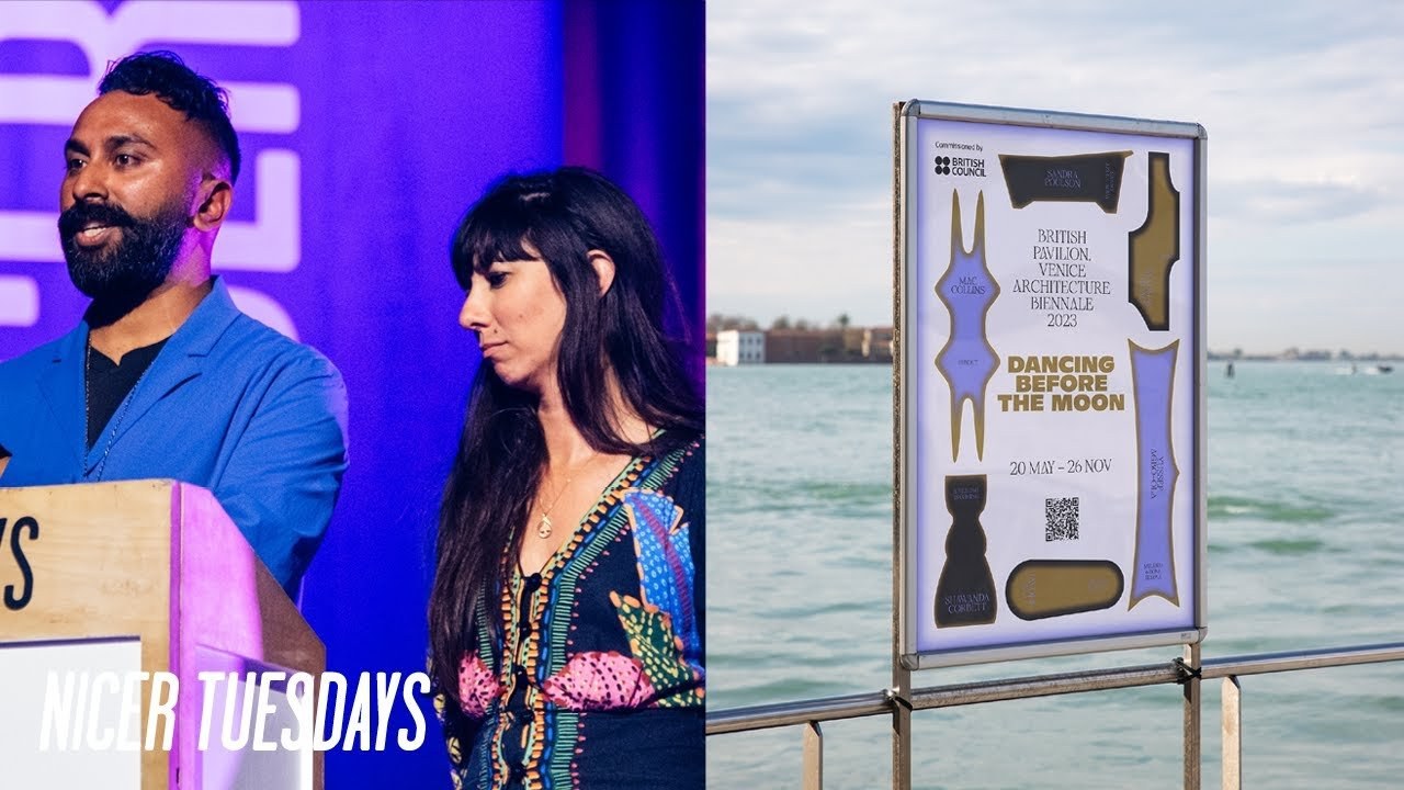
So just building on that for the last couple of years we've worked on the visual identity and campaign for the British Pavilion at the Venice ban Al I don't know if any of you know what that is but essentially it's the cultural Olympic so each country around the world will have their own pavilion and put on what they think best represents their country in art and architecture each year and last year. There was a real step change in the curatorial narrative so it was all about celebrating the rituals of UK diaspora and bringing those rituals into the British Pavilion which is a real s space of power represents the British Empire and all of those sorts of things so as P just said we were brought in as tempo as part of the wider team and this ethos ran through everyone that was involved in the the project so from us the agency the creative agency to the curatorial team the artists photographers musician we were allowed we were able to that was a Freud in slip we were able to bring our lived experience into this space of power which influenced everything so just to run through some of the work that was exhibited in the space that we felt really close to so firstly Sandra polson's work was all about the ritual and act of washing clothes in public madav kadow's work was all about reincarnation in Hinduism and Buddhism Matt Collins's work was amazing piece there was all about the Jamaican Domino culture in Nottingham Shanda's work was all about her disabilities and Jaden's work was all about sort of still pan making in in from his culture and so from a creative perspective we we were really interested in the shapes of these objects they really ful unusual sort of alien looking shapes and what we did we took those shapes we messed with the edges made them look a bit more ethnic this is the only way I can describe it by the way but not from this world.
And then we took those shapes and intersected them and got them dancing through the title of the exhibition dancing before the moon.
And then you could also use them to isolate isolate um specific rituals themselves so permanence and play creation through death and and still pan making and cooking or use them to focus in on some of the artists as well or get the typography dancing around the subject matter before the visual identity was released we did a we did a series of teasers to reveal the title itself this one being using sort of 3D to simulate the motion of the moon set rising and setting and then we were really inspired by the sort of Neolithic structures and how their connection to Earth to Sky and then back in Venice everything from the print material to merch and then we did a poster campaign and then interestingly what was more important for us that we did a poster campaign Nationwide back in the UK simultaneously and so it was really important that these posters acted as a portal back to show the reput ation in these powers of space so I'm just going to show you something it's going to get quite loud but some of the sort of um filming that we did on site ♪
and just a final thought really before we leave the stage was when we set up Tempo we asked a lot of people that we knew and trusted in the industry The Establishment you know we said you know we're going to do a CA Le agency and we were told that's really nice that's how sweet that's great but what about commercial work commercial clients need to see commercial work for you to be viable as a business but p and I stuck to our guns from the outset and we never wavered on our ethos and what's been really interesting in the last four or five years commercial clients have been coming to us more and more because they they have a voice that they want to put out into the world and they want to speak with authenticity and they now see the value in working with an agency that has that to offer so it's a really exciting new chapter for us as an agency and there's lots of really really fun and Brilliant things coming out in the next 12 months that we can't wait to share with you all so thank you [Applause]
Latest Talks
-

Murugiah
Why you should reject the formula and make art about things you love
Watch -

Amber Weaver
How does contemporary type design translate into the wider world?
Watch -

Delali Ayivi
How does photography give us the right to imagine our futures?
Watch -

Will Anderson and Ainslie Henderson
Bringing stop motion sorcery to BBC’s Small Prophets
Watch -

Ollie Babajide Tikare
The importance of not flattening the complexity of observation
Watch -

Marina Willer
Design thrives when you find poetry in the simple things
Watch