
Spin Studio is known for its innovative approach to design and branding, specializing in creating engaging visual identities that resonate with diverse audiences.
Spin Studio
This studio thrives on the messiness of not knowing
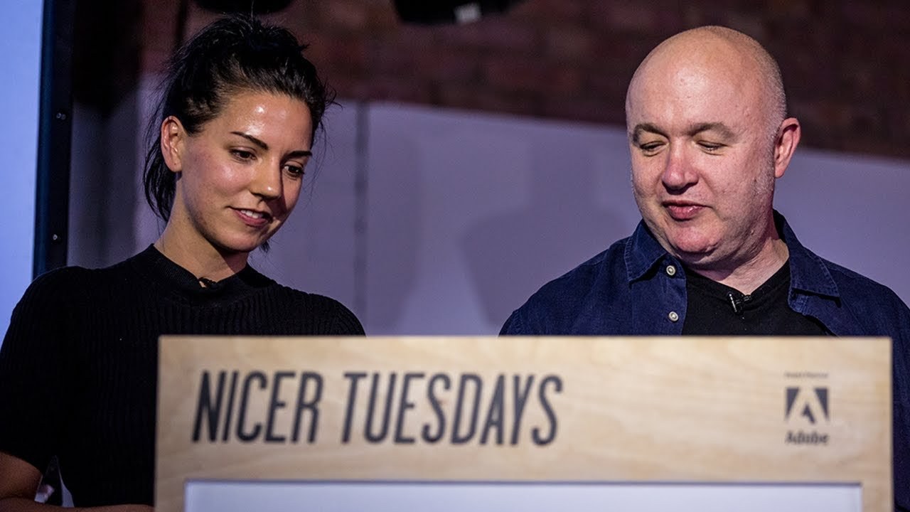
“Creativity is often born from the messiness of uncertainty.”
Transcriptmay contain minor errors or formatting inconsistencies
[Applause]
and we are saying I'm not sure how much you know about us we are design studio creating identities animations environmental graphics and design footprint we are based in Clapham Junction.
Now we actually just move from a conventional studio space into a house and we converted a complete ground floor into a studio where we now have a virtual photography studio a lively large meeting room and the kitchen and also this ready built kit studio in the garden it just took about four days to erect so this is how it looks now. And we had the pleasure to have design lessons learned Simon / unfortunately if you can't really see him here but as we opened the studio officially there was amazing pop so you have to be that really.
So if the new studio also comes at vegetable and herb garden where we can grow in H means crochet horseradish and all sorts of things. And we try to use as often as we can dig readings for the garden to to focus.
So these crochets for the first things we are able to harvest and now everybody is someone of updated over the kitchen and ♪
[Applause]
so this is the outcome of our first attempt which is a range of different coaches stations including coach at Martinez which were actually really delicious we just thought we'd increase it to think to an eating summer beginning of the mothers we've Eddie Eddie Eddie my god Evy disjoin is recently she's Cydia manager and then we have gabbing is a graphic designer and Jonathan the maker of martinis our top dollar project is also here as a designer Trish is the person to make sure that we don't lose money and Tony design and our new partner Claudia who's just become a partner spring thank you yes I just want to show you some of our recent work a long time we have a long time collaboration with the University for the creative art we created an evolving identity which works on over the last three years so here is some of our latest outcomes this is this year's prospectus covers and some inside spreads and we also had the chance to create some super graphics for their campuses the next project is also an identity job we were asked by the Samson fashion design Funds to create a visual language for their annual Fashion Awards Show the competition is split in two sections so one is for professionals only which is in uppercase letters and one is a student competition which is in lowercase letters so this is how it managed how the visual language manifests itself on the website before the student competition we came up with a vibrant color scheme which is applied like that so as including mission we also do a lot of work for unions I'm a family partner of unit additions and we thought we'd announce a couple of new books tonight one list that printed at the moment which we've been working with Rick going on which is national theater posters which should be available fairly soon we hope and one on lecture set a DIY typography revolution which is a really fascinating story it's more than just rub downs it's got a whole world behind it so something we always enjoyed doing is making new letter forms and experiment system so I just want to show you some of our latest efforts we were asked to contribute posters to an exhibition which celebrated the 60th anniversary of Helvetica we were interested in using the letter forms and creating something that isn't in this typical austere Helvetica aesthetic so these are some process shots of how we approached it we looked at some compositions how this could work and also some colors which led us finally flower poster which we submitted in the end the next project is thin adventures in typography which is essentially the first issue of a thin magazine it's the expansion of our monographs if you want those it's a collection of various visual outcomes which were explored during different client projects during the process and we started to remix and rearrange those outcomes and also look at some other visual News were interested into exploring so here are some examples of that.
And we also like to take these visuals in onto a screen based environment and in this case we turned them into moving images the second issue should come out soon. So that something we are currently working on yeah again so we was like a challenge and this was certainly one of those this project so tomorrow's it was a Parisian based publisher calls out the blue and said they were saying as a company and would we like to design the identity and also the first book.
So the name of the company was corpse Reviver and caught a corpse Reviver is basically a cocktail which saves your ass the next day when you work nope horribly hungover and it's supposed to revive you and what struck us really was how miserable a letter the VA so down then we're looking and depressed and so perhaps by telling you upside down we could get more in the spirit if you pardon the pun we always want to extend the visual language of anything we do so the upside down be double these appear on the book spines and what-have-you. And we tend to make patterns and play around with them like this you can't have enough corporate either I can tell you that from experience so this is identity and then the this is the book.
So it was pop first published in 1927 and it. Basically takes on a journey of twenty four hours drinking it's this uncle taking these nice out for for a for a first experience of drinking one that she'll never forget and it what it does is it's constructed hour by hour over 24-hour what you should drink and what we should eat at any given time. And it ends with basically a cocktail which is pretty much toothpaste with with with water and shower and then bed so it's quite a read but you might notice when we were flicking through that that they were they were illustration is involved and so and it seemed like if we're going to make a contemporary version of it that illustration should be something that we looked at and that's something that we've never done before.
So we try to conjure up the kind of spirit of drinking now to kind of contrast with the contemporary typography we also use a lot of colored papers paper stocks and they were they were really to suggest the passage of time as you go through the book the cover is basically the bottom of an ink bottle so with serrated edges around it. So that suggests you're putting down a glass and leaving a mark but also suggests the passage of time as well with setting hands and then.
This is just some examples of page layouts I don't think big splodge is really count as illustration.
But there are people here that can shoot each other but you get the idea it was a fun project. And if getting hammered your thing it's a good good book to have all right lovely that says that's us thank you very much ♪
[Applause]
Latest Talks
-

Murugiah
Why you should reject the formula and make art about things you love
Watch -

Amber Weaver
How does contemporary type design translate into the wider world?
Watch -

Delali Ayivi
How does photography give us the right to imagine our futures?
Watch -

Will Anderson and Ainslie Henderson
Bringing stop motion sorcery to BBC’s Small Prophets
Watch -

Ollie Babajide Tikare
The importance of not flattening the complexity of observation
Watch -

Marina Willer
Design thrives when you find poetry in the simple things
Watch