
Chantra Malee and Lucas Sharp are the co-founders of Sharp Type, a prominent type foundry known for its innovative typefaces and commitment to supporting women of colour in the industry through their Malee Scholarship.
Sharp Type
Why type design has more in common with fashion forecasting
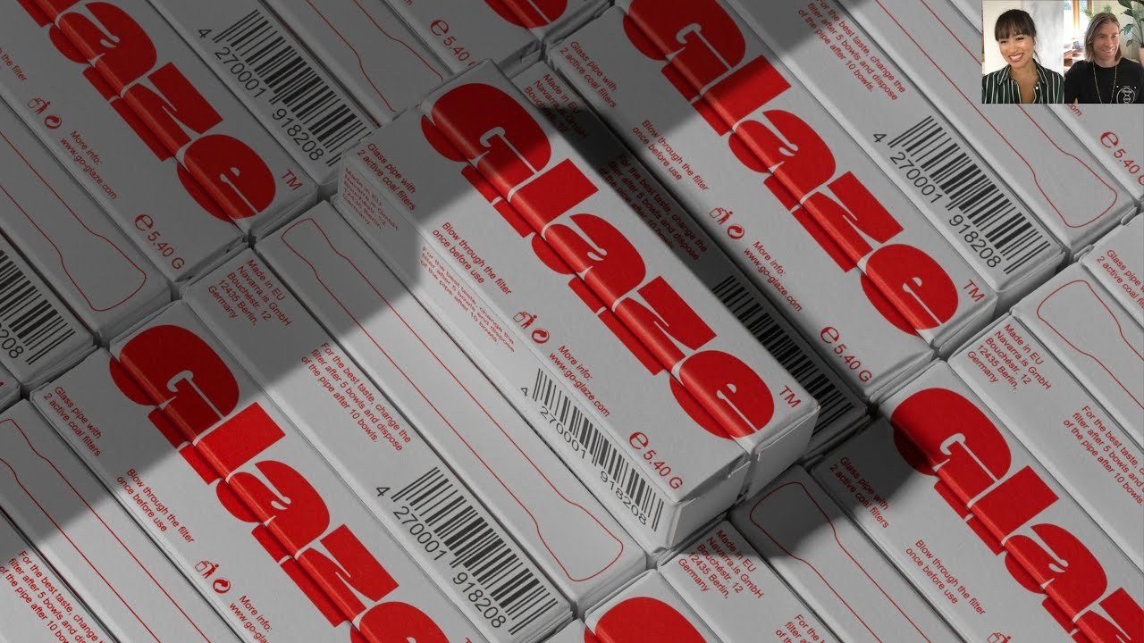
“Type design is so much about fashion forecasting.”
Transcriptmay contain minor errors or formatting inconsistencies
Now many of you will be familiar with the type foundry shark type founded in 2015 by chandra mali and lucas sharp its releases have been featured across publications brands and design design houses galore and have won several awards along the way with the tdc the european design wards communication arts and more two years ago shantra also launched a first of its kind initiative supporting women of color type designers and helping them to kickstart their careers the mali scholarship offers an annual grant and mentorship program to one young woman of colour working in the industry now so far the scholarship has resulted in the creation of typefaces melee serif and melee sands as well as an ongoing showcase that shines a light on cutting-edge typefaces designed by women I'm delighted to say that we're joined both by lucas and chantra hello to both of you hello hey hey thanks for having us great to see you yeah you're now you're not together you're you're dialing in from two separate parts of the country where are you dialing in from we are there's a phone oh boy I'm in I'm in california and in marin county john tries in newport rhode island where she's from yeah we kind of jettisoned new york as the covid curtain was coming down.
And we've been kind of splitting our time amongst both of our families ever since which is kind of a big personal priority for both of us. So we're apart for a little bit.
But we'll be back together very soon but you've kind of switched I guess what you when I saw you in new york you were in I think little italy like a really busy part of town and you've kind of switched that up for trees and chickens you were saying yeah yeah yeah we've made quite the ship rural northern california fantastic well instead of you both you know oh sorry you go I was gonna say you know it's nice it's a big it's a it's a major gear change for us I think we're both still kind of acclimating but you know.
I think after living in southern spain for a number of years it's kind of nice to to you know dial the volume back down a little bit absolutely well we'll come on to spain because I do want to talk about your time there but just for everyone at home just so you're aware instead of sharptup giving us a talk today we're going to be having a discussion. And I've got loads of questions for them.
But I've also yeah if you have any questions for lucas and chandra please do pop your questions in the chat alongside your stream and I'll I'll do my best to ask it for you.
But I guess first off lucas maybe we can start with you you launched chuck type as I mentioned together in in 2015. You'd already built up a bit of a reputation among type designers but was there a moment when you feel like sharp type really came into its own was there a particular typeface perhaps or a custom font for a brand maybe that that really made you feel like okay we've arrived as sharp type you know.
I think it was the website when we first launched 1.0 it was like such a kind of a bootstrapped endeavor because we had you know very very little capital we were kind of like working with you know friends on all aspects of it like with the design and development and it really it was a moment where it really hit where you know everything had kind of come together that it was really like greater than the sum of its parts you know jantra had done incredible work kind of like you know taking a look at the competitive landscape you know like where we fit into this industry you know what our licensing strategy is going to be you know what kind of what kind of clients we're trying to you know cultivate and you know coming up with kind of like an aesthetic strategy for like how we present our work you know trying to not you know just hit like a one-off trend cycle but also still feeling very contemporary something.
That's gonna it was gonna last us you know as long as it has I think we'll probably do for a new website now but you know at the time it just felt like kind of very fortuitous and miraculous that you know we kind of actually managed to pull together like a scrappy little e-commerce thing that. Actually showed off our work pretty decently and you know I I think I credit jantra a lot with that yeah definitely did that for sure you you mentioned there the kind of trend cycle I think that's a really interesting point I mean as a type foundry how much are you kind of aware of the trend cycle how much do you feel like you need to kind of engage with it and how much do you want to I guess steer well clear of anything that kind of yeah comes in and out so fleetingly yeah.
I think it's inescapable I think it's like you know and type design is so much about you know fashion forecasting because you know you spend years and years on these things so you're really kind of trying to figure out like where the aesthetic zeitgeist is gonna be when you're actually ready to publish the thing.
So I mean you know hitting that trend cycle is definitely like you know important and can be very you know good for business and stuff like that.
But we we do really try to you know kind of get into our art cave and you know shut out external kind of noise and try to like you know build something.
That's wholly our own but so yeah it's kind of it's it's kind of a dance you have to do you kind of have to stay true to yourself but also you know it's at the same time you know like design and all all kind of artistic culture kind of happens in movements you know we're kind of like building things collaboratively it's an intergenerational dialogue so you know things come things come kind of back in vogue and it's important to kind of know where the aesthetic zeitgeist is heading and kind of you know chart your course according to that strategically but I think if it defines you too much you lose something yeah interesting I mean I guess I remember we did an interview with you a few years ago about your typeface beatrice which I think is named after your your mother lucas I believe and you talked about how it was the closest you'd come to carving out as you described it a niche in the aesthetic ecosystem which I think is a lovely way of putting it how would you kind of describe your place today in the typography world. And I guess we have what is that niche in the in the aesthetic ecosystem that you think you now feel like you're yeah I guess you're able to inhabit you know.
I think the way I kind of see myself right.
Now is like actually kind of like behind the scenes like I I feel like I'm purposefully kind of like receding into the background to try to you know make room for you know other talented up-and-coming people that we're publishing that we're promoting with our platform trying to build something bigger than the two of us incredibly proud to publish like karta by milan tuang who's just incredibly talented mark wu all we've published a few of his fonts conor davenport you know we're trying to build kind of like a community foundry model and we're always looking for fresh talent and I think that's kind of given me the space to really you know take my time with with stuff that I'm working on I'm definitely still developing my craft and trying to perfect some stuff I've been working on for a very long time but you know.
I think my our aesthetic niche is hard to it's hard to pin down you know beatrice was you know I kind of set out to do something wholly original and which of course I didn't do you know like like I was saying before you know these things are in the zeitgeist they're like in the in the ether and things happen you know as movements I think this this idea of internal contrast that beatrice did was kind of on the tip of a lot of people's tongues for at the time mark walt our our collaborator he published a typeface called choi mill where the the black weights really do that kind of explicitly where it really collapses in the center but I think you know by by like kind of naming it and kind of having like a really vigorously outlined you know contrast methodology even though you know lots of people have been experimenting with those ideas forever I mean it's in wood type you know the way that when wood type gets really really dark you you kind of cheat in the central strokes in order to you know have that mono linear feel so the outer strokes can be you know as thick as as like the o and stuff like that.
So I mean it's been around for a long time but you know in terms of our our current like aesthetic nature or whatever you know.
I think we're just trying to avoid having one you know.
I think we've we've kind of like you know had had some moments of you know inspiration and and you know fleeting achievement but yeah we're just trying to you know to keep that going and kind of stay fresh and and not not pigeonhole ourselves into into anything you know.
That's very very modest of you I'm sure but chantra I guess we we're seeing some images coming up of work. But also of the the mali scholarship and I promise we will get on to that in a second but before we get on to that I guess just to talk about you're obviously the foundry's ceo and I'm curious about how the business model of a foundry works particularly one on this kind of community model how much of your time are you kind of splitting between yeah I guess those custom type faces for brands and then retail type faces what's that difference between the two and how do you kind of yeah how do you kind of balance them I guess it's a good question running a type boundary a is a really interesting challenge because it's the coupling of two formerly independent industries you have the art and creative meeting the engineering and the software side and so we have to manage those simultaneously on the creative side you know our mission is to create quality typefaces and really pursue a diverse range of styles like lucas was saying we don't really want to be fit into any particular niche and that really has to come from a place of inspiration and you know.
I think when our designers are excited and motivated and inspired to do to work on a project we're going to get the best work out of them.
So we always try and find those those fun projects for each individual designer and that could be the mono linear geosans if they're interested in that.
But it also can be the really fun display type that we we gen we end up doing building a lot of you know og is a great example of that which is a was a passing passion project of lucas he also mentioned cartoon nueva but by milan we just released greenstone which was inspired by this really robust archive that we had of og and designed by connor davenport so that's that's our pursuit there.
And then on the other side we really have to be very careful and strategic about our licensing foundation and our strategy what I like to remind our designers is that they're artists first and foremost and they are not selling their font they're selling the right to use it. And it's really important as a foundry to establish what those rules are and I think on that side font licensing is by no means easy to understand and one of our greatest challenges is to communicate that to our audience in a way that is approachable and so that's kind of our next challenge too on an operational side is trying to you know make our licensing as concise as possible and find ways maybe interesting ways to communicate that to our to our audience so that you know it's it's it's more achievable when it comes to bespoke versus are building out our own retail library I would probably say that split is a very strong word one of the the greatest challenges with working on bespoke work with clients which can be really gratifying is the time constraints with our own work you know we we eventually have to set deadlines for ourselves but we also have the flexibility to push things out if we feel like we need more time and of course with clients they have deadlines that we need to meet but we're also you know keeping that same level of quality that we that we keep hold ourselves to with our own internal work.
So that can be a big challenge and what that means is as a boutique as a boutique foundry that we can really only do a few a year to really dedicate that time and make a commitment to our clients and do them justice this is an extension of our team here. And so yes exactly and you know we again we have had some really fun projects dropbox you mentioned comes to mind that was working with jessica stenson and her team on their internal design team was really gratifying and we expanded what was already 249 fonts to 294 fonts created a variable type and also did localizations for thai and cyrillic so you can see the sort of the breadth of what a project can take on and why we need to you know make sure that we're selective and don't wear ourselves too thin another really fun project was just recently with jesse reed on a project for williams college which is one of the one of or is the largest liberal arts university in the united states and we did a really pretty robust diverse set of independent styles that were all pulled from their archives and inspired by their own university archives and even stone carvings on the property so you know we we like to to be selective and work on projects that you know are kind of holistic we think that's really.
That's really great there are other foundries that you know are more heavily weighted in the bespoke realm but for us our mission is to really expand and branch out in our own library and also because it has a longer shelf life it's you know it's not kind of one and done with the client work we we you know it's it's more fruitful over time because it's our own intellectual property amazing thanks for that. That's such a good insight into how it works and I don't think I personally haven't had that kind of yeah understanding actually works behind the scenes lesson 101 exactly appreciate that but chandra I guess we are here this evening or this afternoon for you to talk about creativity with a purpose and I did mention that in 2019 you launched the mali scholarship could you just talk us through first of all I guess why you decided to launch that initiative I mean had you been thinking about it for a long time before before you kind of actually made the step of launching well the melee scholarship is is very personal to me and and and very close to my heart from you know my own because of my own background I'm first generation on my dad's side who is from thailand and my mom is of spanish and native american descent and you know growing up it was such a huge part of our identity it was our identity and we were very proud of it it was a little different when I walked outside my door I grew up in a small town in new england and you know it really was lacking in diversity and while I made some you know lifelong friends I I definitely struggled to find my community and I think maybe if I had been in a more diverse community you know with some with people who shared similar cultural values that it would have been a great different experience for me. And it wasn't until moving to new york city that it was you know the first time people weren't asking me where.
I was from because it didn't matter I mean you know everyone's from everywhere in a place like new york so that really solidified me the importance of you know diversity and and that was an issue that that sort of stuck with me and that I took very seriously just throughout my years. And I also was already pretty involved I social work really interested me I had been volunteering on various things since I was a kid up into adulthood and when I took a career test in college it predicted I would be a non-for-profit so here we are and we also took great interest already we were kind of dipping our toes in trying to give back with raspira black for example lucas decided to donate all of the proceeds forever to the nrdc which in the united it's the national resources defense council a group of incredible lawyers who are fighting to preserve our environment and and and help those who are suffering the most from the effects of climate change so I had always already you know I it was really an amalgam of my personal experience and then finally being in a position to to do something I was now owning my I had owned my own business and I was noticing in in my new community and then in that industry it was very familiar to how I was growing up but now I could really you know establish something to try and just move the needle and it was that and and lucas's encouragement and and really helping me sort of articulate what this project would be that that I was able to make it happen fantastic and I guess I mean just to give a bit of a kind of background to it how does it. Actually work I mean I kind of mentioned that there's mentorship involved as well as a kind of grant yeah yeah maybe talk us through the actual kind of way the mechanics of how it works yeah sure so every year you know we receive a number of applicants and we we select one recipient who gets a six thousand dollar grant to go toward anything that can be toward a specific educational programming type or just to have the time to sit down and continue the development of their own typeface because that's one of the greatest barriers of entry is just to have the time and there's also a mentorship that goes along with that we have a program of about 10 sessions where they have a typeface that they're going to continue to push along and get feedback from the team lucas is is a big involvement there as well as the rest of sharp type and also learning other things other lessons along the way I do a really I do a licensing course for example and we really try and give them a holistic view of what it means to run a type boundary and and and hopefully and help them help guide them to to you know figure out maybe where it is that they they want to pursue but very early on we realized that we couldn't just you know this wasn't just going to be a single scholarship for a single recipient we were you know overwhelmed by the amount of applicants that we got and further beyond that just the amount of talent that was coming in and so we very quickly established new sort of categories and have recognized coincidentally three finalists who were top contenders for the recipient position as well as women of typographic excellence who just you know showed in a great were very well adept at type design and we thought would be an injustice to to not showcase their work. And so really.
Now we're seeing ourselves also as kind of a database of of top talent that we're discovering and and hopefully you know sharing with the rest of the community yeah fantastic it's such a such a great initiative and I guess I mean I could do looking you're obviously both very connected to the type design community do you think type design as a as a community as a kind of sector is is worse than other parts of the design industry when it comes to diversity or is it just you know bad across the board and this is somewhere where you really feel like you can have an impact well I think what's important to to note prior to answering that question is is kind of defining what diversity means and it's it's very different in different parts of the world but for us as a western foundry you know we we do notice that there's generally that the the industry is generally kind of a white male dominated industry and that's not really unlike I would say the design industry as a whole I was in branding prior to this and you know the agency and our competitive agencies were mostly male dominated and also all of the clients that we had that spanned across many different industries so I think as a whole across the board you know it's we're seeing it seeing it as an issue and I think it's you know broadly recognized now that.
There is a discrepancy that that we're trying to to boost up.
But I also don't want to undermine and forget that there have been a lot of incredible women and people of color that have already contributed and continue to contribute to the industry I just think that.
There is a lot of room to continue moving toward that trajectory and there are other people that are involved in that as well there's alphabets comes to mind which is a really amazing institution of women in type in the type design world who are trying to raise awareness about this exact issue and and also empower women in the industry provide mentorship and what have you it's a really great place and they've offered a lot of support to us as the melee scholarship and and also you know following the announcement of our our award even monotype released a type design scholarship for people of color so you know it's really exciting to see how you know we're all kind of moving each other along a little bit little by little and I have I have high hopes for the industry that's incredible yeah it's good to be at the vanguard of that and kind of pushing that ♪
with that kind of scale as well is great I guess just finally what are your plans with the the mali scholarship going forward I mean we've just seen a couple of the recipients popping up on screen which is fantastic to see but yeah what are the kind of next steps and the next kind of yeah phases for them yeah well we have long-term and short-term goals for for the malee scholarship I think starting with long-term I'm really excited to to follow these these women and all of our applicants and see where they go in their career and I'm really hopeful that when they reach a point of success and they're in the position to do so that they pay it forward and that's something that we really emphasize in our mission is you know finding people that are not only you know passionate about type design but also you know take an interest and are involved in their community and from my own experience I was a recipient of a scholarship from the urban league of rhode island and when I was in high school.
And it was about five thousand dollars I think that could go toward any any educational expense going into college and so while the financial aspect was really great it was it was really the vote of confidence that was so profound to me you know just having that support was really was really immense at the time in my life. And so this is you know whatever 15 years later this is sort of my my way to contribute and pay it forward and so I'm excited to see and pressuring our girls to think about that as they move forward in their careers but then you know on the tactical side and the short-term goals we really just want to find more people and reach more applicants and that just means greater exposure which you know we're trying to do progressively and we're finally ready to open our doors to involvement from the larger community we had a lot of support and interest in the beginning but when we launched we really didn't know what we were doing so we kind of took a pause and and now we're ready and excited for them to come we actually just released a donations page on our website themilyscholarship.org so anyone who's interested please please visit you can donate any you know amount of money that you can or if you you know are interested in some sort of mentorship program to be involved with or just shooting us a message we'd love to hear from you.
But yeah. So those those are our our our primary goals fantastic yeah no great great to hear there's a donation page as well yeah hopefully people are reaching into their pockets as we speak we've had a question from the audience which I think is probably one for you lucas to answer but olivia asks what do you think are the key factors to consider for type design forecasting which is a potentially huge question.
But yeah maybe a few things to pick out for type design forecasting well you know.
I think it's it's hard to say it's kind of just like you know keeping keeping an eye keeping an ear to the ground you know like like I think there's like type tape's design is such like a kind of like a legacy thing that you know a lot of you know like historic beautiful typefaces kind of end up you know having little resurgent moments that kind of spell the you know a trend cycle that will you know pop in the next you know couple years like in I think it was like 2014 no no 2015 you know you could start to see like cooper black getting used a lot and like a lot of those old kind of like more psychedelic kind of funky types and there's kind of been an awesome resurgence of that.
So it's kind of hard you know.
I think it it's it's I think it'd be more productive as a young type designer to find like a style in our genre or just you know some kind of move that really excites you and and you know makes you like passionate and really like want to draw you know the best typefaces are the ones that I think it's very evident that someone had like a really good time drawing it so fashion forecasting is really tricky and it's kind of like you know like a like a suit saying like oracle thing like it's hard to like define into words but you know just just keep your ear to the ground and you know just just be aware of like where where the trends are now and try to kind of like extrapolate that into the future taking into account you know what it feels like to be alive right now and kind of the present conditions we're living under absolutely and I think as chancellor mentioned here sometimes it does take a year 18 months even beyond that to create a typeface so it's it's they're slow moving trends in some ways as well because of that because of how yeah yeah totally like like times new roma yeah definitely definitely so it's you know if you're diligent about it you can kind of you can kind of catch the wave and surf it yeah that's a nice way of putting it I remember type designer telling me once that you shouldn't trust a typeface that's taken less than six months to make which is maybe a bit a bit much.
But I I'm not a type designer I'll leave that to you guys to decide maybe one last question because we were slightly running out of time.
But yeah can you talk us through what what sharp types currently working on anything you've got I guess coming up that we can look forward to got a ton of fun stuff there's we've we made sure to put a bunch of unreleased stuff up in the slides here but something I will talk about that we are getting into in a major way of the last three years is really looking to kind of move beyond just latin and delve into other scripts so we've made sure to basically include like every single latinized language that we can in our character sets like the last three releases we have include like vietnamese so really trying to be like kind of inclusive in all aspects of the foundry but you know we we kind of like have delved like head first and taken apart ourselves to develop like cjk like all the hanzi-based scripts which are the hardest nuts to crack and of course we we work with native designers and collaborators every single step of the way but just from you know personally I I've been you know had just so much enjoyment and kind of given me given so much life to my to my practice and and my passion for this craft kind of getting into you know figuring out what like how these different writing systems function even though I'm not speaking the language I you know I understand you know the different even the different like tools that are used like the ink brush in in you know hanzi based scripts compared to the broad nib pen in latin you know and how those two writing systems can sit together on the same page you know because it's it's a global world we're living in and you know these things need to kind of exist in harmony even though they're like completely different kind of you know conceptions of how writing works and just understanding just like I mean the incredible efficiency of hanzi I mean you go and google translate and you know translate a page of english and it'll just go into like a tiny paragraph a ponzi because it's so dang efficient understanding the legibility like how hanzi readers are reading the outside shapes of the letters okay similar to how you know latin readers are reading the top of the boma you know the the the elegant simplicity of hangul like the most you know probably the most brilliantly designed written language ever where it's incredibly modular there's a few base you know consonants and and vowels and shapes that are actually the shape of your mouth when you make them like the o sound is like a little o circle you know that kind of thing like it's just ingenious and the way that they kind of like fit together in this modular fashion.
So it has that efficiency but you can learn it I mean you won't know what you're saying but you can learn what the sounds are and you can sound out you know words you know quicker than latin it's an incredible feat of engineering the beauty of japanese like I'm obsessed with with hiragana because it's like the most like curvy wiggly beautiful like specific like you can get away with so much in terms of like how the skeleton of latin you know what you can dress it up whereas the you know the strokes and the emphasis are so specific in these languages so kind of just like playing with those you know and having kind of one family that's like all these different languages is kind of like this you know it's an exercise in futility in some ways but it's also like an incredibly interesting and complicated problem to solve and you know the semiotics of form you know like what these forms mean in these different cultures the the kind of similar styles like you know they have sans serif styles they're like in japanese it's called gashukai and how those have kind of like involved in parallel to the corresponding latin styles and how they're kind of like you know based on their own you know history but can kind of you can kind of be you know slightly you know molded to kind of work together so you know all that stuff has just been just been absolutely fascinating to work with over the last few years so hopefully we'll have you know some of that stuff for retail at some point kind of have to like refigure our whole e-commerce system to to you know work with the with the global audience for selling to people all over the world. So it's a huge undertaking in a lot of ways but I think that's that's some of the most exciting stuff we're working on right now besides just you know still you know making sweet fonts sweet latin fonts amazing thank you so much I'm sorry guys we're gonna have to end it there because we're slightly out of time but thank you so much for your time and for those great answers it's been it's been a pleasure talking to you thank you thanks thanks so much matt good to see you great to be here
Latest Talks
-

Murugiah
Why you should reject the formula and make art about things you love
Watch -

Amber Weaver
How does contemporary type design translate into the wider world?
Watch -

Delali Ayivi
How does photography give us the right to imagine our futures?
Watch -

Will Anderson and Ainslie Henderson
Bringing stop motion sorcery to BBC’s Small Prophets
Watch -

Ollie Babajide Tikare
The importance of not flattening the complexity of observation
Watch -

Marina Willer
Design thrives when you find poetry in the simple things
Watch