
Sarah Parker is a set designer known for her love of optical illusions and creating uncertainty in visual culture. She values projects that allow her total creative control and discusses the challenges posed by client constraints.
Sarah Parker
Why the material of an object should shape the entire set around it
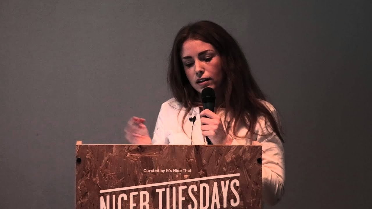
“Once I got over the fear of making something that might look crap, I was ok.”
Transcriptmay contain minor errors or formatting inconsistencies
Nice to see loads and loads and loads and loads of you. That's cool I'm Sarah I'm a set designer and I thought I'd start off with a quote from my a-level art teacher who in one of my reports said to me.
Basically that was absolutely crap at Art I couldn't draw but one thing that I was good at was making other people's work look nice which is kind of ironic because that's pretty much what I do now oh I missed out on hello hello and so if you've not seen my work before I'm a set designer and prop stylist so that. Basically involves creating environments backdrops organizing props and styling objects and making other people's objects look nice and I'm predominantly working fashion. And some of my clients have included people like Christian Dior I've worked for the British fashion Council on their London's London menswear collection advertising and also people like Mr Porter and it's kind of a mix really I do obviously this kind of commercial work.
And then try and do as much editorial and also personal work as possible and this as I say it's not just fashion I'm also interested in other bits like food I've done some stuff recently for the gourmand I also do quite a bit of work in interiors and lifestyle bits so bits of wallpaper design you.
And then the other bigger names sort of fashion magazines like this is laficial piece and bits for Vogue and all that kind of stuff so another question I get asked quite a lot I thought you might want to know about it's basically how I ended up doing what I'm doing because it's not an obvious job choice I never knew about it when I was at college or when I was at school or anything like that. And I I always thought it was going to be a graphic designer because I'm really into sort of clean minimal things.
So I had that in mind I was you know looking around all the courses and everything just seemed a bit bit kind of dull without wanting to offend any graphic designers out there.
But I didn't want to be sat at a computer all day I enjoyed making things.
So I went to Brighton and looked around the course there and they had an amazing illustration course. And some of the stuff they were doing it was totally it wasn't just drawing it was model making animation photography and so that's where.
I went and that's what I did and ended up doing basically sort of 3D illustration and the guys there pretty much introduced me to set design and said hey these are some of the people you should look at you know if you thought about doing window displays have you thought about doing music videos and yeah. I was like wow that sounds like fun so that's what I did after I'd finished I spent maybe two years or something just doing loads of different placements I went to Wonderland magazine and did like a kind of proper full-on fashion thing which wasn't for me in the end but it was interesting nonetheless and also went to Harry Nichols and worked on window displays and did music videos and then luckily met a really nice set designer called Sarah May who I worked with for maybe two or three years and pretty much learned how everything works essentially made loads of contacts and started to shoot for myself which was quite a big deal because I'd not really made any of my own work for a few years so once I'd got over the fear of making something that looked absolutely crap it kind of started growing up going all right really from there and another question I also get asked a bit about is my influences and the things I'm interested in and so here's just a couple of really quick examples I try and avoid really looking at too much other photography or specifically set down design stuff and I'm much more interested in other things like sculpture like the the bottom left-hand side as a sculpture by Donald Judd who's an amazing minimalist sculptor it's all just about light color materials really sort of simple but beautiful stuff and anything geometric I absolutely love I don't know what it is about me just patterns and lines and really simple colors and and also things like optical illusions I think one of the main themes within my work is if there's a bit of trickery are you just not quite sure how it's been done then. That's awesome for me.
So this is one of the first personal projects I did which is with a photographer called Alex Kent and it's just a really basic idea but a little bit of visual trickery with perspective and beams of light and just painting directly onto a set and another piece which is a favorite of mine it's a little bit older now but again it's sort of focusing on the idea of architecture and steps and simple things like the way objects create Shadows on backgrounds also I don't know if you can tell from that.
But it's actually a sculpture that I made out of fabric so I'm quite into trying to subvert like the use of something so obviously fabric it's usually flexible and bendy and malleable and sort of wanted to do something completely opposite with it and make something totally rigid and on the next one here again this is just a bit more personal work.
But this is just a series based on simple patterns so it's just going back to the idea of stripes and spots and architecture I guess making an environment where you're not entirely sure what's going on is it real you know is it the pattern that's making the different colors how's it lit is that bit sticking out or is it going backwards or I don't know just a bit of a bit of trickery really so aside from the sort of whole environments quite a bit of my work is also to do with styling of objects this is where the prop standing comes in I just wanted to talk a little bit about that because that's one of the other key themes and like something I'm trying to focus in focus on with my work at the moment which is just trying to use things in a different way because I just I don't know about anyone else but I just find you you sort of bombarded by images of objects all the time you're on the internet someone wants to sell you some trainers or a bag or a Hoover it's just like I've seen a million Hoovers I kind of don't even look at the Hoover anymore it's like just the same shape you know exactly what it is and it's not taking you even a millisecond to to think about it or look at it.
So yeah these are kind of examples of where I've tried to do something a little bit different so the the shot on the left is a actually a bit of pasta I don't know it's just is it's kind of trying to just elevate it into something else and turn a bit of pasta into hopefully what looks like kind of a luxury luxury image another key thing is also the material an object is made out of so whether it's sort of a fashion object whether it's a shoe or whether in this case it's a shelf like the shot on the left I think it's really important to play on what it's actually made out of really.
So we've kind of Taken what's essentially really handmade highly finished plastic shiny shelf and put it next to something completely opposite and natural and hopefully it's not obvious what it is initially and again the same similar sort of thing with the jugs on the right.
So this is a bit more into fashion which is probably what you're expecting me to talk about a bit more but it's just an example of looking at the material and taking inspiration from that. So it's a white cotton shirt you've probably seen A Millie of them before.
But it was about saying what you you know what the qualities are of it that are interesting like it's stiff literally sort of starched white shirt and just taking that to an extreme and again turning it into something a little bit different and so I was also just asked to go through a little bit of process and how I actually would make a shoot happen and the sort of design element of it.
So this is a project I actually did with it's nice that for okini the menswear retailer and I tried to start this in a similar way the approach of looking at the object and getting a bit of inspiration from that these are power of sunglasses that I found on the website well sunglasses just regular glasses but I just thought they were really amazing completely unwearable but they really reminded me of graphite and charcoal and I don't know if anyone else did this but when I was at school we made sort of rubbings and had like bits of bark and put the paper on top and made patterns so I kind of got a bit carried away with that and just sat at my desk furiously like drawing with charcoal and decided to try and put that into an environment and make a whole set out of that which is what I did so there's just a couple of slides of of the project which again I think it just has that link to the material that the items actually made out of and then it also goes back to the kind of minimal elements that I'm really interested in also another good thing about this project in particular was that I was kind of in charge of everything which doesn't happen often often people are kind of like they give you some stuff to work with and it might not always be the best stuff you've ever seen or they already have an idea.
And it might not be the best idea you've ever ever sort of heard of whereas this I got to pick both so I really managed to make sure that all of the products that we use you know the colors were the structure of them worked I knew how I'd be able to hang them. And sort of make them interact with each other and and also another good point about.
This is it's literally just pieces of paper with pencil on. And I'm really interested in how you can take something. That's you know it's quite a basic inexpensive item and make it look hopefully quite nice and quite luxury and yeah apparently that's that means I'm doing an alright job. So yeah.
I think that's the last one and that's 10 minutes and five seconds thank God
Latest Talks
-

Murugiah
Why you should reject the formula and make art about things you love
Watch -

Amber Weaver
How does contemporary type design translate into the wider world?
Watch -

Delali Ayivi
How does photography give us the right to imagine our futures?
Watch -

Will Anderson and Ainslie Henderson
Bringing stop motion sorcery to BBC’s Small Prophets
Watch -

Ollie Babajide Tikare
The importance of not flattening the complexity of observation
Watch -

Marina Willer
Design thrives when you find poetry in the simple things
Watch