
Rose Pilkington is a digital artist known for her vibrant creations and deep fascination with the effects of colour. She explores how colour communicates and its origins in the natural world.
Rose Pilkington
Why are we so affected by colour and how can we harness its power?
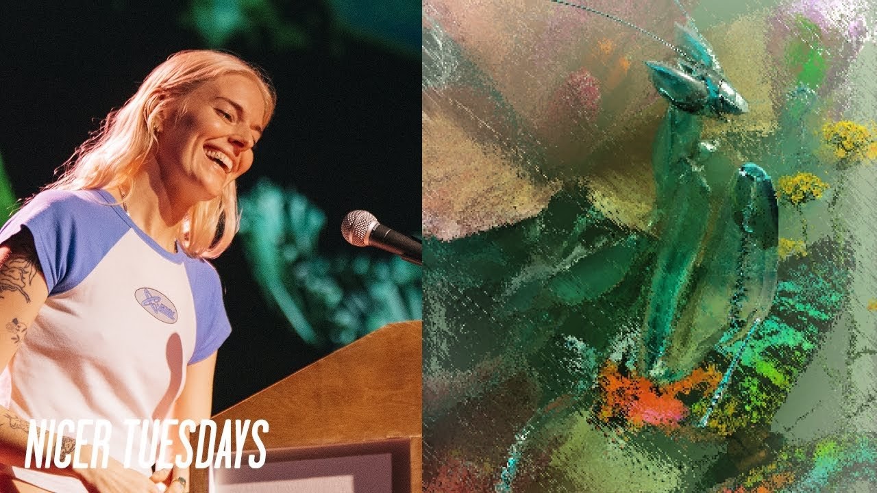
“Colour isn’t just seen; it’s felt, it’s experienced, it’s a bridge to our emotions.”
Transcriptmay contain minor errors or formatting inconsistencies
[Applause]
hello everybody thank you very much my name is Rose Pilkington.
And I am a digital artist so firstly just want to say a massive thank you to its nice that for inviting me to speak here tonight I've always wanted to do this and thank you so much for having me and you've always been so supportive of me right since the very start so thank you so much so yes you're Angels thank you so digital artist what is that what do you do so in layman's terms I create computer generated digital artwork. So it's my job to visualize the visual so the work that I love doing is essentially abstract and experimental image making and often the kinds of briefs that I receive will be to take an abstract concept and then whether that be a word or a theme.
And then turn that into a visual so whether that be to take a set of colors and then translate that into a set of visuals or to create an artist's interpretation of a sustainable process or to create animated moving visuals for a live performance ♪
all Under One Roof raving laughing and joking you know what I mean to St so hopefully that's all a little bit of a taste into the work that I make but what I really wanted to talk to you about next is a subject that really makes me tick and it's become a thread and a theme.
That's kind of woven its way into my work from the very beginning and that is my love and Fascination for color and that Fascination has led me to ask these questions why are we so affected by color what kind of impact does it have on us and why do we feel the way we do when we see a certain color and the thing is there's so many factors at play here.
And this processing of color often goes very unnoticed and and certainly can be quite instinctual how we use it so firstly of course we know through science how we perceive color through our brains and our eyes but what I'm really interested in is the psychological effect that it has on us.
So the emotional feeling response one that can literally see our moods and our Behavior shift and then there's this other part to it where we see our responses color they're actually rooted in our biology what is it about a sunset or a sunrise why do we feel this this emotional it's an emotional spectacle for us this kind of gorgeous pinks oranges and purples of a sunset there's something almost quite Primal about it and that perhaps many of our fundamental reactions to color start with Nature's role in forming our associations and our emotional responses to it.
So if a person's reaction to Orange is always related to this kind of Primal memory of the sun then perhaps that's why we refer to it as a warm shade and we feel optimistic around it.
And then of course it follows with green it reminds us of grass trees nature and and we feel tranquil and grounded color can tell us a story it can be used to Signal action. And it can be a powerful communication tool that can influence us subconsciously and I recently came across this very gimmicky Trend term called dopamine art which is it's very Pinterest very Etsy I'm aware but what I love about it is that it takes this idea that when we look at an artwork. That's bold bright and colorful we get a hit of dopamine which we all need more of right I need that.
So we're stimulated by these bright and these hot colors and then we marker them with associations for energizing us and they make us feel happy and joyful and and therefore boosts our mental health overall. So if color has the power to do this and yes give me more of that give me more so we make choices based on the way color objects are designed and presented to us.
And so do animals similarly in nature of course animals communicate use color to communicate with each other many birds like the bird of paradise we've all seen they use color to choose its mate by this dazzling display of feathers and the brighter and More Beautiful they are then the more they appeal to the female in question. So if you think of all the amazing ways that animals use color in this way they tell us a story of why they're colored this way because their colors serve for different evolutionary functions and then of course in addition to attracting mates we see color and animals being used for for a sign of warning or camouflage mimicry and how animals like the squid change color is a pretty otherworldly process so this is a digital interpretation I made of chromatophores which are the the the color changing cells found in the skin of a squid and their primary function is camouflage so these little spots they they're like little balloons filled with pigment and when they expand you see more color and when they contract and Shrink you see less so then they're able to to to tonally match the the color of the background or the environment that they're in it's amazing stuff and then if we zoom in even further to take a closer look from a macro level to even a microscopic one it can reveal even greater depths of beauty so these are the scales of this madagascan Sunset moth magnified under a microscope and they just make my I mean look at that it's so gorgeous they they it makes my jaw drop in the same sort of way that when you think about space and it's overwhelming and hard to comprehend imagine these kind of micro worlds that are going on in nature right underneath our nose and we can't see them with our own eyes I think it's quite special so using nature as a reference point I find myself attempting to kind of recreate the colors patterns and textures marrying the natural world with the digital and then turning it into a commercial piece of artwork like I did here for commission by freeze artfare so I next wanted to talk to you about an application of color in a slightly different context so a couple of years ago. I was approached by Instagram to redesign their iconic gradient that sits behind the little Infamous camera that we all know and the logo was last redesigned in 2016 which is where first saw this introduction of the gradient so they came to me for a refresh and a reinterpret dream job my time to shine hopefully so out with the old in with the new I will get their shocking similarity after but so the brief the challenge design it to feel like it was lit from within rather than one-dimensional and flat and create more a sense of depth so I was given the set five vibrant new colors so in essence it's just straightforward brief right it's just a gradient but how could I push the boundaries of something so simple and that was the challenge of course.
So these were my first Explorations trying various different ways of recreating it in 2D like it was originally made but needed to feel more three-dimensional so I tried digitally painting it adding in texture that ctes the light warping surfaces with colors mapped over them testing out different ways to play with light and shade but I quickly realized that Instagram weren't really willing to steer too far away from this original anatomy of the gradient so how could I solve this problem so this is when I have my light bulb moment and they wanted it to feel illuminated so why not try making it out of actual an actual light source could I try creating a smooth gradient and simulate the look of light with pure color so I built this rig in 3D using colored lights so despite being flat still had this kind of visual look of dimensionality and it was then this technique that got the goahead and sometimes it's very simple executions that hit the mark and this was the first render I started out with so now we had this fully customizable set and I was then able to make many many many different iterations possibly over a hundred of this you know this one gradient kind of trying different color combinations and trying to find the harmony between the colors and so over six months Believe It or Not six months later and painstaking feedback and many of these figma boards we got there in the end and this was the final outcome the switching on of the lights on the 3D rig and this is the F icon that you see on your screen today so but yeah before before anyone gives me any hate for it looking barely any different I've already heard it cuz the trolls are going to troll and things never go unnoticed by the internet so just wanted to take the opportunity to share all of the love that I got from from the internet and most people barely notice the difference I don't know why lots of people commented on the increase in saturation like someone had just switched a button and switched it up of course I've been working away on it for months on end so spare me a thought when you click on that little laugh on your phone please and then lastly I just wanted to touch upon a subject that's very close to my heart hopefully one that I'm not alone in anyone in the room and that as a very self-deprecating British person is imposter syndrome and self-doubt and that along with the help of my ADHD is a little cocktail of worry that I have experienced all throughout my creative career and so I just felt like it was important to mention it. And I even rejected this talk a year ago because I thought it wasn't good enough not attention seeking I'm just saying so anyway.
So it's we got to talk about these things. And I wanted to stand up on the stage and talk about this.
But I've not overcome this feeling yet but I've been trying to learn to reframe and manage the negative inner voice in my head and practice a little bit more self-compassion.
So I've tried to start to seek words of affirmation from the people close to me and from the community around me and know that comparing yourself to others gets you bloody nowhere and put your bloody phone down delete Instagram celebrate those big wins no matter how big or small and where you may feel like you are you're out of your depth remember all the times that you got through it and survived thank you very much
Latest Talks
-

Murugiah
Why you should reject the formula and make art about things you love
Watch -

Amber Weaver
How does contemporary type design translate into the wider world?
Watch -

Delali Ayivi
How does photography give us the right to imagine our futures?
Watch -

Will Anderson and Ainslie Henderson
Bringing stop motion sorcery to BBC’s Small Prophets
Watch -

Ollie Babajide Tikare
The importance of not flattening the complexity of observation
Watch -

Marina Willer
Design thrives when you find poetry in the simple things
Watch