
Rick Banks is a graphic designer known for his fascination with football typography, which was sparked by a childhood experience involving a misprinted jersey. He authored the book 'Football Type' after a two-year effort to collaborate with various brands and clubs.
Rick Banks
How a mis-printed Schmeichel shirt sparked a charity book on football lettering
“I wept when the font was wrong because it taught me that attention to detail matters in everything we create.”
Transcriptmay contain minor errors or formatting inconsistencies
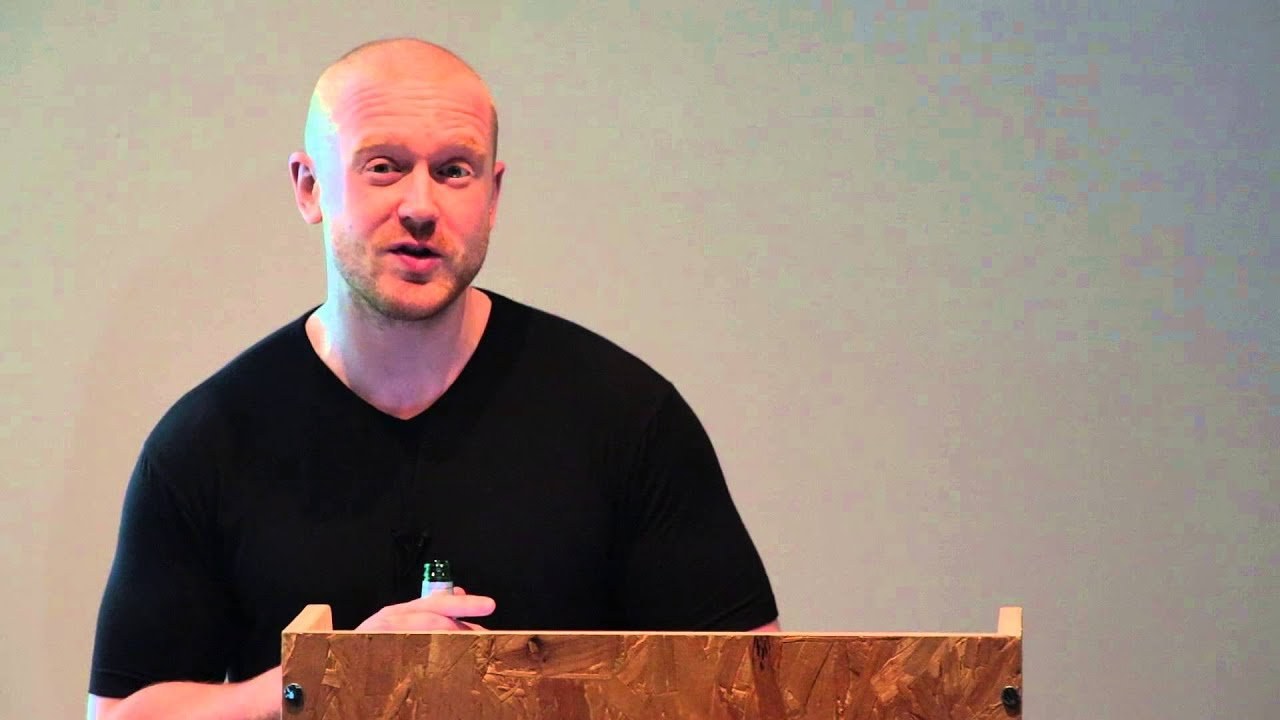
So hello my name's rick banks and I'm a graphic designer based in london. And I'm going to talk about a book called football type that I published last year in september and I've only got 10 minutes so it's gonna be quite fast-paced bear with me.
So the start of the book goes back to when I was 10 years old and I was obsessed with the goalkeeper peter schmeichel and so my mum kindly went to the the sports shop and bought me the replica top with schmeichel printed on the back and when she gave it me I I remember nearly crying my eyes out because the font wasn't the correct official funk it was totally different as you can see but I remember sketching the official one in my notebook at primary school.
So I've always been obsessed with with football typography and I did a quick google and I realized that.
There wasn't a book out there celebrating football and typography so I bought a scrapbook and researched lots and lots of type it's cantona and pele maradona are messy number 10s and I started to realize that recently top brands were in investing in top designers to create shirt lettering for example vasa in spain produced barcelona's current current typeface and paul barnes designed england's gyoto letter in 2012 the rooney one at the top right and the famous design agency gbh designed puma pace for the champions italy so on top of all the the lettering research I started to learn lots about quirky stories involving players choice of number for example zamorano was so pissed off that ronaldo took his number nine shirt he opted for this quirky one plus eight to make nine so I thought by adding these these stories into the book it would add something more than design and appeal to the non-designer as well so when I started to realize it was coming together as a real project I I wanted to do the book for charity as this is something I've always wanted to do and I was inspired by a friend who who produced a book to raise money for the cancer charities so I started digitalizing old typefaces and this was england's in the 80s and then.
I started to put them in an editorial layout I thought it's coming together now and the book sort of organically grew after contacting and meeting people it massively snowballed and I didn't think it would be what it was and I realized the book would only be cool if modern and official alphabets were shown after all there's nothing worse than a fake alphabet like the schmeichel saw but it was really tricky to get all the brands and clubs on board within one book it was so tricky it was so tricky that the book took two years to produce and getting sign-offs from everyone but my I firstly started to contact top designers such as paul barnes I've mentioned shown here.
And this is one of my favorite typefaces in the book I don't know if you can see but it's duotone there's two different reds and then the famous type designer bruno marg was happy to be involved he did tottenham's typeface and vasava who I mentioned before sent me their gowdy inspired alphabet there it was inspired by gowdy's chimneys the bottom there.
I think they still wear this and mark bonner from gbh sent me over there puma typefaces and and guidelines on the right. And this was gaffer and he had to get special permission from puma to allow allow me to publish publish the works but once one brand was on board it was easier to get the others paul barnes who I mentioned before did the england typeface he gave me the details of the creative director umbro and he invited me up to manchester to have a look at their archives as you probably could guess I was like a kid in a sweet shop and without doubt this is the best shirt in the archives the mighty whites bolton but joking aside umbrella were absolutely amazing like they told me to pick out any shirt and they photographed it and retouched it for free and then adidas soon got on board after I emailed their agent ad agency I should say 118 amsterdam and their lawyers had to sign off every bit of copy and credit hence their huge list on the left and then nike sent me their world cup alphabet featuring all the different countries I can't remember what world cup this was from though so the brands were done and now is time to start contact individual clubs and chelsea were super nice and sent me their retro looking typeface and again I just contacted clubs emailed used linkedin rang people and yeah united were happy to get involved and apparently sir alex ferguson signed off this design and I didn't want the book just to be flat vectors I thought it'd be quite dull so I started to contact some of the top photographers in the world to donate some of their sort of stunning imagery of footballers I wanted the book to have some sort of pace to it and when I was doing my research I stumbled across this article by sheridan bird on the creative review blog and it was the only article online talking about football and typefaces so I contacted him to to write the forward for the book.
And in that article shared interviewed a designer called anthony barnett and sheridan panda gave me his contact details and auntie's now retire retired now in france but he worked at a company called sporting id for many years and was responsible for some of the most iconic football typefaces this is inspired by waving flags at football grounds and anthony did a lot of work for real madrid as well for this typeface and he put me in touch with him and they were really strict in what I could say and design a lot of back and forth with them I couldn't mention any madrid players for example and it's a cliche but I had the idea for the book covers in the shower and I wanted to number the limited edition books using shirt lettering and anthony put me in touch with a director at sporting id who produced the majority of the shirt lettering and the badges you get on the sleeve and he kindly donated all the lettering for the book. And so I went up to newcastle to test the numbers on the book cloth which was donated by winters and I wanted to emulate a cotton shirt so the butch wrapped in cotton and the numbers at the top there were flocked and I was told these were being discontinued for the current season.
But I wanted to use them.
So the book had a textual quality I don't really like the new pvc ones the bottom and this was the result I'm happy I didn't have to iron them on myself the amazing people identity did all that. And this is the flocking I talked about. So it has like a felt like quality so I wanted the user to sort of feel the book as well I use all the different numbers that you can use in the premier league I think each club can opt for any color they want and I decided to publish it myself as I was inspired seeing the likes of spin and brown's top design agency publishing their own books and I also decided to create a bespoke website for the book where customers could pick their own number within a price range my friend tom dunkov built the site for free and up.
And I priced them at 50 pounds to 35 pounds I wanted to make them affordable for everyone especially students so the gold ones would be 50 pounds and the the black ones were 35 pounds and they sold out so quickly I think they sold out in three weeks but they were selling so quickly the same numbered book it was being sold within 30 seconds of each other and that was something I didn't anticipate when I built the science it was quite mad and this is my flat imagine picking one number out of this lot it was an absolute nightmare and even when I woke up I saw books it was horrible but thankfully I've got a kind and wonderful girlfriend I have to say that she's in the audience there but who helped me with the packing but the logistics of it and sending them out was by far the hardest thing about the project I don't think I've ever been as stressed in my life I've got a stress arm I think because scratching it all the time and those stacks weighed a bloody turn as well and the reaction to the book's been amazing I've won a few awards for it and even been on the telly but the best thing about the book was giving the money to to charity and it was one of the best feelings I've had and and more rewarding than any design project or award and I and I got to meet my hero kevin davis bolton legend and the 22.4k raised from the book he's gone to a bolton grassroots football club I work with a the charity football foundation who hunted this club down and they were they were waiting 10 years for funding and so I donated 22.4 and kevin davis donated 20. And the picture at the bottom there the bottom left is their current changing rooms it's a shipping container it was absolutely horrible seeing it. And so the money will go towards new changing rooms and pictures for grassroots football which is a it's a great thing I can't wait to see it in six months I think it opens and that's it thank you you
Latest Talks
-

Murugiah
Why you should reject the formula and make art about things you love
Watch -

Amber Weaver
How does contemporary type design translate into the wider world?
Watch -

Delali Ayivi
How does photography give us the right to imagine our futures?
Watch -

Will Anderson and Ainslie Henderson
Bringing stop motion sorcery to BBC’s Small Prophets
Watch -

Ollie Babajide Tikare
The importance of not flattening the complexity of observation
Watch -

Marina Willer
Design thrives when you find poetry in the simple things
Watch