
Richard A Chance is an illustrator known for his signature drawing style influenced by underground comics and 80s pop culture, adept at transforming headlines into complex visual narratives.
Richard A Chance
Underground comics and 80s pop: Merging influences to create a signature style
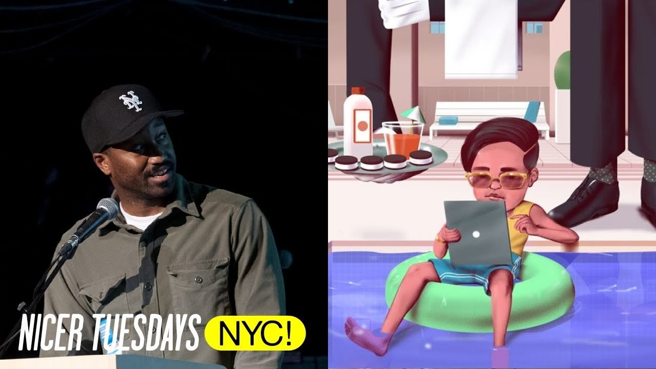
“Humor is the secret ingredient that transforms a simple image into a conversation starter.”
Transcriptmay contain minor errors or formatting inconsistencies
[Applause]
hello hello that's me right there I'm Richard Chance an illustrator and gift maker I'm based in Brooklyn New York I lived here my whole life I'm going to give an overview of my drawing style and how I how it came to be basically then I'll talk about a specific project that I worked on in the past and show examples of the process from the creative brief to the drawing I'll start from oh it's the GIF I start from the beginning when I was young I spent majority of the time inside watching TV and playing video games when watching TV I watch TV shows that like the news tell you hey don't let your kids watch this type of stuff like that's all I watched basically when I wasn't watching TV I was reading comic strips and drawing a decent amount of comics I was exposed to were from the weekly Sunday newspaper when I got older I gained access to the internet and I discover underground comics and read the available Comics that were online also also to mention the occasional Mad Magazine they all have like elements of humor in it.
So I went to a school in downtown Brooklyn called New York City College of Technology I wanted to study computer information systems but I had bad grad so I just switched over to gra grav design these are the drawings I did in college yeah illustration classes were a little bit later it was like about 5:00 p.m. To 8:00 p.m.
So I would stay in the lounge and just draw people. Basically whoever was in the lounge yeah yeah I drew a lot of people yeah this was like web design class that's why I I was like failing so so after graduating I worked at like a few places as a graphic designer I did a lot of like Bear posters and like like basically took information and put into graphs and stuff like that.
But I still wanted to be illustrator so in 2016 I was really into 80s pop music I was one of those people that was like oh my God I was born in the wrong era that was me right there like I said that out loud not on the internet like in real life I said that that.
So I came across something that was like a mix between music and the visual arts and Vapor wave Vapor wave was it.
Basically if you don't know anything about Vapor wave Vapor wave is a micro genre of electronic music visual art style it chops and screws old music. But in particular it was 80s music that I was really into and because of the ' 80s music I start to like experiment with airbrushed style then I start experimenting with my own illustrations the first one you see is like Barnacle Boy oh it's mer Man Dan Barnacle Boy Heartbreak Kid HBK if you're a wrestling fan you know who that is I was getting I was getting a few jobs with my older style the penet ink style the only problem was was that like it takes a long time to like make the drawing line by line they got to pull out the tissue paper it was like too much like too much of a hassle so I started to integrate the two Styles together.
So I went from something like this to something like this. And this to this I started to play around more and created more drawings that favored the style best I was moving very quickly in comparison to the older style so I started to animate the the images because I have much more time to draw so they just became more and more complex throughout the time I created a series of like music gifts so it was way more gifts than this.
But these are just like the the ones that I want to pull up Big Sean you got like Rihanna is raining she has no umbrella this time and ha I love Hy I thought they were twin like triplets but realized they're not triplets I uploaded all these like gifts onto gify and I was like commissioned by gify to create a series of gifts the the concept of the gifts was it was a midday at work of an office environment I'm going to show you it. Now.
This is the GIF okay like part two and the last one yeah it was way more like crazier than that they had to change me it was like no no you can't do all that but funny enough it was featured on his ni stat way back and that kind of led to a lot more like editorial work.
So I did a lot of work for splice Baff Bloomberg Business Week New York Times and R transfer and because of that a lot of the illustrations had a like a concept behind it.
So it wasn't just purely the style in itself The Vapor wave pink colorful stuff at some point I worked at a company called refining 29 for 2 and A2 years inh house so a lot of the illustration that I do recently or anything past this point had these similar color palette was much more bright and saturated even the subjects was like way different I usually don't like draw illustrations that's based off of like how know to explain it moisturizing your face loving your hair I don't draw stuff like that usually but over time I took this I took the color and the pallet and the the way how I communicated set illustration and brought into my actual personal style and over time the style just slowly slowly over time start to like develop the audience and the Publications had like different audiences so I had to like accommodate the illustrations to them not all of this has to be humorous but when they are humorous those are my favorite drawings to do yeah oh now is the process say you kind of see the style in itself the process usually is like super quick because a lot of the editorial stuff is super quick first I get the brief then I read it then I write some words and then I doodle then sketch then refine to final so I'm going to give you like a quick overview like the tone of how I kind of solve illustration problems if that makes sense so Michelle showing you like headlines and then how I my my ex owes me $4,700 and I can't stop thinking about how to get him back.
So I drew a dude that was like a scarecrow that like ran enough with the money she looks pissed you know many people have a vivid Mind's Eye While others have none at all.
So I drew a couple like one has like a good memory of the situation other one just doesn't remember Silicone Valley very masculine year.
So I drew like a nerd turn into like the incredible Chad you know it will work itself out it. Actually won't so I drew like a guy that's like got a lot of bills that's coming out his head yeah like Mondays you know.
But I'm going like focus on a particular article Simone biles and an Olympic award-winning athlete the title of the article was no baby unicorns what no baby unicorns while you never understand a black woman's decision if you don't understand her history in short the article was inspired by Simone B's interview that offered a ton of context leading up to the decision to sit out the 2020 Olympics it touches on her mental hurdles that involved the succeeding as sorry it touches on the mental hurdles that involves in succeeding as a black woman in that profession it's a bit hard hard to like turn that like title and that subject into something like humorous.
But I can use elements of humor and exaggerate certain things and recontextualize certain things to kind of tell the story.
But the main idea was to come up with an idea that was like mainly focused on isolation and how she was feeling or being weighed down by depress yeah these are the sketches I sent to the art director they focused on this one yeah I like this one too they offered hey we should animate it. And I was like oh yeah that's a cool idea yeah.
So I animated it a lot of like drips and arm shaking kind of gives a lot of that it goes back to the central idea of like her weighing down her being isolated the arch director offer say hey we should like fix her face and I and it did fix fix her face like she she looks really happy but it. Actually also like makes the idea way more stronger cuz like she has this mask on her face that she's very serious and very happy but she's like in turmoil so I made it more refined and then I colored her face this is so M biles was a cool idea right.
So I at some point I animated it.
This is what it looks like inside of Photoshop and this is the final yeah and this is like the article yeah just repeated I don't know why it didn't have the other piece but yeah. So it's kind of like the overview of how I kind of get from point A to point B how I like take a title and bring it to its like creative conclusion. That's a quick overview of like eight years of like exploring my style and humor to like portray an idea to an audience thanks so
Latest Talks
-

Murugiah
Why you should reject the formula and make art about things you love
Watch -

Amber Weaver
How does contemporary type design translate into the wider world?
Watch -

Delali Ayivi
How does photography give us the right to imagine our futures?
Watch -

Will Anderson and Ainslie Henderson
Bringing stop motion sorcery to BBC’s Small Prophets
Watch -

Ollie Babajide Tikare
The importance of not flattening the complexity of observation
Watch -

Marina Willer
Design thrives when you find poetry in the simple things
Watch