
Raphael Abreu is the global head of design for Restaurant Brands International, known for leading the comprehensive rebranding efforts of Burger King. He specializes in creating impactful brand identities that resonate with consumers through innovative visual strategies.
Raphael Abreu
Reimagining a fast food giant by looking inwards, not backwards, for inspiration
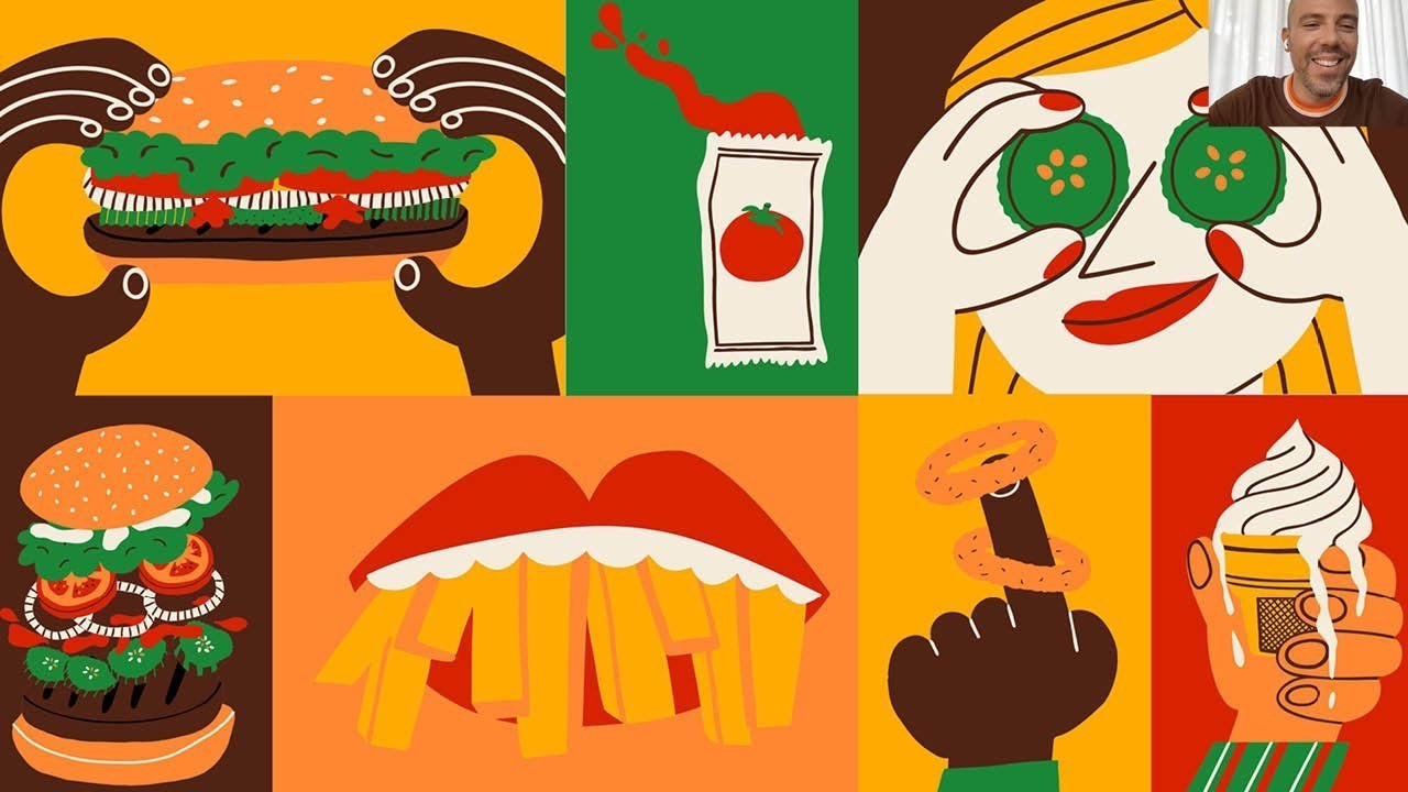
“Let’s design something that people wished was always there.”
Transcriptmay contain minor errors or formatting inconsistencies
Hello everyone and good evening good morning or good afternoon depending on where you're joining us from my name is matt alagaya and I'm the editor-in-chief of it's nice that. And I'm delighted to welcome you all to this the march edition of nicer tuesdays online now first off I just wanted to say a massive thank you really to all of you for signing up for today's event it's going to be a very special one as well as we're continuing with our new format for nicer tuesdays in 2021 now if you haven't been to one of these events in the past couple of months we've made a few changes nicer tuesdays will still be held monthly on the last tuesday of the month that much will stay the same but what's different is that this year each event is gonna have its own theme and will be joined by two speakers each month talking to them in more depth discussing their work in detail and giving you folks at home more of a chance to ask your own questions tonight's theme is a really juicy one branding for the food industry and I'm delighted to say that we're going to be joined by two people who have crafted brand identities that are packed with personality and playfulness in a moment we'll be joined by ur chen chang co-founder and head chef of bao a small london restaurant chain known and loved just as much for its fun illustration-led identity as for its legendary steamed buns after that we're going to be speaking to rafa abreu global head of design at restaurant brands international the parent company of burger king rafa is going to be talking us through the recent rebrand for burger king which he oversaw and which I'm sure lots of you have seen it caused something of a stir in design circles earlier this year now for our second speaker now if you're a designer there are certain projects that deserve to be categorized as dream gigs one of those would probably be to complete a reimagining of a storied global brand that's what rafa abreu got to do earlier this year when he launched a brand new look for burger king which caused something of a storm across the design industry for its 1960s inspired style it's irreverent tone and colorful illustrations rapha is the global head of design at restaurant brands international burger king's parent company and I'm delighted to say he joins us today to answer our questions about the rebrand which he and his team oversaw along with jkr's new york office hi rafa hey matt hello hi everyone so happy to be here yeah thanks for having me and you're dialing in from miami I believe is that right yes I'm here from florida sunny and warm almost too warm to me but yes yes I'm here excellent well listen as per our new look nicer tuesdays you're not going to be giving a talk this evening instead I get to ask you lots of questions and and so does does our audience so just another reminder to everyone if you have a question for rafa pop it in the chat and yeah I'll do my best to ask it before our time is up but rapha I guess my first question really was what were the reasons why a rebrand was launched at burger king I mean yeah it hadn't been rebranded for over 20 years that is a huge undertaking so what were the I guess what were the reasons behind embarking on that yes so if you yeah it's definitely I mean a long time like 20 20 years. And if you think about 1999 there was the 20 years ago when we designed the previous identity many things have changed right in the world of brands and in our own burking world as well right. So if you think about digital what how we use our phones today and how phones were used in 1999 we were probably just playing snake in our nokias that's all our phones could do at that time and today it's really like a an important channel for brands to to interact with consumers right. And in our in our case in burger king we are really almost like reinventing the brand right. So from a food quality perspective we're investing a lot to improve the quality of our food so we are now removing all artificial stuff from from our full menu right.
So no callers no preservatives from artificial sources and we are we did did al already this for the whop and the whopper our flagship product and we are now trying to do this in their entire menu that we're going to complete this year that it's something super exciting and important we also I mean from a digital perspective we all we had our own digital revolution internally as well like not only how people can interact and experience our brands in a digital in in mobile devices but also how digital we are is influencing the experience in our physical restaurants right and also from a sustainability perspective we've been investing rbi that the parent company is investing a lot in doing big commitments around our food our planet and people and communities right. So if you think about all this that I just described and you think about this identity from 1999 I think that it wasn't represent our brand anymore reflecting who we are as a brand and and to your point yes although there is a massive undertaking I think it's a big effort to change an identity for a brand with so many physical restaurants right. So think about all those physical signs that are there we in order to kick kick the project we we question ourselves about almost the opposite right. So what are the implications if we didn't change and I think we we thought that those implications would be more damaging and then bigger for the future of the brand and longevity of the brand to be relevant and really and communicating all these new stories that we have to communicate great thank you that was that was brilliant yeah kind of encapsulation of everything that was going on behind the scenes I'm keen to hear what the kind of first stages of a rebrand like that look like I mean how broad is that initial brief and where do you begin I mentioned that you know there's the kind of the logo was inspired from maybe the 1960s influence so did you go back to the archive first or what's the first step yeah the interesting part of this project is that it it hasn't started as a rebrand project right. So jkr from new york office was already working with us as a design partner for the brand we did several projects with them in the past and it the inception of the project was to communicate our food quality story right what I just said about the removal of artificial ingredients through design but then we we immediately understood that we shouldn't be a temporary solve right. So it cannot be just a campaign but really a deeper reassessment of our brand visual assets right. So our brief was to in order to communicate this new food quality story we need to reimagine the the visual identity system and create like a new set of assets but each element was very distinctive recognizable and unique to us really dialing up this the taste and quality in each one of them right and the brief in off the bat we knew that the logo needed to be redesigned I mean it was very dated we like to joke that it looks more like a gas station logo than a restaurant logo all the time the dynamics and the perspective and the blue was almost like doing a disservice to the brand communicating the the opposite what we wanted to communicate there is real delicious simple warm food so we knew that that one was needed to to to be redesigned and of course as part of the creative process we looked into our bk history.
But we also explored new paths so the from from that exploration that you see here in the loop some of the images the the the favicon the monogram came out of those bigger explorers so we really left no stones and turned on this one because our the ambition was to create like an enduring new identity so making sure that all possibilities were explored were so critical so we we defined four design principles to the work to to really guide the work.
So the first one is about the mouth watering so if you see our new photography style our colors really plays on on that principle the other principle is being big and bold right.
So the way we use our typeface that we stretch it we compress it. And we do it in in a proper way so you guys know that we have a a variable version of the font that we can do it in the in them in a nice manner also the way we do macro photography I think they they really double down on this big and bold principle playfully irreverent that you mentioned yes is our personality so our illustrations if you see you see here some of the mr sketches and also the typeface definitely reflects that playfully reverent principle and the lastly probably true that is all about being true to to to ourselves to our history and also to our food so photography being real the logo itself being a part of our of our history somehow the packaging and the uniforms and on top of that we had a lot of we define a design criteria really to to evaluate the work coming right. So all of us and even to use this as a as an alignment a process with internal stakeholders right when you need have a project that this big there's so many people that you need to talk to about.
And so the design criteria was making sure that the work is on brand that it stands out so on brand meaning that really reflects the brand and only bury king right stands out among competition being timeless somehow something that could endure being practical right. So practicality as a global identity that will be touched by so many different agencies and and partners out there making sure that whatever we design is easy to do the right thing moving forward and lastly exciting right something that. And I think that the launch was really a proof point of that excitement around the work.
So yeah that's basically before we start to design that this was basically our path very interesting I mean there's loads of questions coming in through the chat which is fantastic franzi I hope that asks answers your question slightly about how much time was dedicated to research and strategy and laura asks a really interesting question which is what was the moment like when you completed the new logo must have been an amazing feeling I guess like your your personal yeah response to finally yeah getting that new logo ready yeah the new logo as I said there was a wide exploration.
But then we quickly narrowed down to that era of 69 to 98 that honestly was really.
There was always been a lot of love internally for on bk from that for to those logos for instance was always the preferred logo to use on t-shirts we all we we did a test we did like the the vintage logo on a t-shirt and the current logo on the t-shirt those t-shirts with the current logo they they were there like a lot of leftover and the vintage one a lot of people want to wear it so people are very proud of that and and the logo I think it has a role but it doesn't need to carry all that we have to say right. So it should convey some important messages but but not all.
So that's why we created like this very comprehensive system of visual assets and they can carry other messages from the brand in depth be different levels of intensity let's say right.
So we really strive for for a more like a long lasting design for the logo right. So thinking about the longevity of the new signs on our restaurant right. So franchisee partners will put the old down and put the new up making sure that whatever they put up. And invest behind it will wage well right.
So nothing trendy like our previous logo and and really we we loved how the logo is is really it's uncomplicated it's it's confident and on it's on its own simplicity right. So and and there's a lot of talks about going backwards and forward right. So that this discussion about hey what how was that discussion about going back to a time. And this is a future proof identity but for us we didn't we didn't see this as going backwards it's more like going inwards that we'd like to say that really trying to to look to ourselves and see what is the best representation of our new identity really realigning all these elements to represent ourselves as a brand the best from from inside out somehow right.
So yeah.
So we we felt lucky to be honest to be able to find inspiration in our own history for for the logo gavin asks a really interesting question here how well do you feel the new identity marries up to burger king's feisty advertising and social media and I guess it's worth saying that you know sometimes that can kind of go get you in trouble almost in burger king I know there's been times when you kind of treaded the line of feistiness and maybe yeah ended up on the wrong side of it.
But it's part of the brand identity isn't it to be kind of quite feisty and I think gavin puts it really well feisty and yeah on advertising and social media so how well do you think the new identity marries up to those yeah.
I think that we we try to create something that is a first of all very uniquely burger king right. So definitely the the expressiveness and boldness of the identity the it's it's a colorful identity it's very expressive it's very rich so definitely plays out on that more especially in the context of quick service restaurants right.
So our main competitors I think does differentiate us. And I think to your point a playful playful irreverent personality is something that we that we have that we own that is really differentiating as well so yes so if you see the the illustrations that even those sizzle videos that you're seeing right.
Now they really plays up on the on those displayful irreverent personality our side but definitely that there. There are some. There is a price of of being feisty right.
So there is a and I think probably the price is to do some mistakes along the way right but but yeah but we definitely want to keep being a challenger and challenging the status quo for sure as a brand as you're talking we've obviously got all these visuals coming up on screen which are amazing but show the kind of I guess the breadth of different outputs in a way that this brand had to go across this this revamp you know we're seeing billboards we're seeing uniforms and social media what were some of the tougher challenges I guess that you faced when you were rolling out this design system across that many different outputs yes I think like any other restaurant brand right that has been through every brand I think we unfortunately we can we don't have like a magic wand that we from day to night we kind of change everything right. So so it's a it becomes like a gradual transition so things will will move forward will change transition to the new identity as the years come right.
So and the old and the new will coexist for a period of time. And that's to me that the most challenging part even to convince to talk to people about this process there's no other way right. So unless you marry forever with that that old logo you cannot move to a transition if you don't if you don't allow yourself to live with the old for a little period of time so and we know that people are smart right.
So they get it they see that okay the older the new these guys are are doing their job. But they cannot change everything at once right.
So we we are now transitioning all the soft assets digital advertising and then we're gonna change packaging and uniforms that has some sort of inventory right.
So we don't want to create waste so we're going to deplete our inventory and then we start producing the new and I think the restaurant signage right. Basically the logo above the the door I think this will be the one that we expect to take several years like following we have like new openings and remodeling schedules worldwide so hopefully those will be changed by that. But yeah.
I think that. That's definitely the the most challenging part of the process like this I think that the one that I liked the most that I felt very exciting about this just that how did our digital touch points really look different from the usual ditch digital touch points of of recent rebrands right. So again as I said we we use bold and rich brand elements like there are colors or typeface illustrations that have a lot of personality and expressiveness and and honestly they are kind of rare today in rebrands nowadays right.
So especially digital brands or brands that has a digital presence right everything right. Now is so clean so sterile and I think we went to the opposite direction really intentionally infusing our burger king personality in each one of the elements of the identity and and I and I like the juxtaposition that when you see the digital touch points that he has like of course an inspiration on our past but also there is something new to that. And I think that way we can create something that feels differentiated and authentic to to bk I mean on that just following on almost straight from that johnny has a really interesting question which is how do you make sure that that an identity grounded in nostalgia still feels fresh it's something that I guess a lot of people you know one of the first things you do is you go back to the archive and you look through yeah what the brand's been like over the years and over the decades but how do you make sure that it doesn't feel a bit old when you get to the final thing and was that a conversation even between you and your colleagues yes of course. And it's funny that you mentioned archives and unfortunately we we don't have an archives here at bury king and we started to create a little one through ebay right.
So we are buying all the things that we found at ebay for burger king and definitely of course this was a huge source of inspiration for us we wanted to create something as I said like an enduring identity but it feels that it's it's grounded in something that is authentic to the brand right. So coming out cupping up with something completely new foreign to our own history felt like something almost like unnecessary and and almost like trying to build we need to build much more equity on something new so we thought that okay let's look to our past let's make let's design something that people wish that was it was always there right.
So that that it felt so bright for the brand that people wish that that was the the forever identity for barry king right. So definitely we're trying to fill so our logo of course is a modernized version of the 69 to 98 identity our typeface the new brand typeface that we call flame it is it is inspired by the cooper blacks and all the the serif chunky serif fonts that we used in the past but again trying to give a little twist to that.
But then. There are many other elements like the illustrations from cachette jack they're completely current the colors again colors that are makes sense to us right.
So it's inspired by a flame grilling process the brown the red and the and the orange and then the green the yellow and and the cream they are like more secondary palettes so we tried to combine and it's funny because that was the the headline about straight on nostalgia I think probably coming out from from the pandemic that was a big thing people trying to seeking for comfort and nostalgia does that we are not hitting on creating a nostalgic identity I think was more something that has a gravitas that makes sense for this brand right. So that that is not something new that is trendy or but it's rooted on on our history right. So definitely a balance there for sure to make sure that it will age well as well right you talked about I guess how this kind of went against a lot of the branding work and the rebrands that we've seen in recent years which I think you're yeah rightly you know two colors very paired back sans serif fonts yeah all of that.
But I guess I mean what do you see do you think this is going to be a bigger trend within the food industry that. Actually people will push against that a little bit I mean you know.
I think chobani is maybe a good example of something that did go against that a couple of years ago and there's a few brands that are doing it do you think that's going to become even more of a trend people pushing away from that you know very stripped back look.
I think so because I I think I mean there are many brands that the strip back look makes sense you know.
I think right now before this I think everybody was doing the same right. So everybody looking apple like because it's slick minimalist and the thing is you kill the brand personality there's no differentiation anymore they all look the same you don't know if you're eating a phone or if you're you know like it's it's so it blends so much the industries so I hope that people bring this back somehow right.
That's why the nostalgia thing I think because in the past I can if you go to the 60s even the 80s I think you had much more expressiveness with brands right.
So the brands were more rich playful and then we suddenly became very utilitarian very stripped stripped back.
So I think so I hope so it's funny that I saw the other day the mcdonald's social media they posted like a vintage I think was hashbrowns or something.
And I say hey I see you I'm I'm looking at you like a vintage ad looking for a hash browns so yeah I definitely hope so more for the sake of of brands being authentic and really communicating something unique about them yeah charlie's asked us a question kind of in a similar vein which is do you think brand nostalgia will become a wider trend in the food industry maybe even beyond that maybe a few words on that just specifically I I guess you've kind of covered it.
But yeah.
I think there is something comforting about when you when you evoke memories right.
So there is something there I mean we didn't intentionally were targeting that. But we are very happy that.
This is an extra on on our on our work right that we bring those good memories because it's a loved brand hope thankfully the brands are the memories are good from very king so I think that. There is a I think nostalgia brings something of simplicity I think today today's world is so complex and you you kind of you kind of don't trust brands anymore I think nostalgia is a moment in time where things are simpler and people has a more yeah.
I think that nostalgia being brings somehow simplicity in the interaction with the brand of a moment where it was simpler to interact with brands and I think in food as well right I do believe that food right. Now it's much better from a from a industry perspective quality of the food we are able to push things and and this is I'm all for it of course right.
So to improve and be modern in that sense of crafting the food and ingredients but from a branding perspective to bring people to a space a imaginary space I think that. There is value in nostalgia yeah I would say and by the way I missed this but nicholas said what I love about this rebrand is that it feels like it's always been there which I think is something that you you said as well but nicholas has put that in the chat I think his question after that has been answered so I won't come on to that.
But yeah nicholas I think that's spot on there's a really interesting question here from alex which is maybe on the more technical side of things but probably very useful to our audience how do you use a tester brand like this or a rebrand like this with so many touch points and implementations I mean you can kind of you presumably could keep going on and on and on doing that and there's there's no end to it.
So yeah how do you use a tester yeah.
So we there was a moment that we do did consumer testing with it I mean so to get I mean we we really knew the brief right.
So the needs that we had in front of us but at some point in the process I think was six months in the pro the project we had a couple of versions of the logo that I think you've seen here in the in the in the emotion here. And we put this into in front of consumers we tested in five global markets a lot of people to see I mean those are the things that you need to do when you're moving something this big right.
So making sure that you're not messing messing up that that. There is no risk or red flags coming and was amazing to see that I mean from in all the markets it really beat the current identity by far in many of the key brand attributes for whatever we wanted to communicate this new identity communicates much better and it's much better perceived by our guests so it is as as we go so we we did like the gradual transition right.
So we started implementing in the us for instance way before the launch like in july last year we were starting to use the new fo the new typeface flame started using the new photography style the new color palette and was interesting to see we kind of had like this test period before launching globally and see what was working better than other things. So it was a little bit before we had the final guidelines right.
So there was a little bit of testing in that sense and then in november last year we released global guidance for all the regions so it is a bit. There is a moment that once you release the guidelines I think you need to stick to it right.
So there's no a lot of you need to be able to implement it. And that's being the message to all my my teams and colleagues worldwide there's a question kind of follows on from this from andy how do you now monitor the success of this rebrand it's obviously going to be rolling out for as you said a couple of years across 18 000 odd locations which is crazy so what's the criteria when you're monitoring the success of a rebrand like this you touched on it a little bit there but maybe go into a little bit more detail yeah it's funny because I mean people I mean there was discussions as well especially with the franchisee partners there are the business side the operation side of our of our business about the return of investment on this right because there.
There is investment that will have to be made at some point right in putting logos up and replacing things. And it's hard for them to wrap their minds around to be honest because it is a more like a long-term it's more that initial question that we did what if we don't do right what if we don't do this rebrand instead of putting all the problems and the issues about yeah they will cost money oh I don't know if this will make sales go up immediately probably not right.
So this is something about for the brand to exist 10 years from now.
This is what we need to do now you know so 10 years before. So it's more like a long-term investment and and and project for the the future of the brand and it's funny now we're gonna start seeing the the good adaptation international market so we are rolling this out in latin america in europe asia so it's fun to see the new languages right.
So we're having the the mandarin version of the the logo all the the the arabic version of the logo so very many inter international versions of it different alphabets being adapted with a new font so it's it's good but it's a work that never stops because now you have different work streams that branches out from this one right.
So we are now developing the new kids platform so how kids right kids meals they look within this new this new identity and yeah.
I think the success to me is just like as a designer to be able to see things being developed right. Now that look much more on brand right.
So they're they're that brings the design at the same level as the brand as those feisty ideas I think the design right.
Now is at the same level as the brand is yeah it's a really nice way of putting it I mean I guess I probably got time for maybe just a couple more questions so everyone in the audience if you do have any more questions do get them into the chat and I'll do my best to ask them but one question I had was just internally when you're having these conversations how do you decide when to dial up the irreverence and when to dial up the playfulness and when to hold it back because if you go too far with it it starts feeling a bit inauthentic and a bit insincere but if you don't do enough of it it's not really your brand so how do you find that balance between going too far and not going far enough yeah we were very deliberate in on the intention of each one of our design elements right.
So we knew that each one of them they had they could convey specific things and have different jobs to be done right. So by each one of the elements for instance for instance the the logo of course as I said will become like a physical asset in a restaurant sign it. So it should be a bit more restrained with last personality we we bring the personality of the logo more in animation you see here some some some usage of that because the logo the physical static logo and the sign it must the job.
There is to age well and be a great representation of the brand right. So it's a quieter design let's say and the illustrations that that you mentioned they are on the other hand they are much more expressive energetic and and have this more is a perfect representation of this playfully reverent tone that we have so it's definitely a balance right. So it all the individual pieces they at the end they should be distinctive to burger king I think distinction distinctiveness it is probably the end goal here but somehow in different different levels not all of them do the same thing right.
So we can we can have illustrations that are fully expressive and then the logo is a bit more simplistic when you use them all combined I think it does create the the brings to life the personality of the brand in the right way very interesting a question here from from laura and something that I mentioned at the the in the introduction is that you worked with jkr's new york office on this how much was it the in-house design team working on this how much was it jkr I'm interested in yeah that I guess that interplay and that relationship and that's also something laura's asked about yeah it is I mean jkr brought the muscles to the to the project right.
So all the the creative team the strategy team and and myself and my team we were more guiding the the project right. So at some points I I asked to lisa smith the ecd there lisa send me your files I'm gonna do something here sent back to you and hope and thankfully it's a great we have a great relationship this is has been I before burger king I was at coca-cola and was always the same every time I interact with agency partners is really on a true partnership model that I I want to be part of their team and then them being part of my team so a lot of back and forth but yeah definitely my team is much smaller than jkr's design team so they did the heavy lifting and yes it was it was a nice collaboration and even jkr brought people from outside right.
So we had we got uh colorful foundry designing the flame family we had bryce barnes designing the new uniforms we had jack designing our illustrations creating an illustration so a lot of specific talent brought in that we could not do this internally not even jkr could right definitely yeah no a shout out to raquel and nuria there at jack they are yeah incredible and they brought such a playfulness to the brand it's amazing I guess maybe one last question we probably only just got time for one more but as this now starts its rollout across as I mentioned eighteen thousand something stores globally what's the bit of it that you're most excited about seeing I guess in the flesh you've probably seen a lot of the digital assets now in you know on social media and things like that but what are the things that you get most excited about honestly to to see I think the new typeface is really successful you write anything with that.
And it already brings up our personality I know of course it needs to we need to be build equity on that for that to represent to be synonymous of burger king but at least for now when you write something it feels tasty it almost is a typeface that you almost want to bite and it gives it it elevates the quality of the design by far as a bespoke font for us.
So I I love I love how how the typeface is being used and it's such a simple element that communicates back to the brand this one's probably the most exciting part I'm excited to see the the future of it right when everything starts to be rolled out really because it's as you said eight more than eighteen thousand restaurants worldwide is is huge and it's it's a it's kind of a a process right. So you so every time okay a new today last week I received some some packaging from burger king that I ordered here at home.
And then I open and there is a new packaging there.
And I was super excited about. So it is those surprises that you you're gonna start seeing coming in that makes me super excited and also knowing that some of the elements they really they really we really nailed those to to be able to accomplish what we want right to communicate this idea of taste and quality thank you rafa I'm afraid we're going to have to leave it there again I'm sure there were many more questions out there that we I would have loved to ask but I'm afraid we're out of time but thank you so much for joining us and for answering everyone's questions
Latest Talks
-

Murugiah
Why you should reject the formula and make art about things you love
Watch -

Amber Weaver
How does contemporary type design translate into the wider world?
Watch -

Delali Ayivi
How does photography give us the right to imagine our futures?
Watch -

Will Anderson and Ainslie Henderson
Bringing stop motion sorcery to BBC’s Small Prophets
Watch -

Ollie Babajide Tikare
The importance of not flattening the complexity of observation
Watch -

Marina Willer
Design thrives when you find poetry in the simple things
Watch