
Sophie Mascatello is the head of design at Mythology, known for her innovative approach to creating memorable brands that resonate with audiences.
Mythology
How to build an iconic brand
“Building an iconic brand is about creating a story that people want to be a part of, not just a product they want to buy.”
Transcriptmay contain minor errors or formatting inconsistencies
[Applause]
hi cool so I'm here today to talk about design obviously and branding and more specifically the difference between design as a medium for communication which we're finding now can really be automated and design is a vehicle for Innovation which we believe is where our value as designers lies I'm Sophie I am the head of design and mythology and I came to design a little bit circuitously through art history and fashion.
So I've always approached design with a little bit of a wider aperture than just straight up graphic design mythology is known for the brands that we build and agencies are often known for like a specific aesthetic or they have certain tropes but we're not not known for a certain aesthetic we really try to differentiate the projects as much as humanly possible and this is actually a studio project that we developed which is sort of an encapsulation of how we work we took all the rounds of all the creative for all of the brand projects that we had done for five years. And sort of remixed it into this over 500 page publication that sort of sought to interrogate like all of that work that typically goes into the trash and just sort of zoom out and look at Brand building a little bit more from an artist lens talking about branding is interesting because design tools are really becoming open source and we're finding that the question kind of becomes how do we go about making design that really does actually innovate as opposed to just simply communicating the thing. And we find that tension is kind of the most important thing when we're thinking about how we can innovate and I'll talk a little bit more about that. So if we zoom out a little bit I just want to acknowledge that historically this idea of tension has been explored in fields outside of design and branding for a really long time in photography this idea is really well known it it refers to this kind of rupture or question mark That's in an image Roland bar the famous critical theorist defined this idea as punctum in his book camera Luca he says it is the element which Rises From The Scene shoots out of it like an arrow and pierces me it's a sting a speck a cut a little hole a cast of the dice a photograph's punctum is that accident which Pricks me. And that's also interesting when we think about like internet and meme culture because what makes Something meme Worthy is is that kind of tension that punctum that thing that sticks out at you. That's sort of in congruous and and Pricks at the viewer of course in art history. And in decorative Arts there are many versions of this idea of tension in Japanese culture there's wabisabi which is the idea of beauty and imperfection. So instead of something being totally resolved that imperfection or that organic quality is what makes it really interesting um asymmetry in Fine Art these are all sort of examples that I pulled together that sort of illustrate that.
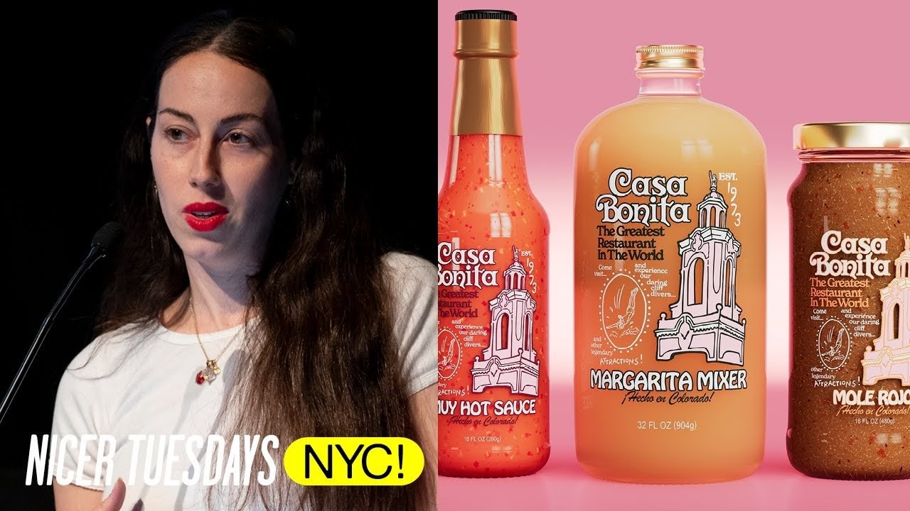
And in design which is mostly on the right here just pulled together some examples of tension that feel really iconic you know designers like tbbor Colman who I'm sure most people in this room know his firm em and Co was like iconic for creating design that sort of encapsulated this idea of he operated more like an artist and really believed that design had to do a lot more than people were used to his work for United Colors of beniton and Cafe Furon really subverted Norms this idea of like play between word and image and how image could subvert words and words could subvert image was very iconic to his work and all of these things really sacrifice pure communication for innov ation because they have this tension this weird thing this in congruous element another example up here com de garon you know famously is an anti-fashion brand which sort of made them the blueprint for cool I love this quote from Ray kawakubo who's the founder of CDG she said for something to be beautiful it doesn't have to be pretty and I love thinking about that notion particularly with fashion because it is so much about beauty but her interpretation of that idea is what made com de garon like as I mentioned this blueprint for cool this idea that you know becoming anti-fashion became this pervasive idea that led the industry that now like the coolest brands are sort of anti-fashion Brands you know that sort of just like have design being more artled became the thing to do in in design and I guess guess the point here is that even though brands are not art per se or that graphic designs long standing debate of whether it's art or not they should provoke these similarly engaging reactions in people that like great photography and and fashion do and I think you know this whole discussion around AI that I mentioned with design for communication it's interesting because it is becoming automated you know if you can describe something in words you can make it now You can signal that a beauty brand is a beauty brand without doing any design work per se but it doesn't produce an emotional connection or a special feeling it's just this weird sinkhole of Pinterest sea of sameness images and that's because ai ai is inherently familiar it you know is basically just inputting all these rules and standards from the internet and spitting back out this mirror the Sea of sameness which is what we're trying to always push against in design is to like break through that sea of sameness and so it's interesting that we're sort of Landing here. And so when we actually look to make something interesting this is kind of an interesting example of that Half Magic is a beauty brand that we built and it was born out of the show Euphoria and it's makeup artists Donnie Davy's Artistry so it was a unique challenge like how could we take this Lush filmic editorial world and translate that into a brand that could really break through a crowded Market there's a new Beauty brand like every 10 minutes and it's a very syy Market with a lot of Sy Brands and a lot of work that kind of looks like that weird AI khole that we just came out of so what was the tension was sort of the question that we had to ask ourselves and we had this Insight that you know the makeup was not about this idea of heteronormative Glamour and Perfection it could be a vehicle for transformation and operate more like an art practice than a traditional Beauty brand and so from that Insight that the brand was about transformation and art making we knew that. There was this innate tension between the maximalism of the show and the minimalism of like art making supplies that we could kind of extrapolate and tease out into a really interesting brand so this is actually a mood board from one of the first presentations that we gave to a24 where we tried to really crystallize that idea. And we knew early on that we didn't want to Simply communicate that it was just a beauty brand because the brand itself is not just about beauty and the show was so Innovative and groundbreaking and looked so good that the brand had this really high bar that we had to meet so that was intimidating but also a great challenge so you know in the beginning you really try to seed this very relevant like sticky idea that gives you this good good jumping off point and that feels really substantial so that you have a lot to work with when you're trying to tease out this tension and make something Innovative as opposed to just communicative so from that initial idea and you know in our process there is this huge iterative undertaking where you're really ideating from that initial core idea and you're sort of creating and generating a bunch of design and at the same time editing down to the final thing and all the while you're trying to implement taste and Humanity which you know as I mentioned we're trying to distinguish between just communication. And Innovation humanity and taste are kind of the X factors and we feel like that's where our value increasingly lies as designers when you know the tools for automation are getting sharper and smarter all the time. So it never made sense for us to go about building this brand using these industry standards like that AI sort of Industry standard stuff we were looking at because the show really defied industry standards in of itself and then the brand would just sort of look like everything else so we really tried to tease out that tension between maximalism and minimalism by you know obviously creating this Lush visual world. But also finding the symbolism that we could turn into like the brand Mark and we landed around this really beautiful Diamond that was iconic of Donnie's Artistry because all of the sort of Shimmer and shine and glimmer that's iconic to her in the show was sort of crystallized in that really simple Mark and so you know we went through that whole Journey and all the while we're trying to like continue to move away from this syy brand landscape where Everything feels really uninspired and you know is just meeting the bar of communication. And sort of trying to push way past that to innovate so sake Ono is another project that we did where we wanted to draw upon the heritage of Japanese design but avoid being pasti or using these kind of tropes that communicate Japan or sake The Vines we were inspired by the vernacular design of ancient Europe but wanted to leave things really imperfect and kind of raw like the Tera with casab Bonita which is actually owned by the South Park guys we leaned way into 1970s Americana and let the food speak for itself with house Labs which is Gaga's brand instead of like pretty Beauty light and portraiture we used filters and exaggerated lenses to create this world for the brand that felt like an extension of Gaga which is an experience with auam mahika we made everything feel like really of the earth and organic and filmic and textural and differentiate in again another really crowded Market that's usually again pretty pasti and with staple Jin we wanted to defy a category that's typically very clean and blue and clear and sort of English and again like pastan pretty vernacular with like a dark completely illustrative package so at our studio we're always really hoping to attract projects that are up for this challenge of doing something different so not wanting to just communicate the thing but to really break the mold and innovate and challenge the Sea of sameness and we really hope that we can continue to reinforce the value that humanity and the role of innovation plays in design as the world around us is becoming more and more automated and the role of designers continuing to get interrogated so thank you [Applause]
Latest Talks
-

Murugiah
Why you should reject the formula and make art about things you love
Watch -

Amber Weaver
How does contemporary type design translate into the wider world?
Watch -

Delali Ayivi
How does photography give us the right to imagine our futures?
Watch -

Will Anderson and Ainslie Henderson
Bringing stop motion sorcery to BBC’s Small Prophets
Watch -

Ollie Babajide Tikare
The importance of not flattening the complexity of observation
Watch -

Marina Willer
Design thrives when you find poetry in the simple things
Watch