
Madeline Montoya
Making publications into playgrounds for design
“I always find myself personifying type. What I mean by that is I think really physically about it, like how letters would move and behave according to the theme.”
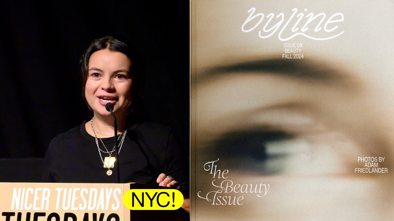
[applause] Hi. Hi. I'm kind of nervous because this is my first time my parents are here to hear me speak, but I'm I'm even more nervous because Michael Beirut is here to hear me speak. or not for me, but um hi, my name is Maline Mononttoya and I'm a graphic designer and art director based here in New York and I'm the creative director of BYine.
Um so this is just a little bit about me and my my career. That's me as a baby and um that's actually the first poster I think I ever designed. Um super Microsoft publisher coded if you guys remember that program. Um so uh I graduated from WashU in St. Lewis with a BFA in communication design in 2019 and then worked at a number of digital and print publications but most notably was at the New York Times and I'm currently at Bloomberg Business Week as an art director and I'm the creative director of by line. Um I like to say that Bloomberg Business Week is my 9 to5 and then by line's my 5 to9. Um but I also
think I I always show this diagram because it shows a lot of arrows coming out of like different jobs saying freelance. And I think that when you're a creative, one of the great things is you get to sort of collaborate with all kinds of people and work on projects outside of work and it really helped my love for design grow. [snorts] Uh I'll be talking about by line today and so first I'll give some background on what by line is and why we exist. We launched in 2023 with the goal of becoming a space where people could write about literally whatever they wanted. I've included two screenshots from r/f freelance writing both from
about the last year showing people's response to some sort of shift that had happened in the world of editorial freelance writing. The founders of by line noticed this shift as writers themselves and wanted to create an editorial platform where writers could actually talk about what interested them and you didn't need to be a prolific editorial name to be able to get a by line. That's where the name came from.
We wanted to be able to give anyone with a cool idea or an interesting thought a by line. And we recently did a survey from writers and contributors to see how they felt about the magazine. And I wanted to include these because to me it's a symbol that we really are achieving this place where people can feel like they don't have to be a prolific writer to be able to say what they want and what they feel. I think it's amazing that somebody said that we gave them their first by line and that it feels like by line is a place that democratizes the echochambery media landscape.
Since our launch in 2023, we went from being just a digital magazine to producing print issues, special print issues with brands, having merch, and events like readings, launch parties, and even an artist and residency program with the Ace Hotel. Here are some of my favorite pieces that I think encapsulate what Bine is. um a piece on why someone loves the show Survivor, what to do when bad people make good music, and everyone's favorite, our youngest columnist, 12-year-old Henry Jay, talking about what he wants to be when he grows up.
We also do more traditional cover stories. Um, this was a piece that we did on Clara, the musician, but what was special to me about this piece was that Clara wrote it herself. And to me, it was a great collaboration because while it was a cover story, the fact that she wrote it felt authentic to Bine's mission to champion the personal voice.
We also do more unconventional features. An example of that is the piece we first launched by line with, which was a photo shoot and story on five very active Wikipedia editors on their experience and opinion of the internet. And another example for our issue themed buddy system, we decided that we would only feature different like practices and businesses that were run by at least two people. And so this one was a feature on the Ridgewood furniture store Lyken which is run by two good friends who met on Craigslist.
Some of my other favorite pieces are on the rise column where we profile people that are really getting somewhere in their career. This one was on Chapel Ron's creative director Ramisha Satar. I love writers on writers. This piece in particular between two fashion writers and when people in our community or other creative share personal essays.
This one was Rob Vargas who wrote for our risk issue about going from creative director at Bloomberg Business Week to design director at GQ and that how he chose to go freelance and how it was super risky it was necessary for him to rediscover his creative spirit. A more recent foray into by line is more visual focused essays. A favorite of mine was a photo essay with boys trying different makeup looks and interviewing them and how they felt and their experience at makeup for the beauty issue.
And then another favorite was from our most recent issue, our summer issue, See for Yourself. The issue was structured differently and instead of commissioning work for stories we had in the pipeline, we made a list of artists around the world whose merc work we admired and asked them what they were interested in capturing in contributing. This essay was from Lebanese photographer Tanya Trabulce, who captured some never-before-seen images from her ongoing series dedicated to capturing the beauty of Beirut.
For the rest of my talk, I'm going to dive in a bit with one of our more recent issues, the spring 2020 issue themed risk. For a more macro visual look at by line, I made this diagram when we were launching back in 2023. It's a rough look at some of the pillars of other websites and brands I admire and where I imagine by line falling within those.
There's the organization of the New York Times magazine that gives a great reading experience, the clean but strong type that the editorial platform Essence has, and the color, playful buttons, and moments that creative collective Fisk Projects has in their work and their website. The line between Essence and Fisk is sort of where I imagine by line falling. Being an editorial platform, organization and ease of reading are the most important thing more than crazy colors or other factors that affect accessibility. Something that I've had to learn the hard way. But playfulness and injecting surprise and fun into the
brand is something by line also champions. And every issue, I try to reinvent the wheel on how we do that. For the risk issue, I started off by thinking about what words came to mind when I thought of risk. The first words I thought of when ideating were unap unapologetic and brave, which made me feel like type should be thick and large. In addition to that, I always find myself personifying type. What I mean by that is I think really physically about it, like how letters would move and behave according to the theme. I kept thinking about how risk felt to me, like being at the edge of a cliff or some sort of tipping point and
not being afraid to step off. that resulted in me diving into visual inspiration that showed type stacking, tipping over and falling. In other words, taking the leap. After doing this, I knew that was what I wanted to root the visual identity in. And then for the visuals like illustration and photo, vibrant colors were also a pillar.
When preparing for this talk, I looked at some past issues I did um some past talks I did and one of them was last June when Ban had only published two print issues. I spoke a bit about by line being so new and not really knowing where the visuals were heading yet and how it feels like every issue we really reinvent the wheel back then. I wasn't sure if things would start to change every time. And to be honest, I'm kind of still not sure. Some web designs for the issues change a lot like we implement a lot of new effects in design motifs but for the risk issue there was only three major changes. The first one
is something pretty consistently by line which is changing the hero type phase for each issue. This one is called burns and I first saw it as the joggy energy drink logo which I've actually never seen in the wild. I've only just saw it on the the designers website who did an amazing job with it. Um but I remember thinking the type face was so strong and chunky in a way that I had never seen before. I think I saw this like five years ago and I knew that I would use it eventually.
The second thing is the motion effect we add on the homepage carousel and story headlines. I work with a super creative developer who was always down to investigate ways to activate type with the same physicality that I think about it. So, we played with different ways to have the type feel like it was stacking, wobbling, and tumbling. Um, I included this because this is an example of one of our early mocks and how much it didn't work. Um, we wanted to have the the type come in in stack like this and then sort of wobble. But with the varying headline lengths and some words being long longer than others, it ended
up being kind of a disaster. So instead, we went with this effect where the type would scatter and tumble only when you hovered on it. To me, it still kept the spirit of the movement, but was way less invasive and only activated when you hovered. The third change was just an update to our feature layouts. Not necessarily risk issue specific, but it felt nice to include as a way to illustrate how by line is constantly updating and creating special layouts on the web when we can.
I also think all the negative space on this layout really paired nicely with the scattering type effect. For print, we had four covers. Three were of our cover stars and the fourth is what we call our conceptual cover. Every issue, we try to do a cover that isn't just a traditional feature or a profile, and we always put it on the back cover. So, no matter what cover you choose for the front, you always get something special on the back.
For this issue, our conceptual cover was a series I call the risk-takers. While our cover stars were embracing risk in an emotional way or in their career, we wanted to also feature groups who engaged in physical risk. We found three different groups in New York City who did so. A group of female surfers who surf intentionally in the coldest months of the year. The Gladiators NYC. A group who dress in full medieval medieval armor and then fight. And Circus Academy New York aka trapeze artists. We had photographer Luca Venttor go to a surf outing, a gladiator fight, and a circus academy practice to capture them. And
collage artist he Kim took all the different figures from the images and made a new work on the cover. These photos are some of my favorite work that we've ever commissioned. and the whole series really felt like Bine's core mission of telling all kinds of personal stories. [snorts] The rest of the cover features were of city council member Chi O, performance artist Anne Imhof and actress and author Tommy Dorfman.
All of these features embrace that type movement we saw on the web, that scattering and then stacking and tumbling. The rest of the book has what I call features and front of book. Here are some of the examples of the features. They mimic the same design of the cover stories. They just have a type that's slightly smaller and run less pages, but they still hold weight with their full spread openers and keep the same typographic structure and energy of the cover story openers.
And while Bland doesn't have a real front of book, I do feel like if the entire book was full of the energy of the last few slides, things would feel so overwhelming. So, I designed some of the stories with a little bit more space to breathe and less movement, which is sort of my version of a front of book. I still use large type and inject moments of excitement, but it's really important to me that I diversify the book, especially with calmer moments and shorter pieces.
This is my last slide with images on it, and it's one spread of every issue of by that we've done, which is it's not including smaller brand um brand print issues. I always do this kind of selfishly at the end of every lecture I've given. Partly because when I first started doing this, there was only two and seeing how much it's grown really just shows that a so much can be done in only two years when you're committed to telling stories and you find other people who also have a passion for doing so. And I also worry that every issue feels so different. But then when I put them all up here together, they feel
more in conversation than I would have thought. And I think that goes to the strength of the readers and writers who contribute. I hope that someday I'll make this slide and there'll be like 50 spreads up here from all the issues that we've done. And that's it. Thank you so much. [cheering]
Latest Talks
-

Murugiah
Why you should reject the formula and make art about things you love
Watch -

Amber Weaver
How does contemporary type design translate into the wider world?
Watch -

Delali Ayivi
How does photography give us the right to imagine our futures?
Watch -

Will Anderson and Ainslie Henderson
Bringing stop motion sorcery to BBC’s Small Prophets
Watch -

Ollie Babajide Tikare
The importance of not flattening the complexity of observation
Watch -

Marina Willer
Design thrives when you find poetry in the simple things
Watch