
Lee Belcher and David McKendrick are co-founders of B.A.M., a London-based design and art direction studio known for its multi-disciplinary approach that includes a wide array of creative services beyond graphic design.
Lee Belcher And David Mckendrick
Redesigning Christie’s magazine by raiding the archive and respecting the art
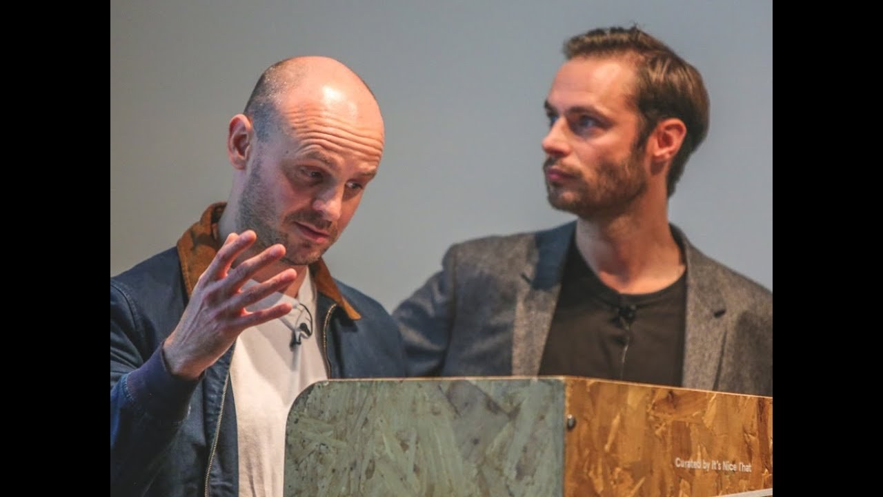
“We wanted it to be about the elements that were there and how they spatially relate to each other, rather than it be about adding graphics to hold all this information they didn’t need.”
Transcriptmay contain minor errors or formatting inconsistencies
Raise that's working and everyone here wonderful and okay. So firstly and a lot about about us and even McKendree this is Lee Belcher about 30 months ago we set up our company which is called BAM and of not quite a detained to get ready to do not own identities so we punch one from a a rather famous artist hope he doesn't mean but given it was talking about art today.
I think it's quite appropriate and buttbounce stands for bill to the McKendrick quite simply also is another meaning that we don't really tell about more corporate clients and an F you know if you likewise we do what you saying I'm a bum yes below average mentality also sums up myself and lead to an extent so yeah as Rob mentioned three months ago we had quite civilized relatively glamorous jobs leave us. There are directed at wallpaper I was a clearer than actually Esquire magazine and yeah it was quite a nice place to be legal we got to travel the world leaders in Singapore looking a little bit bored I gotta get a petrol take with famous people to show off to mommy it's basically. And that's mine quite an export off I'm actually very flattering Jeremy like meet meanly fast mate eight years ago all People magazine we were working together and Jeremy was adam chief it time.
And we have remained friends for a long time letters will be cheap and we do about my tag team which makes it doubly easy it's all about to leave for this but yes so as David said more paper was very first met Jeremy he has gone on to become the chief content officer Christie's by doing that he's kind of building a team to kind of work on a lot of the content across Christie's from the website to the magazines to all the publications they produce he knew about David and I thinking about setting up something so he invited us to sign a contract where we redesign Christie's international magazine Christie's international magazine goes out to kind of twelve thousand of their top clients we were really excited about a new challenge getting involved in the art world seeing what kind of challenges this throws up we were slightly apprehensive when on day one at Christie's Piero Mancini's in a canvas or a hundred three thousand pounds so we were starting world a what we've got ourselves into and beef we should rethink our design fee but onto the brief the brief of every set of supposed to redesign the magazine which has been going since the early 20s bring apart bring in Jeremy on board who previous to Christie's was a mr. Porter previous to that he was at Esquire with David and animal paper was to kind of bring Christie's up to date and make sure everything they were producing was looking fresh and modern and clean con straight on to what we ended up producing the first challenge from Jeremy was to try to separate the magazines to this being that the magazine goes out every other month and it gets sent out to all of their top clients and it's a mixture of part of it is a kind of art features magazine features in and around the art world not necessarily directly linked to Christie's and the other part of it is directly linked it's about what Christie's is about which is selling art previously in the magazines it's all been coming together and ourselves and Jeremy felt that maybe the content would be clearer to the reader if we separated them so one magazine being more editorial content and one magazine being more driven at the sales again a little way how we how we kind of decided it took us a little wires got a head around the review preview thing but preview kind of previewing all of the sales having two magazines was something threw up a bit of a design challenge in terms of how we pieced these two things together we opted for a belly band in the end we went through many many many different versions of binding which we'll get onto and we gave our production department many many headaches of doing so in doing so again there's a very simple kind of method terms of binding them stirred again it felt like a bit of an event when when the Christie's reader kind of received their magazine our first port of call for in terms of the design inspiration the background of how we go is that we knew that Christie's was steeped in in history. And it was something that we wanted to make sure that we that we got hold of and that we understood and you know.
I think our whole backgrounds in it at all design you know really taught us about you know completely fully understanding the content before but even going near the design so Christie's having started in 1766 had archives and they had everything worked back from the log books of all of the pieces of art right through to all of the magazines they've been produced missus - early 20s and it was some amazing bits of information that we didn't really use in the end but it was a standard they used after the Second World War where.
There was the building was bombed and lot of art pieces were destroyed and it was a kind of a stamp that they kind of put on and they said that in the room where all of the log books were there were rum it was a big silver collection about to go into as a sail and obviously the building was bombed and it was on fire and all of this silver kind of melted but left pristine on the shelves with all the logbooks and the sail cuts was everything which they're really kind of Precious about it was a great history.
So we met a lovely lady called Linda who kind of took us through and it's another one of my random slates okay we really we found it really interesting going back to the catalogs and everything it's really confident use of typography there's really confident use of multiple typefaces and it was something that we thought would be quite interesting to take it in rather than keeping it super clear you wanted to try and bring a bit of character and have a little heart back to the history like we said of the of Christie's and this kind of lid on to the ways in which we design our cover lines we kind of used a kind of a less of a mix than they did but it was still kind of nodding towards the things that we found in the archive room a typeface Chapman which they used quite heavily across catalogs and magazines we kind of brought back to life when we kind of paired it with a few more modern typefaces to help present this this kind of modern and feeling again thank you to come back as late as well and just to go back to that I mean we kind of surprised herself because it's not really an or aesthetic would you say mm-hmm I mean the first few takes of that was pretty much it was very dry and it was only after they open and the archive that we thought let's try something about bonkers and I don't know I don't think we normally put like eight different take feces in weights no no I'm not a lady okay that goes against what we've been taught on a good against what we've been doing super Kenna I guess we can I surprised herself maybe we also in this image there similar drawings was something we found in all their Sara catalogs they had a lots of places with a lot character and a lot of very descriptive whether it was a porcelain sail or what kind of sailing they had all these different typefaces they were docked throughout the magazine that we thought we'd bring through again so we've got a display typeface that we can kind of dot around I think this is back to you I believe double tees I'm thinking okay.
So and and you know we won't talk too much about this.
But it's the the previous covers it was kind of semi arts celebrity based and one of the things that we feel really strongly about was again through you know a Delvin and in the archive and realizing the rich aesthetic thing that I had on it saved what was the art itself to be kind of we wanted to get him over way for putting people the coven in China make it look like a commercial magazine and really make the most of of what they got and again just Delvin any that archive there was a real attitude and a real delicate approach to the really used imagery always Freeman things and letting the crop speak for themselves the edge of the Art Walks we're always Sean and and that was something that we kind of took to the extreme with the covers and we put quite a heavy-duty bulb dot on it as you can see maybe a bit too much sometimes but you know it really felt his effort was quite precious and and it's got like a gloss foil on it. And it's embossed and it feels really it feels like could be a lot like about like one of those old books you see how when you're grown up is good and boss covered on it.
So it was own quite a tactile approach as well why are you laughing at me so nsaids yes let's talk a little bit about ants Aidan and I guess we could talk you through a little bit more about what we stole our sort of peer-to-peer homage to from the archives and there was a lot of astray ssin in the old catalogues in the old in the old magazines some of them quite and someone quite grotesque in our way but a lot of it was document what was going on in the in the in the auction rooms at the time and also in the view names I don't know if you can see that rather grotesque picture than the top left-hand side of you and there's a small fat man with a rather glamorous woman next to him buying some art. And I guess I think that still happens these days but and so we kind of yeah yeah we paid a little bit of them a home each to that missing George Butler and to the max to the auction rooms just to start sketching what he saw in those days and this is something that we're going to keep doing every magazine that comes out so he's gonna he's gonna head here and there you have done yet snow make your sir okay and the other thing we still I mean they get paid homage to as the the great there we discovered and most of the old cart logic she's a really strong functional grad we're basically all this logs and I'll get to graphic design like all the slogs in all the grad as everything's on the left hand states the left hand glad it's the same as a right-handed basically. And it's something that we found really useful typically worth and here's a slide that doesn't really demonstrate that.
But it was late last night and we were doing that.
But I think you can see that everything's indented from the left and you can yeah we get above an idea to that think and yeah.
I think like boss so but the kind of main man really James Christie a Scotsman he was very proud of right from the very earliest of catalogs we've kind of wanted to have a little heart back to him so he was very featured a lot through the early catalogs immediately at the beginning of facing left it was redesigned fairly recently to be facing forwards to be facing right.
So we we did have kind of blind the boss of him on the cover and like David said I think in this in the kind of digital age that the tactility of the print it's really important so there's a there's an embossed texture on the paper this there's there's him embossed there and like David said there's a froze dumped kind of gloss over the image in over the logo which made it all feel like a a precious item that you kind of really excited about game in the post through the next sections of the format so grant are very lovely Christie's production person here is the patience of a saint work with us on many multiple ways of buying the magazine together.
So we looked at ways in which they were perforated kind of part wrapped in a wallet multiple paper stocks who went through all the kind of processes in quite a short amount of time change the page size all trying to make sure that we got to the right result at the end and everybody saying he just nodded in smell and I said yes of course boys yeah.
So I can I can I think he's east way he's quite a pivotal figure than this.
But well he really he really owes part of this magazine because without him I don't think we would have had any of production believed of God and he you know meeting those if I goes and meeting those characters when you go into a place to be a consultant it really is really key to what you do and I think we're really lucky in that aspect so Thank You grant he's here thank you so again going back to our bond technique we ended up having our kind of perforated belly bands that you kind of break open to reveal your two magazines I think she's David's typos so I think I'll give it back to him at this point that is my table and I apologize about that.
So yeah.
I think this is a bit quickfire whatever amber yeah you forgive this little box which is giving amber and red we're all red means killer so we're not there yet she's put on your red did you just do that.
So yeah well quickly flick through some of this stuff and say just to give you a little bit of a flavor about what we were doing and a lot of the stuff that was in the magazine was stock photography and stuff in being labeled very insistent that we shot a lot of stuff so that was case our cheese guide to LA art and galleries and food places this was a thing called collectors and collections which is going to be in each issue again it was James Morrison who's quite a famous photographer for shooting people in the species and when I say people on the species who can I just shoot them both at the same time but he takes the P also note in his space and shoots them next to the the collection if you like this guy at the top rate was a lot about bond cuz he collects Marlyn Monroe memorabilia and he's got hot dress easy stuff like that's rather strange but yeah and Tristan fell off.
And so yeah I guess you're just looking at a bit of editorial features sharing not necessarily directly into Christie's yeah and a number of features that again would normally just be using stock photography and stuff that we wouldn't we were kind of quite adamant that we got a lot of stuff short and I think that's what we cannot chat about being a team we come yeah and even down to the top left image we had a lot of persuading to try and allowing them Christie's to let's take a picture of a work in progress they've installed in our exhibition because it's not really the done thing with showing the crates showing everything showing a bit dark wasn't necessarily seen so things like that just helped it to make it a little bit more editorial but a little bit more context and something I thought really elevated the magazine into a new area hence why I'm not allowed to talk about fix and again just rather than shooting books just in a little pail and stuff like that we've got a guy called Marius Hansen on board to kind of make a little bit of a solo so it's just as more about it was more about doing as much as we possibly could and changing it and being up though because I think as opposed to just ticking the material and design and it as such so the majority of that all those examples there were from the review the more editorial side of the magazine these are example spreads from the preview side which is all linked to Christie's and their sales so the magazines come out every other month in time with with the sales so this is a really important part of the magazine's this is Christie's business you know.
So we had to be really respectful to the art I'm really respectful to them.
So the collections and Christie's goes from post-war contemporary art right the way through to Chinese ceramics modern antique furniture lots of lots of very different departments so we had to kind of really work with different departments to kind of produce the second magazine and make sure that our design didn't overpower anything but be respectful but also have a little bit of character and make sure that it still felt linked to the previous pieces so it was a really interesting kind of exercise for us as designers and and just being really respectful to this and also trying to make not make it look too much like just a straightforward catalogue so there was a feel all the features running around and it all kind of worked in the AMISOM kind of colors hauppage Rafi and with some beautiful kind of guard Richter and the imagery that we had was fantastic to work with it wasn't all plain sailing there was a few kind of Arizona on the way we we had after changing format so many times the sizes so many times right at the end of the process we were just double checking all the ads that were coming in just to make sure that everything was okay and we were cursing and swearing and losing my temper the fact that the advertising is sent out all the wrong dimensions and everything was in the wrong space and then we realized that it wasn't them it was us.
And we designed the entire magazine at the wrong size two days before I went to Brendan so I think I kind of realized that after being a wallpaper for eight for eight years my mind was maybe still there. And I set all the templates to wallpaper dimensions so while margins got quite a lot larger but it worked so it's great and then the second moment was we finally sent everything to print and our first kind of belly band design was this idea of giving a glimpse through to a piece of art we had a kind of circle die-cut belly band on on the magazine very happy it'll going to press not much sleep every hour possible went would be to celebrate the next day came owners who were freeze masters catalog sitting on a desk with with a darker circle and Christie's was being launched at freeze masters so we it was not the best moment so again a little knock on grants door with our tail between our legs sorry grant can we change all the artwork.
So we kind of that was our second monoclinic which led us to this which which we were really happy with in the end in terms of we really wanted that element of surprise within getting into the into the magazine and kind of giving a glimpse to the artwork I think we're almost done yeah yeah a a couple of more slates and so I think the point being here.
This is meeting Lee Kenna left our jobs in the Frady and in a Monday we kicked off.
Basically a blank mini book we 240 editorial pgc fo and we're not going to see we did all the sales because out there completely not to lie Henry our Hitchcock Faust employee in our studio manager then the glue of the whole thing held it all together for us and Carly Gray who produced all the ships that we were boosting the boat producing we never did that I was a category she was on the phone 24/7 and and and young Ben McLaughlin a very talented young designer who's come on board and got his opus shet at the end of the schedule so it was a four-week process for different starts to finish commissioning designing dealing with the department's we had a frosty off the other day it's very exciting but yeah a really don't take it it was Anna and also ticket out other offers mouse well I think he's sleeping not days yes so that's up
Latest Talks
-

Murugiah
Why you should reject the formula and make art about things you love
Watch -

Amber Weaver
How does contemporary type design translate into the wider world?
Watch -

Delali Ayivi
How does photography give us the right to imagine our futures?
Watch -

Will Anderson and Ainslie Henderson
Bringing stop motion sorcery to BBC’s Small Prophets
Watch -

Ollie Babajide Tikare
The importance of not flattening the complexity of observation
Watch -

Marina Willer
Design thrives when you find poetry in the simple things
Watch