
Simon Beckerman is known for founding Depop and creating Delli, a community-driven food app that emphasizes quality and health through conscious food choices.
Hato And Simon Beckerman
From founding a fashion app to reimagining how we buy food
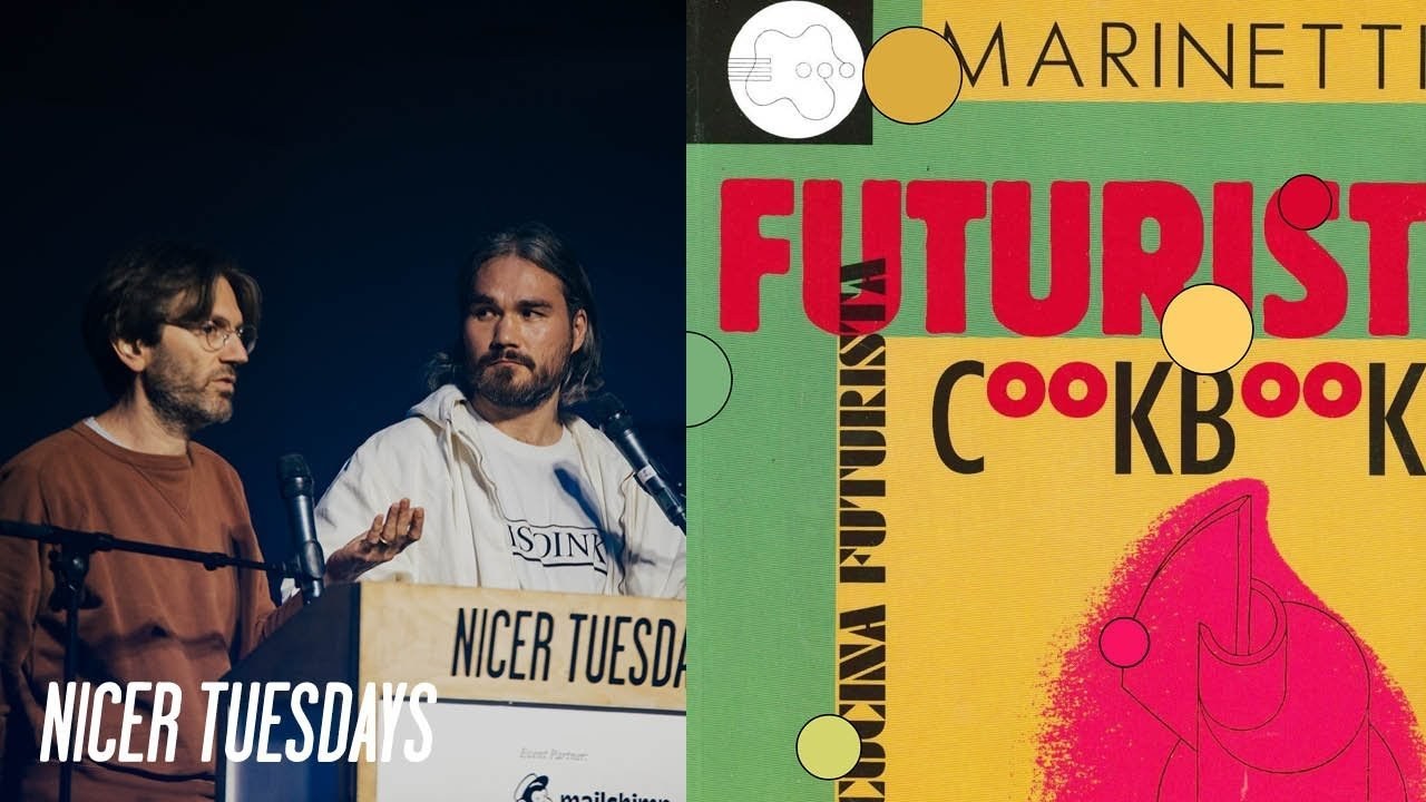
“The next 20 years is going to be a very particular moment for the world; it’s going to be more sustainable, more healthy and therefore more local.”
Transcriptmay contain minor errors or formatting inconsistencies
[Applause]
as some of you might know deep I'm not working at deep up anymore the company has been sold to etsy and is now part of the etsy family so in thinking what to do next I thought about my previous experiences together with the depop experience and what I thought was I love building communities I love bringing people together around discovering what's new what's unique around there.
I did it before d-pop by launching a magazine with my brother and also a sunglasses brand called retro super future before d-pop and all of these things that I've done before were about bringing creatives together.
So I did it with fashion and music I did it again with fashion with d-pop and now I thought let's do it with food why food I think the next 20 years is going to be a very particular moment for the world in a different way more sustainable more healthy therefore more local and as we all know food big food is broken in a sort of way processes and sourcing are becoming more and more opaque and quality and health are becoming are being sacrificed more and more for the sake of profit in a sort of way so what I did was I started observing what was happening around the world. And I noticed how these new conscious consumers who want to eat better are discovering and buying from all these small food makers who who do incredibly inspiring products from their kitchens and so I noticed this in london.
But also many other cities all across the world and as I was observing what was happening I noticed a little spark coming up from that world. And I thought why don't I bring together these conscious consumers with these incredible independent food makers and I thought why don't I do it in the same way that I did it with depop by creating an app which wants to recreate the experience of a virtual food market in your pocket so this is this is more or less the idea behind delhi yeah yeah and then I guess for us our research really started at looking at the history of delicatessen and delhi's themselves and you know through and three we thought these were 100 american I guess having seen them in the likes of the simpsons in films like spider-man with saturday night live eating pastrami sandwiches which we'll come to later larry and curb your enthusiasm of course tony's deadly himself action granted and then the rumor of this kanye delhi which I don't think is happening [Laughter]
and I think in parts of that research we stumbled across this delhi which sounded fantastic to us.
And we we brought this forward to simon which is cactus delhi and we found this clip from a film that shows us how good cancer really is oh yes yes yes yes yes yes but in actual fact demi's actually originated from germany and simon reminded me just now that they're from munich and it really came from immigrant or migrants who were migrating from the war and came over to america and what was super fascinating is that they started to create this really I would describe them as like hyper local stores where they were producing meals bringing across ingredients naturally processed foods of items that weren't available on an american high street for this local community and I think nonetheless it had such a strong parallel to the app data that sort of simon had envisioned and then I guess in addition to this what was what seemed really odd I guess coming from a design perspective and thinking ourselves I guess is so privileged how many resources and tools that we have was this notion that during that time in america that. There weren't really any published american typefaces and the american titan foundry and the us government sort of made this big push to start creating their own their own fonts so that they could rely less and less on the likes of how and gilsan in europe subsequently this point franklin gothic was one that became synonymous with these delis I guess due to their sort of ease of use and accessibility reasons and this is something that we quite quickly realized that we wanted to bring into the brand and then I guess as part of our pitch we really wanted to bring in this aspect and culture of food so bringing in these sort of designers that we we held as really huge pillars in our in our careers this design namely bruno manari and omari I think what was really rare in this sort of process and dialogue and connection with simon was that how attuned he was to these designers and artists and how he had so many like first-hand interactions with him in the past I think when we were actually pitching simon you would kind of jump in and talk about bruno minari and and your sort of relationship there yeah.
I was born and raised in italy in milan hence my strange accent this point my english name. And I was always exposed to this cross-contamination between industrial design fashion architects etc and my dream was always when I would grow up to open a design studio and follow in the paths of designers like aquila castilloni etoresotsas gioponti but some of my favorites are bruno munari insomari marinetti and tying munari with what we do in delhi there is this book that munari wrote which is called designers art which has a couple of chapters which always stuck with me because they are so interesting in how he describes a particular aspect of two food products he talks about the orange and how in his opinion mother nature has created the orange as a perfect product with its packaging to protect it where once you peel the packaging off the orange is already cut into slices so you don't need a knife and he thinks mother nature did that on purpose and also he thinks that mother nature is also a great marketing person because what they what she did is she gave you the seeds for free in the orange so basically when you eat your orange you can take a seed and plant it and you get more oranges for free which I think this is genius and he talks about in the same way he talks about the piece how they come in this super nice pouch which is smooth inside and you open it and all the pieces are laid out perfectly so mother nature has thought about a really great packaging in that sense you know. And so this is an example of how bruno munari thinks and why I always loved him yeah and I think this is something that we really again wanted to bring into this deli the dna yeah.
So one other aspect that ties together everything I did in my past is how to convey the stories of the people that we talk about or the the people in our community in general and that's photography as I said all of my previous businesses were about discovering new talents up and coming the most avant-garde digging underground and looking for the most inspiring ones and how to portray the these people to the communities that we were talking to the idea is doing it through a photography which represents in the same way this kind of newness and so we always wanted to work with new up-and-coming photographers and with our magazine we worked with some very good talents like anna crass when I became is quite famous or adriana glaviano or matteo montanari who is now quite famous too or nacho legree who then who he sort of worked when he wa with when he was at the beginning and then he carried on founding a magazine called apartamento magazine which also portrays the lives and the houses of creative people in a very very unique way through this photography which is quite raw quite crude very not not posed and shots taken in the moment you know getting inspiration from many other photographers in history like euro and teller for example now one of my other favorite photographers so with daily we decided to do the same. And we started working with some of these photographers too yeah yeah and then I guess for us really trying to bring in I guess these develop and evolve this principle into delhi's brand language we sort of reconnected with this book called the photographer's cookbook which I'm not sure if you're familiar with but it's one of these projects that you sort of look at and for from my perspective is a dream project and one that I really wish I got to be involved in but most importantly we discovered the works of barbara crane and in particular this series here which is called private views and eaters so here you can see the shots that she took throughout the late 70s and early 80s in new york and all these were just shot with a polaroid camera and they just really show this sort of raw relationship and real relationship of food and between food and people and the sort of overarching society around it yes so as we were working on the branding together we started to realize that many of the food makers that we were bringing on board they were doing us something which is very well known in the world of fashion which is the drop in fashion as we all know brands now drop whether it's on a thursday afternoon like supreme does or on the sneakers app like nike does we we like to be notified when there's a job yeah yeah jobs on daily work very well we have a lot of food makers who drop on specific days and like the sneakers app by nike you can be notified when a drop is live and you can buy them and many of the sellers the makers they sell out within minutes so I guess we're at the final part of the brand process and then simon drops in the drop culture and brings in the the reference of fashion. And so we started to look around and understand what the fashion sort of culture was around drops I think needless to say we realized that obviously it wasn't fashion that started it.
But we started we came across this project which is something that I was super fascinated by which is actually white dub is barbara kruger versus supreme.
And I think it just really communicates the sort of kruger's response to the fashion brand supreme that have been appropriating her artistic language over the past couple of decades where they use it for their logo the campaign images and and so forth so here you can kind of see kruger's skatepark design she did metro cards bust the sides and so forth and then created this store where she dropped all these sort of merchandise items from skateboard decks to t-shirts and posters and so on but as we dive deeper we realized that the drop culture was most likely came from the music industry but there was no real recollection as to exactly what sort of drop it was so there's this notion that it could have been a drop of a vinyl record being released at a store the drop of a needle landing on a record or the drop of a beat so we thought we sort of felt that as we were sort of drawing towards the conclusion of the talk we would just take us take a little break have some water and then we let wayne and rain and garth sort of show us the drop of a beat ♪
thank you.
So this is us sort of in the work in progress phases some of these assets are sort of pre-drop culture where simon just dropped it in or post after that and you can see here quite clearly that things like the logo type and typography are very consistent that that was sort of that sort of dna reference of those delicatessens were really strong and sort of solid there whereas color photography that sort of really evolved since that drop culture things started to become a little bit more vibrant we punched it up a little bit and kind of tweaked it for a slightly young younger and a faster paced audience you also see we're using sort of these illustrations these are sort of placeholders from andrea samuelson and these are sort of things that you know I guess delhi's is such a young brand and company that's going to grow so much and these are sort of elements that we'll look to explore in the future whether they'll be added in or not and then we can sort of see the photography of the key makers yes so as I said earlier one of the key aspects we wanted to portray about our community the kind of raw photography and in this case we think it can work even better because we are talking about food products done at home and the rawness or the crudeness of the food or the process of making these products at home I think they could match perfectly so I mentioned the partamento magazine earlier and I thought that's what I thought when I when I started thinking about how we can do this.
So we we talked with ken and we decided that this would be the perfect combination one of those principles yeah yeah and then here we can start to see how the brand sort of evolves so these are some visualizations that kind of show like the brand flex so here you can see the introduction of the drop what we call the drop bar which is the deli on the right hand side and that really references back to the sort of the idea of the drop of vinyl records referencing back to the sleeves that we have on vinyls and then you can kind of see this color palette coming in which was really our opportunity to reference back to those sort of designers and artists like marinetti munari and mari so shot here is a mono santos by caitlin izula and then here you can kind of see this la cucina chartus which is this sort of primary brown color that it's become now so here we have the small drop bar of showcasing mary red and this is decatur shot by liam hart some early visualizations of the app they're sort of expanding on those color palettes yeah the colors female ad are one of the things that we really enjoyed most about the branding that we did together because we worked with many colors in the previous company too and actually even depop had multiple colors as part of the brand different kind of colors and we thought even in this time maybe we use more colors to represent the variety of the community the variety of the foods that is represented and we think that they came up with a set of colors which is incredible very unique representative of the the food and the colors of the the community that we have on board yeah I hope they last well.
And then here I guess more of a modular campaign so in terms of colors we have monari blue and crane beige here we're just showcasing a drop by cold sauce and again photographed by liam hart. And I think this kind of showcases the sort of early phases of delhi as an app and as a brand and I I guess from hasso's perspective it's been you know brilliant to go on that journey and kind of see where I I as and I guess we'll be able to get to see how the brand sort of grows and grows so we thought we'd just add in our final drop for the night and we'll leave it here thank you thank you
Latest Talks
-

Murugiah
Why you should reject the formula and make art about things you love
Watch -

Amber Weaver
How does contemporary type design translate into the wider world?
Watch -

Delali Ayivi
How does photography give us the right to imagine our futures?
Watch -

Will Anderson and Ainslie Henderson
Bringing stop motion sorcery to BBC’s Small Prophets
Watch -

Ollie Babajide Tikare
The importance of not flattening the complexity of observation
Watch -

Marina Willer
Design thrives when you find poetry in the simple things
Watch