
Robin Howie from Fieldwork Facility specializes in creating immersive environments for museums, notably designing for the V&A East Storehouse with a focus on bespoke typefaces and sustainability.
Fieldwork Facility
Creating an immersive wayfinding system for the V&A East Storehouse
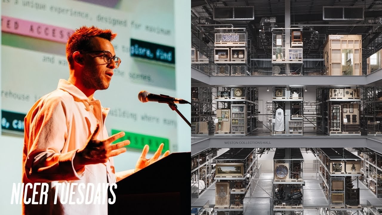
“Design isn’t just about aesthetics; it’s about creating an experience that resonates with the audience.”
Transcriptmay contain minor errors or formatting inconsistencies
Oh, hey. How you doing? , so my name is Robin Howe. I run a small design studio called Fieldwork Facility. We describe ourselves as a design studio for uncharted territories, which is a really overly fancy way of saying that we like unusual design challenges which typically navigates societal and environmental shifts. , so earlier this summer, , probably our biggest project to date launched. , this is VNA East Storehouse. It's an immersive new museum experience that gives you radical access to the stored collections of the VNA. We're talking about 250,000 objects stored here, 1,000 entire archives, 350,000 publications, and it goes on and on. , our job was to think about how to make this a a welcoming and intuitive experience, particularly for younger and more diverse audiences. , and be really mindful of the local context, which research is showing that not everybody or not not many people in those surrounding neighborhoods might have experienced a museum at all. So, we had a little bit of a mental idea. What if we approach the entire building as if it's software?
So treating storehouse as if it's the operating system to access the the nation's collection of art, design, and performance. And how can our wayfinding help you search and discover this environment? And can we help people decode what's happening in this kind of working museum environment and maybe even occasionally hack what's happening there too. So imagine you just opened up an app for the first time. What that's going to do is going to give you some kind of like onboarding kind of notification that tells you about what you're about to experience. And in the welcome area we we took that same principle. The onboarding text as we call it sits right next to the first of several wayfinding directories. And you might notice here we're trying to do something a bit subtle with color, right? So when you're reading about kind of how storehouse gives you unprecedented access to to the collections, that same pink that it's kind of colored in is highlighted in the study center or and and in order and object. Similarly when we talk about like caring and conserving for for their collections that same green is kind of highlighted in kind of the conservation overlook. As we go into the collections hall signs just kind of appear when and where they're needed. We're not trying to be didactic about where to go. You're free to explore.
This is a kind of venue that's there to make your own kind of journey inside of. One thing we're we're we're really mindful of and kind of try and always bring to the project is that we think about sustainability really deeply at fieldwork facility and this time we were kind of met with like a bigger challenge.
So the VNA gave us a a carbon goal to reach or to to to come under rather than to to reach. That would be pretty bad to kind of go over the the the goal. But also they asked us to kind of take up circular design principles thinking about kind of how the materiality can be when it when a signage gets to its end of its life how can everything be dismantled and materials to be recovered. And what we what we kind of landed on was kind of like this very modular system built up of tiles and blocks. The materials it's really rich in materiality.
So the the the black material here is actually kind of recycled paper composites. The the the white letter forms is all kind of recycled plastics. And kind of like we're trying to kind of create this kind of modular kind of scheme which looks and feels programmable. Now most cultural organizations within their branding have like a bespoke type face, right?
But the thing is kind like with the VNA's brand type face, it's sometimes really really wide, sometimes it's really really narrow and kind of like it didn't really work in the signage that we just shown you.
So we commissioned a bespoke version of Spiller. It's called Spiller Mono. It's a monospace type face, which we really enjoyed geeking out about because early computers were used monospace type faces. When you do coding, it's a monospace type face. So it linked back really nicely to kind of that software kind of concept. When we weren't kind of making these kind of fabricated signs, we were trying to make sure that we weren't using any single use plastics.
, so the signs here are kind of screen printed directly onto the wall. They're kind of sign painted on with like the big super graphics. , we had one conceit really kind of like we weren't sustainable like throughout the entire kind of process of the project. The the little color roundles here are actually enamelized lava stone. So VNA is all about celebrating making and kind of we want this like these little kind of colorful kind of journeys to kind of be like little little jewels with kind of a a beautiful materiality that you find along the way. A museum that will reame name well I won't name that would be better because I get in lots of trouble. We we found out along the journey that kind of like a change of room name can cost tens and tens of thousands of pounds to update all of the wayfinding directories.
So we took like these same design principles of modularity to kind of make sure that kind of if you change a name on level two, you just have to take out little panels. You don't have to kind of rip down the entire directories throughout the entire venue.
So the thing with storehouse is actually first and foremost it's a storage facility, right? It's just that some of those storage bays are actually kind of displays. It's storage on display. If you go to VNA as in in South Kensington, you'll see kind of interpretation everywhere and that's kind of like a duty for the VNA to make information accessible about what's on display. The thing is kind of like objects it still has can move and they do move. They can go take taken on loan. They can go to conservation need to be cared for. And at the same time all of these shells can kind of be moved up can be down.
Different objects can come in. It's a completely agile environment which meant that we had to invent all the locations for for labels to live on. We call this the interpretation hardware. It's another modular kind of kit of parts which is based around these kind of A5 and A4 panels which you can slot in paper onto that is printed in house. And these easily attach onto the the various shelves onto crates onto pallets. The adjustable pallet rack in and just kind of they're really easy to dismantle kind of put somewhere else. That was our little invention for how to handle the labeling. The other thing is kind of like in that kind of duty of kind of VNA making information accessible is that every object that you find especially at South Kensington is a good example there'll be an object label for that specific kind of item. The thing is here that you've got displays which have 40 or 50 kind of different objects in just one small display which means that you know like this immersive new museum experience actually would become an immersive experience of object labels and you wouldn't actually kind of see the architecture you would see kind of like the storage.
So we had to come up with like a different kind of approach for it altogether. Another thing that you'll see in in galleries especially is like a large print guide.
This is typically a format which is designed for visual impairments so that you have kind of paritive experience and can see kind of like the see these captions in museums. And we thought you know why are we kind of creating kind of two different things. Let's just make the large print guide the ex the kind of place where you can find out all these kind of object information. It just so happens to be the most accessible kind of method by by default. , and this is all kind of designed to be printed and updated by curators and the interpretation in house. , printed really agile and if an object moves, you just kind of replace that page. There are at storehouse five large objects. , no prizes for guessing what a large object is. , but these are kind of architectural fragments.
They're full interiors. My favorite one is kind of this. It's the Calfman office designed by Frank Lloyd Wright. It's it's really stunning. It's it's an office for kind of like a titan a titan of industry in Pittsburgh. All detailed in cypress plywood. It's absolutely astonishing and it's like a little bit daunting that we had to design some massive piece of furniturey thing next to it. The reason we designed this was the interpretation principles at VNA take polycality really seriously. So if you imagine an organization like as big as the VNA, it's typically what they have an institutional voice, right? It's kind of like what the creator says and that is kind of the opinion.
But we know that any object has thousands of interpretations, right?
So we wanted to play create a space for dialogue for participation where different kind of folks can give their kind of opinions on what's on display, what should be on display, what shouldn't be on display. So to the right hand side of this obviously a place where you can kind of grab a sheet of paper, join in on the conversation, but to the right hand side are these bookshelves. And the idea here is like when a question kind of is changed over, we'll kind of bind up all of the responses and create a public archive of kind of what everybody said.
There's another smaller version of like these kind of visitor expression points which is kind of much simpler. It's kind of based around kind of voting with a coin. And like you might have noticed if you're being a bit eagleeyed, there's pluses everywhere in this scheme. , and the reason is that like the the the VNA East branding is kind of all revolved around a plus mark.
I think it's a bit of a play on, you know, the classic VNA logo got the amperand between the V and the A, but at East they're using a plus. And we've kind of co-opted this to be a mark around polycality. So those little rubber stamps that say plus one use internet language of I agree. So kind of nice tool in the polyality front. The last thing I want to kind of tell you about is this isn't our invention, but I think it's absolutely incredible. There's a new service at storehouse called order an object, which is essentially you can order online five four or five objects. , and you don't need you don't need any accreditation kind of like you don't need to be studying a doctorate in kind of some obscure kind of designer art kind of paraphernia. , it just being curious is kind of like all the accreditation that you need. , and I'm legit going to get in lots of trouble for this, but my advice to you is, , if you're going to order an object, make sure you order something big because, , it's safer to take you to the object than bring a large object to kind of one of the study rooms.
, which means that you get to go behind the scenes, like the real behind the scenes. And I promise you, well, I feel like Indiana Jones in like a Christopher Nolan movie every time. It's it's insane. , like we did all the the back of house wayfinding here, too. , and it's just Storehouse. I would say this even if even if we weren't involved, right, storehouse is an an absolute gem. And I really hope that you will all take the opportunity to go soon and order really massive objects. That's it. Thank you much.
Latest Talks
-

Murugiah
Why you should reject the formula and make art about things you love
Watch -

Amber Weaver
How does contemporary type design translate into the wider world?
Watch -

Delali Ayivi
How does photography give us the right to imagine our futures?
Watch -

Will Anderson and Ainslie Henderson
Bringing stop motion sorcery to BBC’s Small Prophets
Watch -

Ollie Babajide Tikare
The importance of not flattening the complexity of observation
Watch -

Marina Willer
Design thrives when you find poetry in the simple things
Watch