
Emily Oberman is a Pentagram partner known for creating iconic logos for high-profile projects such as Saturday Night Live and the new Willy Wonka film. She emphasizes the importance of reinvention in her design philosophy.
Emily Oberman
Creating iconic logos for Saturday Night Live and the new Willy Wonka film
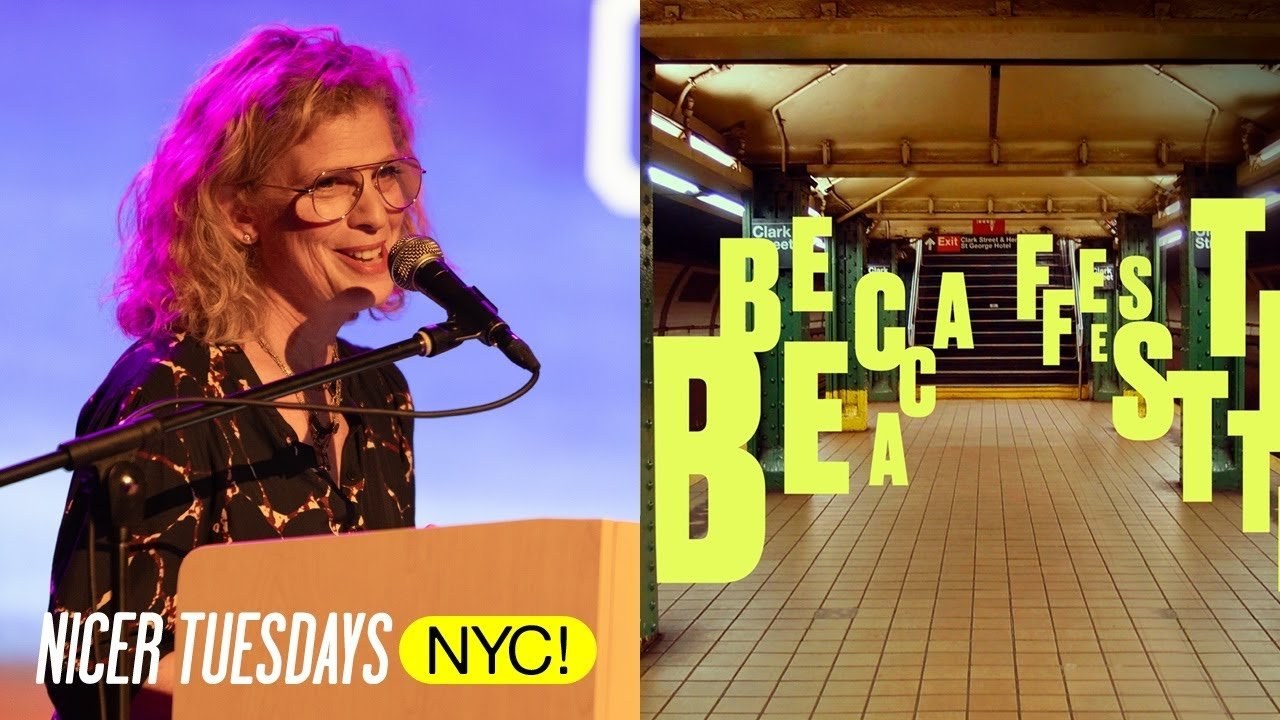
“The only way to create something iconic is to embrace the fear of starting over.”
Transcriptmay contain minor errors or formatting inconsistencies
[Applause]
hi hi okay.
So I am going to do a talk that was inspired by one of my favorite paintings by Ed rouche and it comes from the idea that like in our careers we have to start over a lot of times I've had three jobs in my life so each of those jobs I've had to start over but also sometimes you're working on a project and you have to start over sometimes you have to start over because that's the brief like with a project that you work on over and over and over for years and years you have to like rethink it sometimes you have to start over because you're doing a Rebrand and sometimes you have to start over because something goes really really horribly wrong so I have kind of one of each of those stories for you tonight so and also normally at the beginning of you know when I'm sort of meeting a bunch of new people oh I forgot to say thank you thank you for coming here thank you it's nice that for inviting me here for this very first ever nicer Tuesday it's really awesome to be here.
I am a born and bred New Yorker so doing something in my hometown is really really nice and really special and my team is here. And I'm so happy because they really do they really do the bulk of this work that you're going to see not me.
Anyway so at the beginning I'm just going to show you a little film I I won the aiga medal last year and which is amazing and like a lifelong dream and literally a lifelong dream because my parents are graphic designer says you'll find out in a second and and so we had to kind of make the make our own film about it because the aiga is you know not well whatever and love the aiga thank you for the medal anyway we made we made the films for the three honorees and I don't have any reason to show we worked really hard on it again especially my team who does more of the work.
And so I'm gonna start by showing this film that will sort of tell you the story of me in case you don't know anything about it which I would not presume that you do so here I'm Emily Oberman I'm a graphic designer raised by graphic designers I'm also a creative director a teacher a visual Storyteller and an entertainment Enthusiast I believe that all good design has wit and wit is different than funny wit is a little spark a little tweak a little wink and that is what can take a good brand and make it a great brand growing up was great there was always design in our house always designed in my life my parents are My Greatest Inspiration my heroes and my mentors and they taught me what a life full of design was all about and being in New York in the 80s when that explosion of Art and Design was happening was so amazing and I love that.
This is my city unlike a lot of people I know I feel like my professional career has been kind of like a straight shot but I took a year off from Cooper Union to study acting with Stella Adler and I realized method acting is a really important part of the way I practice design that whatever we do always feels more like a client than It Feels Like Us my life has been broken into these three chapters like three Acts but I'm in company we always tried to do things in a really undesigned way to get things just exactly not quite right beautiful but imperfect number 17 was act two I thought I got company with my best friend Bonnie Siegler and we were two women who kind of didn't take any crap and we got to do work that hopefully move the needle forward for companies owned by women companies that are small and mighty and driven by doing the right thing at the right time I've been a pentagram for 10 years now.
And I sort of had no idea that I would be able to do projects as big and as wide reaching as what I get to do I also still get to do really small projects projects that I'm passionate about Saturday Night Live it's just been a part of my life from childhood from watching the very first episode with George Carlin to you know watching it this weekend with my kids every year that we do the opening sequence bringing it to life not just through the way the camera moves through the city but the way the type comes on and goes off getting this award besides being a huge honor is another moment to sort of look at what you want to do one of the things that I want to do is to make sure that I'm not just doing design for design sake that I'm doing design that has a reason for being ♪
[Applause]
thank you also also my kids those kids who are actually way bigger now they're right here. Anyway.
So I'm just going to Barrel through this stuff because it's there's a lot so Saturday Night Live is a project I've been working on for 28 years.
So there have been some ups and downs some and here.
So this is called forlorn huh puns puns are my favorite as my team will say so I I like I said I've watched every episode it made it seem like I watched Saturday Night Live with George Carlin but he was just on the show.
So I think I've seen every single episode since the very first one I love it it's like this love affair and so at a certain point when I we had number 17 Bonnie and I were asked to start working on the show we started with parody commercials and then eventually we were asked to do the logo and so we looked at the history of the SNL logos and at the time this was the logo and it was done by a man named Eric Baker and it was Saturday Night Live was always this like you know Clubby downtown brick wall kind of like oh Skin of Their Teeth kind of thing.
And we sort of thought you are so not that anymore you are actually like the sort of granddaddy of sketch comedy you're kind of more cool than that you're kind of blue note jazz so we're gonna take you and change this Scrappy thing and move it into this cool thing.
So we went and designed us a nice piece of type that was clean and modern and you know kind of Timeless based on those blue no Jazz album covers and then we also wanted to have one little tiny idea and the idea was everyone says Saturday Night Live it's just one word so Boop no letter spacing and that became the logo for the next chunk of years.
And then we were asked to work on the titles which was kind of amazing and there's a brief the brief is the same the same for every year that we've ever worked on the titles it's the party you wish you were at the cast you feel like you know. And in the greatest city in the world.
And then we added to it the show should be funny the open should not and that's been the rule ever since and so with that in mind this is the first title sequence that we ever did it was shot in one club in one night with the entire cast there super 90s right the shoulder pads and the whole thing.
And then what we did what we add to it is like these little pops of color and this little bits of type and in the time we were just like the people doing the type but they let us go to the edits and one day I walked into the edit. And I saw that cut and that was me. And so I got to be in the open once and I had an ex-boyfriend who saw the opening he was like that was Emily and his friend was like Let It Go um so then in 2008 Lauren decided that it was time to change the titles and this is you know he gets to he's the king he gets to decide and so he wanted a new logo and so that was fine we decided that it would go from this Saturday Night Live one word onomatopoeia to Saturday Night Live so it's just getting bigger and it's still long and wider and Bolder and we presented it and he loved it and approved it.
And we did I think we didn't change the opening sequence at the time. And so we edited it into the opening sequence and this is a bumper shot by Mary Ellen Matthews the photographer for the show. And we finished the titles you always finish them at like 11 20 on Saturday night of the live show and everyone went home after the party and I woke up on Sunday morning to the phone ringing to a man named Jim signorelli who's the head of the film unit saying Lauren doesn't like the logo and I said like oh well catch you next year and he was like no no no Lauren doesn't like the logo fix it before next week and so thought so we got to work and started working on new logos you know sort of in the same way I'm going to show you a new logo so you're gonna be like that how many how much work did you have to do to get to that.
But we went from this to this.
So we're still Saturday Night Live Like You know but now it's like a wedding cake and we presented it to Lauren and he approved it. And we re-edited the open to put it into the show. And it aired and here's a bumper with Jamie Lee Presley whoever that is and with the logo in it.
And I think she's on that show Mom now and why do I know that and Sunday morning Jim called again Lauren doesn't like the logo and now I knew I we had to change it. And so we got to work. And we went from this to this fortunately Saturday night and live each have fewer letters so we could still do Saturday Night Live like it's getting a little larger and bigger and it made a nice tidy square and we presented it and when I say we presented it it's it's not really like that it takes a lot to get to meet Lauren but it wasn't us.
But it went through the steps and he approved it and liked it and these bumpers everything every scrap of evidence of any of these logos were erased I had to go hard to find these and so now when you look and you see reruns of these episodes they look like this and that became the logo for the next I think 10 years.
But that's a little starting over nightmare so then here's a little Montage of a bunch of different opens that we did just showing the sort of the logo but you can see how each one just by looking at how we treated the logo differently each one every two or three years we have to reinvent the the whole title sequence and treat it a little differently so we're telling the story.
So the whole thing feels updated and modern the whole idea is that it feels a little different but feels a little the same at the same time so those are different ones somewhere between the two last ones I we closed number 17 and I moved to pentagram and so shortly after that the 40th anniversary for Saturday Night Live came came around and we had to redesign Lauren wanted a new logo for the 40th anniversary and at that same time the man named Don Pardo who was the voice of Saturday Night Live from the beginning died oh yeah Don Pardo no I'm serious he was but he died and so having a logo that was his voice basically didn't seem that necessary anymore so when we did the 40th anniversary logo we decided instead to do something that was more of a tribute to sort of the city and city lights and grids and you know vertical architecture and also that you could take apart and put back together.
And it would always feel like the same logo no matter what it was doing and so that became the new logo for the 40th anniversary and then when we did the open slowly I was like pushing my way into doing more of the open not just the type not just the editing but now we're going to the shoots and now we're going you know working with the cinematographer. And so slowly wheedling my way into into having control of the open and so by now I'm I'm pretty close and so the idea that we conceptualized was that it was this giant type in the city and that also that it should look like if because it was the 40th anniversary if you left your if you left a a tape in your VCR for 40 years and pulled it out what would sort of the bleeding of the images look like and again we're editing this right up until the last minute every week I mean every year.
And then we don't start working on the on the show until two weeks before air time. And so it's always done with Incredible speed and now you can never get the cast really in one room at the same time anymore and then these are bumpers that we do for in and out of commercial these were done with something called a pixel stick where you digitally program in the type and then you move it through space and when you shoot it it looks as if the type is in space no AI in any of this um did you say next year depends on the writer's strike sorry anyway they're making that joke themselves in the writers in the writer's room at SNL anyway the next one I'm just going to show you is coming back from covid while kovid was happening Lauren decided that SNL should come back and everyone needed to come back into the studio and and we needed a brand new open to show that everything was going to be okay that the city was going to be fine that we were all going to survive covid and SNL is often a barometer for that sort of thing and by now Mary Ellen Matthews and my team and I were working on creating the open and we were the creative directors of the open so we had this idea that it would be everyone in the cast actually welcoming you back to 30 Rock back to the city back to life.
And so we did this whole we did a mood board that sort of said that. And we decided to bring handwriting into the whole thing to sort of show the humanity and to slow the whole open down a little to make it feel really human and really welcoming and also for it to have this sort of Wizard of Oz thing that. There was a little bit of color seeping in to sort of show the joy seeping back into our lives every open has a back story so my incredible wonderful team which I would be saying even if they weren't standing right over there did spend a lot of time writing all of the cast members names because it had to look like handwriting but not like a signature and then for the shoot instead of a craft Services table there was a covid Services Table and there was a woman whose job it was to keep people six feet apart the entire time she had a six foot long noodle that she walked around with to keep everyone apart and and that guy had that mask was like a you know like a Jenny Holzer sort of style mask like ran across his face so that's that year.
And then just right.
Now we just finished doing the most recent open which is Lauren wanted to sort of change everything up to head towards the 50th Anniversary we were kind of hoping that last open would just last till the 50th Anniversary why he needed to change it just two years before the 50th Anniversary we're not really sure but he felt like we had to make some sort of change before the big change so this was a little change to sort of let you know that we're heading towards the 50th anniversary and he really like when he he wasn't going to do it then he was and but we we thought it would be great to sort of go back to the roots of the show.
And this is the very first logo and so we wanted to do a little update of the very first logo as sort of a tribute to the beginning of the tribute to the 50th anniversary and so we did this modernization of this logo and I gotta say that little n that lowercase n which to me was the beauty of the whole thing really freaked people out like online people hated that little n like there was just a lot of hatred for that end which I I I love I love that little man and even to the point where like people at the show are kind of like should we change that in and I'm like I'm fighting hard to keep it.
But anyway I love it.
And then we got to do this other thing which was we decided to shoot the whole open in two nights inside the Chelsea Hotel this sort of iconic landmark of the show and try to do a thing where we got the cast members together again but it was it was very very difficult but we sort of managed to do this thing where we created these like sort of artsy tableaus in the open and then here are some bumpers from this year that I love and some other shots and that's bow and yang is my like my favorite shot in the whole open plus plus he's my favorite cast member and he used to be a graphic designer whoa and and he follows me on Instagram but anyway.
So that is where we are with SNL right.
Now we just finished the new logo for the 50th Anniversary show so two years in advance so they can start making merch but I can't show it to you because they haven't really they haven't put it out in the world yet but anyway Saturday Night Live is just a just fun to work on next thing I'm going to show is this is Wonka the new Willy Wonka movie so starting over strike that reverse it it's a Willy Wonka reference if anyone knows that.
Anyway to go from Gene Wilder who is sort of the iconic not Johnny Depp Willy Wonka to Timothy chalameter who this is a prequel ♪
wow [Applause]
so the story is a prequel so in really true starting over style we're making a you know we're making a logo that has to sort of Explain the origin story help explain the origin story of Willy Wonka himself but the cool thing about working on movies like this is that you get to see you get to read the script and sometimes you get to see rough cuts and you also get to see all the sort of behind the scenes all the stuff from when they're making the movie and then we also do a ton of research whenever we do I'm sure all of you guys you know when you're doing a project you do the research you you know to figure out what the story needs to be so we looked at all the Wonka you know versions in film we looked at Wonka from the books we looked at all the Wonka candy and then no we looked at what candy from the early you know late 19th century early 20th century looked like and then candy packaging from Europe and what confectionary stores look like but also what handwriting would look like both then.
And now and the reason was because we had a very specific idea for what the story for this particular version it's a musical also the new Wonka so the concept was that at the heart this film is about family it's about the warmth of a mother's presence to inspire the concept so we wanted to portray the Wonka name in the handwriting we wanted it to be his mother's handwriting that was the big idea that we had because in the script we found this moment where Willy is falling asleep as a small child and his mother is singing to him and making chocolate and she wraps a piece of chocolate up in a piece of paper and writes Wonka on it and Tucks it into his suitcase and we thought that that was just a beautiful moment and so we thought that that should be that was sort of the perfect beginning of Wonka's story. And so we and again when I say we I don't mean me went and Drew a million different versions of the word Wonka to get to exactly the sort of perfect version that was just enough handwriting just enough logo for this to be something that could go on a film.
And then the filmmakers who love the idea conceptually it was like one of the first times that we actually got the filmmakers to sort of say like yes your graphic designers actually had a great addition to the storytelling yes we want to do that however we've made this W can you put this W on your logo and we hated that done and we we kept calling it twonka and so but because they asked we did a whole bunch of versions of it with that on it.
But then in the end because and I genuinely like the people who are making this film I love our clients so much his name is John Stanford I really do love him.
And I also really like and respect the people who are making the film they actually decided that this was the right WC you spend so much time thinking about W's and the weird curves and how it hits the A and where to and you know you all know we all do this all day long and I know that this talk is a little less esoteric than Eric's and but I I love this as much as I love your talks both of yours like I love what I do on a daily basis and it's my passion. And it's all of our passions and so there you go anyway.
So then we had to make a whole bunch of proof of concept things to sort of explain to them how it would look in the film which then sold them on. Actually their their Pro possibly probably in the process of re putting the logo with our logo into those confectionary stores in the film which would cost hundreds of thousands of dollars so they're still arguing about it while we're still waiting for the trailer to come out.
But these are all samples of what the logo will look like in the film. And well we've all been waiting for the trailer to come out in anticipation one little thing got leaked and I found it which was this [Applause]
okay last story oh you know you boycott something for so long and then you get these hideous shorts okay Warner Records this is a heartbreaker but with a happy ending so this one is called w x w x the Y these are puns that never mind so we were asked to redo the identity for Warner Records Warner Records had leased The Shield from Warner they time was running out they could no longer use the shield The Shield had to be removed also the word Brothers they could not they could keep Warner but they couldn't keep brothers so we had to work on renaming them.
And we had to come up with a new identity that would no longer use the shield so obviously when we come out with when the new logo comes out online everyone says what do they get rid of this shield and the answer is because we had to anyway ironically at the same time we were also doing the new identity for Warner Brothers where we kept the shield so these two things were happening at the same time.
So we were working on Warner Brothers records which we renamed Warner Records we we talked we said it was great to get rid of the brothers because it was so gendered anyway it was much more inclusive Warner Records way better name but so in working on while working on it in doing our research we got to go to the Warner Records archives which looks a little bit like this which is you know Indiana Jones but it is where they keep everything from Warner Records archives every album cover every photo shoot every pre anything printed any ephemera any they you know you know actual size cutouts of like Bruce Springsteen selling something or what it wasn't Bruce Springsteen I can't remember who oh it was what's his name from Van Halen not Sammy Hagar the Eddie David Lee Roth yes Eddie Vedder is from Pearl Jam [Applause]
but David Lee Roth yes anyway.
So we got to go there and spend a day as inspiration in the Warner archives and it was incredible it was there was literally a sign that said like tapes this way tapes that way you are here.
But it was and we weren't allowed to take pictures but occasionally you would oops um and then sometimes they let us.
So I think that was a pentagram but like every also all the recorded music like all the one inch recorded music of like Sammy Davis Jr and Frank Sinatra and Neil Young and Prince Prince and all of their printed materials all the 45s all the LPS they're all there in this one place The Grateful Dead stuff is in a cage because Grateful Dead fans are so rabid that they break in and try to get into it.
So it has to be in a separate sealed off place within the secret location but like I swear like the contact sheets for Contra princess I'm a prince fan the contact sheets for Prince's controversy the original shoot from Madonna's first album cover are directed by my friend Karen Goldberg who recently passed away. That's a picture of Joni Mitchell that Neil Young took like it's just unbelievable anyway while we were there I said because there's a to the guy who has to take you around because you have to be with a person the whole time I said you know I did some albums for Warner back when I used to work at Edmond company and the guy said like what name one and I said I don't know Lori Anderson strange angels and he went took out his little you know handheld device and went rolled a ladder across like a shelf it climbed up on it took out a folder the folder had this in the corner and inside it were my Mechanicals from 25 28 years ago my handwriting on them the tissue nobody knows do you does anyone know what a mechanical is like it's like the tissue paper the thing that says like print the blue over black make it pop whatever that means like you know blacks must be rich and cool like all of that stuff and then Atman company we used to have to like sign off on a mechanical so that every make sure that everything is spelled right everything is cut right everything my handwriting my signature tea board signature t board my old boss and Mentor who is not who is also you know who has passed away like his I it was like that scene in Ratatouille where he eats the Ratatouille and goes like it was it was so it was one of the most incredible personal moment but they have every like not just it was it's incredible and now it's all digital so like you know somewhere there's a chip not that I'm a Luddite because I am not anyway back to Warner Records so the idea of Warner Records I'm almost done the idea of Warner Records is that they we also did the strategy for them because we do a lot of strategy work which is also great was the idea that they were going from a legacy to a leader because they were a little Dusty in terms of the brand so we looked this was the history of their identity these or who their artists are everyone from Talking Heads to Dua Lipa this is the world of record labels yeah fine but they wanted to be sort of modern and fit in this world title sorry SoundCloud this is a few years ago.
So we came up with this idea that they were the major they were a major record label that felt like an indie and also California is a huge part of their story like the fact that they're in California that they're right that they've always been in California it's a really big part of their brand so we came up with this idea for them that the Indie part is that they're born in the California Sun but they're at home everywhere on Earth so that became their tagline their their Mantra so that everyone bought off on we moved on fine so then we started to work on the logo and we agreed on some points at the beginning of basic logo assumptions should be a w or a monogram because Warner Brothers had been a w and a b so it should be a w or monogram versus an abstract thing or something illustrative should feel large solid and Powerful should live comfortably in any era or genre of music right because they have all different kinds of things.
So we presented a few things. And I'm going to show you the the two main contenders first one was called monumental ♪
and then we did a whole bunch of proof of concept things to sell it through like like one does hot air balloon.
And then we show it on a on a vinyl and then how it sat in its competitive set I also want to say that they were wonderful a wonderful client we worked with Tom and Aaron who are the co- heads of the company they were very creative they were really involved very interested pleasure to work with second idea called Magic hour because magic hours like when the sun sets it's that perfect moment in the day ♪
and then. So it's a w and an r and it's a little Sun it hadn't had it all.
And so again a bunch of proof of concept stuff on the label some social media there you go there it is looking like a sunset there it is here are the two logos pre we presented it unanimous decision everyone that one that's it we love it great awesome doesn't always go that way but really nice so the EVP and the COO or the CCO yes proved it. So it has to go up a chain you have to present and present and present and present then the CEO and the CEO yep thumbs up then this the the next CEO whoever that was then the other CEO or literally we had to go to meeting after meeting after meeting then the owner of the Warner Music Group he approved it.
And then after that we had to present to Warner media who owns Warner Records no why now remember at the beginning I said that the the they had sort of they had a lease on the shield there was a finite day when that lease was running out. So that clock had been ticking down during all of this.
Now. There was like a month and a half left before there would be no logo somewhere along the line someone missed that not someone at pentagram but someone on perhaps the legal team somewhere along the way missed this particular thing. And this like like the needle scratching across the record that was the end of that logo so suddenly there were new restrictions there were new rules for the logo the first one being the logo cannot feature a w the second one was the typography cannot resemble the Warner media logo this had never been mentioned to us before.
This is the Warner media logo in the end the types the next one cannot be a logo vacation of a word Mark we learned that that meant that the word Mark could not be like a punny word Mark like you couldn't have like a look like something else like it couldn't be a bird also or something.
And then also Warner and records must have must be the same size and then if there is an icon the icon cannot be bigger than the logo type these are all things that had to be before they could approve it and on top of that we had to show it to Warner media Warner media had to check off all of these boxes before the actual creative team at Warner Records could even sort of agree could even I think look at it I'm not exactly sure I don't remember correctly but I think they couldn't even look at it until after that was done and now we had like a month so we like rallied oh so this is what I pictured so we rallied all the again fabulous designers on my team we pulled in some more people.
And we spent a lot of time. And this. This is what we we made ♪
foreign ♪
so that's the Warner Records logo it's a sun it's a record it's it's setting I think there might be a tiny bit of logification of the word records because it's also setting into the water but that was the logo that that is now the Warner Records logo and it's kind of I Love It I actually sort of love it more than the logo that they chose it's actually more useful they can use it as a window they can it looks like you know a record looks great on swag it looks good on social media I it's one of those things where we in the end we were sort of forced to rethink something.
And it sort of came out better now they have a giant one of those Setting Sun record things at every location and when artists come in they all sign it. So it's just getting layered and layered and layered and layered on they're supposed to send me an image of it.
But this is what it looks like in use and in practice that's still a comp but this is the actual Warner Records Headquarters they use it everywhere. That's a Shepherd fairy thing using it they actually built it into the headquarters in Los Angeles it's a tunnel in that you walk through which is kind of great and this is the launch video ♪
okay and then. I just have one little more thing which is over the past year we do a lot of other things. And this is one minutes worth of everything that we've done else we've done [Applause]
[Applause]
[Applause]
foreign like I said I don't do any of this thank you I don't do any of this by myself I wouldn't know how to I wouldn't know where to begin I these are the names of the people who have done the work some from teams before and the rest are my team now who again are here tonight and I thank you guys it's a pleasure working with you every single day you're brilliant and funny and smart. And I thank you and thank you all for coming and it's been a pleasure
Latest Talks
-

Murugiah
Why you should reject the formula and make art about things you love
Watch -

Amber Weaver
How does contemporary type design translate into the wider world?
Watch -

Delali Ayivi
How does photography give us the right to imagine our futures?
Watch -

Will Anderson and Ainslie Henderson
Bringing stop motion sorcery to BBC’s Small Prophets
Watch -

Ollie Babajide Tikare
The importance of not flattening the complexity of observation
Watch -

Marina Willer
Design thrives when you find poetry in the simple things
Watch