
Fabian Harb is a type designer and one half of the Swiss design duo Dinamo. He is known for exploring new technology in typography, developing signature typefaces, and creating innovative design tools.
Dinamo Typefaces
This type designer is pushing letterforms into new technology
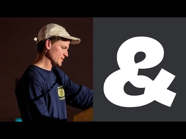
“There’s a gap between the development and the actual application.”
Transcriptmay contain minor errors or formatting inconsistencies
[Applause]
hey good evening thanks lovely introduction and thanks for previous presentations and thanks for staying all right yeah my name is Fabian I'm one half of the starting part of dynamo Johannes couldn't be with us here tonight but it's very important to say that it's not just me dynamo started maybe somewhere in 2013 we don't really know yet so we don't really know anymore so we just like staged some kind of funding picture at some point and he's by now a team that is really like spread out some people we have really close to us.
And we can demand a lot from and then others are a bit more remote yeah but they're all like very important part of what we do and without them a lot of things most all of the things would never have happened in the way they did and also I think I would never stand here.
This is the garden of Gustavo a Brazilian type engineer who is insanely talented and that we had the pleasure to meet while we all lived in Amsterdam sometime it may be 2013-14 something like this who moved back to Brazil and is living really like halfway between Sao Paulo and in Rio then.
This is a king who is in this picture creating a typeface with the xbox controller he was the first one to really like to trust us when we didn't really have a studio yet but he came to intern with us and basically stayed connected with us and was really part of every official release release that johannes and I put out so far then.
This is Jakob a graphic designer and a programmer that is really talented there is no art director of the Czech walk and kind of like slowly slowly abandoning us.
So we like doing next steps online this is even one of our most hard-working and best relaxing interns this is Selena who worked with us on one of our very first corporate custom typefaces then here.
This is Andrea who is currently working with us on two projects in Berlin Rob in the back who's our first and only employee that we have then chil'en who is taking care of a lot of the mastering and Sophie who's morally supporting him then Felix who released the typeface with us Gillian who is going to release a typeface with us and work with us on the specimen that we that we designed as well that we put out as well yes was also more less constant part of dynamo helping with several projects you know we interned when I moved back to Switzerland from Berlin couple of years back then said who I'm having the pleasure to have here tonight an extremely talented graphic dist graphic design and typeface designer here based in London who published the typeface with us.
And is going to publish a couple more you're on the day of his wedding with Johannes it's going to take a while but it's really important like we have a lot of people at them yeah really make you know what it is Rob we already had before walking he's also the developer of our darkroom that I'm gonna talk a little bit about later on Larissa no sorry oh some of our oldest shared friends of your harness and I did also publish the typeface with us then here Maria that we met the first time in real life just a couple of weeks back in San Francisco who helped us or we had the privilege to work with on a Cyrillic version of follow it.
And then was working with johannes in berlin on a lot of the technical documentation of typefaces next to two projects that are gonna come later this year's one listo who is between once I'm in Berlin then Vanessa who is the head of accountants and really making sure that we don't only work.
But also the studio makes sense do we my current intern in pasta and Vladimir who's taking care of the servers Selene who was also working with me in Basel on a project that in the end didn't happen but turned out really nicely so we're gonna see what is happening to that Daniel I think this is even a video on does work what yeah there's a couple of more with projects that are gonna come.
But I didn't want to stretch you much much memory this is the studio that we have in Basel at the moment we're just about to move to a new location.
But it's basically like us here a little bit more here on the side right.
Now there's like two assistants so we also occupy a little bit of T space over here sometimes and there's an architecture studio and another studio is more like in design research in correction active in Basel and then we have a space that we share together with the graphic design studio no they in in Berlin will be occupied more or less this half and the other yo.hannes and I we met in I also don't remember maybe like 2010 or something like that because he studied in Zurich and I'm a bit jealous of these pictures that was like his class his type design class in Zurich then he worked with known with his graphic design students Erick for a little bit.
And then he changed to the rethread I myself I just studied in Basel in his very building and I had to break free from a lot of like very straight lines so on later on and the reason why we met each other Johannes and I was basically Larissa who finally now also designed and had released a typeface with us she was in the same class as your harness and she somewhat I said I know her because she comes from some garland from the same place as I come from and she said ah maybe you guys should meet and then a couple of years later we happen to be both in Amsterdam at the same time you're honest tonight and somehow it's just like spent a lot of time together went to the library looked at old specimen catalogues and so on. And we found this source from from a letter set that we saw her like very like frankly and naively just like cut out of paper and started to mess mess and then someone like over the time we realized how hard is like such a big system to it and brought it further. And then.
Actually Gustavo came in because my my partner is Brazilian and she knew Gustavo from Brazil she sound like I said maybe you should talk to him he just graduated from the school in the hague and he summer like opened this huge area of type design that if you just use cliffs or effect and maybe front lab you wouldn't really see that you can actually also include code to a type project and he saw the project that we were working on that was that is called row which is a display typeface that is based on like six outlines that someone I can add up to the spatial feeling and we were just at first thinking are we really smart and you can actually also I combined I mean other way so maybe onto the first and the third layer is visible or the second and the third or something like this and you can make different combinations from basically one and the same drawing and he came in and said hey you can actually even like use all of the outlines individually and you have like 63 different possibilities to combine them so what do you see here a little bit is just like ticking off the individual our clients and creating all of the combinations possible and that was a bit of a turning point in in the history of in amo that we really not only knew Gustavo is helping us with all of the production the typeface is really bulletproof so we can like give them to our friends or also like sell it to other people because we know that it's gonna perform but it was also very nice to see that. Actually like things have a price Gustavo was like very very nice to us. And we definitely didn't pay him but he would have deserved but it also costed something so actually artists are you know so was I'm fair to say hey these typefaces have a price and I think that is really important to learn as well so out of the sudden Tina Moe became a little bit like something like a company maybe then a bit further down the road we some like started to also like reflect a bit more what is dynamo and we decided that we have this kind of like four areas you know more projects that's what we work for on client-based projects so can be commissioned in the beginning it was a lot for like people that we know that some like got into maybe like cultural institutions or maybe like art spaces stuff like that could design a typeface for the kunst ala in Zurich one of the nicest art institutions in Switzerland but then also more commercial stuff like maybe a job for Nike or for yeah like really established brands tended enormous standards which is a bit like our research fields that we at the moment some like reflect a little bit if it should be called differently that is Morgan with something like find nice things out there that other people did at some point like types from old books or something electric on a facade or stuff like that that some rock just inspires us and that we may be digitized because we want to understand it better or maybe back when we did more def graphic design projects ourselves also use it for a website or a booklet or something like that and yeah but we some like we feel there's also a lot a lot in that that could somehow like be more activated in today. And now again and be something I think currently think about ideas how could actually this huge archive these huge drawers of like ideas and tests and references some like also function as something that is some like yeah more coming into the now again and in a more hardware that's a section where we do like everything that is summer-like also interesting but not specifically typefaces so sometimes we make it t-shirt when we go with something like I started to get invited for lectures and then.
I think for the first one be someone I could we went to Scandinavia and then we thought are we make like these kind of like goth like tour pullover and we put like all of the places on the back that we've ever visited type related that summer like became something that really.
Now we have a little bit of like a t-shirt line that also a lot of people that not necessarily are graphic designers anymore artists sudden started to wear which is really really nice bit funny as well.
And then of course we do typeface so and we almost forgot them well.
Now I have to really race yeah but we also like then we started to do more serious typefaces this is a project that we did for the Biennale in Brno then another project that is a bit more leading into what I actually wanted to talk about which is called Pareto which is a kind of a cowboy style typeface that has like Bauhaus areas so like a triangular one a circular one and the square one and you can either use them separately or you can combine them the video is playing here there's also a lot of like open type stuff that is nice to just like test out. And include for specific versions for specific projects another project we did together with Felix with a friend of us from Amsterdam we he made a movie project where two characters are playing a game. And some like start to life we consider nice language and he came to us in the beginning saying hey like I realize you can really make like proper letters from it can we make a typeface that something like it's a bit like Tetris and you can just like flip through it and compose the letters yourself and we did that in a beginning but then he also realized it so hard to use it that we made a proper typeface out of it consisting of like seven different versions or around one square ones q1 bla bla bla there's also like a lot of technology in the back again that you can create all of them in different weights and with and without the grid and so on so over time we realized that really like somehow exploring technology trying to understand new technology also is a part of our interest that we want to have in our project and that summer like also led us in two weeks pouring variable fonts at the point where it was not really like completely clear where it's going to go and how do you.
Actually export it. And so on so just maybe quickly for somebody that doesn't know what the variable font is like now conventionally a typeface is Dominic saved as a static font file so there's like ly the regular medium and a bold maybe italics to it then you also have to individually install them if you want to use them where the variable font format is basically just like using exactly the same but all in one font file so instead of just having all of these and then a application where you have to select a specific style you. Basically have one file that contains it all and you can also use it on.
So there's like no more you can have of course a regular if you want but you can also have the kind of like half regular half medium half italic Halfmoon or something.
So this is the kind of exactly the kind of conventional spectrum but what we felt was really interesting is to also explore other stuff that maybe is like not that obvious and not what everybody else is doing as wrong and that is what has been mentioned before already the darkroom we call it.
Now I have to read it from here or maybe you just read yourself a virtual space to test drive internally developed tools or plugins to help or confuse the modern type designer so there's a lot of skeptics of course but basically we published it as a as a kind of like public tool that everybody that is interested in exploring this field can use you can go to dynamo darkroom comm and then.
Basically just like drag and drop the font file the variable font file that you're working in into the browser the browser checks out which of the X is that something like define your movement from lights to Boulder from condensed to extended or whatever else you have in mind and then you can hit the play button and you can animate it so for example this is one of the fun projects that we develop together with Larissa knows audio where we just connected the regular and the mono the proportion and the mono so you can also have some kind of like semi mono and semi current style and maybe out of the sudden that's maybe like even something that goes back to print like down here I you can probably not even seem a master old-timer yeah like on the bottom left there's also like a button where if you found the perfect moment with your sliders you can also then again like export the static from try that everybody can use just on a conventional way we also some like realizing the potential went into yes I'm like really experimenting like these things that are not necessarily like very very like out outcome driven but more just like sir cheese and some like experimenting in what is in the technology learning a lot from mistakes like this one for example and also just fun projects like this one for example our studio made Sean got his permanent residency granted in Germany he's from Canada so we made this for him here something that unfortunately is really like depending on the the kind of views edged application.
So I think a lot of type design is starting to be like really enthusiastic about it our stills are more like a bit like slow down because you also need a developer to actually implement it into some kind of a website or I think maybe another hint to Adobe I think like illustrator and Photoshop are already supporting it but for example for all of the book designers InDesign does not so there's still like a lot of a lot of gap I think between the development and the actual application and also asks like somehow trying a lot to push it only get like by little opportunities to actually like put it into real projects and this one is one that. Actually happened here in London I think for the last design Biennale or whatever that was called the Swiss vivillon allowed us to do like a tiny lettering that were just based on your mouth positions imma like appear and disappear order position it would help hold your your tablet or telephone okay to stretch it even a bit more Bible if we want to talk about the project that we actually designed really using the Dynamo darkroom which is called the white and has been released a couple of weeks back which is a kind of portable task that we found in an architectural paper when we lived in Amsterdam but there was summer like talking about like the the Lake of Zurich which is kind of like a nice connection for us.
And we really loved the ink traps these kind of like sharp transitions that the letters have here that when they were printed in hot metal type wood in put some on and not foreclose completely you you see one that is actually not really well done and that summer like becomes a bitonic Rinna stick in today's world where the displaced like so sharp did you see everything and at first which is digitized it and a friend of ours used it for a nice publication. And we summer like always thought ah it's nice maybe we could continue developing you.
But then it also fell to be like this interrupts a so style driven do we really want to put out the release that is like really focusing on that or shall we talk back.
And then it's just like something completely different that we came to the point learning about variable font technology saying we could actually just like offer both and designer itself is choosing which kind of end or which position between no ink traps and crazy ink traps he or she wants to use so this is a very early stage I think only going from regular to paroled and then we also like we added like hair lines and we added like a super black it's a lot of work that also just comes with every conventional typeface designs where you do a lot of proofing your position all of the x ends but with this one what is special that you really like you connect everything so every letter from every are from like light italic has to go to bold italic or bold upright as well and everything is summer-like constructed from exactly the same kind of information.
This is actually our king who worked on this project with us as the lead and this is what we managed to put together in the very end so it's like two fabulous one being like completely clean and without the ink traps showing at all but of course they're all in there because you also need to pull them out with the slider this is the same graphic but just made a bit more choosy and here you can see it in action. And this means very nice I love how it gets a bit drunk coaches may be a kind of inspiration yeah that's all thanks [Applause]
Latest Talks
-

Murugiah
Why you should reject the formula and make art about things you love
Watch -

Amber Weaver
How does contemporary type design translate into the wider world?
Watch -

Delali Ayivi
How does photography give us the right to imagine our futures?
Watch -

Will Anderson and Ainslie Henderson
Bringing stop motion sorcery to BBC’s Small Prophets
Watch -

Ollie Babajide Tikare
The importance of not flattening the complexity of observation
Watch -

Marina Willer
Design thrives when you find poetry in the simple things
Watch