
Danielle Pender is the founder and editor-in-chief of Riposte, a magazine that challenges the unrealistic portrayals of womanhood in mainstream media by emphasizing a content-over-image approach in its design.
Danielle Pender
Building a smarter women’s magazine that celebrates achievement over appearance
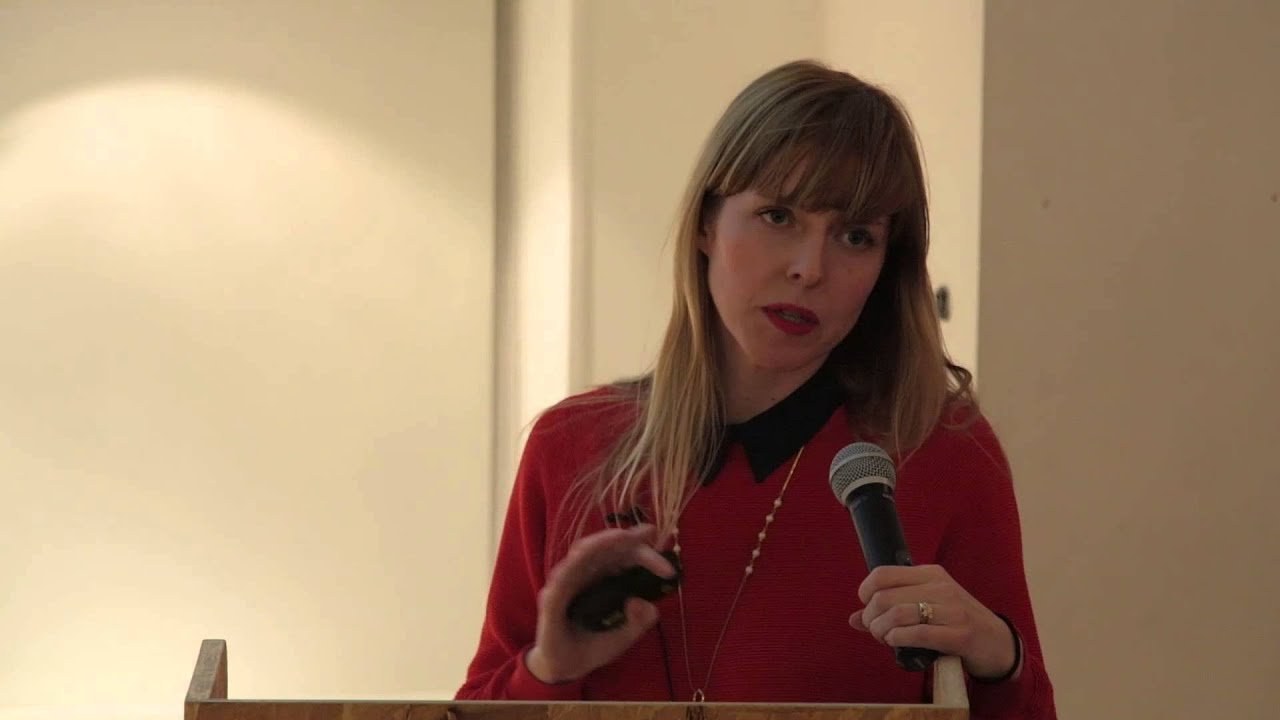
“Even the more reputable magazines portray images of womanhood that are entirely unrealistic.”
Transcriptmay contain minor errors or formatting inconsistencies
Hello everyone yeah thanks to it's nice that for inviting me along tonight as liv said I'm danielle pender I'm the founder and editor of repos magazine clicker yes so tonight I'm just going to talk about where the idea came from how it developed how the idea the ethos behind the magazine influenced the design and some of the challenges that we faced starting up the magazine I just mentioned magazines a lot in there in that intro so one of the earliest influences was the fact that I was a teenager in the 90s and the women of my teenagers were badass they didn't have a team of stylists behind them they wrote and played their own music they didn't spout off about simon fuller's like girl power marketing speak they were women like kevin kelly deal with the breeders kim gordon of sonic youth party chamo courtney love and melissa altima of whole pj harvey gwen stefani and bjork and many others swv jade anyway these women heavily influenced my outlook and attitude and one of the starting points for the magazine was the fact that I didn't really relate to a lot of the women that I saw in the media their sort of guts and rawness of these women had been replaced by some boobs and artifice and I didn't think that the magazines they that were on offer to women were particularly great either.
So I just pulled together a random selection of covers see what we're dealing with so there's the classic fatty versus skinny and none of them come off very well so you're kind of screwed whether you're far awesome and to be honest the people that they say are fat just kind of look normal so it's a bit degrading posh is pregnant but she's worried about being fat but then she's so stressed about being fat she lost some weight so that's kind of cancels it out these girls have gone out without any makeup on which is mental and then these girls need to wear more makeup because their skin is terrible which is obviously not good and then good old grazia loves a star in crisis so angelina's in a jealous rage about something jennifer aniston is a wreck madonna's in some sort of crisis and they're kind of reveling in rihanna's mistake whatever that was and yeah it's this kind of negative language and sort of commentary and comparing one woman's life against another which I don't think is very helpful I don't think it has to be like that and even the sort of more reputable magazines they portray a vision of womanhood which is really unrealistic so the women in these photographs don't look like that adele has like miraculously lost about five stone bonham carter has lost about 20 years kylie lost a foot and she kind of looks weirdly like to lisa which is odd and then kate winslet seems like she's been transported back to the 70s and looks like jerry hall like I'm not quite sure what's going on with that one so yeah there's obviously the argument that these magazines sell and they wouldn't sell if people didn't want to read about this kind of stuff but I think and I'm not saying it's wrong to buy these magazines or to read them.
But I think that when this is the only thing.
That's on offer it's a bit of a problem so I looked at well that was really loud I looked at the kind of magazines that I was buying and they were more male oriented magazines like monocle port modern mata or whoops or more culture art and design-based magazines like apartmental rag called print of pages the gourmand and yeah these are really beautiful magazines and their design and production qualities are really high and the reason I bought them mainly was because the broad they offered a broader range of topics than the usual like fashion beauty relationships celebrities that make up stories about. And I thought there was a gap in the market for something that was a bit smarter and better designed there's obviously the gentlewoman which I think the latest issue looks incredible but that's only one against like the rough a raft of the usual suspects excuse me.
So I saw a photograph of kate blanchet on intelligent life.
And I thought she looked I was quite startled when I first saw it because she can see shadows under her eyes she's got lines by her mouth but I think she looks really amazing she just looks like natural and that's how she looks she's 44 she looks like 44 year old woman possibly better than most I thought it was really interesting because you never normally see women of that statue looking like that unless they kind of got like a heat ring of shame around the fact that they've got no makeup on and they're not minging what was I gonna say next yeah.
So I thought there was basically a gap in the market and had all of this sort of mulling over in my head and decided that I'd start thinking about starting a women's magazine which was smarter and celebrated women for their achievements rather than what they looked like and so in the early stages we played around with the idea of coming up with a magazine app but I spoke to some people who work in established magazines and they were sort of saying the amount of money that is spent on developing an app versus how much how many people downloaded it just they didn't see the benefit in it.
So we didn't kind of go for that.
And we've had a really great response to the magazine so far but I don't think that would have happened if it wasn't a print product I think there's the tactile nature of print which it's impossible to reproduce in a digital format and I think that's where independent publishers really excel the amount of care and attention to detail that goes into some of the magazines that I just mentioned it's phenomenal and I think if you're going to commit something to print it has to be really good because of the cost and the effort it takes to make a magazine and I think readers really relate to that and they really respond to it and also in an increasing digital age I think there's a real demand for pastimes that kind of take you away from staring at screen so and also yeah if tyler brulee isn't doing it then we're not doing it because he's a smart guy so with the format we decided to have a magazine and we did we came up with the concept of five ideas four interviews three features two essays and one question.
But I asked a bunch of women that one question and nobody responded so it was either a really terrible question or that it just wasn't quite the right format so we decided to change it to one icon.
And we asked shaniqua jarvis who is a new york-based photographer who her icon was and she picked carrie mae wiens who I'd never heard of but she's an amazing african-american photographer. And that's been one of the really nice things about working on the magazine is finding out about all these women that I'd never heard of before so with we had the format it was going to be printed product and then.
I started thinking about a name. And I had a really bad long list of terrible terrible stinky names which I was going to put in the presentation.
But they're too embarrassing yeah I knew it didn't I didn't want to explicitly reference women or feminism I wanted something that was quite bold in sentiment and that also looked quite bold on the page and riposte kind of finally came by came around because it's a repository what's on offer and it also references the women in the magazine they're sort of given their repost so yeah thinking about the concept and the approach we started early on thinking about what the magazine stood for and we decided it was about we wanted it to be honest smart celebratory but we didn't want to take ourselves too seriously and in terms of being honest and upfront I kind of I really understand that people everyday life's and people buy into magazines and films and music because they want escapism but I think that a magazine can still look and feel beautiful and we wanted riposte to be more inspirational rather than aspirational and sort of fake and unrealistic and unattainable so the photography that we use is it's unfortunate we don't work with outside stylists there's no fancy lighting and I really love this these photographs of francoise mooley who is the art editor of the new yorker and they were shot by anthony crook in her studio in soho which looks pretty incredible and I think she looks really brilliant and I think you can take a beautiful photograph of an older woman without patronising her or or photoshopping or trying to make her look 20 years younger I think it doesn't have to be like that.
So yeah one of the main concerns was that although it was going to be more challenging content we didn't want to take ourselves too seriously or feel too worthy and this quote by s dublin which we put at the end of the magazine kind of sums it up yeah if you can't have a laugh at yourself then you're pretty so we call ourselves a smart magazine but smart to us is more of an idea it's about yeah we feature women who are street smart and business savvy women who have carved a career out for themselves across a range of different disciplines and and in all of the content we try and celebrate women for who they are and what they've achieved rather than what they look like nelly ben hayne I don't know whether you know her but a big fan of the jumpsuit she's incredible and she managed to like blog her way into nasa and direct a space orchestra she's been to cern she's making a film which I have no doubt in my mind that she will achieve yeah everybody should know about nelly even though she has this crazy french accent and then francoise who I mentioned before she is the editor of the new yorker she was she's from paris she was a plumber and an architect and now.
And then she moved to new york she bought a printing press and she became an authority on graphic art and when tina brown took over the new yorker she hired francoise and now she commissions culturally relevant covers for one of the world's most famous magazines every week click there you go for our second issue we've just done an interview today.
Actually with the nigerian-based writer chimamanda ngozi adichie whose book have the yellow sun has just been made into a film and she was also referenced in one of beyonce's songs her ted talk is incredible and her calm and collect considered lectures and writing about race and gender relations should literally be made part of the curriculum so I'm just going to talk a little bit about the design now and how the ethos behind the magazine influenced it I worked with shaz madani over there she's our creative director and she did a fantastic job of turning my ideas and developing the idea with me and making it into what it is so the yeah the logo is a slightly altered version of amerigo the pointed and angle serifs reflect the swift smart tone of repost and the tapered strokes and curves are an elegance and femininity and it was this focus on what women had to say rather than what they look like which influence influenced the front cover of the magazine and it pulled together some options from early presentations that charles did so we had we spent ages probably way too long debating which covered the goal for so we had multi-image covers another one large format photographs color there's always going to be I think always going to be an image on the back.
But they were kind and there's as lovely as they were they weren't you kind of seen them all before and when charles did a nice shock job on a carpet of the options next to the other magazines that were out at the time yeah they kind of yeah they just weren't as exciting but then she came up with the text-based cover and when she came up with that one it was very it was quite risky it made us a bit nervous because obviously images sell and why would you not why would you take away one of the most given sort of hooks visual hooks but then it was that risk that that made it more exciting and she had this national geographic magazine which sort of influenced the design and really started in its sort of boldness and simplicity yeah and it was this sort of shifting the focus away from what the women looked like to more about what who what they were what sorry what they had to say and who they were and this is what we ended up with which we're really happy with so we have yeah we've got the five definitive sections but we didn't feel the need to differentiate each chapter with graphics and we've done that with different paper stocks so the meetings are all on glass paper which market park helped sort out it's not there and just from what bruno was saying before about long copy all of our interviews and features and essays are all quite long so we wanted something in the middle that split it up so charles came up with this idea of having an insert and we featured the work of linda who's quite an influential artist who did work early work with the buzzcocks she's busy mates with morrissey she's yeah she had a big show in paris and still very influential today and just thinking about the design in terms of not taking ourselves too seriously with the longer essay pieces we kind of introduced some illustration.
So we worked with hello vaughn and he did these portraits of these different women who program and curate some of the arts organizations around the uk and just thinking about one of the challenges that we had we didn't have any money so this was actually a solution because we didn't have the money to pay for a photographer to go around and shoot portraits of all of the women so I think von did a brilliant job of drawn some paint and some really beautiful portraits and it was actually quite a nice happy accident that we were skinned and then stephanie von writes fitz who's in lagun she she drew portraits of ada lovelace who's byron's daughter and a really early computer programmer and also this was a piece which featured grace hopper she did a portrait of her as well yeah and I just thought I would kind of touch on the fact that we use an image on the back of the magazine so apparently we've lost really valuable ad space but if on your first foreign publishing you can't play around with the with the format then when can you and to be honest nobody was going to buy that back page so it's no big deal and I think yeah that's the kind of beauty of independent publishing why not put a photograph oh sorry I've missed a big section of my presentation.
This is more about shazza's beautiful design and sort of no stylistic tricks and it all lets the content speak for itself that's a bit embarrassing yeah why not put a photograph of an office in nasa where there should be some ads because you haven't got any stakeholders telling you to put some gustly brand on there that you would never wear yourself so and I think advertising is quite a tricky one when you start off your own magazines you spend weeks trying to speak to brand managers who have no idea who you are and they don't want to speak to you.
Anyway or do you spend it developing your content and to be honest I'd rather spend it developing the content and if it's good enough then.
I think naturally the right partnerships should come along this is the other nasa office so yeah I'm just gonna wrap up we're kind of currently working on our second issue which we're really excited about we feature some really inspiring women photographers from bogota publishers from the middle east a writer from africa a rapper from minnesota and a new band from london amongst many other amazing women starting up a magazine hasn't been an easy undertaking I'm way poorer in terms of time and money I'm quite inherently lazy person.
So I haven't watched tv for quite a while which is gutting and I think you have to be really careful about your business model from the start you have to kind of think long term how is it going to be sustainable in terms of time and money are you going to is it realistic to expect to earn money from a print product alone but I don't buy the argument that print is dead I think it's a really exciting time for print and you know.
I think people haven't been making money in the music industry for a long time they make money elsewhere kind of add-ons and nobody's bemoaning the death of the music industry so I think the trick is working out what other sources of revenue are around that. And it was like are you talking about with wired and the way vice kind of makes money through other means not just print product but I think with the amount of independent publishers that.
There are at the minute there's an opportunity to create something that makes it maybe easier whether. That's a sort of media company that specializes in selling adverts for independent publishers or new peer-to-peer distribution models or it would be amazing if someone at one of the big high street chains got a clue about magazines and didn't just stock all the regular rubbish stuff so yeah aside from that I think there's a lot to be said for producing your own magazine you've got freedom to decide what you put in it what your message is and I think larger magazines might have bigger budgets and access to bigger stars but I don't think that necessarily makes them better I think in some respects it makes them worse because they don't have to be as creative so yeah I'm kind of looking forward to developing riposte over the next few years if for nothing else I can show my nieces that it's not it's more about what you have to say and what you do than what you look like thank you very much
Latest Talks
-

Murugiah
Why you should reject the formula and make art about things you love
Watch -

Amber Weaver
How does contemporary type design translate into the wider world?
Watch -

Delali Ayivi
How does photography give us the right to imagine our futures?
Watch -

Will Anderson and Ainslie Henderson
Bringing stop motion sorcery to BBC’s Small Prophets
Watch -

Ollie Babajide Tikare
The importance of not flattening the complexity of observation
Watch -

Marina Willer
Design thrives when you find poetry in the simple things
Watch