
Femke Campbell is a senior graphic designer and Michelle Janssen is an art director at Crack Magazine, known for their creative contributions to one of the UK’s most-loved music publications.
Crack Magazine
Why the messiest creative process makes the most beautiful magazine
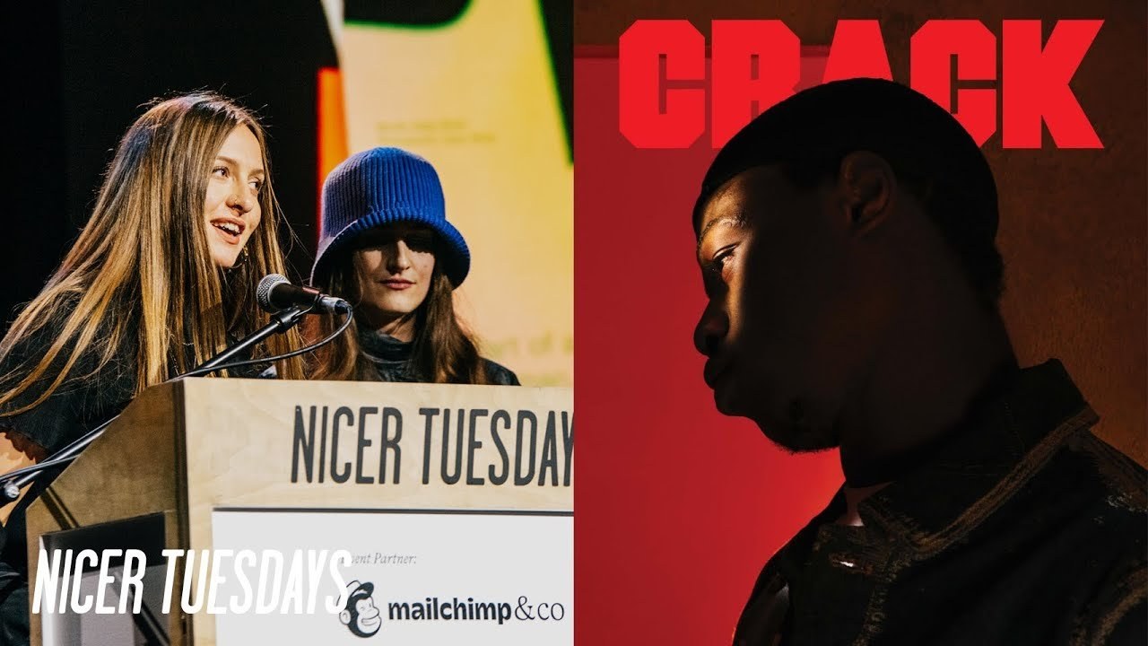
“Our creative process is messy, and that’s what makes it beautiful.”
Transcriptmay contain minor errors or formatting inconsistencies
Hello hi everyone thank you for coming 600 people it's a lot yeah crack magazine me and Frankford wanted to talk to you about the collections that we recently did it's a publication by crack magazine its annual but for the ones that don't know crack magazine I'll tell you a little bit about our history we've been independent for 14 years some of our notable cover stars have included MF Doom Aphex Twin zombier Grimes skepta and even Kylie Minogue it was founded in Bristol in 2009 by Jake Appleby and Tom Frost it was very much a DIY project with a strong independent spirit.
And it has slowly grown into becoming one of the most trusted and respected voices in music without any corporate backing it's so independent that until the pandemic we were doing all of our own distribution around the UK and also Europe which we sometimes still do now we've got one guy sending all of the magazines personally personally to everyone with no sleep at all I'm just kidding okay I'm art directing crack magazine and on this slide you see all of the covers that I was involved in for me our directing for crackers conceptualizing the overall visual narrative and choosing the best teams for the stories that we peed out. And it's important for me to reflect the featured musicians albums direction or their General visual mood and I'll let femke introduce her role yeah.
So I'm the senior designer at crack magazine and we work in a really small team it's just me my executive designer Manu and my junior designer layer and we cover absolutely everything from the print magazine which involves like bringing the shoots to life on the pages as you can kind of see all the way through to commissioning designing illustrators and designers and working on Mini branding projects in the crack sphere and also for external clients as well.
So we're here to talk about the collections which is the most recent publication that we just brought out.
So we're just gonna let this little intro video explain a little bit about it for you this ♪
collection of stories and photos and stories about photos it brings together the voices of creatives and artists and we've been proud to work with in 2022 ♪
our magazine is built from their creative ideas and beautiful work.
This is a celebration of that work and those people all the little details and final touches bring our publication to life printed on luxury paper this is a collectible annual for anyone cares about music culture and creativity foreign cool so that's a brief overview and I guess we should probably tell you a bit about why we do the collections obviously we print a monthly magazine and that's amazing because it's free and it's accessible for everyone but we feel like all the hard work that goes into the shoots like Michelle organizes and the design and everything it all gets a little bit lost in the way that we print because we print on newsprint so the collections for us is just like a really good opportunity to showcase our work in the best possible light yeah we feel like the quality of the work that we do like every single month is of actually of a really high standard and we think it deserves to be printed properly in a book as you might know in the monthly magazine we have a lot of much needed advertisements at the front and sometimes we feel like that sort of gets in the way and clogs up the content so the collections is a bit of a way for us to really like just lead with content and keep a really highly consistent visual read it's also stopped globally and with the monthly magazine we can only reach sort of like city-wide audiences in the UK and in a few places in Europe so it's a chance for us to like get our work out to the world so Craig's Independence period it's really great and it makes it possible for us to not have to appease to a mass audience and therefore we're not very afraid to go all out on our visuals and I think that really translates in the covers that we do and the shoots that we do and or creative Community is key to our output and it's important for me as an art director to keep building on that and that Community also allows for the magazine to keep that consistent High visual level especially working within the power meters that we have as an independent platform on this slide you can see some of the BTS over Grime shoot which was done by Charlotte ritterford and it's really incredible to see how an idea can come to life from idea conception to mood boarding to the shoot to the output we shot some really amazing artists across the globe crimes were shot in la birds I know Charlotte's 3D artists he lives in Prague and Rama was shot in Legos but the post-production was in London and there's really a lot of work Behind these pictures that we create and a whole team of creatives across many cities we rely heavily on these creative teams and even more importantly on our assistance and oftentimes we don't see how much work and production really went into these shoots and like fem says we do this every month to talk a bit about the shoes that are in the collections one of the shoes that I really valued was this Digger D cover shoot where commissions Honda or Kevin he lives in LA and he frequently collaborates with artists like Kendrick Lamar and Kanye and as a reference for the shoot he used my favorite artist shuiitarayama it's a movie called smallpox as his reference without us even speaking about it before.
So I really love that alignment that we had and I also love that take a d wasn't really shot in this way before which is an important part for me for the outputs and here you can see on a shoot that we did really having fun with my team and it's important for me that the artists are comfortable in a shoot and they're having fun and they have a good time.
And that's why I choose my team sometimes because I think that the artist and the photographer will have a really great Synergy maybe the photographer would have a similar output or music interests but sometimes I also think that a paradox can work really well.
But that would only work if there is great communication and expectation management and we're a music magazine so of course the musicians are essential but the community that we're building includes a far wider range of creatives it's stylist it's a designers it's Beauty artists it's designers and for the collections or angle this time was to really highlight that work of these creatives and or network globally and that's something that we wish to continue in the future so I'm just going to talk about the design decision process a little bit we feel like at crack like we take pride in championing artists and creative collaborators who aren't afraid to break the mold and that's kind of what we wanted to do in the design of the collections as well so much like giving the photography an opportunity to shine we also wanted to give the design an opportunity to do the same.
So we really went to town as much as we could within the budget restrictions that we have and pulled out all the effects we could so we have a silver Pantone ink on the cover spot UV glass emboss and different paper stocks in the magazine as we really wanted to create something a bit more textual and tangible than the print the monthly print magazine that we have the cover was actually a really difficult thing to design because obviously we're showcasing like the best artists that we've had in the magazine over the year and also new features with behind the scenes like creatives and stuff and we had to get all of that onto the cover which was really difficult so basically one one of the solutions is that we have this clear spot UV gloss to highlight the artist names which is something you can't see unless you sort of like wave the publication around in the light and then you get the reflection of the names so that was a way for us to like create more space and also still have all the artist names on there the Design's sort of broken into three sections so we have the insights which is like the behind the scenes collaborations with our creative communities that's like photographers and hair stylists and for this we wanted to create something more sort of factual and documentary style in the design so we could sort of represent like the knowledge that we're sharing in these pages we have like a Roundup of all of our best features from the year and with this we really wanted to sort of reflect the exciting and like boundary pushing nature of the artists that we're covering which we don't always get to do so much in the monthly magazine because we're restricted by our own sort of brand guidelines our like limited use of fonts and also our timelines and the fact that we're doing this like every single month so with the collections we really wanted to make it like way more fun and playful and hopefully that comes through in the design and the pace and the flow of the publication was really important to us and hence we've broken it up with these full bleed sort of photo stories where you can really see the detail in like the best shoots that we've done over the year and these are all just like full bleeds to really let the photography shine so yeah one of my favorites is the lose and the Yakuza shoot which is this really colorful bright one because the set was amazing the photography was amazing and you don't really get to see that in the newsprint so we really wanted to let it shine and yeah much like Michelle we are limited by budgets so creating a publication like this is a really a fine balance between what is Affordable and for something.
That's such a passion project for the magazine and also what's going to make a publication that people want to cherish and keep on their coffee table for time to come.
So yeah that's kind of it to sum things up crack story kind of started in in publishing sought after Printed Products and now we're creating even more bespoke Printed Products ourselves and also for a wide range of clients as well. And we just wanted to say if you did want to get in touch with us about the creative work that we do and then please email us on this email here. And we'll be happy to send out a copy of the collections to you as well.
That's kind of it thank you thank you so much [Applause]
Latest Talks
-

Murugiah
Why you should reject the formula and make art about things you love
Watch -

Amber Weaver
How does contemporary type design translate into the wider world?
Watch -

Delali Ayivi
How does photography give us the right to imagine our futures?
Watch -

Will Anderson and Ainslie Henderson
Bringing stop motion sorcery to BBC’s Small Prophets
Watch -

Ollie Babajide Tikare
The importance of not flattening the complexity of observation
Watch -

Marina Willer
Design thrives when you find poetry in the simple things
Watch