
Chris Vickers is a graphic designer and editor at She Was Only, known for creating a cohesive design for boat magazine that balances the elegance of each featured city with clarity.
Chris Vickers
Redesigning Boat magazine to let photography and journalism breathe across every city
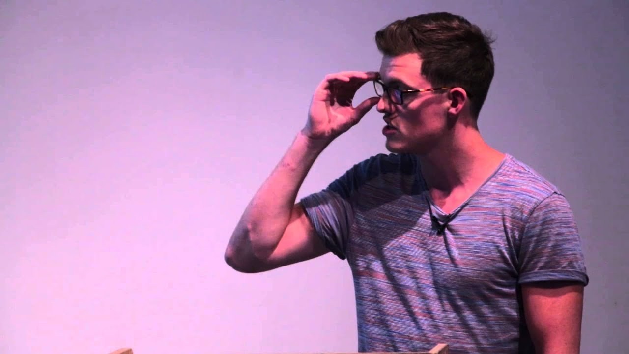
“We wanted to create something that feels like a cohesive journey rather than a collection of random stops.”
Transcriptmay contain minor errors or formatting inconsistencies
[Applause]
[Applause]
Hi there. Okay. Well, that was most of my introduction. So, yes, for anyone who's not familiar with Boat Magazine, it's a nomadic travel and culture publication that temporarily relocates to various cities that have big stories to tell. Each issue the editorial team at boat takes a handful of talented people with them but makes a conscious effort to source local contributors from each city that it travels to. Since 2011 boat has visited Sooo, Detroit, London, Athens, Kyoto and Rekovich.
Then for its seventh issue in Lima, Peru, we were asked to readress the overall design and art direction of the magazine. Previously, each of the issues, and here's a few slides from from those felt like it was a different publication entirely with the art direction trying to reflect each city's personality. For us, there were times when this worked really well and times where not so it wasn't so successful. On occasions, we felt that it felt like some of the important content was being masked by the design. The problem is some cities have an obvious color palette, type choices, or visual cues to to kind of expand upon and some it's not so obvious. We wanted to create a simple, flexible, but recognizable house style that would still allow for some expression and character. The challenge being how do you design a magazine that focuses on different content and a different city for each issue?
We started by looking at the existing mast head which is pictured here. There was a lot going on it including a tagline, an antidote to lazy journalism, issue numbers, the title of the magazine, where it went and this all resided in a luggage tag kind of lockup that wrapped around the spine. For the most part, it was successful to get the magazine where it was. We felt that it could do been some information being stripped out and the actual unique name of the magazine to be celebrated and made an ownable and distinguishable asset. We came up with this. It's the new master head of boat magazine. It's based on a type face called Dala Moa. And we introduced a custom liature between the A and T.
We now feel this is elegant, sophisticated and more importantly recognizable. The liature itself was as mentioned was custom but was based upon liatures from that type face. Here you can see that kind of design choice there. We thought that this built a recognizable mast head which looks not good. So it looks good on as well as the cover. The website which is this is a snapshot here which was also designed built by us for this project. Now on to the cover. Looks a bit different on here, but on the left is the new cover of Boat magazine. Compared to the old one here as a reference, we've we really feel like we've elevated the mast head, made boat much more obvious and as again just to reiterate, an ownable and distinguishable asset.
We also cleared away some of the clutter and housed it neatly at the top of the Mstead which talks about the kind of content you can expect within the magazine. We now feel that this sits confidently amongst a growing number of indie magazines. It's also worth mentioning, it's not quite as obvious here, but the format we decided to change. It's now a slightly wider format.
This was to partly to be more economical and make the most out of print paper than the site like how many we could get per sheet. And kind of reduce the waste but also to give us more space to kind of really craft the designs onto the design. The first thing, one of the first things we looked at was the typography. B magazine is extremely lucky to have such amazing written content and even has politers contributing to the magazine.
We wanted to honor this high level of content by developing a type hierarchy that was simple, sophisticated yet easy to read. When we were briefed by Erin Spens, the editor of Boat magazine, she expressed to us how much she liked the typographic language of classic lit literary journals. Inspired by this, we wanted to develop a sophisticated typographic style that would really reflect the quality of the journalism. Here you can see some snippets from the magazine of the type style we created.
We also introduced the sand serif which is I'm not sure how visible it is but smaller smaller there to build a hierarchy so it was more flexible and to ensure that the magazine felt still felt still felt contemporary and there's another example here as Chris mentioned in his talk earlier on a single image can tell a whole story and boat magazine also works with amazing and often award-winning photographers so we knew photography was going to be a big part of the magazine.
The next few slides are just a couple of examples of some of this quality content from issue 7 Lemur in Peru. This, for example, is a photograph by photographer Alistister Anne of an elder of the Can Gallow who make jewelry from seeds found in the Amazon.
This was also part of issue 7 and was part of a photo essay shot about cockpiting in lemur by Clement Jolin. Also from issue 7, this is the boat magazine's first fashion shoot and it showcased designers who cherish their Peruvian roots. If you bring together these two ingredients and treat them both with respect, it allowed us to create clean and considered layouts. We really celebrated photography within the design and use images large wherever possible to really show off their their quality. In some instances, we also use the same type typographic hierarchy and type family to create spreads that have slightly more interesting titling. Some of this lost in the projection here. There's a few spreads from another fashion shoot shot at night in Lima on the coast. I hope you can see that we really wanted to honor the content.
We use white space wherever possible to really allow both the written and image content to to breathe. I've mentioned quite a lot throughout this talk about how we stripped things out to allow the content to speak, but we also wanted to add a little bit and when looking for inspiration in Peru, there was a lot of handwritten signage. Whether it's due to monetary restrictions or techn technological there's a lot of this around and it's too beautiful and too much of it for us to kind of really ignore. Still with the same principles of not wanting to cloud the content, we decided to create some title screens to introduce some of the stories. And here's one of the ones that introduced the Time magazine. We want we used these to kind of interject some of the content, vary the pace, but also give over some of the character of of Lemur as a city. And the colors were often were taken from some fabrics. And again you can see the influence on the topography.
This was another opening spread for this time for a food story. Again allowing the photography to speak and kind of tell the story for us but marrying it up with bit of the character.
As I've mentioned before, there's one consistent thread with Boat Magazine, and that's that wherever it goes, it either brings with it or sources contributors of a very high standard. For the most part, we hope that by treating their material with respect and applying clean editorial layouts, we've not only showcased their work, but more importantly championed the content. We think this is where the the true character of each city is is contained, and we really didn't want to cloud from that.
Before I finish, I'm excited to say the boat is working on its eighth issue and the editorial team currently residing in LA. , and this is something we'll be working putting together over the upcoming weeks. They've been kind enough to share a few images with us today. , without going into too much detail, I think you can see it's going to shape up to have very strong visual content. Again, I guess if you want to find out a bit more about it, you'll have to pick it up from shells when it's available in September. Thank you.
Latest Talks
-

Murugiah
Why you should reject the formula and make art about things you love
Watch -

Amber Weaver
How does contemporary type design translate into the wider world?
Watch -

Delali Ayivi
How does photography give us the right to imagine our futures?
Watch -

Will Anderson and Ainslie Henderson
Bringing stop motion sorcery to BBC’s Small Prophets
Watch -

Ollie Babajide Tikare
The importance of not flattening the complexity of observation
Watch -

Marina Willer
Design thrives when you find poetry in the simple things
Watch