
Chantal Jahchan is a graphic designer and illustrator known for her research-led approach to editorial illustration and intricate photo collages. She captivates audiences with her imaginative work, including covers for prominent publications like The New York Times Book Review.
Chantal Jahchan
Using collage to convey a single message
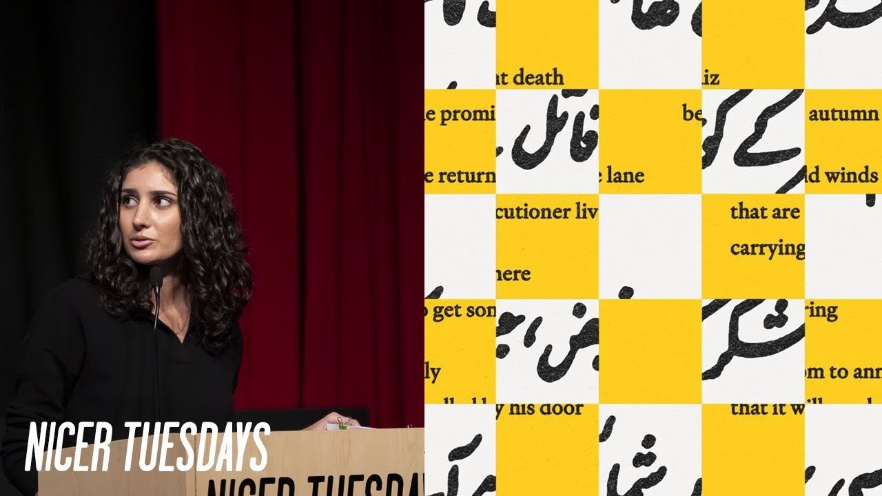
“Collage isn’t just about cutting and pasting; it’s about layering ideas to create a deeper narrative.”
Transcriptmay contain minor errors or formatting inconsistencies
Hi everyone, my name is Shantal. I'm a designer and illustrator based in Brooklyn. And for the past couple years, I've been working primarily in the world of editorial illustration, where I found a specialty creating these detailed photo collages full of archival images, textual diagrams, and bold colors. My background is in design and branding, which I still do sometimes, but I have found that my favorite projects recently have been ones where I get to help tell a specific story or convey a single message, like in the case of a book cover or editorial illustration. And I really do feel like I found my thing. I get to work on a range of different topics and learn deeply about them.
The people I work with are really smart and good at what they do, whether they're writers or editors or art directors. I make my own hours and work from home, for better or worse. Art directors give me words of affirmation. Things move really quickly, so I never get tired of a project. And finally, I get to see my work out in the world, which is maybe the most rewarding part for me. So today I wanted to take you through my process of creating an illustration from start to finish.
So this specific piece was a cover for the New York Times book review. And the book that was being reviewed is called The Deepest Map and it was about the race to map the ocean floor which is an epic and challenging project. And so this is how it usually starts for me. I get an email asking if I'm available and interested. I say yes or no and then things move really quickly from there from the creative brief to sketches to final artwork. Sometimes this whole process is less than 24 hours and sometimes it's a few days or a week, rarely more than that.
So, in this case, I got to read a draft of the piece, , which is my preference over just receiving a summary or creative brief because I can usually find some small detail or quote that might inspire further exploration. So, you can see here I started highlighting things and pulling out words I might want to use for image research and sketching. And so, this is my favorite part. , I usually give myself a few hours, give or take, to get lost in the research process. , and this involves finding and saving a ton of images. Some which I'll end up using directly in the work and some that'll just serve as helpful references. So, here's a peak into what some of that research looks like once it's collected.
I started by looking into how the depths of the ocean are visually represented.
So I got lost in a Wikipedia rabbit hole about baometric maps which are essentially topographic maps of the ocean floor. In some of them the depth of certain points was represented by a single number and in others the entire ocean was divided up into equal grid sections. Some used arrows to indicate the direction and the depth of currents and you can see those numbers here again.
And then I also collected some photos of the people behind all this work and of course some technical diagrams of submarines and deep sea mining. So if you've seen my work, you know that those diagrams are really up my alley.
But I also wanted to pull some photos of human ocean exploration like this early submarine and deep sea diver.
And then I also gathered photos relating to deep sea mining and all the valuable materials that can be found on the ocean floor.
And then there were also a number of species that were talked about in the piece that could be under threat from deep sea mining. So some of them were really oddlooking, some really cute.
And then there were also a few key people mentioned in the piece. The first was a Japanese billionaire who's funding the recent project and the second was an American businessman who was the first to the deepest points of all five oceans. So after I collect an insane amount of imagery, I move on to the sketching phase. And for me, most of the time I'm just kind of stumbling into a solution. I'm not really following a linear path or setting out to recreate something I've already imagined in my head. And I use the word sketching loosely because I do it all digitally.
And I think this helps me iterate really quickly. It helps me picture the finished piece as I go. So for this New York Times piece, this is the general template that I started with. , I knew that the logo would kind of have to stay in the top left corner and that the headline and description could be moved around however I wanted. So in this early sketch, I started by building a simple grid which is probably the graphic designer in me coming out. I put the headline on the bottom and then I created this sort of clear space to work on the illustration in.
So I started dividing up the composition into shapes that could be filled with color pattern or imagery. And I kind of think of this part as an underpainting, kind of like mapping out where things might go. , and starting to think about value.
So here I started putting in imagery into the shapes, some photos, and some color. And here's where that first sketch landed. , but it was kind of feeling a bit rigid to me, almost like you could see the grid a little too clearly. So for the next one, I thought, what if instead of starting with placeholder copy at the bottom, I worked it into the color blocking from the start to make it feel more integrated into the composition.
So I did that and started putting some diagrams in and photos. And you can see how that second sketch turned out.
I also tried a third similar idea, but with maybe some more white space. For this next idea, I took inspiration from the even grid on this ocean map on the right. And so I created another grid on the left and I pictured these sort of panels telling the story of all the different pieces that the book was about. So, I started with these diagrams and then I started putting in some images of all the different parties involved in the exploration and I kind of zoomed in on some of them to create more interesting crops.
And then I liked what story this was telling, but I kind of felt like the images and the diagrams weren't part of the same visual language. So, I adjusted the photos to be higher contrast and to not have any midtones. And I thought that worked really nicely to bring everything together, but then maybe something was lost in the legibility of the photos or some of the texture. So, I brought in some color to highlight different pieces of the photos and then also some of the diagrams.
I also tried this one where I took the lines from a bathometric map and had them intersect the frames, sort of like bringing them all together through their negative space. For the third approach, I wanted to integrate the type and illustration even more.
So, I said goodbye to the grid, which is really hard for me because I think it makes the blank page just that much more intimidating. So, as an alternate underlying structure, I was looking at maps like this one to see how I could draw organic shapes to serve as containers for the imagery. So, I quickly sketched this out and threw some images in there just to see if it had likes, but I found the shapes a little awkward to work with.
I think because they were going edge to edge, they required the photos to be really big. , and then I also just didn't leave any space for the type. So, I started over. , this time I placed the headline and description in first and then drew these sort of organic forms around it and the logo.
And then I placed a single image into these container shapes and added some grid lines and numbers like this reference, which I thought was nice because it really made this look more like a map, almost like an incomplete map with lots of uncharted negative space, which spoke to the story nicely. , and I did type out and place all the numbers individually so that they would work with the composition. So, while this looked nice, it did kind of feel one note. It, you know, didn't show all the different pieces of the story and didn't really reward any closer inspection. So, I decided to try more of a hybrid approach to get some of the storytelling of this second one into the first. So, I kept the man in just some of the shapes and then added diagrams and textures to the others.
And I also introduced some different shades of blue to speak to the idea of depth. And so these are the three directions and subdirection that I put in front of the art director. And I basically just got the green light on this one. , and there was just one piece of feedback which was that because there was only one person featured, it made it look like the story was just about him. So for the final, I introduced some photos representing the other parties involved. So you can see those hands from the cgrapher earlier. , and then I also just refined some of those curved shapes that I had made really quickly.
And then I also increased the negative space once we had that final headline in there.
So yeah, this is the finished piece. It was published in the print and digital editions of the book review. And hopefully now you can recognize my work out in the world. Thank you. [Applause]
Latest Talks
-

Murugiah
Why you should reject the formula and make art about things you love
Watch -

Amber Weaver
How does contemporary type design translate into the wider world?
Watch -

Delali Ayivi
How does photography give us the right to imagine our futures?
Watch -

Will Anderson and Ainslie Henderson
Bringing stop motion sorcery to BBC’s Small Prophets
Watch -

Ollie Babajide Tikare
The importance of not flattening the complexity of observation
Watch -

Marina Willer
Design thrives when you find poetry in the simple things
Watch