
Anna Mills is known for her animated words and letterforms, developing a distinctive style of type design characterized by childlike playfulness and imaginative movement.
Anna Mills
How animated letterforms develop a style all their own
“I actually don’t think my work differs from this too much now.”
Transcriptmay contain minor errors or formatting inconsistencies
[Applause]
hello yeah. So oh here's my hello hello yeah I'm anna I'm a graphic designer and I thought I'd just start off by showing you some of my work sort of set the scene yeah. So it sort of looks like this I use a lot of analog processes and hand drawn type ♪
and I'm really like exploring the anthropomorphic quality of letters but my favorite things to make are these like type gifs and moving posters but I'm gonna talk today about how I developed the style that I found myself working in a little bit about my process and then about a project that I worked on last year.
So this is some of my early work thank you I actually don't think my work looks vastly different from this now.
But I between this point in my life and uni I didn't really touch on hand-drawn type or type in general in a big way that much at all.
But in my final year at ue I was making a lot of publications and I started to use a program called fontstruct to make really simple super basic typefaces that are kind of constructed out of blocks and I just found that the limitation of making a typeface out of this a selection of bricks really freed up my approach to type I could get really lost in the process it was kind of like a puzzle that I was finding a solution for so I'll just run through some of those yeah.
So they kind of look like that.
But it wasn't really long after uni that that happened and I had loads of time on my hands and I was looking for something to do but I also didn't I was really fired up about type at that point but I didn't really want to spend too much time like glued to my laptop so I was looking for something to get lost in and kind of on a basic level I just wanted to do some coloring in so I started drawing grids in hindsight I don't think I needed to label that for you.
But yeah.
I think before when I started making type when I tried to draw type I sort of stared at the infiniteness of a blank page and everything I drew just sort of looked the same.
But this simple like framework of again like using a limitation just drawing a grid and repeating a letter over and over it just kind of slowed down my approach to type and I just ended up having loads of fun with it. And I really got into it I found this quote the other day of making alphabets there is no end it did turn out to be the perfect lockdown task because I just did it and did it and did it the alphabet felt like a problem with an infinite an infinite amount of solutions yeah and it was kind of meditative for me.
And I just couldn't stop thinking about doing it. And I started putting some bits on instagram and I got some commissions which was really fun because it really didn't feel like work. But then.
I think because I was drawing such a dizzying amount of letters and maybe not spending enough time with people these letters started to become like I started to see these characters as characters with personalities and little lives like these bees for instance especially these four I couldn't stop seeing them as bums and then. There were there was this ampersand this ampersand changed my life right this fifth one down on the left it was looking at me like it wanted to fight me it was holding up its fists and it was going to come for me. And I thought I want to make this happen and so I just sort of blindly drew out these nine amazons and I thought I'm going to move the arms a little bit at a time super basic process and I'm going to see if it is going to come alive and find me.
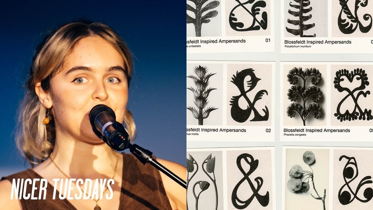
And it kind of worked so this year this really unlocks something for me very basic process nine drawings but I just started to think okay what can I do what am I gonna do next so I sort of went off on one so some more some frames for this guy it's a it's a cannibalistic e if you've ever seen one and then we've got an a that's got an itch another a having a little rest and some letters with little knees and cowboy boots but I also started to think about how these shapes could be inspired by textures from other other forms other areas like how can you treat a letter like it's a plant on these like blossom ampersands and then the reverse on the other side what happens if you treat a flower as if it's a font so there's some there's some metallic flowers for you. And then. I went down some other parts like how can you just I was just looking at how to make type move basically and just having loads of fun with it how can you slice it up how can you make it a puzzle this is another thing I did which was for everpress for their outside the lines campaign which was part of their type of focus collection just sort of how can you undress some super serious kind of businessman type and have fun with it and have a little party underneath but yeah.
I think this style started to evolve for me it kind of happened because of the limitations of the animation techniques like everything looked super low five like lo-fi lo-fi thank god because it was super low-tech so it was kind of it just started to look like that and at the same time when I was just sort of like looking at design out in the world because I'd been making things in this way I just started thinking of like like looking at a poster I could not see the potential for movement like oh but imagine if that title just sort of dripped down the page or that g could like shimmy across so I started thinking like okay how am I going to put these letters in a poster context so this next bit I'm going to talk about I've made a little chapter of this presentation I've called it backdrops as dance floors which is basically looking at the background elements of a poster like the small text the page furniture the lines in the boxes and how they divide the space and they they create a kind of room where this super wiggly unruly type can come and dance around and how I use this as an opportunity to kind of anchor the hand-drawn stuff with something steady and static and kind of grow it up a bit.
So I've always been really into like old printed ephemera and especially worksheets and forms and they've always got these like clunky old graphics which are kind of in their nature incomplete because there are bits to fill in so it's kind of expecting hand-drawn type because they'll be a little boxed around your name or that kind of thing and they're full of these like lovely little details like a slightly wobbly line because something's been photocopied too many times or like little circles and boxes things to tick that kind of thing.
So I kind of pinched that a bit in my work.
This is a little breakdown of some elements that was on a little gif I made for 36 days of type so I try and create this like second visual language to go along with the wiggly stuff sort of as as if it's been created by someone else so this bit's not really by me.
And then all the fun wriggly stuff can live on top of that. And I think because the well here's the here's the actual thing I think like the sampling of the old printed documents kind of it because that because my work's kind of low-fi I need it to like sit harmoniously with that.
But yeah. So just like little elements like adding a stroke to a type or like the bit that says days of type I've kind of used a motion blur to like make it look like a stamp and then just sort of saying the same thing again really with these small details anchoring the dancing type for this word poster I made for flux which is like super chaotic and how it uses the room kind of thing and yeah and then to enhance that like old form feeling and give my work like more texture I like to print out every frame.
And then scan it back in so that takes a very long time.
But yeah those are some of the frames from the flux poster but I'm just gonna finish by talking about a project I worked on last year which was for terracotta prince and I kind of got to use all these different techniques that I spoke about.
So I'm gonna kind of knit this all together with this project so just as a little background terracotta prints if you don't already know them are a print shop and an online space that kind of celebrate and circulate artists work and last year they put on their first exhibition since covid which was called nothing to spare two and they asked me to do the branding for it.
And this included a few bits of animated type a flyer some stuff for socials and an exhibition poster so basically the little bits of animated type were going to be overlaid on these really beautiful videos by sam mulvey who runs terracotta prince and what we were going to do is like tease a little bit of information about the exhibition on each one and then release them as we went so in terms of briefing they wanted type that was kind of slippery and fluid and I mean I could read the whole list but but they sent over some bits that I'd done as a reference and they also wanted something that kind of touched on aren't nouveau styles so I started off by drawing nine different versions of the word december because yeah the first animation was teasing the date and so I just sort of thought well I was making the type how can I how can I make it slippery how can I make it fluid how can I make it touch on art nouveau styles and how can I do that nine times so yeah did that sam ended up picking type number eight which was kind of closest to the reference that he sent me.
But the the limitation of this like super oily super coiled type is it wasn't very legible so we had to find a kind of solution for this to overlay on the video because you kind of needed to know what the date was not just some wiggles so our solution for that was to take another type style which wasn't particularly legible either and just morph between the two and you can kind of get a sense of legibility like within the transition.
This is these are some of the frames for the second animation which had a similar idea.
But this time the type was changing from both positive to negative and then the actual like text was changing so we ended up calling this technique the blob technique where you kind of treat type like it's one big piece of play-doh and you're like balling it up and reshaping it and making it into the next bit of type which kind of touched on nothing to spare this idea of like reusing your materials is my plan you can see the blob the blob makes an appearance on that one and then. So that was for the third animation. And then.
This is how it this how it turned out so super gooey super blobby yeah it's not moving for me on here.
So I'm just waiting for it to be over you get the idea. And then.
There were these two gifts for socials which and what I liked about this was we could kind of just pull on stuff we'd already done so we got the blob thing again I'll stop saying blob in a second and we got to use the december all the december type styles we got to use them again in this like super simple type gif and then the next bit was to create a flyer for the exhibition this book this was a bit different but illustrative it was completely sam's brain child he wanted to see a guy with his head split open with a flower coming out of its head and it was super fun to draw and he was really pleased with it but not my usual way of working but what I found at this point was that in terms of the exhibition poster we kind of had all the ingredients from all the development work and the actual like frames of the animation we had all these bits that we could use and it was just about like knitting it together. And I thought I'd end the talk just by talking about this poster because yeah it kind of knits together all my favorite things because we're kind of using the worksheet strategy like it kind of looks like a form with all the little boxes and the crossings out it's got this super gooey custom type which is kind of cheeky maybe because it's got mixed uppercase and lowercase letters it's got some illustrative bits and squiggles and then.
I also got to make it move so it was really fun and thank you for having me you
Latest Talks
-

Murugiah
Why you should reject the formula and make art about things you love
Watch -

Amber Weaver
How does contemporary type design translate into the wider world?
Watch -

Delali Ayivi
How does photography give us the right to imagine our futures?
Watch -

Will Anderson and Ainslie Henderson
Bringing stop motion sorcery to BBC’s Small Prophets
Watch -

Ollie Babajide Tikare
The importance of not flattening the complexity of observation
Watch -

Marina Willer
Design thrives when you find poetry in the simple things
Watch