
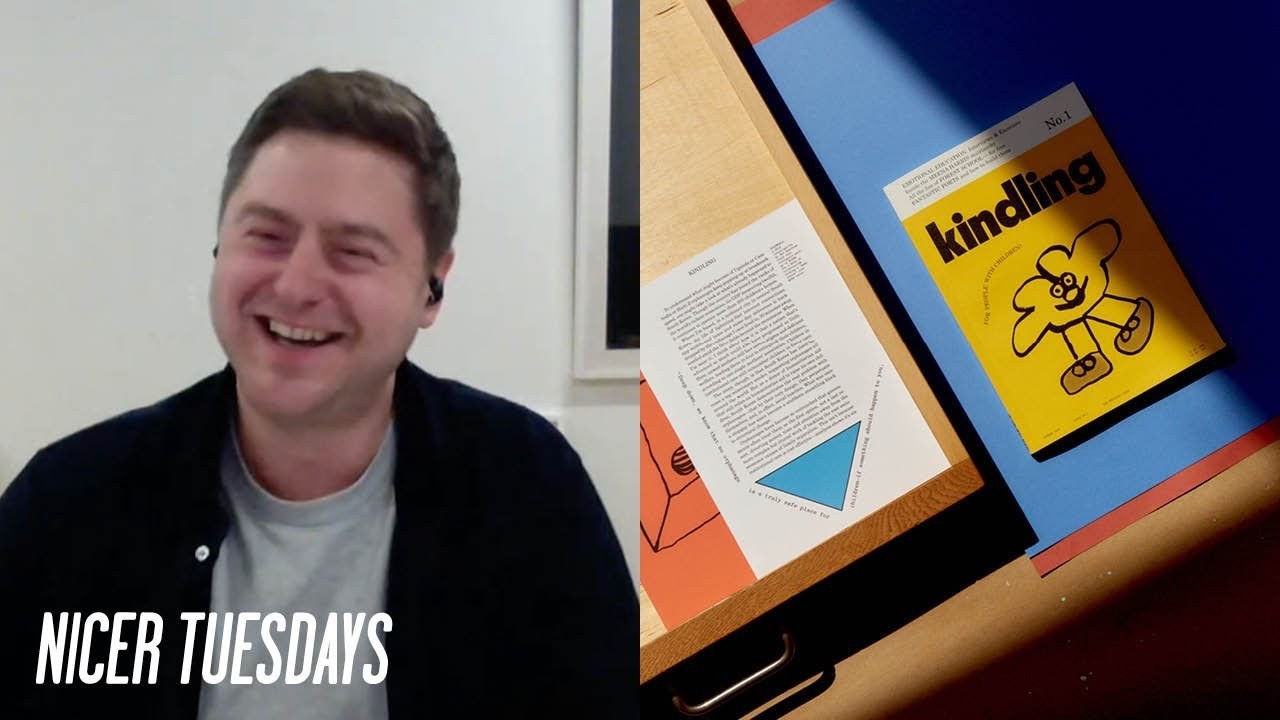
Alex Hunting is an editorial designer known for his recent redesign of Kinfolk magazine and the visual strategy behind its newest venture, Kindling. He emphasizes the importance of evolving visual styles while creating engaging content for diverse audiences.
Alex Hunting
What the redesign of an iconic lifestyle magazine really takes
“It felt like the right moment to make that big call.”
Transcriptmay contain minor errors or formatting inconsistencies
Right it's time now for our second speaker now last year the acclaimed publication kinfolk underwent a dramatic redesign to celebrate its 10th year in print this new visual direction was led by alex hunting the founding designer of the eponymous london base studio and the magazine's design director aiming to ensure kinfolk stays ahead of the pack the rebrand features custom typefaces from shik toika and alex is joining us today to tell us about some of the crucial design decisions that went into the redesign and also to discuss kindling the new offshoot magazine for people with children hello alex hi matt how you doing very well thanks yeah how are you yeah very good very good thanks for having me excellent I think we're we're hoping that there's not going to be some proofs sent to the studio where you are in the time we're talking yeah no let's hope not yeah yeah that wouldn't be ideal would it yeah.
I was telling I just mentioned to matt we've got some issues with paper stocks on some of the issues so we could easily have some proofs arriving at any moment for some new new paper styles well listen fingers crossed that's not the case but yeah I guess now that you're not gonna be doing a talk today alex instead I get to ask you lots of questions but also anyone in the audience as well please feel free as ever to pop your questions in the chat and I'll do my best to ask alex for you.
But I guess my first question was really I'd love to know how you approached the redesign of kinfolk last year because as we all know the magazine is it's always been such a high watermark for that kind of premium print magazine so what was what I guess what was the reason for revisiting it.
And then what was it that you you know and the design needed to move on what was what was influencing that decision yeah.
So I mean I guess it was a number of things the main one that you you mentioned was like it was the 10th anniversary of the magazine so you know kentucky was founded back in 2011 so it kind of just felt like we've been talking about some you know redesigned for quite a while and obviously 10th anniversary you know it just it just had to be really at that point because you know it's such a kind of big milestone for you know for the magazine and for the team and you know it's been the magazine's been through a number of kind of iterations over the years or units had a few redesigns but the last one was actually you know was back in 2016. You know.
So it's a long time really for long time to kind of be with the same design so we were just also a bit conscious I suppose with that I mean I feel like it hadn't totally like we were still happy with it and obviously we'd refreshed elements of the magazine kind of you know throughout you know that that period of five years. So it wasn't sort of exactly the same but you know in terms of the kind of wholesale like nikki looking at it again you know it just felt like the time was right for it really and you know you mentioned about kind of I guess it's influence and I think it's kind of you know kim feck's always been influential from I guess you know right from its first you know the first design I suppose it was part of that kind of set you know that group of like breakout independent magazines I suppose about you know 10 years or so ago and you know that kind of very minimal kind of stripped back aesthetic was you know pretty influential in well particularly in independent publishing genuine around that time. And I suppose that's probably a bit of a reaction against what was going on in you know mainstream magazines I suppose you know at the time.
But I in terms of its influence I've not really I I just think that you just always want to be trying to redesign before jumping before something becomes you know kind of you just see everything everywhere.
And it's not that people's specifically copying kinfolk or anything like that it's just that you know it's just it just becomes you know sort of seeps into the visual landscape I guess of it and when something's you know got a big following or you know very popular it just you know it just naturally is quite influential I suppose so you know we were just keen to to move it on and 10th anniversary was just you know perfect opportunity yeah absolutely I mean did you feel any added pressure knowing that you've done a really successful redesign in 2016 as you mentioned was there kind of added pressure on this one alongside it being the 10th anniversary as well I mean I think I felt more there's I think it was more pressure really in 2016 for me personally just because that was obviously you know that was when I was brought you know on board you know into into kinfolk so you know.
I think you know that was it was obviously I mean it's a big job this time.
But it was at the time it felt like very you know quite a scary sort of thing it was something.
That's kind of so you know so loved and I was very very aware of it very aware of it very well you know it's readership and that sort of thing I think this time around I probably feel a little bit maybe a little bit less pressure in the sense that having worked with the magazine for kind of five years I hopefully feel like I know the audience a bit more or you know know you know know a bit more about kind of you know the magazine I mean there's always gonna be things that people don't like when you redesign something you know and particularly when something's got you know when something's got like a really strong kind of community that's been generally built around it like kinfolk has right from the start and there's people that have been reading it you know for a decade so you know there's always a bit of pressure I guess with with that and you know hopefully people like it I mean redesigns come along a lot of the time.
And it takes you a little bit of a while to kind of to get on board with it.
Anyway I know like I felt like that about you know magazines that I've loved in the past that have you know had a readers on you for oh you know what what's this.
And then it's only after it's settled down a bit you think oh actually. That's you know.
This is great yeah yeah definitely agree I think sometimes you need a bit of time to live with something.
And then it kind of you start realizing slowly how how good the redesign was I mean we're seeing lots of images up on up on the screen at the moment of you know the new issues and I guess what were the big things that you felt you and the team felt needed freshening up and updated in terms of kind of details what was it yeah that you felt would be able to give it a new look well I think we you know we the the you know the kinfolk team you know we spoke about you know kind of ev I guess we spoke about a lot about you know what we thought was working you know as well as what wasn't working so john so john burns editor-in-chief harriet fitzgerald editor and christian miller anderson art director we all kind of we basically went through kind of a lot of aspects of the magazine and sort of spoke about yeah I guess not just design wise but editorially what you know what we felt was working and I think the structure we decided to keep the same.
So the you know the structure of the magazine like the editorial team felt like it was serving us quite well like the way that we section the magazine which is was which we changed in the last redesign and and actually that was quite helpful because kind of keeping that same editorial structure sort of meant that you know design-wise you'd kind of feel like you were you know the reader would have a familiarity despite the fact the design was gonna you know change quite a lot.
But in terms of what needed changing I guess obviously the main thing which the whole kind of redesign is based around is the typography and you know. I mean I love the type that we had chosen you know we had in the last I should say this is all kindling by the way suddenly changed yeah but you know I love the type that we have that we use in the previous iteration.
But yeah it just felt like kind of as a wholesale change the the type basing it around sort of quite a distinctive type based family it was always kind of what I had envisaged really and you know it's kind of just to try and make it like make it more ownable I suppose you know you sort of spoken about like the influential thing but you know kim feck's very much known for kind of its you know its imagery and you know the art direction is imagery and you know equally it kind of felt like you just I wanted to give kind of quite a lot of weight to gentleman to the typography in terms of making it kind of quite identifiably confoc moving forward I mean we changed a lot of other stuff as well like you know we kept the size the same.
But we changed sort of the paper stocks and we also kind of introduced some new editorial formats to kind of help the reader a bit more so we had some kind of I guess like more readable essay formats so slightly you know larger some sort of more body texts like size styles so like slightly larger text so we sort of it was also kind of wasn't just you know just design decisions there were some you know nice improvements I I hope you know hopefully for the reader as well yeah absolutely yeah I mean we're going to come onto kindling because I appreciate yeah there's been some some images of that on on screen we will come on to that.
But I wanted to stay with with typography and I noticed that a couple of questions have come through on the chat as well about the typography so you worked with shik toika on a on a set of typefaces what was your brief to to lori and florian from chick toy yes it.
Basically was for them to create a very a sharp refined kind of contemporary feeling serif family kind of like in like the latin genre of typefaces so it's really keen for it to have like triangular kind of wedge shaped serifs and the whole the idea was that obviously like at every point you know we needed like a body you know body text type phase a deck sort of size for kind of stand first and pull quotes and like a display a much more sort of slick kind of display version as well for to use you know very large for kind of big splashes of typography and it it was kind of just we wanted it to just pack kind of as much character like into that genre you know that kind of type of genre of type typography so we kind of went back and forth with a lot of references at the start of kind of starting points and there were quite a few versions before you know we ended up where we ended up and one of the main parts of the brief really to them was I was really keen from the start like I just I love ligatures and sort of most you know in typography in general but I was just briefly to create kind of quite an extensive set of like uppercase ligatures you know to use for a lot of kind of the feature openers and to use like a bit of decoration really I think they just kind of they create these really lovely moments where you sort of the reader almost does like a bit of a double tape because you know your brain can kind of read something you know.
But it's kind of sort of not quite right. And I've tried to use kind of some sort of interesting kind of arrangements slightly more unusual kind of arrangements of headlines and things with them sort of emphasize the detail in the type but those guys they were absolutely amazing to work with they sort of yeah like you know lots of technical details and stuff but they really I think they really got they really got the brief anyway from the start and kind of this funny thing talking about type with people because and I'm not a type designer at all like I you know draw typefaces every now.
And then but not you know but when you.
But there's very much a kind of you know ultimately it's kind of it is quite an emotive thing about you know how the typos makes you feel so having these conversations about you know technical details are important but it's also you know it was really great to work with them because I really got you know when we were talking about kind of jeremy the diff the subtle differences in the versions we were working on and how that kind of generally had that sort of how that was making you feel as a reader really interesting I'm just staying with with the ligatures because you mentioned them there tom in our audience has asked how many ligatures are there in the final font I I you know I definitely couldn't tell you because I've not I've not been I've not been through I've not used all of them yet by any means but I'm sort of chalking them off as we go through in in headlines but oh god I mean probably ♪
probably 25 30 something like that 20 25 I mean yeah there's quite a lot well I'll have to come back to you on that tom I mean I think that's pretty you know it kind of gives us a big picture of yeah certainly a lot more than you might expect even during the stage I'm pretty sure I had in my mind a headline that I was using like mocking up.
And I think the guy sent me like the latest set of them. And I was like no no no like we need you know I don't know what it was it was like m.a I'll say we need this one so yeah there are a lot of lot of fun a lot of fun to to play with I'm just imagining you in the in one of those calls just demanding more ligatures every time olivia's asked a really interesting question how did you set about prioritizing what needed to change and what should stay and I guess one thing that kind of I wanted to touch on with this is you know the white bars on the cover was such a kind of recognized thing about kinfolk and was it difficult to lose those bars or were they one of the first things that you knew had to go well I actually I I actually wanted wanted to lose them in the last redesign but I went I I wasn't I suppose I wasn't certain about it.
But it was definitely something I guess when I went and I was discussing but I think that.
Actually it was probably it was the right decision not to change it then maybe in the sense that I think we changed in the last week design you know we changed the size of the magazine fairly dramatically like the physical size of the magazine in terms of the format and you know we changed all of the type we changed the papers we changed germany we changed a lot of stuff so I think actually kind of you know. There isn't there is like a degree of familiarity sometimes you do want to generally bring with you.
But I think everyone this time like the entire team was just like totally unanimous that you know this like everyone everyone was on board in terms of the cover changing it you know it's kinfolk wasn't by any means the first magazine to jeddah mean to to have that kind of what sort of white framing device or you know to use it.
But it certainly is like quite a key you know quite an iconic sort of I suppose part of the design so you know it was a difficult decision.
But yeah 10th anniversary I think it gave everyone quite a lot of leeway to jennamen to to make that big call.
But I'm sure there will be people that'll be unhappy about that but hopefully hopefully everyone will come on board thanks I'm sorry I completely hijacked olivia's question there she said her question was also about how you prioritize what needed changing and what needed to stay the same apologies olivia yeah and yeah I guess I mean it's just like from the team really everyone ♪
you know yeah as I was just mentioning that you know. There is some things you kind of want to take with you there's like I you know there's you want there to be a little bit of familiar familiarity how we prioritize this stuff I mean I think I I guess it's just like what you know we don't do focus groups or anything like that really really that sort of thing.
But I suppose you know the team know you know the team have worked together for quite a while and you know know the readers very well.
So I guess yeah just a lot of kind of discussions really around the table about you know the things which are strong and I guess having honest conversations and people in the team telling you you can't do exactly what you want quite rightly and you know and what what's you know and being honest about what's good for you know what's good for the magazine what's good for the readers you know that sort of thing lots of discussions I don't imagine probably not very clear let's take a look now at kindling so that's the new offshoot magazine which is described as a magazine for people with children so it's not for children it's designed to be read by their parents but you've also mentioned before that you still wanted it to be visually appealing to children and what design challenges did that create having kind of two different very different readers in mind yeah quite a lot I think well I think we thought maybe a bit easier than it was initially when we started doing it.
But I mean it is it is designed to be read by adults but there are there is stuff for children in there so you know there's you know we have like a section which is you know called fun stuff so it's pretty clearly marked when it's you know for so sort of things like activities and you know basic content for specifically specifically for kids so and we also you know particularly in the first issue we kind of had sort of editorial devices that ran throughout the magazine so like we call it kids corner so kind of little moments during main articles for adults where they were little things for kids so I think we kind of wanted the the magazine to be very approachable I suppose so you know very not you know kind of family so it could be something that could be passed around like you know the family basically so you know it needed to be appealing visually yeah to kids and to to adults I think we did that we did that from you know we used a fantastic illustrator that stefan simpson our art director found espen friberg who's just like absolutely fantastic and he's done both the covers and kind of illustrated like throughout pretty much the almost all the illustration apart from a little bit in the the kids section in the second issue but I think kind of having that consistent style of illustration is quite sort of appealing to adults because there's a kind of there's like a visual consistency that adults can slightly so whereas if we had sort of 50 different illustrators it might be appealing to kids in that way.
But it's probably a bit too kind of you know maybe messy or et cetera for adults so that the use of illustration was quite important I guess to us and espen style was just kind of really amazing it's like very kind of naive like lovely like thick kind of mark you know line drawing style and we've used it in you know sort of mono so you know it's quite I guess you know it's quite sort of appealing to kids but also yeah to adults so yeah we've done a number of kind of things to try and you know do that I guess also the format is quite you know we again we wanted to make it quite approachable you know as a format so compared to something I guess like kinfolk which is quite you know very it has quite a weight as an object I guess you know.
And it's sort of meant to be a bit coffee table you know esque etc you know kindling's you know much sort of smaller you know it's still got quite high production of values but it feels a bit more kind of throwaway you know like you could pass it around you know your kids could probably scribble in part of it it's got a kind of textured coated cover so you know you can get grubby so kids fingerprints all over it and wipe it off.
So there's a number of kind of things that we tried to do jeremy to try and tackle about yeah really nice I mean you can tell that I guess we're seeing some images cropping up on screen now and yeah I'm sure everyone will agree when we wrote about kindling I think you told our writer that you'd kind of scoured educational resources and even scientific journals for inspiration what were some of the elements that you really liked in the research and I guess yeah what then fed into the final designs yeah.
So I guess a lot of it was like just around I guess the visual language of education or learning so you know one of the things that we ♪
use a lot alongside you know photography typography illustration is we kind of use these sort of geometric kind of like graphic shapes quite a lot so and they're very simple kind of shapes but they're sort of drawn from you know those kind of educational kind of activities books that you used to get as a child so we kind of use them as sometimes use them as sort of infographics to kind of help you know kind of illustrate a piece so if we have you know kind of statistics or if we have you know kind of little short pieces about a particular topic you know we'll try and use you know use them kind of graphically to help like tell the story.
But they also apart from just being infographics they kind of they also just sort of help actors like containers for texts and that sort of thing. So that was they were quite a big part of you know that kind of language of education I guess and then also the you know typographically you know one of the typefaces well the the main kind of the the body text typeface that we use is century schoolbook which is you know pretty much the typeface used in every pretty much every textbook or school book you probably would have had growing up you know.
So it sort of gives you that takes you back a little bit I guess when you when you see it. That's a really nice detail yeah lovely really interesting question here from rachel are you mindful of accessibility throughout your your design process or how much do you think about accessibility when you're designing yeah yeah quite quite mindful I mean I suppose the thing graphic designers are always guilty of is yeah sort of making the type too small.
So yeah quite mindful I mean I think particularly with this project we wanted it to be really accessible so you know we hopefully it's sort of it's just appealing jenna meaning in in lots of ways to to like quite a wide audience I mean I think we were quite conscious that if we had designs I think it was maybe slightly unexpected not necessarily what people would expect the team at kinfolk to design you know essentially a parenting magazine in in this way I don't think people would have expected that that much that.
There is a certain way we could have done that design jeremy that would have fitted you know more kind of I suppose directly to its oldest you know it's older kind of sibling but I don't think we wanted to do that at any point you know.
I think we wanted it to be we wanted it to be much more yeah much more approachable much more kind of accessible and much more fun basically we've had a question which is yeah no absolutely a couple more questions come in which is brilliant lauren has asked what tip would you give your younger self before going into the design industry so yeah with everything you've you've learned on kinfolk and other projects what piece of advice would you would you give to your younger self now ♪
I mean approach people you admire I think one of the yeah I guess I've I've been quite lucky with the some of the you know very lucky with some of the jobs that have come along and you know kind of through people that you've met and that sort of thing.
But I think particularly in editorial design the you know essentially it's text and image right.
So you know you. Basically want to be working with good content so you want to put yourself in a position where you can work with say a great photographer you know work with a great writer so I would say be very proactive and be very kind of open to putting yourself out there really you know getting in touch with yeah people you admire because more of like the great kind of work always comes from if you've got you know a talented team you know or if there's passion kind of in the projects like that always comes across basically in general in the outcome.
So yeah I would say that I mean that probably applies across the board to design really.
But I guess particularly editorial design yeah 100 I think that's a really piece of advice to anyone in any creative field is reach out to people and yeah particularly if you if you really love their work yeah there's no harm in getting in touch I think just one final question oh I'm sorry yeah please I guess I suppose like practically or the thing which I still think today or still is still a part of you know my day-to-day is I've kind of always thought that design is graphics is a craft like as in rather than necessarily than an arts like I know you have sort of there are artists like and it's pretty this is probably quite controversial in some ways but I think you know that sort of adage of like 10 000 hours or whatever it is is a you know really is a thing.
And I think in particular in editorial design because it's such a you there's you often have like a very tight sort of brief in terms of you know even if you're designing like a feature or something like that like that in itself is quite a contained brief and I always remember like even from my pretty much my first internship when I was doing a year out my year-round industry was at as you know sorry it was just when I left uni but was at studio eight which was matt willie and zoe bathers studio and I'm sure that's something. That's nice that you know readers know about them.
But they were they worked on lots of editorial projects and I remember they were working a book and they they were printing off they printed off sort of I think it was you know it would have been like 12 13 14 versions of the same spread and I remember thinking like seeing what I'm thinking you know.
That's the one that's one that's amazing you know it can't you know you can't design something better than that. And then.
I think they sort of printed off 20 something more and you know. There were seven or eight seven or eight better versions of the thing there.
So I think you know. I just I don't really know I'm going with that.
But I suppose it's about it is like you learn by doing entirely I think with german this thing and you know you want to kind of always keep pushing something you know however subtle the difference is until you know something clicks into place so that would be a more practical tip I guess yeah it's a brilliant another brilliant piece of advice there.
I think we've probably got time for just one more question.
But I definitely wanted to come to this one from margarita where do you start to design a new issue of the magazine can you say a bit more about that process yeah well it's quite we weren't quite far I guess in you know in advance I'm sure you you know about publishing schedules that sort of thing.
So yeah quite far in advance but we basically have you know there's a series of like editorial meetings you know kind of throughout our publishing calendar where everyone's checking in talk about ideas at the start and yeah talk about possible ideas for stories chase those leads and then by the time everything comes basically to me it's in quite a lovely state so I I'm I miss out on a lot of the stress of the the editorial team have to have to go through but then really it's kind of about thinking about how to when those stories come in you know what treatment each story is you know going to get and you know how we might develop you know at the moment obviously there are a few issues into the new you know the redesign so it's still kind of about pushing you know different elements of it and seeing you know just kind of seeing maybe what works or pushing kind of the the way we approach features you know like sort of defining that style so yeah and then it's kind of basic working out a way to put all of those pieces together you know those like different design elements different story types putting them together yeah great thanks alex really appreciate you answering all those questions and those questions from the audience as well I really appreciate it.
And I'm probably gonna have to leave it there but thank you very much for joining us thanks so much
Latest Talks
-

Murugiah
Why you should reject the formula and make art about things you love
Watch -

Amber Weaver
How does contemporary type design translate into the wider world?
Watch -

Delali Ayivi
How does photography give us the right to imagine our futures?
Watch -

Will Anderson and Ainslie Henderson
Bringing stop motion sorcery to BBC’s Small Prophets
Watch -

Ollie Babajide Tikare
The importance of not flattening the complexity of observation
Watch -

Marina Willer
Design thrives when you find poetry in the simple things
Watch