
Wallace Henning
The untold design story behind the British Rail identity system
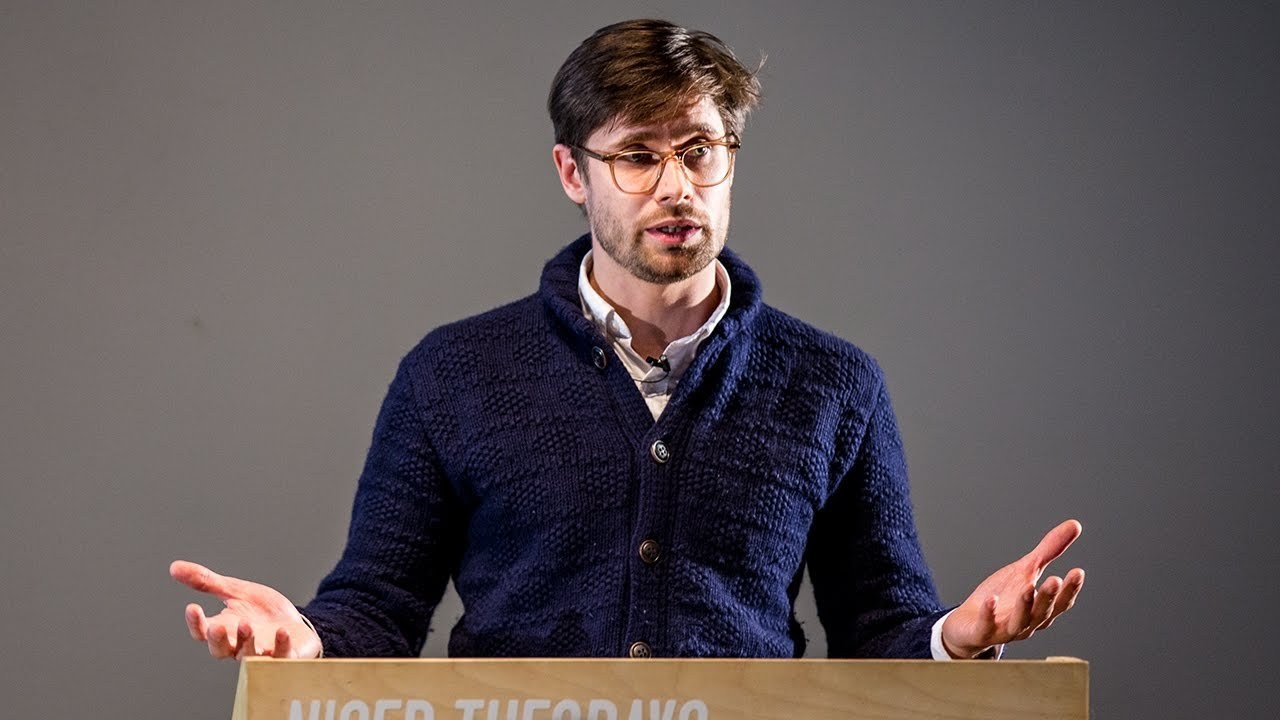
“Nobody has the British Rail manual. So the only place that you can actually read the full identity guidelines is in the reproduction.”
Hi thanks very much for coming to see all of us tonight thank you and my behalf so British Rail Manuel will get on to that in a minute but not many of you probably know who I am so I work for a company called Coto this is the work we do I'm not going to tell you about with the projects because that's not what tonight's about but you might be in just a little bit on our background so coca-cola air B&B lots of little tech brands FMCG that's that but what got me onto trains was when I did my MA so I wanted to really natural eyes the railways it had to be done it's an absolute disgrace what we've got now has been my opinion.
So I went through the process of designing a new identity so it started on paper moved through the paces as to what it looks like at different sizes line weights and scales I got really nerdy about it it was a bit of a fetish but now I looked at signing signing a railway stations he's awful so could you run great big LED screens down the platform just without people slipping over maybe and various things like that so when you weren't up to your train what would it look like where would your seats be what stations is it going to call that then what's the outlook like we might get to all of that.
But I did design a paper ticket as well because not everything can be solved by an iPhone then.
This is when it got a bit dark this wasn't a good time in my life this was eBay every night I had to know what was out there what was I missing and I began to collect it all.
So it would be a pin badge but not even a British crown train for some reason timetables I didn't read them didn't go that far don't worry but actually some of the illustrations and thoughts things that British was producing pretty amazing they don't conform to the guidelines of course because nobody follows guidelines that's boring because you end up with things like this which I kind of like that or just go and eat but this is pretty cool I like this one they did a good job at that I think it looks a lot like the night bus timetables we get 40 FL so tonight's talked about broken into two pieces the first parts about British Rail just a little sort of insight as to who they are what they did why it's important that we think about all the graphics they produced the second one off is the making of the book I'd like to say the pain of it but trying to stay positive so what made the British royal identity part one it wasn't the Flying Saucer they produced that was nuclear fusion driven but it does say something about the company they were forward-thinking they tried to do everything they possibly could to be at the forefront of the transportation and and sometimes their uniforms maybe not so relevant and useful these days but it was four core elements that made the identity it was the colors nice and drab and little bit of highlighting places it was the typeface this typeface was in two versions it was a positive and a negative if you want to go a little bit nerdy it's because when you put a white typeface on the dark background it fluoresces so it gets a little bit thicker so they have to make two versions the logo type there's a bit of controversy around there as to who really drew the typeface was it jock Kinnear was it Gerry Barney designed the symbol I don't know if my book says it's Gerry Barney but lots of other people might say differently and then the symbol of course when you look at the symbol it's designed on a grid rather it was designed on the grid or the grid came off I'm not exactly sure nobody can really quite remember and although it was designed on the back of an envelope on the tube probably not on the grid point but it's really important that this exists I want but on the biggest grid nerd I think whoever made this is the biggest group mode because when you think about the 1960s they didn't have computers they didn't have the ability of an EPS bar just Chuck threatened enemy email and send it someone somebody had to get a ruler out a pencil or masking tape and a paintbrush and put it on the side of a ship or on the side of a train so this is how you reproduce it it has to be to the millimeter so it has to be to the image for the manual government way more than all those details it was the applications that I think really make the manual what it is so what it looks like on a ship the uniforms random bits of paper you find a buffet car on the train you'll still see this today the actual road signing because that hasn't changed in the 60s and this was done before British Rail so they were able to include it in the manual and then the famous intercity 1t5 but there were all of these pages as well. That's not even halfway I shouldn't actually be including this because I'm fond of giving away the book now but and that the point about the manual was that it also included an addenda at the back of this reproduction the original manual there is no complete manual it's been consistently updated reproduced so many times and updates were made then nobody has the British Rail manual so the only place that you can actually read the full book or the full identity guidelines is in the reproduction she's quite rare I think it's a pot to this lonely sort of railway station nothing.
This is what I always think of my Kickstarter backers so Kickstarter was how I funded the book I'm pretty sure you guys know what Kickstarter is but it's a crowdfunding platform and the book was like there's about eight months late and they're still people complaining and moaning at me.
And this is kind of what I think they're sort of sitting there waiting for this British Rail identity book to come and to quote someone on the Internet and it was why is this book about as late as a British rail train sums up of the feeling I thought it would take about three months four months five months yeah I'll be fine I'll just knock it out scans and pages in you know someone will have them there we mail them to me what's this ticket let's get it all done it took a year to actually make it to the despite of my bosses my friends my colleagues my girlfriend it's yeah a year of British Rail every single day so what happened to the other 215 days well spreadsheets things like this this spreadsheet plots where every single sheet of the manual is in the world or the UK so we had to go and locate these then you move on to the next spreadsheet which is how you make a book how is it paginate 'add where the throw outs where the colors sitting is I didn't think about this I was like oh you know but crazy oh they involve spreadsheets and horrible things when you organize the shoots a lot of people here probably do photo shoots but I doubt you do she that involves organizing old bits of paper who make sure they go back in the right place that was pretty tedious and aren't enjoyable but it was shot on a Hasselblad and that got me excited I was really pleased as I guess has a bed finally on a sheet and then the photographer John short I rate him more than anyone else he's so fastidious he at points I was like that'll do John that's fine and he's like no no every single piece of dust must be gone and we shot it underneath the museum glass that's how we got the pages so flat because they weren't scared they were shot the museum glass got rid of the reflections trade secret that's fine you can have it then you can onto the point well there's got to be new content to make this book. So what does it look like I could have followed the old guidelines he's universe wasn't so sure this book was going to be big it was going to be heavy I thought you're reading it from a distance so maybe it should follow the sliding guidelines so I referenced this page this looks at the leading and which is 1x height between X eyes there's a little bit tight on some tests so if I moved it on 25% and this is getting a bit dry a bit boring but it kind of shows the point like every detail has to be considered I couldn't go to bed at night thinking should the heading be one point more don't know this was it.
And then when it was actually printed this out came out.
So the books got an interview of Jerry Barney which was amazing to get his insight into what it was like to be a designer in the 60s coming through and and he still designs on on paper now he doesn't have a computer he only uses it for email and that's that one comes through in the interview if you get a chance to read it a lot of measuring measuring measuring measuring measuring you've got to get it exactly right and even if it doesn't look great I kind of made me made the mistake of following the rules it's so much checking whether it's the right typeface the original manual was actually in Helvetica I'm not the picture of manual print tests then we've got actually you got wet tests and then what the what does rail blue look like nobody really knows you've got color values back and forth I had these dreams of mixing my own ink and having cans of it and you know I could use it for all sorts of things in reality it was just a curve and a CMYK print but it was there the thought went into it you got to be used to your living room looking like this if you want to do a book every single night everything spreading out and one two o'clock in the morning and then.
This is it you send the artwork to print you think yes brilliant I'm done I'm gonna go on holiday now.
This is it I'm gonna just relax okay feet up no this is this is what happens when you order 16,000 pounds worth of paper and then you go to the printers and it's early in the morning and you're to spy oh god why did I tell you this project I'm tired but the printer was incredible it was a million pound press it had a HEV sorry pop I'm not sure if you've got one but you should get one it's got an HEV dryer on the other side this is what allowed it to be pin shot because they didn't sink into the paper every single page was checked against the original manual were we getting it right with the colors balanced that the other things that you think about what happens when it goes across the spread is it the colors match on each side do you want to punch the red up a bit.
But if you do that down the book you're gonna get a blue page it's yeah a nightmare so this is what the book turned out as was a hardback it was a to color for to spot covers 252 image is 372 pages five throw outs there the double page throw me out ones and five written contributions I know.
This is what it look like this is the page that I always refer to if I'm ever gonna show someone I always think this is it this page was printed in 1966 and with fifty years later and we've scared well photographed it and reprinted it.
And then it's actually been shot again and the detail is so short it's yeah it does it for me.
That's the page and then. That's it I found all good book shops and website
Latest Talks
-

Will Anderson and Ainslie Henderson
Bringing stop motion sorcery to BBC’s Small Prophets
Watch -

Amber Weaver
How does contemporary type design translate into the wider world?
Watch -

Murugiah
Why you should reject the formula and make art about things you love
Watch -

Marina Willer
Design thrives when you find poetry in the simple things
Watch -

Lizzy Stewart
The hundreds of drawings and writing-on-a-whim that goes into comic novels
Watch -

intra
The rewarding process of recognising the art in obscure everyday life
Watch