
Designstudio
The process behind redesigning the entire Premier League brand identity
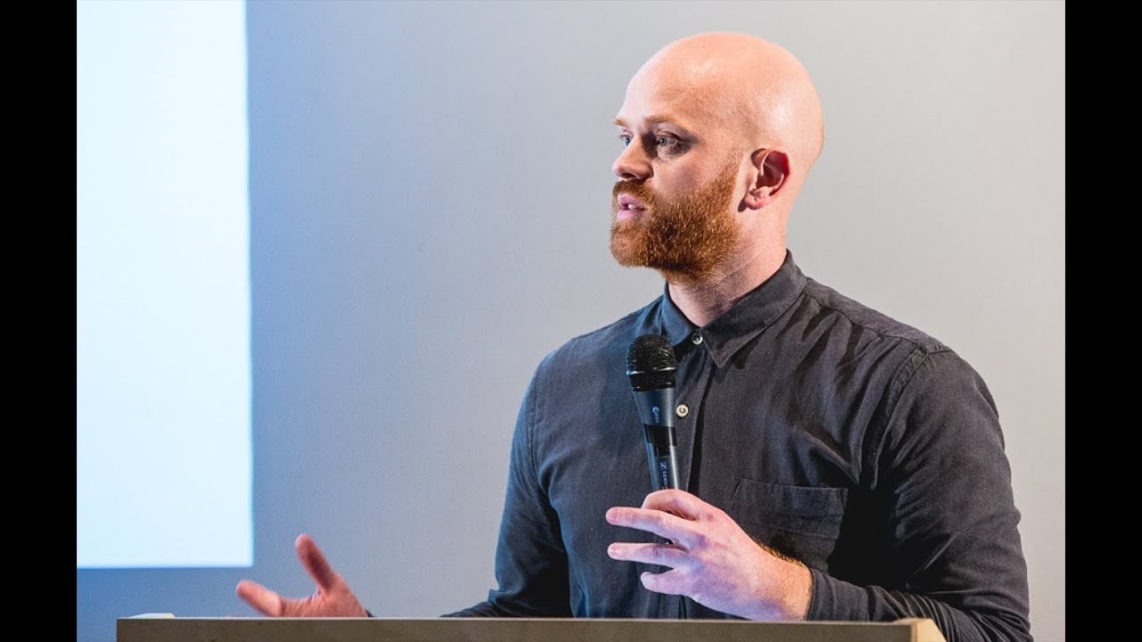
“It's kind of very daunting to be working on something that was going to be seen by billions of fans all around the world.”
[Applause]
thank you.
So I'm creative director at design studio and I'm just going to be talking you through kind of the process that we went through so we started working with the Premier League last August when we got a call.
And it almost seemed like a bit of a joke that someone was calling us saying would you like to pitch to Rebrand the Premier League so everyone in the studio was kind of like a little bit in disbelief that. There was this opportunity to Rebrand something so famous that so many people in the studio had grown up with and kind of idolize the footballers and the clubs that they kind of stood for so not only did we get to pitch for the Premier League we won that pitch so again we just kind of ecstatic they didn't actually give us the trophy on day one unfortunately but later on they trust us a little bit more and kind of like allowed us to have it in the studio for a short period of time.
So we were all kind of like this photo doesn't really convey it.
But we were extremely excited and energized to be working on that I think this is after a lot of hard work this F but we were kind of really excited to be working on something so kind of Epic but then also it's kind of very daunting to be working on something that was going to be seen by billions of fans all around the world so as we've every project that we kind of work on the first thing we do is kind of immerse ourselves into the world of our client so actually this wasn't the first thing we did playing football.
But we actually interviewed people across the whole business so everyone from the CEO in the company all the way through down to people who worked on the kind of in the grounds and in the community working with the the development of talent so we also audited like thousands of sports leagues and looked at all the logos Associated around Sports so there was kind of a huge amount of res Arch that went in before we even started even thinking about what this would actually mean so there were a few key reasons that the Premier League actually needed to Rebrand and one of the key ones was Barkley were actually stepping away as sponsor so for a variety of reasons they decided that they no longer wanted to sponsor the Premier League so this was a like a fantastic opportunity for the Premier League it was the first time in 25 years that they could actually own the brand themselves and everyone had known the Premier League as the Barkley's Premier League so this was the opportunity for them to really take ownership of and take the ownership back to themselves and build some equity in it.
So the second key challenge that the identity needed to address and the brand needed to address was kind of all the negative things that come around and associated with the Premier League so people talk about the best players in the world playing in the Premier League but they also talk about a few like few of them are English they talk about the best clubs in the world.
But they charge too much for tickets so one of the key things that we really needed to do with this piece of work was understand how we could change perceptions because the Premier League is actually doing fantastic things and has been doing fantastic things in the community even abroad as well.
So it's built over 500 artificial pitches in the UK it supports coaching for in every school in the UK and it also does things abroad so it's like helping with training camps in refugee camps and really kind of promoting football as a positive force throughout the world so what we needed to do was allow create something would allow the Premier League to talk about all these great things because one of the things that the the brand looked like this. So it was very blue cold felt very corporate and there was no kind of flexibility so if they were talking to a corporate sponsor or they were talking to a child who was just getting into football everything looked the same so what they needed was something that with like great flexibility so after auditing kind of where they stood we kind of and looking at all the research and immersion stuff we had gone through we kind of came to an idea of how we could achieve this.
So I'm G to play you a very short film which is kind of like a small cut of the the film that kind of sums up that creative idea ♪
[Applause]
[Applause]
[Applause]
so this was kind of a very emotive way that we could get to the shorthand of what the idea that we came to was which was we all make it.
So it was about telling stories and telling stories from the perspective of not just the players but everything that happened off the pitch as well so everything from the coaches the coaching they do in the community all the way through to the things they're doing abroad bringing football to PL places where they necessarily see that as a really positive force so we centered the kind of core idea around this idea of we all make it so from this then we needed to think what does this look like visually so again we came back to some of the research that we'd gone through we' kind of spoke to I think over a thousand fans in a survey and 90 like 90% of them said that they Associated the lion with the Premier League so obviously this was like a good place to start.
But we needed to kind of fully understand what a lion means in society so we spoke to a human an animal studies professor rampton and he kind of guided us as to what lions me. And so in society and all the kind of semiotics around that.
So the feedback was kind of overwhelmingly positive around Lions they're the only nons solitary big cats they work as a team when they're hunting so there's a lot of things that we could bring back as like positive cues that really fit with what the Premier League is about we also looked at the existing logo and kind of this is kind of a heat map of what you look at when you first see the logo so immediately most people are drawn to it around the face and we thought that's really interesting that the lion's head where it communicates is kind of the key Focus so what we wanted to do was simplify what it had at the moment and move it back to being just about kind of the head and the kind of emotions that you could convey through that so as you saw before we had the trophy in the studio so we looked for inspiration and kind of the shapes and the elements that were EX existing in the trophy and then we started to sketch what that could start to look like we were looking at how how far we could simplify it.
And this was just a few things that a few sketches of the the things we started to look at the key thing was we started to look at changing the perspective so before the line was looking straight at you which felt quite confrontational so we were looking for something that felt more kind of emotive uplifting with a sense of Pride and kind of looking looking away into the future so we' done by this time I think this was we've done a lot of work.
And then we got to I think it was December and the Premier League we developed all of the identity everything was signed off. And we're like this is great it's all been signed off we can like start to kind of implement this and see this in the real world.
And then on the 12th of January the story leaked that the Premier League was rebranding it wasn't due to launch until in the summer and yeah there was just suddenly a huge debate around CES or The Lion and the fact that we as an agency going to kill cile and get rid of him.
And it wasn't true which was the the strangest thing it was it was quite shocking for us we were kind of very like oh we need to react to this we need to kind of say this isn't true but the Premier League they're very used to dealing with the media both positive and negative so they were very they were kind of quite cool and calm about it.
So they were like don't worry about it we just don't say anything. And it was and we were like okay great fans obviously tweeted about it.
So yeah it was kind of yeah that that wasn't the worst one unfortunately Barry had passed away the same week so it was all kind of quite negative but after a few days it kind of all died down a little bit and but what had happened is on the 8th of February the Premier League decided that they were going to launch the logo and we were kind of surprised by this because we thought everything was going to be launching in the summer because you can tell a really cohesive story about why we're changing and kind of really communicate what it means to everyone moving forward but because of the trademarking process and the leak that the that it was being rebranded they decided that it was going to be safer to launch the logo on its own and tell that story. So it launched and this is where we got to with the Premier League symbol so we simplified the lion which was all about making sure it was going to work primarily in a digital space so they a lot of broadcast and everyone's moving to watching football either on their phone or on the iPad so it was about creating something that really worked well in a digital space which was difficult and also something that sat with all these kind of iconic Brands and the world they lived in not just sports brands we developed a word Mark which was all about flexibility so this allowed us to lock up the symbol in different ways which was kind of the restricting element of what they had before it was always portrait which just meant it didn't work in lots of instances so we had a lot of flexibility how this could work everything through hoardings to how it started to work on the ball one of the biggest changes which got a lot of reaction was adopting a more vibrant palette so we went for very bright colors that F fitted more in the World of Sports and less in the kind of corporate land that they'd been living in previously we worked with monotype to develop this typ face which is Premier League SS and again it's all about accessibility working well across digital and broadcast and being a lot more friendly less shouty previously that everything had been en capap so it is moving to being much more approachable we also looked at the art Direction.
And it was all about telling those human stories about the people who really make it and treating them with the same kind of respect as the stars and making sure the quality of the photography and how we depict them with as much care as we did with the players there was a need for some graphic elements as well so part of they do huge events all around the world. And sometimes you need to put them across Holdings and we created this pattern which was based on the Lion's Main and this is also designed to work well in like broadcast and digital spaces where we can animate we decided not to animate the line because we thought it might get a little bit cartoony and a bit Lion King as you'd seen before unfortunately I can't share everything we've been working on them with because it's still kind of we're still working in the process to launch everything for the new season.
But these are just a few images that kind of give you an idea of how some of the graphic elements come together so when it launched there was a lot of positive and negative press as with everything the Premier League seems to do the guardian kind of took it upon itself to launch a competition to design a better logo because the Sports wrer didn't like it there's some great ones in there I particularly like the one with the Airbnb logo in it because we also did the Airbnb logo but it wasn't all kind of mocking and making jokes fortunately this is one of the favorite tweets we had in the studio that Gary liner liking it meant a lot to all of us singing play for England so this is kind of just the beginning for the premier league and it's really about what they're going to do over the next couple of seasons and how they're going to drive kind of reappraisal of what they're about and change their image in the media so hopefully the identity we developed and the way we're working with in the future is going to help them get to where they need to be thank you [Applause]
Latest Talks
-

Will Anderson and Ainslie Henderson
Bringing stop motion sorcery to BBC’s Small Prophets
Watch -

Amber Weaver
How does contemporary type design translate into the wider world?
Watch -

Murugiah
Why you should reject the formula and make art about things you love
Watch -

Marina Willer
Design thrives when you find poetry in the simple things
Watch -

Lizzy Stewart
The hundreds of drawings and writing-on-a-whim that goes into comic novels
Watch -

intra
The rewarding process of recognising the art in obscure everyday life
Watch