
Territory Studio is known for creating on-screen graphics that enhance storytelling in films like Blade Runner 2049. Creative director Andrew Popplestone leads the team in achieving a distinctive 'organic and grubby' aesthetic through innovative techniques.
Territory Studio
Designing the screen graphics and broken-down technology of Blade Runner 2049
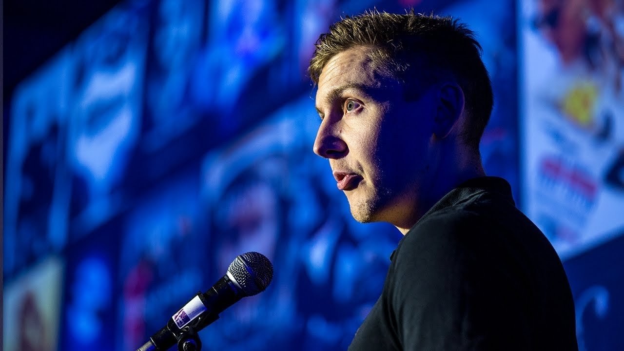
“We wanted to create something that felt lived-in, like it was part of the world, rather than just another piece of design.”
Transcript: May contain minor errors or formatting inconsistencies.
[Applause]
hello I'm my name is Anja Papa stone I'm creative director at territory studio in London we're a multidisciplinary studio and we do a lot of work in film predominantly but also TV brand commercials experiencial cultural and future tech projects here is a an overly technical diagram for what we do in very nonspecific terms we like to think that we're kind of at the intersection of story technology and design and we have a really wonderfully talented wonderfully talented team of around about 70 to 80 artists designers producers coders everything in between work across some motion graphics and visual effects for film and as Ivan said we're we're lucky enough to have worked on Prometheus guardians of the galaxy ex machina the Martian ghost Nichelle Blade Runner and recently ready player one but what I'm going to talk to you about a little bit more is Blade Runner 2049 and the work that we did on it predominantly it was we were asked to conceive the screen based technology and the graphic language throughout the film.
And then we were going to we replayed that back on set to act as kind of lighting sources and also direction for the actors for them to interact with but I shall show you some of the actual work I want to ask you some questions ♪
just checking in on an old serial number that's gonna be dead ♪
[Applause]
you so how did we get involved well David our founder at the founder of the company his first project when he set territory up seven years ago wasn't prometheus and he worked with Paul Inglis who was the supervising art director and David somehow discovered that Paul was the supervising art director on a rather covert film which turned out to be Blade Runner 20 49 and called him up and said hey quite frankly I'll give my right arm to get territory on this project and lo and behold two weeks later we were flying out to Budapest to go and get a brief and it was it was a rather interesting experience because kind of we were ushered we got we got to set and we rush it into this this huge room with this massive table and we didn't really have any information we didn't we had very little idea of the kind of work we were going to be doing and who were going to be even talking to Paul walks in then the production designer Dennis Gassner walks in then Denis Vaughn of the director walked in then a whole bunch of the visual effects guys the post soups the producers and executive producers were walked in about 20 pretty influential people all in all.
And it kind of just turned to us and said right off you go and luckily I had a few few mood boards up my sleeve which I'll show you but top tip always have some reference imagery always or be prepared to think very very quickly so at this point the brief was extremely broad and and Danny he's he's just the most wonderful passionate person and and he just spent the whole time kind of just trying to help us understand the context of the film and and his vision of the film you know this Blade Runner 2049 was it's in the same universe as the previous film.
But it's it's kind of I mean it's 30 years later and it's slightly diverted somewhat because of this cataclysmic event and what's happened is that all of the digital technology had been wiped out. And so what he said to us was right we're in this world which the technology is completely different it's not digital based what is it right it's we're in a bleak dystopian universe and that was ultimately his that we ultimately his brief he he knew what he didn't want he didn't want marvel he was like if it looks like it's one Marvel film I don't want it.
But that and that was his challenge you know he wanted to see something that hadn't been done before which is great but it's hard at the same time so here's some of the you know some of the moves that we luckily had and started to talk through with him and the things that he really responded to was anything which was one sort of kind of super low Phi nothing that looks slick or high-tech anything that was quite organic you know this one here was you know bioluminescent stuff he loved it because it was just pretty abstract pretty organic which is what this this world is you know it's kind of grubby and again it's got this kind of physical tangible feeling like this microfiche stuff anything that didn't feel like it was a screen based material this one was all about texture and imperfections and and when he started to respond to some of this stuff I said well okay what about if we start throwing in some handmade processes you know the kind of kind of human imperfections and the human process is that that bring those that bring it to life really.
And that's what he kind of got really excited about that.
And then when were on set and we went to set a couple of times but when we were there the first time we got to kind of dig around the art department a bit which is great and we were in Dennis castner's office and it's it's plastered with all this concept art which is fantastic because you know we really got to get our heads to what this world's like you can see it's you know it's very much it's very grubby it's very bleak and dystopian this is this here.
This is Josh's office Joshy is the she was the police lieutenant and so we created a graphic language for at the LAPD and a whole bunch of this was and was in here and there was a facial scanner and there was kind of various kind of replicant records and various other bits and bobs oh and the baseline as well which I'll talk about in a bit this one was the the morgue scene and this was quite important because you can see you can see the screens there it was this was where our graphics really helped to push the story along much like what and conversely the market scene here was very much an environmental kind of everything we created about 50 graphics here that will come together to create one overall impression as the posters just having one story beat so ultimately our task was to create the graphic language throughout the film and what this does is it helps to helps to define the characters and it helps to build the universe and it does that in a couple of ways ultimately it's all about story so with what we create it helps the director or the film maker tell his story or her story Levana it's more it's not just making stuff look cool it's you know you you see it all the time in any sort of Marvel film you get hundreds of screens of super high-tech looking stuff and it looks wonderful but it doesn't really do anything it's not telling you anything specific what Denis did really cleverly on this film was that he used technology and and screens and graphics very sparingly but ultimately in doing that it made their effect on the story much more significant you can have the best looking graphics in the world.
But if it's not doing anything it's not communicating then it's kind of pointless we had we had a great example of that in when we were kind of knocking out some concepts and and we created this beautiful graphic and he absolutely adored it and you know he's like I say he's a his french-canadian guy and he gets so so into stuff and he absolutely adored this graphic but it wasn't quite he said it was the most beautiful graphic it ever seen which is a wonderful thing to hear but it didn't it didn't work so ultimately wasn't used and what our graphics served two main purposes you know this was a this is a detective story so you know he was we're going from one clue to the next and when our graphic steve was helped to to communicate a certain story beat a plot point and help drive the story on to the next clue for example like in the morgue scene or it's it's a well building device and it's adding layers subtly layers and layers of contextual detail which helps to ground the film in reality so when we got back to the studio we started to write up an internal brief how do we go about creating conceiving a whole new technology when we have no point of reference all we know is digital tech in our generation at least so we kind of had to throw out the rulebook somewhat and and step away from the Mac start playing with handmade processes and experiment and it felt like going back to art school for a while we had two weeks of concept and and play with weird and wonderful techniques that we could that we could create this kind of organic abstract kind of handmade loaf I feel and here's some of the process work ♪
[Applause]
[Applause]
[Applause]
so one of the things from the guys that to experiment was to play with macro photography for with with fruit and vegetables and various other weird and wonderful things we actually had a pig set in the fridge at one point because Peter decided that would be a fun thing to photograph and you know that was actually weirdly enough in the you can see in the top left that's a grapefruit and that. Actually became the basis for so what we did was we use photogrammetry and that's the idea of that is I'm sure you know is taking a photograph of an object from every single angle and you can recreate that in 3d we then brought that to life and that became the basis for the baseline which is where Kay when he's being interviewed it's monitoring his brain so that a grapefruit became Ryan Gosling's brain basically and and some of the other processes we played with you know we started thinking about physical and tangible processes you know in my head it was always something this technology was something.
That's going to be chemical combined with something kind of mechanical and so we started playing with kind of like physical lens is shifting into place because we can't you know you can't do a digital zoom so how do how do we zoom into someone's brain started playing with texture again I think this is some more I think there might be a banana actually about it. And this is where.
This is where the grapefruit came into action. And so this this was when we initially had two weeks of concepts and these were we explored a whole bunch of different designs we initially started looking the LAPD route and that that sort of graphic language as an area and this stuff here even though I thought it was it was lovely it started to get a little bit too high-tech and we started to have to bring it in again and likewise here as well.
This is some stuff for the morgue sequence again it's like the lens is shifting into place and here what we were doing is we had to we had to tell quite a complicated sequence of events where they're analyzing this bone and I kind of moving around it in 3d to find and if they find this replicants DNA code on it this was some these are some designs which were kind of inspired by the microfiche vibe so very low Phi non reflective materials I really loved this and Danny really loved this yellow the yellow stuff but ultimately we moved away from that again it's very very abstract you know you kind of get the sense that there's you know maybe there's some sort of chemical behind it or there's some sort of depth to it.
But it's still quite it's quite tangible at the same time playing a lot with texture and process so you know printing things out scrunching them up drawing into them scanning them back in reprinting and then just using those those textures and those layers taking them back into the CG and applying those kind of those human elements that those human imperfections to create this kind of imperfect technology and once we started to develop these concepts and talk them through with the knee we started to define certain rules for each area so LAPD was much more grungy and broken so he'd elapid ated it was much more colorful at the same time whereas the wallace tech which is used the knee and the wallace is the body and he's got this kind of super high level technology in the world with everyone else it's all pretty low fight but his stuff is all very cold and inhuman by contrast or dehumanized and it's very stark black and white just fine lines very very minimal very purposeful this is the interior case spinner and this is this is kind of how we'd get a brief from the art department as to the layout of things how they work you know how does this machine work we had to take a lot of inspiration from aeroplanes airplane functionality again it is all very it was very colorful so the opening sequence of the film its Kay trying to go to sapa Morton's Supper Norton's farm and it's it's kind of essentially a Dust Bowl and it's bleak and it's quite d saturated and initially we had this kind of bright yellow vibe going on or rather it was kind of a like a golden vibe and Denis said no I need I need color I need you know you need to bring some vibrancy into this thing and and all of a sudden these screens became these the pops of color and they became light sources as well and Roger Deakins used them as light sources here are some more designs for the LAPD again very very grubby tangible it was all the idea that was all going to be hand written so this is some of the some of the final work now moving into when I was talking about Josh's office this is the LAPD face recognition facial recognition scan her and there's a scene in the film where love who's the kind of the bad he assassin goes to Joshy and is demanding to find Kay when Joshua refuses she kills her and and uses her head her face to break into her own computer system and I was talking to a guy and gadget man gadget said a tech magazine in the states and he was telling me about when he actually saw the first time he saw the screening of the film I think it was a bunch of tech people and and at that scene there was kind of a ripple of laughter going through the audience because the iPhone eight or whatever it was has just come out.
And it's got the the facial or the the retina scan as a security login and it just shows how one how prophetic this was and also how useless the the retina scan is so and this is the this is a the Wallace limo so as you can see by by contrast the LAPD stuff this stuff is completely slick completely clean you know very austere and cold which one reflects the company but also reflects the character at the same time so again it's starting it it helps to add extra layers of theme and context to not just Wallace as an entity but Wallace as a human as a character and that is that ultimately the thing about this project and why it was so wonderful for us not because it was Blade Runner and as a you know as a designer and as a as a film geek it's kind of a bit of a pinnacle pinnacle project to work on but to work with a director like Denis was was really an inspiring and wonderful process because he was someone that not only encouraged you to experiment but but wanted you to because he knew that that he knows that's how you you get the best out of something you know and and it took that for us to realize that. Actually you know the easiest thing in the world is just to do normal CG work or the coolest visual effects or use the best technology but actually stepping away from the Mac was incredibly liberating and sometimes it's that's just the best thing to do so yeah that's it thank you [Applause]
Latest Talks
-

Will Anderson and Ainslie Henderson
Bringing stop motion sorcery to BBC’s Small Prophets
Watch -

Amber Weaver
How does contemporary type design translate into the wider world?
Watch -

Murugiah
Why you should reject the formula and make art about things you love
Watch -

Marina Willer
Design thrives when you find poetry in the simple things
Watch -

Lizzy Stewart
The hundreds of drawings and writing-on-a-whim that goes into comic novels
Watch -

intra
The rewarding process of recognising the art in obscure everyday life
Watch