
Michael White is the creative director and founder of Studio Lowrie, known for creating the Sundance Film Festival’s latest identity. The studio operates out of shipping containers and has a distinctive approach to design collaboration.
Studio Lowrie
Designing a film festival's identity from inside a shipping container
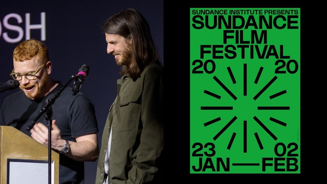
“It’s quite a surreal experience, especially being in a shipping container doing a PDF over Skype.”
Transcript: May contain minor errors or formatting inconsistencies.
Hi guys thanks for giving up pancake a for us so hello we are studio diary and this is my gran she's 91 tiny and Scottish and she's a big fan of FaceTime as you can see her middle name is Larry which has been passed down to all the women in my family and now it's our studio name so Larry is two people it's a getting our names so I'm Mike the creative director and founder and this is Kalyn the design director our team often grows depending on the project. And we regularly collaborate with talented individuals outside of our own skill set this means that each project has its own idiosyncrasies but it's grounded by our combined interests in typography and color and yeah and we're here to talk about one project in particular Sundance Film Festival it was an incredible project for us.
And it's been a year in the making and it took place a month ago. And this is the email that started at all in late March last year to our studio email so this was from Luis Farfan the recently appointed and first-ever creative director of Sundance Film Festival and being such a small and relatively unknown studio a hundred percent we thought this was a spam email or an early April Fool's or something like that. And it hurt but it turns out.
This is the first year that they'd ever reached out to a small studio to pitch to deliver the branding for the festival so for those of you that don't know Sundance Film Festival was started by this handsome man in the late 70s that actor Robert Redford aka the Sundance Kid and it's the largest nonprofit independent film festival in the u.s.
Taking place in Utah Salt Lake and Park City with around 50,000 people attending the festival branding is updated each year. And we were asked to picture the creation and delivery of the brand identity for the 2020 event so this is Park City Main Street taken from a previous festival and as you can see there's a wild combination of mountains architecture and people and the challenge was quite clear for us the branding needed to cut through that noise and permeate all of to all of those attending and the brief from Lewis was very specific which was extremely useful for us it's rare to receive something so precise but it meant that we knew exactly what we needed to deliver so they wanted to reinforce the festival as a vital inclusive cultural event on the global stage the celebrates and connects a huge range of people and mediums across multiple locations they were keen to draw a younger audience and they wanted to explore modernist minimal themes whilst having fun and they came to the right guys and it was important to them that it could be easily applied across all media for our proposal we put forward three different routes one of the one was our clear favorite and was eventually selected as the winner and we're going to explain a little bit about the thinking behind the concept and how we developed the full brand identity so the initial concept came from exploring the way that beams of light would actually come from a film projector then also the way that I guess your eye reacts to this light when watching the film so for example maybe your pupils would dilate when watching dramatic moment in a horror movie or contract when it's like a very bright scene from here we start to explore how we could represent this graphically and in its simplest form and this is some of our exploration we then resolved on this symbol it's very bold it's simple it's recognizable but it also communicates the idea of creativity and connectivity with all these lines coming together to one point it also represents the human eye it also represents then the film projector and even the Sun from here we start to work out a type of graphic lock-up that would work with this symbol we settled on a contemporary sans-serif typeface called Lonard designed by royal Gosling I don't know if that's how you pronounce it.
But that's my effort we refined this lock up to fit within which is actually the US standard movie poster size so it meant that our actual logo lock up is a poster itself we don't need to add anything else to it it is the poster then from there we created an additional seven supporting symbols these were to represent the diversity of the festival I said bold colors were also then selected and these were to stand out and what you saw on the previous image that the mayhem of that Street I guess the animations then came and they were developed to show how the symbols could interact over each other.
So this is just using one symbol over and cymbal and they create this certain whirring effect which again relates back to the the pupils reacting in the cinema screen the combination of these colors and symbols made the identity instantly recognizable but also feel fresh and different each point of contact so you can see here we've replaced the symbols on each one replaced the colors but they still feel like the same festival and this means you might go to one movie and in another movie the next day and see a different color or a different symbol but you still know that.
This is this is part of the same festival from here we then developed the lockups to allow the logo to work both portrait. And in landscape and this obviously means it can work really well on print and then on screen formats as well with the undeveloped flexible line based system and this was to have small pieces of text and also housed all this the sponsors logos because they can often be the thing they detract from your graphic language of your identity that you're creating but we thought if we include them and give them their own space then they don't you don't have a sponsor throwing their logo up massive on your page then we started to see here roll out our brand guidelines so we spent around two months developing the full brand guidelines which included pieces of print signage clothing merchandise wayfinding there was some sub brand identities these didn't happen by the way.
And now they should have but hey ho and there was mobile apps we've got one of these each yeah they did actually do the car but not quite the way we want them to do about hey ho but until for the festival there was actually over 1500 applications that needed to be made and obviously two guys working in the shipping containers next door we couldn't do all that ourselves so lucky for us. There was a team of eight designers who were out in Sundance as the in-house team and they were managing all that so sometime later after we'd handed over the brand guidelines like Callen said Lewis approached us again to work on a brand launch video and three branded trailers that would be played before every single film screening at the festival so we began working with corner Campbell you might know where is he it's got as fresh bleached here on today so you'll see him.
So yeah we began exploring ways to bring movement and personality to the identity on screen ♪
just a teaser so for the music Luis actually brought in the band beach house to create individual tracks for each trailer and these were loosely based on tempos from jazz it's hollow disco and rock and we play one at the end but now we wanted to play the brand launch trailer for you ♪
[Applause]
so some more months after that it began and we were lucky enough to make the trip over to experience him and the city is literally taken over by Sundance there's thousands of people everywhere everyone is there for the festival there's just an incredible buzz and everywhere you looked you could just see the branding it's quite a surreal experience especially being in a shipping container as Kalyn said doing a PDF over Skype and then suddenly going to this city of 50,000 people and they're all wearing it has no idea what it was gonna look like nine months there yeah.
So yeah there was a lot to take in and a lot for us to process and yeah as you can see the architecture is massively varied this is quite cool but the block colors worked really well for navigation so you'd be like on a bus and you just see like a block of red in the court in the distance and it just worked kind of so simply and so well ♪
volunteers will bright orange jackets and we're wearing other kind of various branded items which made them instantly recognizable famous actors like the branding so much they wanted to get photos in front of it.
And it was great to see the posters used around the city as well love this guy so yeah there was lots of people wearing the branded merch I don't know if you can see this guy but he had so much of it on he was obviously a fan so this was one of the sub brands we haven't really discussed these but we created like three sub brands for the festival and this one was new frontier which supports experimental artists and creative technologists and there was a VR experience where you swam in water wearing headsets and snorkels which was supposed to feel like you are floating in space quite interesting there are awards too and finally some pics of the merch which sold out before we could buy any so developing the trailers had been probably the the kind of most unique experience to us in the sense of our skill set and the first time we actually got to view one in the cinema was actually at the Film Festival it was a world premiere a 1,500 person cinema so there was no pressure there really so with the trip the three trailers the objective was to use the core brand elements as a starting point but to look outside of the brand guidelines we created so experimenting with typography color and symbols to create an experience that felt more appropriate for the screen and people were in front of the branding constantly outside so this seemed like a very good opportunity to surprise them and as we said earlier these are going in front of every single film.
So there was we wanted to try and make them feel different to everything else really and with Connors help that wasn't he difficult so one of the three trailers were randomly selected and played at the star of each film as I just said and we'd like to conclude by playing one of them today ♪
[Applause]
Latest Talks
-

Will Anderson and Ainslie Henderson
Bringing stop motion sorcery to BBC’s Small Prophets
Watch -

Amber Weaver
How does contemporary type design translate into the wider world?
Watch -

Murugiah
Why you should reject the formula and make art about things you love
Watch -

Marina Willer
Design thrives when you find poetry in the simple things
Watch -

Lizzy Stewart
The hundreds of drawings and writing-on-a-whim that goes into comic novels
Watch -

intra
The rewarding process of recognising the art in obscure everyday life
Watch