
Stuart Tolley
Designing a book on minimalism without making it look effortless
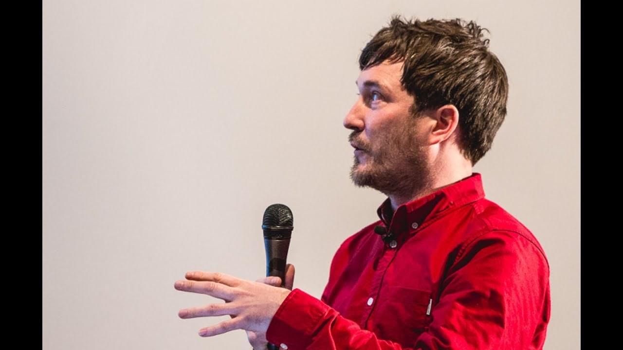
“Every time I mentioned the idea of my book to my colleagues and friends they unanimously said exactly the same thing — minimalism is really easy, put nothing on the book cover, that's all minimalism is. And it just got me thinking about where did this perception that minimalism is easy come from?”
Before I talk about the book. I just want to introduce my work. And some of the other projects I do so I'm the Creighton director and founder of a graphic design studio called transmission we're a small team of people. And we do a lot of work with different clients in their cultural charity commercial industries but the kind of backbone of our work is a lot to do with Creighton books and magazines for different clients I start the studio about six years ago. But in the last four years I've also written a couple of visual culture books which are published by Thames and Hudson.
This is my first book called collects edition innovative packaging and graphics which is all about the limited edition graphic design it's all about special editions deluxe editions all created for the music book and magazine industry so if you think about large format box sets screen printing covers that kind of gives you a rough idea of what the book is about I'm also really really interested in alternative print processes as well.
This is a really really good example for the band called shout out loud so this is a box set and inside the box set you get Butler distilled water a silicon wheel and a 7-inch record as well and the idea is that you freeze freeze the water over the vinyl and you wake up in the morning and you've got a playable bit of ice which is here it does work I've tried it it broke my turntable so don't try it yourselves I'm also really interested in the social aspect of graphic design and also tactile print so what the book is all about kind of the Renaissance and vine or where music and digital formats as well it's a really really good example of how you can introduce digital design and also tactile design for the banquet The Flaming Lips so this is a skull like human skull made out of gummy bears so the idea is you could bring a group of people together who kind of tuck into the gummy bear sweets and they eat into the jelly brain into the middle and inside the jelly brain is the USB stick with all the music. So it's all about bringing people together so as I mentioned the book is about limited ish and graphic design so to get upon myself to also puree a limited edition version of the book which we've got examples here.
There are 10 I did 10 in total and commissioned some of the most famous designers and artists to draw it directly onto the cover so you've got one in the top left-hand corners by Paul McCartney this one's by Wayne Coyne from The Flaming Lips got the artist Stanley Donwood and one from Nick Cave as well the brief for every single one was exactly the same and that was to reinterpret your artwork. That's featured in the book onto the front cover particularly like Nick caves one because if you see these last his last album cover called push the sky away it's got a photograph of his wife walking nude across their flat whereas for his interpretation of the book cover he's got a covered up and she looks very demure so quite like the way that it's sort of reinterpretation of it and all of these limited editions were sold off for auction as well and raised 6,000 pounds for the outsider society which was nice there's me.
So these books are really really personal to me and that is when my first book first came out and the first time I ever saw it on the Shelf I look sort of pleased myself I suppose but what it's really kind of important about it is that I put a lot of my personality my heart.
And soul weave into it my girlfriend once said these books are kind of an embodiment of my personality everything I love and everything I'm interested in so when it came to talking to Thames and Hudson about doing a second book. I had a mild panic because it takes about two years to make and there's a lot of work within it.
But I try and put my personality within it.
And so I started to try and think of ways that I could make it my own some of those ways of trying to link minimalism with sort of society today and looking at the fast-paced nature of social media and maybe this is a reason why minimalist design has started to become prevalent now every time I mentioned the idea of my book to my colleagues and friends they unanimously unanimously said exactly the same thing minimalism is really easy put nothing on the book cover that's all minimalism is and it was really it made me laugh but it just got me thinking about where did this come from where did this perception that minimalism is easy where did it come from and so I did a little bit of research and sort of found that the artwork from the 1960s when minimalist artists started producing work that was reaction against abstract expressionism which is very loose and very painterly and very free and there's one really really famous case by this American artist called Carl Andre and he created this artwork called equivalent 8 which is a large sculptural object big stroke triangle made out of household bricks this was bought by the Tate Gallery in 1972 but at the time the precious went like nuts over it I'm just saying it's a complete waste of money it's a waste of time what a load of rubbish and they were basically inferring that anybody with the pile of bricks would have made this artwork.
But I think the point for me is the fact that anybody with the pile of bricks wouldn't have made this artwork at all they just wouldn't have thought about it. And I think that's quite important and I think that was kind of the hangover for minimalist design I think it's still sort of last today personally I don't think minimalist design is easy I think it takes a lot of work and a lot of attention to detail I think you need a certain amount of confidence to work in it as well it's all about reduction.
So I wanted to try and do justice with my own design for the book as well.
So the book is split up into three different sections is reduction which is all about the how you reduce decoration and design clutter from the page another one is about production so looking at print processes and again how you can reduce ornamentation and the final section is about geometry so geometric shapes and flat colors so having the book split into three sections also gave me the opportunity as a designer to play around with these pages and just kind of go off grid and have a bit of fun so the book is split into three different colors three different sections agree and on the left-hand side there's always geometric shape the reference is that section so obviously here we have the less-than design but what I wanted to play around a little bit with the type so I wanted to push the title for this section which is obviously reduction and push it to the further edges of the page just to kind of create a composition.
But I wanted to push it as far as the type could possibly go but without.
Actually losing sight of what it says another really important part of book design is the navigation system and how the book is structured normally you find it in a top left hand corner or it can be some kind of decoration element within Paige but I only wanted to use the gutter of a book which is essentially the bit right down the middle and it's basically seen as a wasted space sometimes so I really wanted to use that as the main navigation system so as you look through your book you'll see these vertical lines running straight down the gutter and also it gives a nice little twist so that you navigate the books by looking at the outer sections by the side of the spine another really important part of the book process is the photography so every single photograph in the book is exclusive to the book I spent about a year photographing everything. And that's because I love all the projects that are featured and I want to give them the most amount of respect and space to do this I've got a lighting kit from the manufacturer called Bowens which completely transformed the project.
So I chose a different cut a couple very cool color palette which is consistent throughout and there's always a horizontal lines there are no kind of lines flowing off in different directions so it's all about the artwork. And this is actually quite a rare thing to do for visual culture books because quite often you use the existing photography so I also wanted to talk a little bit about some of my favorite items within the book.
So I really love this buy studio in Hong Kong called editors is called a Shoku orange the reason I really like it is because they've just used a hairline outline of an orange circle instead of using a full circle you can't really see it in the slide but it's actually filled with varnish as well really love the way that the type is just really lightly composed around the outside and it's just that one flash of orange just on the outer edge of the book.
I just think it's a really beautifully composed bit work I also really love these posters by Demi and Conrad studio for the art byall festival these are large formats they're kind of like bus shelter sized posters but they're screen printed so screen printed onto fluorescent colors so the Gold's the silvers and the sort of bronze colors are all hounds printed which in terms of production process they're just like it's amazing it's outstanding but the thing that I'm really liked about it is imagine them in a busy city centre so if you're walking around and there's lots of visual noise and a lot of people on their phones and there's a lot of distraction these will sit in the middle and they'll just be just that information the geometric shapes and I'm just imagine they'd really really stand out. And I think that beautiful and it's one of my favorites from within the book I'm really into music so anything music design I'm a sucker for this is by the designer a musician called Trevor Jackson for his book is called format you can buy this in two different formats and itself so every single track is recording onto a different format it's got VHS you've got cassette mini disc vinyl and also reel-to-reel cassette why I love this is there is no decoration whatsoever it is all about the production and also you know I can't imagine a lot of people have many discs anymore so finding someone to record it let alone buy it must have been a big issue and I just love that it's all about the concept so yeah.
So that's basically an insight into my book.
I think what I'm trying to say with the whole book is the fact that if something looks effortless doesn't necessarily mean it was created with little effort so thank you very much for letting me talk and I hope you get a chance to look at a book
Latest Talks
-

Will Anderson and Ainslie Henderson
Bringing stop motion sorcery to BBC’s Small Prophets
Watch -

Amber Weaver
How does contemporary type design translate into the wider world?
Watch -

Murugiah
Why you should reject the formula and make art about things you love
Watch -

Marina Willer
Design thrives when you find poetry in the simple things
Watch -

Lizzy Stewart
The hundreds of drawings and writing-on-a-whim that goes into comic novels
Watch -

intra
The rewarding process of recognising the art in obscure everyday life
Watch