
Sonya Dyakova is a renowned graphic designer known for her work in typography and food photography. She runs her own studio, Atelier Dyakova, and draws inspiration from her personal experiences with food and cookbooks from the Soviet era.
Sonya Dyakova
Designing a history of food photography between vintage cookbooks and contemporary art
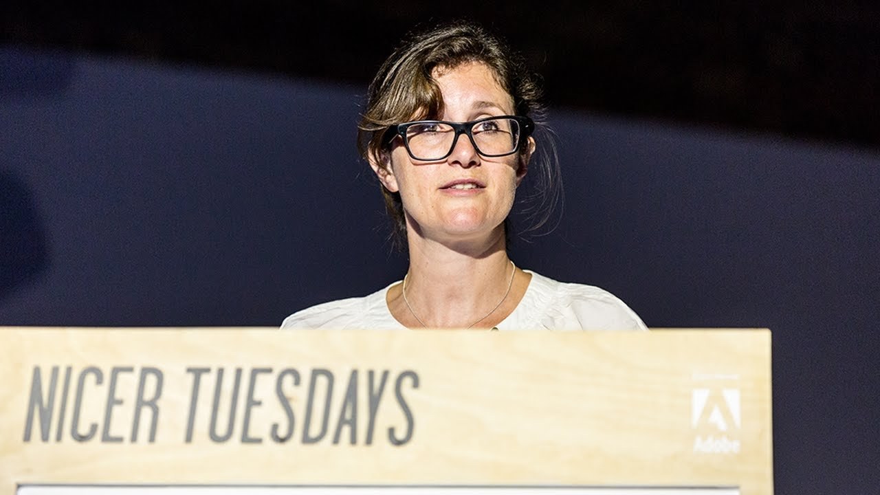
“Food is so central to our lives and there are so many personal memories attached.”
Transcript: May contain minor errors or formatting inconsistencies.
Thank you hi my name is Sonia and I'll be talking about the book that we've designed recently which is about history of food photography for aperture in New York just a bit about myself I am a designer and art director living in London.
This is our studio and I have a small team and we work on a variety of projects books magazines branding websites and packaging just a bit where I come from I was raised in Siberia in Russia it's just there my family immigrated to San Francisco in 1989 and I studied in San Francisco and afterwards I was thinking oh you know maybe the states is not my cup of tea and I came to London to find the dream job I loved the work that was produced in London it was so attractive to me. And I also like the diversity of it and when I got here. I just loved it I worked with Vince Frost and afterwards car Noble before I went on to Art direct and design books for fighting press in 2005 where I stayed for 6 years this was my studio in or office at fiden and at the time Alan Fletcher was creative director and it was amazing to be able to speak with him and to he was sort of a mentor so that was a real perk of the job and at fiden I had an opportunity to design for books for artists that I really loved and one of my first books my actually my first book that I got to design was a 800 page monograph about nbu Yos araki he's a Japanese photographer a very prolific one and it was just unbelievable that I got to do it the book contained personal texts translated into English for the first time.
And in this limited edition I was able to use special papers to portray the playfulness of his personality another highlight in those six years was that I learned to experiment with formats and think Beyond a standard book object so in 2010 I designed this book called cremier It's a curated collection of 100 emerging artists and because it was about new artists I thought of it as making news and which led me to the idea of a newspaper and so I modeled it on Financial Times which was slightly ironic because we were in the middle of a major recession and being a newspaper rather than a hard-bound book it was considerably cheaper and I thought that people would rather buy magazines and read online about new artists so the content of this nature was more suited for this format I could also make images really large and not to worry not worry about such about space whether I can fit everything in this book was awarded with a Grand Prix at the Tokyo type director Club which was really nice I worked on a variety of books for example on subject of sculpture here I took the idea of three-dimensional aspect of sculpture and create created a paper alphabet cut out out of a single sheet of paper we photographed all the different type setting and with my husband who's a photographer at Park and that was a really nice project to work on another good project was younger than Jesus artist directory and because it's an artist directory I made it look like Yellow Pages it was printed on the same paper as a phone book would be and I used the exact same type face that Matthew Carter designed for AT&T six years ago. I was invited to redesign freeze magazine it's a contemporary art magazine and it was time to sort of move on from fiden and become more independent it was a real new environment an a challenge I've never designed a magazine before. And I don't know how they trusted me with it.
But I think the ability to edit images and make them look really presentable maybe that was their attraction I loved working with imagery and typography at a faster Pace it's a different game to book design it was a really incredible experience to work with the team of editors and I learned a lot from them some of the covers that we did and at the time I also started to learn how to work with digital so I directed the magazine that was applied to an app so it was a digital magazine free started a new artfare which was about artworks that ranged from ancient icons to 20th century art. And I have designed a magazine for this Fair which was about looking at art of the past through a contemporary lens so we just literally cut out a a viewing hole in the front cover which then revealed an image inside so this would be what you would see on the first page and it was really important to me to make this look really modern as a contrast to the content so in terms of typography I thought what in typography world who is the master which type faces the master and helvetica came to mind so I set the entire magazine in has grotesque which is the original version of helvetica before digitalization.
And so while I was working with freeze I started to do work and develop relationships with clients like ktia Foundation aperture hous and worth and gagin the position was initially four days a week and then it became two days a week so I had the opportunity to do other things on my own so one one year ago I left freeze magazine to concentrate on my own practice and we are proud to work with interesting clients brilliant content and we are continuing to grow so aperture is a client that I started to work with while I was still at freeze and when they said that there will be you know a new project about food photography we got really excited and and food is so Central to our lives we have great personal memories associated with food when I was a girl I used to look through my grandmother's cookbooks in Soviet Union and was mesmerized by the colorful images and illustrations and just spend hours looking at them so when this project came in we immediately started to look at vintage cookbooks looking for references and trying to understand how we can take inspiration from it it was really good fun as you can see it's really kitchy the typography is wild this was one of my favorite I'm just wondering what you know do you just get drunk and put put the casserole in the oven or how does it work it had very strange color combinations you know just really weird and we love that so our first initial reaction was let's make something like that. And it will be really fun until we realize that you know wait a minute let's look at the content is it really going to be appropriate for all of the images is it going to be strange so looking at the content the imag is really very it and the chronology covers a long time period we're really looking at the development of food photography and whilst we have images like this we we also have images like this.
So this was a real kind of stopping point and scratching our heads a bit you know we have Wolf Gang tilman's we have Edward West helmet Newton some images are not really only about food but it's about society as Martin par Tim Walker images that are part of Contemporary Art. This is fitle and wise Sarah Lucas and fashion.
So this stopped us on our in our tracks and we sort of made a diversion. And we thought maybe there's another route to this.
But we started looking at still life. And I remembered this still Al in my teth just incredible color the flatness of it isn't just fantastically so modern the patterns the just love how flat it is and we really wanted to we didn't know what we were looking for but I remember looking at this towel and connecting it with this reference and I were sort of looking at making patterns like tablecloth patterns and so we tried a few things which sort of looks good but then.
I think the real objection to it was that the book is full of imagery and we would be creating yet another image that would decorate the book. And so we went back to the idea of typography this was one of the books that was actually part of the content and I looked at that book. And I said you know how do we find a way to create a feeling of the past but but in a modern way even though this cover was from 1903 there's something really modern about it the way that the type sits on a plain color this gave us an idea how we could find a balance between modern and vintage atmosphere the letters are the letter forms are interesting in themselves and so you don't really need other bits and Bobs you know patterns or decoration we thought this type specimen book was really inspiring and it just was so powerful the color of it the everything and The Story Goes that this book this specimen book belonged to Yan chold and then found its way to Paul Rand so it was like an added interesting fact but we loved it. And we basically got inspired by it.
And we tried to use striking type on a mustard color paper and we looked for Revival type faces that were influenced heavily by the past some of them were Victorian type faces but they were still done you know last year. So it still had a modern sort of feeli to to it this just kind of outtakes and things that we didn't go for so in the end I really fell in love with this type face which sort of also plays on the idea of A Feast for the eyes you're sort of looking at it. And it sort of plays with a with the geometry of it or how you perceive it. So it has a double meaning in a way we presented this as the front cover type only option and the publisher felt that this book was aimed at a much audience and insisted on using an image I was upset but it's the usual story I'm kind of used to it now.
So we inser an Irving pen image into the cover and with a very modest quiet type and moved the Bold fancy type on the back this way we didn't have to give it up and and it's a bit strange to have a title on the back but you know take looking looking at all these cookbooks I think it's acceptable to take inspiration so as a result we had quite a pallet of elements a lot of type faces I think four in total but they don't conflict with each other I think they kind of inbalance or compliment each other.
And I think it may be to do with otherwise other than that the layout is quite minimal and for that reason I think it works so in inside there are sort of additional flourishy type faces but I think they work well.
So yeah really nice to have such variety of material I love that I think this one is a good one to end on thank you very much
Latest Talks
-

Will Anderson and Ainslie Henderson
Bringing stop motion sorcery to BBC’s Small Prophets
Watch -

Amber Weaver
How does contemporary type design translate into the wider world?
Watch -

Murugiah
Why you should reject the formula and make art about things you love
Watch -

Marina Willer
Design thrives when you find poetry in the simple things
Watch -

Lizzy Stewart
The hundreds of drawings and writing-on-a-whim that goes into comic novels
Watch -

intra
The rewarding process of recognising the art in obscure everyday life
Watch