
Smörgåsbord
Redrawing the dragon: how a nation rebuilt its identity around flag and language
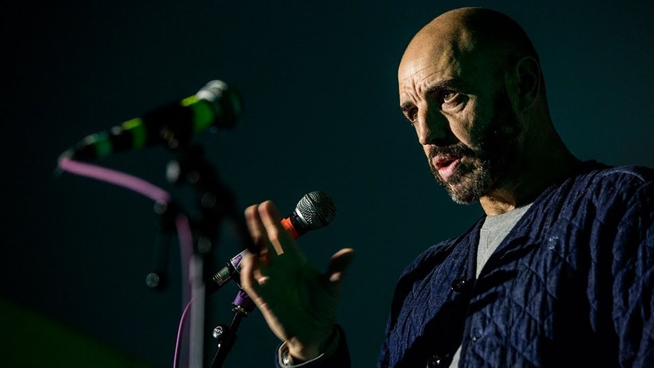
“I don't think that you can do justice to a country if you're living there. If you've been asked to brand the nation, I think you need that objective view.”
[Applause]
[Applause]
thanks Owen we were actually trying to brand them without that lot but still thank you okay. So as I once said we're going to talk about the the Wales nation brand a brand that we've been working on for the past 18 months for the Welsh government but first of all a little bit about smorgasbord let's just check is it this one or this one this one that's the taller one yeah.
I think so okay. So it's more is what we are smorgasbord we are a team of six people based in Cardiff their capital city Wales and Amsterdam and we split our time between both cities dependent on where the work comes from so all the uk-based work comes through the Carlos to do and all the Dutch and international work comes through the Amsterdam studio we work on strategy blending content creation so actually good things that have an explanation of why we chose smorgasbord why the Welsh government chose a design studio with a Swedish name I have no idea.
But there we go I need to gallop through this because I've been given ten minutes so I'm just going to start off by showing a quick selection of ♪
so that was a quick overview now.
This is a slide not to show you where whales in Amsterdam is but the point of this slide is really the sort of what was really crucial for me when designing the the whales nation brand was a bit of objectivity because I don't think that you can do justice to a country if if you're living there if you're if you've been asked to brand the nation I think you need that objective view so whilst most the team of basting plaintiff or they were during the rebranding of whales I was based in Amsterdam in our little studio hidden away with my great-uncle looking over me bottom left hand corner with his was bunch of sheep and sheep dog but this is where.
I worked on most of the Wales brand because as I said I think it's really good to take itself away from being in Wales in the spotlight all the time why Amsterdam I've moved to Amsterdam nine years ago to be the correct director of NTV Benelux I love the city it's a really vibrant city I'm sure most of you have been there it feeds me.
Basically great stuff happening all the time in terms of branding in terms of architecture this is where I would play tennis if I did play tennis so it's large scale stuff it's small scale stuff the three crosses of Amsterdam the the crosses of st. Andrews which is basically Amsterdam's coat of arms dating from the 15th century that crops up time time again on street furniture on publications on communication you know it's really really tight they really get their graphic design and brand identity in in the netherlands as most of you wouldn't know that anyhow coming on to Wales Google Wells and that's what you get nothing wrong with that.
But we felt that we could do better so yes women in tall hats a bit of bala brief Welsh rarebit Rugby daffodils you get the picture but however that wasn't really my Wales call be biased but I think Wales is pretty epic and all France you know it really wasn't being represented in the way that I see my nation compact that is calling compact as opposed to small two hours from London Sounders for wearing working for the tourist board now.
But it is it is pretty epic it's got an amazing landscape Cardiff the capital there's an incredible city amazing festivals you've got first of all number six you've got green man etc but in jazz and yeah a lot to do there so coming on to the brief this is what we were briefed with we were charged with creating a compelling and visually consistent nation brand known to be applied across all consumer facing government sectors from tourism through the business to food and drink so whilst we launched it in the tourism sector first of all we built it we constructed it for plan sector usage so tourism was seen as the as the first step but then we had applied to business food and drink and now we're working on transport health and what else study actually so before we sort of picked up a sketchbook when anywhere near the Mac I worked with a close team of five people before I bought the rest of the team on board with the client and we worked out five core objectives and I think this was really crucial and this really shaped where we went with a creative so they were elevate our status surprising inspire change perceptions do good things and obviously be unmistakeably Wales for me it was the is most important because I think Wales is sort of it's been kind of underrepresented I think not only within the UK but also internationally and being Welsh coming from Wales and having lived overseas for quite a few years I know how good it is a part of me was telling me that I shouldn't be telling you guys how good it is but you know we were given a task and hopefully we've delivered that.
So this was our star point this was the the last iteration of the Welsh brand that was designed in 2006 nothing take me wrong with it I'm sure it was right at the time but as you might be able to tell they'll not be able to tell that is an abstracted dragon which is the the national symbol of Wales but I really felt that we were or I should say the government the nation were missing a trick because it didn't have much in common with a national flag which is actually rather iconic so we just felt that we weren't leveraging that in the right way so essentially we wanted to bring a more well a better more realistic dragon back into the into the frame.
And we came across this little gem on Facebook. And I think that's a fairly partisan but fair point so we felt okay however we have a slight issue with dragons in Wales that's six of them dragons haven't been respected I'd say in the past and I think that's why a lot of people were saying don't default or dragon.
That's the worst thing you can do but I really felt that no the dragon is the right icon to embrace but you know we had to do it properly and not like this so when use properly I think a dragon can be strong distinctive confident proud and iconic so we run about essentially drawing the the definitive dragon as we saw it.
So it took about five hundred attempts but essentially we did actually get to it fairly quickly because there were so many bad examples out there we knew what not to do so that became the if you like the the hero element of of the rebrand also we looked at taking another element at the national flag I the horizon line and this crops up time and time again in the branding whether it's in photography subliminally or in infographics or any other layer so to go with the the hero mark the dragon we decided that a bespoke typeface was needed to and we worked with the colophon type foundry from London who I believe are here this evening to do to develop memory Wales sans because we felt that the Welsh language is so rich and it's got a lot of different elements that really haven't been used in the past so we felt that having a bespoke typeface would really give us a sense of place and then. Actually the the typeface itself has become more of a sort of golden thread than the dragon icon itself so we started by looking at the the Welsh typographical Heritage two main books here decal Berlin and Kiev Taliesin they really informed the way we looked at the letter forms but I think it was crucial that we didn't sort of stray into into the territory of pastiche or parody because it's very easy to do that one of the typefaces that has always been associated not only with Wales but with Scotland and Ireland as well as American unicore developed by an Austrian in America in New York I believe in 1954 I don't know why it's been sort of embraced bye-bye 'since but basically there's a lot of this around so we had to be careful not to go in that direction.
So we started off by looking at you know what other nations were doing looking at alphabets or the typefaces what we liked certain characters from from other typefaces and that really informed our journey and then coliform took the baton and and took it to the next level so I mentioned earlier that the the Welsh language is pretty different I mean that is a BB set over to these two consecutive T's and that is a diagraph known as a in Welsh so we felt that that was the key to making Camry Wales sounds different that's a quick overview of the character set and this is a quick Welsh lesson.
So in in English Bracken is Bracken in Welsh it's a bird jambe so the first question a non well speaker asks is is Welsh a dialect of English look totally different so Cardiff coyotes and that is basically the the defining element we've got eight diagraphs otherwise could be referred to as glyphs in the Welsh language and we developed along with qualified as I mentioned five of them into these joining characters so whilst you see two characters they're linked and they've got a they've only got one sound so that became quite a defining aspect so chef Worth is a place in over North Wales near Buena Vista New York she's lucky enough to have three diagraphs in the name so you know it looks very different straight away so as soon as you drive into a town you see that sign set and tell me well sounds you know you're in a different country so we didn't want to scare people away by going full-on if you like straight away.
So we developed three levels and Kamri Wales sans so level one typically could be used for a sort of more sober or formal business communication level two is the one that we use most often and then level three is has got more personalities got added personality so level one might be used for a if you're talking to a business audience level two as I said somewhere in the middle level three if you're talking to let's say that North American tourism market so that allows designers to dial up the personality as they seem fit.
So I mentioned that it was constructed for different sectors through the government first sector was tourism so you'll see that we used level three on the left there.
That's the typical spread from from the first tourism magazine we're actually in the process of developing at Camry Wells serif as well. That's tiempos from acclaim foundry that's a very good standing but we're developing that for release in early 2018 that's it as applied to a job we did for red book.
So that's a place name in Pembrokeshire so straight away it gives you that sense of place and we also used it experientially for the first tourism campaign that launched under the new wales brand so we built a selfie magnet basically which tied in with the the hashtag the strap line for the year of adventure 2016 finder epic so this is a LED Invicta by four meter typographic of sculpture that we toured around Wales and then after rolling in tourism we rolled it out in trade and invest the business sector and it's exactly the same typeface we just used the the lighter weight and we've tracked it out.
But it's one typeface for all sectors is one brand for all sectors so it is a rebrand but the continuity for us was as key as the rear end another example for aasta.martin and after business we roll it into the food and drink sector and we really did put the type very sort of front and center here.
And I mentioned earlier that we've started working with the transport sector of the Welsh governmentís Transport for Wales and we've just developed again with coliform a stencil version of this called Camry Wales transport so I'm up to 15 minutes so I'm just gonna finish off with a quick three minute case study recap in the summer of 2015 smorgasbord was charged with redefining brand Wales our mission has been to develop a strong and unifying pan sector identity for our nation's future a brand that drives Wales forward on the UK and international stage and that inspires the people of Wales to get involved an identity that is proud of who we are and that is contemporary and engaging to the world a consolidation as much as a rebrand the new identity is the visual expression of our beliefs and values and where better to start than with the dragon that sits proudly on the Welsh flag every girl has the epitome of the Welsh nation on both the national and international stage strong distinctive creative and confident this new reductive and contemporary rendering of the familiar icon crucially reestablishes the link with our national flag another feature informed by the flag is the dominant horizon line itself suggesting infinite ideas and possibility our bespoke typeface takes cues from the welsh typographical heritage it features a number of special large characters or diagraphs but they're wholly unique to come rear ail sends a first for a contemporary digital typeface these characters will allow designers to bring in as much sense of place and character as is required representing Rails to the world in an authentic and creative way the typeface is designed to work in print on screen and online and specific weights cases and cuts have been selected to represent different sectors of activity from tourism to business food and drink to transport our choice and naming of colors has been directly informed by the Welsh landscape and its vernacular the color palette is wholly honourable in the same way as our new tag lace and each of the 18 colours is named after a specific place or location in Wales just as our colors have been informed by our landscape we suggest that color palates can also be created in the same way photography plays an equally important part in the identity ninety-degree aerials and bold horizon lines are established as signature stands our aim now is to bring a strong vision together with great design and bold ideas across rails to push our nation's story forward to create compelling new narratives narratives that elevate our status surprise and inspire change perceptions do good things and are unmistakably Wales according to the Rough Guides the national spirit is undergoing at a remarkable renaissance the ancient symbol of the country that there I Google is working past present and future this is Wales ♪
[Applause]
Latest Talks
-

Will Anderson and Ainslie Henderson
Bringing stop motion sorcery to BBC’s Small Prophets
Watch -

Amber Weaver
How does contemporary type design translate into the wider world?
Watch -

Murugiah
Why you should reject the formula and make art about things you love
Watch -

Marina Willer
Design thrives when you find poetry in the simple things
Watch -

Lizzy Stewart
The hundreds of drawings and writing-on-a-whim that goes into comic novels
Watch -

intra
The rewarding process of recognising the art in obscure everyday life
Watch