
Sascha Lobe is a German graphic designer and a partner at Pentagram, known for his work with the Bauhaus archive and his ability to channel the spirit of the movement into modern visual identities.
Sascha Lobe
Reimagining the Bauhaus archive’s identity without losing its experimental spirit
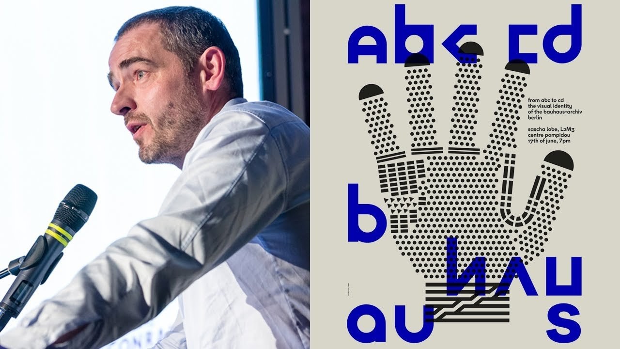
“Bauhaus had no preconception; it was experimental, searching, and often, unfinished.”
Transcript: May contain minor errors or formatting inconsistencies.
Hello hi obviously I am an immigrant and it's my first speech as a pentagram partner in London. So it's kind of something special to me. And I have to say I totally enjoy the evening so far and I hope that we not go down.
Now that you will enjoy my talk also yeah. I had my studio in Stuttgart in southern part of Germany for more than 10 years.
And we were working for all kind of clients paying clients non paying clients in all sectors and all areas so we did basically what classical graphic design studio wants to do we developed identities but we also had a lot of signage project and project in the context of architecture in the meanwhile I would even say signage is not a special not the correct word for what we are doing I'm talking about we because I always feel my team in me is it's the other one who are doing it. And I will continue to work with my team in instead couple will build a new team here and collaborating team here so what we are doing is not only signage it's it's it's more like let's say architectural branding it's an extension of architecture we tried to find the right visuals for certain kind of architecture so far I had really the pleasure and really clear about that I could work would put quite a lot of good architects at the moment still ongoing nearly done two projects with David Chipperfield one in South Korea not in North Korea but also for me very how to say totally new perspective on visual culture and what I do okay I moved to London just a few weeks ago I'm totally new here. I have to adapt obviously and I want to use this lecturer this talk to say goodbye to something and to say hello to something new my first plan was to bring my latest project with me.
But I decided to bring a project which I worked for years on. And I want to kind of I don't want to finish it.
But I think it's for me it's good to to have a perspective on my let's say heritage and and DNA so as you can hear I'm German and one thing in Germany is really super important it's Bauhaus.
That's something which obviously made it into our genes so we we can't escape we can either say yes or no but we cannot say we don't know so a few years ago the the powerhouse archive in Berlin asked us to pitch for the new identity and that's something who it's like you know if your trainer from a football club is one thing if you're training the national team it's something different because everybody knows how to do it better and that's the same with power house everybody has an opinion about it so what I want to show you today is our idea our concept about how we took heritage adapted it to today without losing the history but with a new perspective because that's something I missed in most of similar projects I was aware of at that time it was always if you deal with history you take it and you do it in the frame or on a socket but you stopped working with it or you in other words you killed it you don't let it live and that's what we try to do this is the power house archive in Berlin it's not an historical place for power house it.
But it was built after design or was designed by water corporate which is one of course the founder father of that's cool funny thing is it was not designed for that place and it was not built by him he designed it from another place and before he started building it he died so it's kind of a weird place and it's very 80s in a way because when you were in Berlin before the wall came down before the Union.
There was a certain atmosphere in in West Berlin and it was pretty much like the Bauhaus archive so the first thing which we did when we started working we thought okay what are the cliches can we can we avoid certain things because I was a little bit I wasn't I mean if you think about power house I think I think about rational its minimalism less is more or form follows function which activities isn't a quote from the house but it's like you understand it like that.
But I had the feeling that's not that what I have seen by by artists or designers from that school.
So we thought if it's for an archive then go to the archive and take a closer look what was the visual culture of the Bauhaus and as you can imagine when you see these pictures it was totally not less-is-more or form follows function or rationale it was totally the difference you know it was extremely experimental it was very open searching actually sometimes you think they did not know what they did they just did it.
And it was probably the good thing about it because it was so new and over the years it became more technical or more rational but it still has a kind of an artesian feeling and an arty feeling also so my summary of that was more like there they just had no preconception which was good they were experimental in searching groundbreaking but also often worried kind of unfinished it was not a final result you know. And it was always very brave and nervous.
So I thought maybe when we're doing a visual identity for an archive like the Bowers archive we should try to get that spirit not not to grab a certain picture more go for the spirit of it or more the the what do you feel when you see it.
Anyway. There was a logo they were using and it was the design / habit Piatt and you can see at this examples here that he used the typeface which he started designing in the 20s and when there was an exhibition nearly fifty years now fifty years ago today 50 years of powerhouse he designed the poster funny deciding not not so important but so funny the exhibition was in Stuttgart.
So that's where. I am from and when they opened the powerhouse archives it just added archive you know they had already the design it just added this one so we really loved this font but you know it's kind of you just it's too simple just to take things and to use it for your own design but how can you use that how can you be inspired by that how can you solve certain problems you have for example if you do a corporate design today probably it should be legible and readable you know because otherwise sooner or later you get problems so what we did we thought okay let's keep that fund but take a closer look at the construction and design a fund which is kind of in tune with that.
But is more more functional so as a first step you know. And we designed the fund which the powers archive later called buyer next which is kind of its yeah maybe a bit too big as a name but still so what we could do with that phone now is we could literally use it for texts and come on of course if you have one you need another one and we did two fronts actually four in the end and it was just it's boring right okay I know it was just the first step to get the back free you know you have you did what you have to do and now you can take a closer look and I mean basically what we did we made the bio fun more boring and we knew that we did that.
So we thought okay maybe we can if we take a closer look at the old logo there are a few letters which are really kind of special and a few letters which are more like the letters we designed you know a little bit more functional little boring so I thought okay there is something in it these special funds or letters what can we do then we went back to the archive is that okay first let's do something like collecting very aiding experimenting what we did is it took a closer look at all the different forms they used to construct letters and then we realized that you can play with that you can just do something which is kind of step by step but you also can not only collect you can start to to experiment you can if you have the freedom then maybe you can be inspired by photos or objects situations artwork more artwork more artwork.
And then you really can start playing around and you always have in mind what they did back then and you can take it and you can change it you can play with it. And in the end what we did we did a new kind of art and type or letter archive which was a trick because that's what someone who works in an archive does you know and that made that post kind of a bridge or door for very conservative museums and architect sorry archival people who are not so much into contemporary graphic design they are more mm-hmm and but when they know it makes sense and the Bauhaus also did it you are kind of yeah you have another level so we had this typeface and then finally we designed posters with that and of course be used to more playful funds for the headlines and the more functional fund for all the rest and I mean it sounds from the perspective of our graphic design world it's kind of yeah why not but for the bars archive that was really a kind of a revolution yeah because when we launched this with a summer long colorful posters inhabited the streets of Berlin we asked them don't you want to print for selling how much how much posters do you need that was memorable they said we have I think we will hang 200 so let's print 200 and I was at it don't you sell posters normally not that I changed okay.
So of course that was not the only action we had we designed for all the exhibitions I think now for nearly four or five years we are really kind of let's say we don't use artworks always you know it's not a picture of something it's an expression of something and when we design is catalog for contains keys work as a teacher we used forms that his students developed and just used it I need me music here alright. That's nice you can look at it with music now maybe next time no there's no next time it's a goodbye so also the powers archive there's kind of of goodbye because next year's hundred years of powerhouse so the the school was yes started nineteen eighteen and nineteen sorry and they get a new building the old one will be refurbished and the new at the Budhan additional building beside so in in April they did this areas of events and yeah we developed this graphic language for that. There was also animations but not as an animated poster it was more like animated architecture which was quite nice you know you talk to people for two or three years couldn't we do projections on your facade no finally they did and now they want to have it again I think that was pretty much ten minutes but you know that was my history my past and if you want to know more about what I did the last years then it's a huge project we did in Seoul but there was a journey it was really worldwide I traveled different places to to complete that project totally special and very fantastic building in the heart of Seoul so what we did we designed a typeface we designed a graphic language for that which I will not show you I will need a little bit of it because if you want to see it London Design Festival in a few weeks I have 60 minutes and I will show this project thank you [Applause]
Latest Talks
-

Will Anderson and Ainslie Henderson
Bringing stop motion sorcery to BBC’s Small Prophets
Watch -

Amber Weaver
How does contemporary type design translate into the wider world?
Watch -

Murugiah
Why you should reject the formula and make art about things you love
Watch -

Marina Willer
Design thrives when you find poetry in the simple things
Watch -

Lizzy Stewart
The hundreds of drawings and writing-on-a-whim that goes into comic novels
Watch -

intra
The rewarding process of recognising the art in obscure everyday life
Watch