
Sarah Hyndman
Why fonts can make wine taste pricier and jelly beans taste sweeter
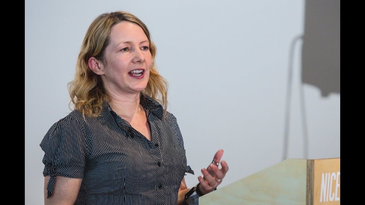
“Typography is what our voices look like.”
[Applause]
hello can you all hear me with my little mic on I always wonder if I say can you hear me at the back how would you how would I ever know if you can't one of those question questions hello yes I'm Sarah Hindman I've been a graphic designer now for look out the technology I've been a graphic designer now for nearly 20 years but what I've spent the last few years doing is looking at different ways to answer this question why do fonts matter and I prefer not to lecture there's plenty of places that people will do that I also I very seldom give my own unsubstantiated opinion instead I kind of like to do a few experiments do a little bit of research but more than anything I like to ask your opinion.
And this is why I'm going to invite you to spend the next 10 minutes joining me in a little portable version of my my typography lab so why do fonts matter typ typography is what our voices look like and rather than lecturing about this what I'm going to do is invite you all to play a game of typography karaoke so it's a very very simple game literally I'm just going to ask you to say what you see and before we get started I'm just going to in the in the age- old fashion do a very very quick sound check so if you can just all answer are you ready to play yes wow and now you've got to top that excellent you're going to come here and help me in a minute so right I thought I'd actually make this one a little bit more complicated being is this is a room full of graphic designers so what I would and also this foot ball on.
So I what I want to do is split us into two teams effectively so that the dotted line is the halfway line and I would now like you to imagine that you are both opposing supporting teams and you're both going to to play karaoke against each other so what I would like you to do is literally as you did before say what you see but look at your side of the screen so if you're ready to go 3 two 1 [Applause]
and finally brilliant I'm so glad that worked I was having nightmares last last night about all of you just sitting there going and I'd be standing there having to do it all on my own so I think we can successfully say that that demonstrated that why do fonts matter also because typography type faces they create trust which warning sign would you take most seriously hands up if you would vote a hands up if you would vote B oh I can see about no a half hand hands up C A so that was unanimously a and in the surveys that I do that that bears out helvetica is the type face that you would believe most in that situation but how about this which one is the real Play Time hands up if you think it's a hands up if you think it's B no Bees at all wow and again that that pretty much Bears out in surveys and if any of you know the the study the Errol morrris study in the New York Times where he he proclaimed that basille is the most believable font this was my little kind of poke at proving that sometimes it's actually not about the type face it's about the context so choosing the type face to create to create to generate trust is all about speaking with the right tone of voice and choosing the right type face of the occasion and had I have asked you which of these was the funniest you would probably have voted C online surveys I feel like I need one of those things online surveys say yes C would have been rated as the most the funniest laugh but I didn't specify what kind of laugh so this if it's a comedic clown slapstick laugh yes but the beauty of typography as we all know is that it.
Actually gives us the opportunity to play with a lot of nuances so there are actually typ faces that would have been more satirical or more sarcastic and and not always just the big belly laugh clown sounds there is a really really famous study that proves that if you tell somebody that a glass of wine they're drinking comes from a bottle that cost 90 they will enjoy it dramatically more than if they drink the same glass of wine and they're told that it cost a fivr so if I read a study like this I then sit there and go could we do that typographically and so I bring this brings me onto my next game.
So I've always wanted to do a Price is Right game. And so we're now going to do it what I would like you to do is shout higher or lower depending on whether you think the each label is more or less expensive so do you think this is higher or lower oh mostly higher.
But there was one lower over there but Higher One how about this one I like the way to say it in a lower voice as well excellent how about this one hi and by process of elimination.
So it's fairly it's fairly instinctive would anybody disagree wildly with this with this order and I it it feels right but of course as I said I don't make assumptions so I know this order because I've run some experiments this is a big event that we did at the VNA where we turned it into a game complete with a buzzer at the end and this is an online survey so I now have this fairly this fa good list of order of type faces but of course as designers we don't just do the obvious what what's great about having a benchmark is you can then take it and use the elements to do something else so if the expensive type face is all about fine details then could you apply fine details to the cheap one and make it expensive and vice versa so again a designer design typography it's all about nuances and and using and playing with with what we have why do funks matter because sometimes they also give you beer goggles so this is where.
This is where you why you were asked to get some extra drinks I like that you had to get lots of extra drinks this is not quite a drinking game.
But if you've got anything left at the end we'll bring we'll come back to it what I would like you to do is drink take a sip of your drink I'm going to wait until everybody's pick them up take a sip of your drink have a look at the words on the screen while you're drinking it think about what it tastes like how sweet is it how bitter how sour if you're drinking beer how fizzy is it if you're drinking those sugar-free drinks how sweet do they taste I'm just going to wait until the last people have had a swig so when you've had a swig and thought about that I'm now going to ask you to do exactly the same thing while you look at this one how sweet does it taste if it's a fizzy drink how fizzy is it how bitter how sour hands up how many of you noticed the difference you're all a bit sort of shadowed silhouetted I can see quite a few hands I would very much expect there to be a difference so I've been doing work with the crossmodal research lab at Oxford University and one of the experiments that I've been running for a while now is the jelly bean experiment and what we find is that if I give you two identical jelly beans they can taste either sweeter or sourer depending on what type faces I'm showing you. And we're just in the process of publishing this as a proper real study I'd get my name as an author on a scientific paper and we've also run it at places like we did this Mass experiment at the science museum which was completely Bonkers so the great thing about me standing up here in front of all of you guys is I get to see your faces when I do things like this I was slightly slow burner or when I do something like that I love it graphic designers it's like don't want to laugh at it.
But I've got to and so seeing everybody's faces it I find it really interesting and what it has shown me is that we very definitely respond to type faces emotionally so what I would like to do is focus your eyes on the on the targets on the screen so you all look pretty relaxed that was basille that's clearly a fairly relaxing tight face to read there's no it's not particularly challenging that one I there were frowns there were laughs a few people's body language actually changed a little bit. And this is something I find when I show big screens of type faes like of typ faes like Clute that people do have a physical response to it now of course I'm not really measuring that I I wish I could there the technology is there to do it and at some point we will start Gathering all of this data and working it out.
And I'm going to end by talking about personalities so type faces we all know that they have personalities we all recognize the Personalities in them but what I also know is that you all know which type faces you would date ditch or be just good friends with and I'm going to demonstrate it hands up who would date one and two and three oh okay. So one and three were popular two actually got a few votes you're holding out there which one for three three okay and I like this your hands up so you're you're claiming three so this particular one again we ran this at the VNA it's also an online survey and I do it in loads of workshops but at the VNA these were the results so a was very very definitely the most datable B was the most ditch but the thing I love most about all of these is actually the descriptions so graphic design CL crowd you all pick C [Applause]
[Applause]
so I know you all reading B now.
So I don't need to read it out. So if ever you're in any doubt that people have a personal response to type faces this is how I can prove it and on the that not CU like on way over my time I apologize my book is like my little love letter to typography gratuitous.
That's where you find me and thank you very much and thank you very much for joining in [Applause]
Latest Talks
-

Will Anderson and Ainslie Henderson
Bringing stop motion sorcery to BBC’s Small Prophets
Watch -

Amber Weaver
How does contemporary type design translate into the wider world?
Watch -

Murugiah
Why you should reject the formula and make art about things you love
Watch -

Marina Willer
Design thrives when you find poetry in the simple things
Watch -

Lizzy Stewart
The hundreds of drawings and writing-on-a-whim that goes into comic novels
Watch -

intra
The rewarding process of recognising the art in obscure everyday life
Watch