
Sarah Boris
How different parameters shape the form of every beautiful book
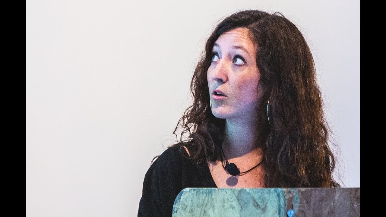
“Often you know the space you have when designing a book is quite minimal, but it can be a little decision that can make the book take a new life.”
[Applause]
Hello. , so tonight I wanted to talk to you about a couple of different books I've designed. , and , how different parameters have influenced , the form and shape of the book. , and I've , chosen a selection of a couple of books , to show you these different influences and and how the books , turned up.
So the first book u, rhythm section is a a book I designed for the ICA. And actually for this book the ICA didn't want to do a book. They didn't have any budget and with the curator we decided to do a book with our own own money. And so one of the parameters was that we didn't have a lot of money and that we had to get it done very quickly.
, and just to explain the content, it was texts from journalists from the the Wire magazine and they were writing about their favorite tracks. , and and so the idea was to do a little a little book which had a a sort of animated feel and I came I came up with this idea of of a scale. So it's very lowfi and and the parameter being that we didn't have a lot of money. I I printed it with Lulu and we only did three and we print put three free in the exhibition space.
And then the ICA printed more eventually they were convinced. This book exist is a book I did for a collective of free artists. These three artists basically did a performance called exist and no one was allowed to photograph or record this performance. And one of the traces of this performance was a cloth that they did the performance on. And so when they came up to me to design the book, they said, "Well, we only have this amount of cloth." And the idea was to do as many books as possible with the cloth.
So we one of the challenges also with this cloth was that it was so thin that no one wanted to to work with us to do the binding of the book and we eventually find a printer who and a binder who who were ready to take on the challenge and so this is the cloth from the performance and we managed to fit 80 books on this cloth and and then on the inside it was a very simple book with basically texts talking about the performance.
So there there were only traces of drawings people had made or or notes people had taken during the performance. And you can't really see see this on the slides.
But the paper is is is is like skin. It has this emboss that feels like fingerprints and and that was to reflect also on the idea that the artist did this per performance naked on the cloth and just to re reflect on the idea of flesh. This project I did a few books for Tommy Younger while I was at Phon and often the brief was you know they didn't want a lot of design intervention on on these books and a lot of these books existed in previous editions of French and German and so they asked me to come up with a way of repackaging the book and and I guess why I wanted to show you this tonight as well is that often you know the the space you have when designing a book is is quite can be quite minimal but it can be a little decision that can make the book take a new life. So on on these books basically the previous editions were all black covers looking very harsh and the age group for these books is really really really little.
It's up to three years old I think. And and the idea here was to change the CMYK for fluuro panon colors and and Tommy Younger was involved in in this and he was very happy with with with the idea and and yeah so that's that's just to show a small intervention on a book design. Then this is another project I did at Phon for the the baker Eric Kaser. And that was quite a particular project as well because the French book existed and they said to me you have to redesign it but you have to use all the existing imagery and one thing that phon usually does is they take new photography for each project. So it was a bit of a challenge because the imagery wasn't the type of imagery we would usually use in cookbooks and and again there was quite little time.
So I had to work with with these ex existing parameters. One thing I do when I start a project is that I look for a long time for the right type face. Well the type face that I think is right for the project and I get really tortured about finding the right type face. And this was a little bit cheeky, but I had been looking at this type face for a long time and I really wanted to use it for a project.
And when when the project came up and and I saw the bee of the type face, I thought this is the bee for bread. And what I really liked about it is that it's it feels really like it's been carved. And the book talks a lot about carving techniques to make bread and to give the shape to bread. And and I liked how the the typography could reflect on on the idea of making bread as well.
And then I thought I'd show you on on this little case study a couple of of cover options I did. , one thing at FHON is that we always presented quite a lot of cover options and and this was always to kind of , you know, give counterarguments to what we thought would work and not work and and sometimes we, you know, we had sales the sales team saying, "Oh, well, one piece of bread will work much better than something that is in craft paper printing printed in a mon in a monotone or so." So I tried a lot of options and I was pretty fixed since the beginning that I wanted to do a cover which showed the different types of breads. The book is divided showing the different types of breads and I thought that's what makes this book special because there's so many books about bread that I like the idea that the book looked like the front, you know, the front of a little pastry shop. , and so that was the cover that was chosen eventually and then I had to do a couple of iterations and then the sales team a couple of months later came back in and said we're never going to sell a book with so many breads on the cover.
, it looks too it's not commercial enough. We want one piece of bread and eventually they were saying we want the piece of bread that the Larus book used on their cover. So , so I tried one piece of bread and eventually that's that's the cover. And and the reason why we changed from brown to blue also is that they felt the brown for me I was thinking you know brown pastry shop wrapping bags chocolate and they wanted something that felt you know I don't know let's say more fun.
So I guess that's the thing as well is it's all about compromise and and finding the right the right tone with all the teams involved. And I managed to to save a bit of my concept on the back cover.
So these are a couple of spreads on the inside just to show you and then another project. So SE so basically Fon published a lot of books for SE and the challenge with these books is that SE is not well known in the in the states even though he did a lot of covers for the New Yorker but that doesn't make him sellable enough.
, and and the challenge was to find a cover that would initiate people to s in the states and potentially in the UK. And and so I came up with this idea to it doesn't seem very clear on screen, but I came up with this idea to use little cartoons to illustrate each of the chapters of the book.
This is another book where I wanted to talk about the idea of how often you can really be involved in the editorial aspect of the book. James Servin is a product designer if you don't all know him already. And the real challenge with this book is that there was so much material, so many images and there was no editorial direction apart from I had to come up with a design concept and I had thousands and thousands of images, materials.
So I'm going to accelerate because I have one minute left.
So I'll show you this and yeah and that's the final book I wanted to show you. Which I've done for for an exhibition I did recently and it's called the Lut Graphic the graphic theater and I wanted to show you this book because it's just a bit of a a different steer from what I've been doing before. It has no words, no typography and and it's a little animation of the sun and the sea and going to the stage and that's it. [Applause]
Latest Talks
-

Will Anderson and Ainslie Henderson
Bringing stop motion sorcery to BBC’s Small Prophets
Watch -

Amber Weaver
How does contemporary type design translate into the wider world?
Watch -

Murugiah
Why you should reject the formula and make art about things you love
Watch -

Marina Willer
Design thrives when you find poetry in the simple things
Watch -

Lizzy Stewart
The hundreds of drawings and writing-on-a-whim that goes into comic novels
Watch -

intra
The rewarding process of recognising the art in obscure everyday life
Watch