
Rory McGrath is a talented illustrator and educator known for his innovative approach to visual storytelling and design.
Rory Mcgrath
Building a Design Museum exhibition from insulation foam, pole protectors and £20 of industrial offcuts
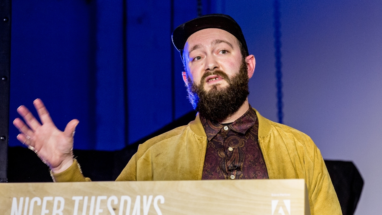
“Design for us is such a fast-paced activity and in a way we follow a kind of intuitive process.”
Transcript: May contain minor errors or formatting inconsistencies.
uh very nice to be here thanks for the introduction Owen it's uh kind of um often humbling to hear that um we are literally based next door so in a way we're in our own backyard here um it's a pleasure to be here amongst so many young design illustration creative others um it's always really nice to come to an event and just see the different sort of range of people that turn up and and uh celebrate in a way what's what's possible with creativity today it's a choice was to speak about a couple of projects one of those projects we literally just came back from the launch of and another is also a really recent uh project for us and we're still getting to know those projects it's
always a thing where you start to um reflect on projects you start to learn them in another way because design for us is such a fastpaced activity and in a way we follow a kind of int intuitive process so krm is Rory McGrath me and Oliver Knights and we work with a range of designers uh a project manager Vanessa which is in the house um and different disciplines come and join us on that Journey so this is the heto Institute it's in Rotterdam we were asked to work with them in around October it a massive privilege I must say we've always been fans of the Dutch Dutch design Legacy and to work within
the Netherlands was was a privilege and something that which not many British designers have really had the chance to do designing the surface is the exhibition it's the result of a dialogue between Chris Carell and coerced and valed as curators the exhibition approaches the phenomenon of finish as in the finish the final layer of design um and it approaches that from several points of view luster Fox agency Teflon different chapters we approached the project at the beginning these are these are rather these are from The Architects we approach project to the point where the Architects have already been working on
the project each of those projects to us were abstract and the curators have this idea of a kind of theatrical or Fair Ground type experience and whenever we get to the exhibition project we have to work out how to deal with it what is the problem uh in this case mon do which are the Architects had a a sense that these would be active Pavilions each one representing in a way fictional space What do we do with this scenario um the Dutch have a really beautiful philosophy that design in a way is every designer with within the project has a responsibility and that responsibility is is our to take in whichever way we
decide to take it it's very different to a British institution that's a big conversation we can have another time but the idea is that we're free to take that layer as we please so the idea for us was to treat this uh as a kind of fictional space and treat these individual Pavilions as acts within a within a play there would be two layers one would be narrative layer and this would create create a kind of experimental attitude where these individual objects within this Within These Pavilion would have dialogue with one another there would be a language system where fact meets system uh fact meets fiction science meets poetry and there would be a scenario
layer and that scenario layer would be uh setting the scene for each one of those Pavilions and in a sense this diagram often becomes a of us creating a sense in this project so every project seems to have a kind of a kind of uh diagrammatic uh um scenario the idea would be that we would create a publication that publication would have a text within it we would work with two writers Jack self who we work with on the Real review and other real Foundation projects and Kate O'Brien who we had already collaborated on a couple of other projects and we would asked them to create this this text under our Direction each one of those acts would
be described in a very specific way and it's hard to read this I think that the best thing would be to to to go and visit the exhibition in Rotterdam and understand it more but in a sense this individual objects within each of these acts would have a character and we would follow a similar vernacular to the way in which theater would work some of those objects would would have uh names like I said so you'd have sunglasses or ski goggles sorry would become the stylist or the vant black which is the black which um reflects uh sorry absorbs so much light would become the absorber the horse which has a uh which is painted like a zebra would
become the deceptive and a chair which is like uh looks like bamboo but is made out of steel would become the devious and these characters could start to explain themselves through the the play the publication would be given to everybody for free when they enter the exibition and it would act as a as a a guide uh to those objects to exactly what they mean and the reader can could dip into that as they go around or decide to read it later and in a sense these spaces are perfectly primed with this kind of black space as you walk into an exhibition into the exhibition with two films and a very specific doorway and this sense of priming is really big part of our work
also we always at we always try and create a space to provide the audience with whatever they need before they enter into an exhibition and within that uh entrance space would be uh two videos and those would start to highlight moments of the text and it's it's difficult to like give you a sense of what that text is doing sort of so fast within this sort of 10 minutes but the text had many different sort of vernaculars so sometimes it would take the vernacular of a children's book sometimes it would take the form of a traditional theatrical script uh but these these different text vernaculars provided us with what we needed in order to convey a range of different objects from
different historical backgrounds this was the opening last Thursday night which was pretty pretty awesome really fun it gives you a sense of the scale and the nice thing about is it had a sort of scale of an exhibition of a similar size to say an exhibition of the VNA but it was kind of completely experimental and none of the different participants really knew what to expect when they arrived because all the work happened simultaneously everything always continued in a forward trajectory and in a sense it was this like beautiful surprise for everybody involved this is some images of the setup so we always would what we decided
to do and this was quite late on but was because these Pavilions seem to be almost like models um they could have almost worked at any scale but they some of them were actually building size we thought it would really complement well to blow up pages of the book to about a th% so you have these huge pages of the book in a sense you create a sort of scal of space and different objects started to have different effects so for instance like a a medieval golden cockrel started to have a Rea relationship with this this sort of super large page of a book and in a way that added to this sense of a sort of fictional space and I think the thing with with exhibition design and sort of rolling
your sleeves up it's important to not try and overdesign until you get to the get to the sort of end of the process or even there so we didn't really know how to stand these large Pages up but what we did is we worked with the Carpenters on site and we came up with this nice little sort of foot method which gave an opportunity to showcase uh these signs and stand them up and then all of the N all of the objects were without captions and just had simple numbers which could be reflected to the center of the book I'm just going to zoom through a little bit here so you can sort of see a little bit here of the the type of pavilions and the type of activity and then here's a page which gives a sense of um a luster
Pavilion in which uh we we had a sort of Ballroom feeling where uh a shell could have a conversation with a design object and it was almost as if it was a kind of ball like an evening but what you through this method what one can do with text is start to really explore language and explore the meaning of objects in a much deeper way to the usual condition of a graphic design project where you're given a text and asked to set it in a particular type face and each Pavilion had as I said before a very distinctive uh feeling or a distinctive attitude to the typography and to the uh sorry to the um language used this case is it's a similar to a
Peter and Jane book and this is a pavilion which is dedicated to faux objects and I really would encourage you to go and visit it because it's kind of painful for me to zoom past this where it's each thing is interesting in its own right but um there's very little time to explain so OB exhibitions have become like a big part of our work at okm and I think that's something of a natural trajectory with graphic design you tend to start with smaller projects books and so on and you sort of graduate to exhibitions and visual identity and branding um in in the case of us we we've always dealt with exibitions at the beginning but then never really got
involved on a on a level where we were able to control an overall um an overall uh effect to the for the audience in a way getting involved with the curatorial activity so fear and love is at the design Museum right now it's 11 installations that aim how to demonstrate how designers canect connected not just to Commerce and culture but to underlying issues which associate with fear and love Justin asked us really early on to help him to solve the sort of pressing problem of how to create an image for this project how how do you convey what is fear and love and in the absence of content what he offered us was a way a mood board of everything that he had been looking at to inspire the curatorial activity and in a sense we
would capture this curatorial thesis with a kind of spirit or mood which was also the mcgree isn't there just for decoration that was also like a big part so how do you create a surreal understanding of the world around us today so this was the campaign I'm not going to go too much and talk too much about the campaign but the images which came out of that are very much um a direct um the direct work from that first conversation the book was also part of that beginning sort of getting to know the thesis of the exhibition and then when we actually got to the exhibition we started to really investigate in
ourselves what is the feeling what is the mood of of fear and love and the first thing we did is research materiality and found objects and these kind of these kind of uh methods which you just don't see um in in design in exhibitions ever they're the sort of things which you might get in this case it's uh insulation materials it's uh materials associated with with uh sort of terrible occasions like disease evacuation um protecting people ballustrades Etc we became kind of obsessed by this materiality and in a way that whole project was really about an investigation into these materials and how can we find the perfect mood the
perfect uh uh sampling which we tested like like there was no tomorrow actually we sort of we used a a kind of direct printing method and all of these different insulation meth materials and so on and we started to realize what would work and what could what could kind of create a a sensation that you just you just have never seen before you don't know what what exactly is you don't have to put your finger on it and rather than sort of investigate through presentation in this case what we started to do is create these forums or workshops in the studio where we would invite the different participants and we would start to investigate what how these materials could live together
and how ultimately they could relate to the architectural space with Sam Jacobs judio and it was a pleasure to work with these guys and also with with Justin MC because they were so open to this this kind of approach which in a sense is a very sort of UNG graphic design approach there was of course graphic design in a traditional sense in a sense of typography um and in that way we took it very seriously but it's a very very different part of the project it was very sort of Hands-On was necessary so we built the exhibition ourselves um I say me I didn't actually myself olle and and Ben built the exhibition but you know team work as it
was there um there was this lovely idea at the end it's like when you walk into this design Museum how do you convey the title so we came up with this idea to build a kind of neon but we didn't want to just build any old neon we wanted to build a a a hug humongous neon so when you go to design Museum you'll see this this almost like artwork size neon which [Music] flushes okay this is the sound of the opening I didn't realize it had sound on it sorry about that um we also as I said before we tend to build diagrams of uh our projects and sometimes those diagrams become part of the final outcome in this case this is the diagram
of the exhibition which was kind of inspired by um these kind of very direct uh diagrams of of housing projects you get sometimes in Switzerland on the right or sometimes in the city of London on the left and we always love the sort of directness of the relationship between these maps and the built projects themselves in in this sense the this functions in a pretty similar way and then you can start to see how these materials come together in real life so you have uh standard Street poles with iridescent uh patina you have this kind of um uh the pole protectors which we became completely obsessed by
which are used for anything from stopping you banging your head on the bus to making sure that your pipes don't burn your hand when you happen to be looking in the roof for some sort of uh mouse or or electrical issue um the exhibition itself was built around a curtain structure and then these which was very much a horizontal horizontal gesture whereas the signage scheme was very much vertical gesture and it's a kind of seamless exhibition design between us and Sam Jacob Studio like neither one of us took any particular responsibility away from one another we worked completely collaboratively which is very important and and quite rare actually and you get these lovely views through the these curtains through to
the exhibition and sometimes the the structures sort of have a strong relationship with the with the different Works in this case a metah Haven work and every sort of detail has worked out so you have these lovely zip ties which tie uh a polypropylene sign to the to the um these big poles and the backs of the insulation material is like super beautiful it's just like hyper metallic and if you if this was to be a signage material it would cost so much but because it's an insulation material that usually you wouldn't ever see it's so cheap I think it about 20 pounds of material that we ended up us using and I'd like to just end by just urging you guys to go and see the
exhibition because it's it feels such a shame to Rattle through it at such Pace but the exhibition themselves are really worth visiting this is this is still on at the design Museum and uh it's pretty great exhibition so uh with that said thank you very much
Latest Talks
-

Will Anderson and Ainslie Henderson
Bringing stop motion sorcery to BBC’s Small Prophets
Watch -

Amber Weaver
How does contemporary type design translate into the wider world?
Watch -

Murugiah
Why you should reject the formula and make art about things you love
Watch -

Marina Willer
Design thrives when you find poetry in the simple things
Watch -

Lizzy Stewart
The hundreds of drawings and writing-on-a-whim that goes into comic novels
Watch -

intra
The rewarding process of recognising the art in obscure everyday life
Watch