
Patrick Savile is a graphic designer known for his style-shifting design practice that adapts to best represent music and artists. His instinctual approach allows him to create diverse visual identities, as exemplified in his work for Clams Casino's Moon Trip Radio.
Patrick Saville
Building an entire visual world for an album of dug-up, mystical music
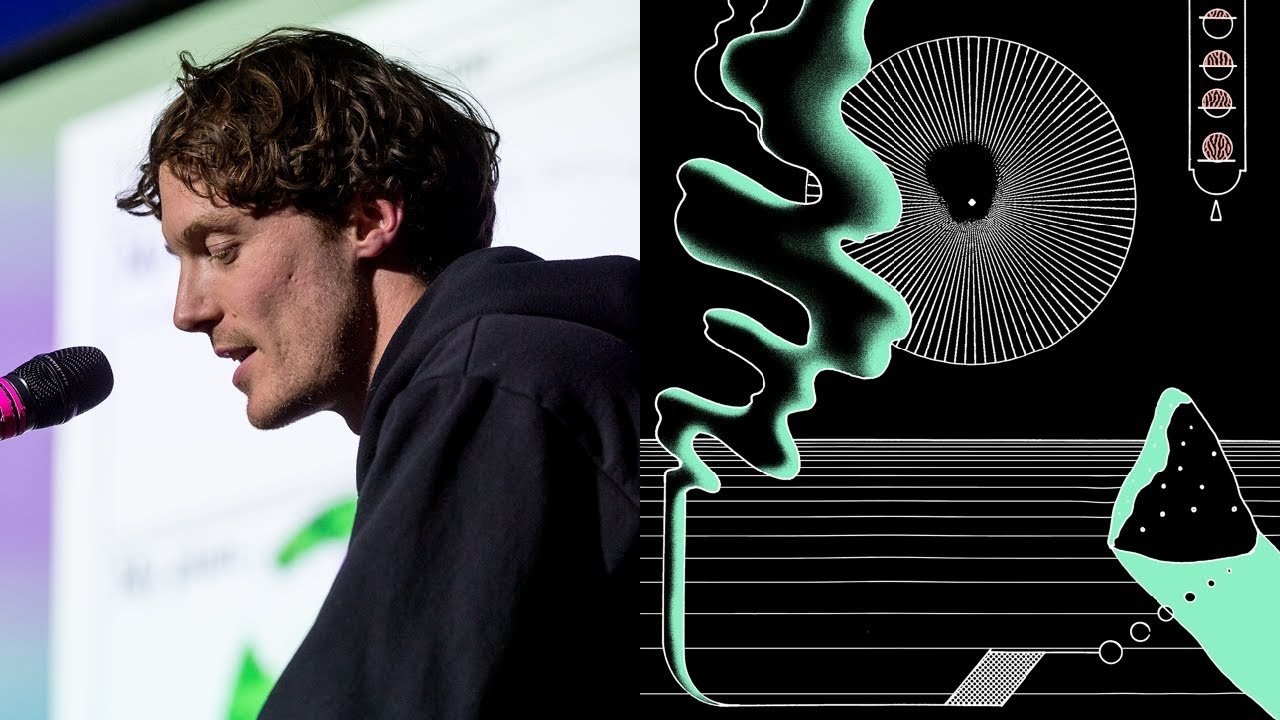
“I produce my best results when I go with my gut on each project.”
Transcript: May contain minor errors or formatting inconsistencies.
[Applause]
okay hello I'm Patrick Savile as you just know I'm a graphic artist in fact and I'm lucky because I knew what I was gonna do in my career from a pretty young age it was a few years after this piece that at school I was designing imaginary flyers for club nights was massively into skate culture and also into records sleeve design that I saw down the local record shops which may be what what maybe want to study graphic design which I did here which is Middlesex this is the cat Hill campus our IP where I learned that yes I was interested in design and typography but I was also maybe more so into image making and particularly that I disliked grids and magazine layouts etc I spent a large chunk of my degree drawing comics and my final piece was actually an album of music so not design at all flash forward a few more years.
And this up on the right was my first foray into album artwork or single artwork I literally can't remember how they found me.
So I it was way before Instagram and I definitely didn't have a blog but there it was and these are some other things from that same period maybe a little bit later this for sonic Rooter records r.I.p after studying I tried lots of different aesthetics and things out hand drawing screen printing more design II design and realized eventually that the best thing to do for me was to go with my gut on each project I did essentially coming at each new thing as an illustrator but from a graphic designers point of view so how does this need to look to best represent the music artists etc I was always aware of people that had like one solid style stuck to but it just never really gelled with me.
There are too many things like going on up here.
So I hope maybe 30 years down the line it all looks it all fits together somehow over the years I have worked for brands across the spectrum magazines museums fashion brands etc I still like to work on whatever feels right and comes my way.
But I do really feel at home most with music it was a few years back.
Now that miles from Bach aversions which is a dub mainly double Abel asked me to do some artwork for a single he was releasing I ended up redesigning the logo and then went on to do quite a few more things with him.
And it's really been off the back of that that I've got a lot more work in the music industry I've been able to focus mainly on that it's with creating music imagery for music the thing that keeps it really exciting is that each new project I have to create a whole new visual language for it I don't really just stick to one thing as I said and I think that's really where my strengths lie taking the things that were all up here.
And then putting them down on paper so I just rushed through a few recent projects yeah it's all mainly posters but you can see that they all vary quite a lot much is becoming more and more of a thing obviously everyone wants to do and it's quite a fun thing to do as well pretty stoked on these skateboards this is a three of what's going to be about well hopefully an ongoing thing for this April skateboards company out in Santa Cruz right.
So midway through last year I was contacted by the producer clams casino he wanted me to design his second album mean moon trip radio which I was quite blown away by his EP from 2011 I think it was a rainforest was iconic for me back then as well as a lot of people.
So I'm gonna take you through in a bit of detail maybe too much detail how I did the project and my thoughts and processes that went into the world that is moon radio so on the off when I get into a project I try and ask what the artists into in other media so media like books films essays etc so we can get some groundwork to build ideas from it's never good to ask for like other visual ideas because then you get stuck in that and with this project at one point Mike who is clams casino said what if you could dig up music and recordings from ancient cultures almost like fossils of music music.
And sound and then repurpose those sounds and collage them together to make something in the present with modern elements and ways he emailed that.
That's what doesn't roll off the tongue so well. And I thought deep we're gonna build a whole world here and like that initial sentence was all we needed to go off it really brought to mind uniform like engravings and archaeological digs and things like that and Greek tablets things that essentially is this this especially is music that has been dug up.
So that really started my brain worrying I love the sort of engravings on these so I started looking through lots of different ancient pictographic languages I knew from the off that I wanted to use these somehow and at this point in the proceedings these words appeared in the email chain and I decided to use them as a waypoint to navigate the project I thought a good way to imbue the album with this mysteriousness or other worldliness was to create our own language system which is something I've long been a fan of I used to sketch in my sketchbook. And so these are some ideas that I put forward and we ended up going with the most runic one in the middle so the first white one so all I had to do was dig up some more glyphs for that and translate them which is hard because I made them up in the first place and I got to also thinking that there needed to be a backstory for it to give some weight to the imagery if this was gonna be a world that we created there needed to definitely be a story this on the left was an early cover concept that wasn't used but there the idea was that there could be these blocks of stones uncovered each with intricate carvings on each face like that and which each each block would have the music somehow recorded within it. And this design even though it wasn't used itself it's kind of reminiscent of something a bit Lord of the Rings II but also felt quite modern at the same time which guided this a lot of the types that I was trying to design at this point again trying to mimic engravings on rocks and but also keeping this kind of Celtic Art Nouveau vibe going but yeah.
I wanted to keep it modern as well because at the end of the day it was an album made in 2019 on a computer I felt was important to degrade the imagery somehow it in first off was a reference to the way that clams sampled music especially in like back in his first EP less to a lesser extent now but used to sample low bit rates I like stuff that you found on the internet and turn it into this lush beautiful music and also the fact that this music is dug up it would be sort of have bits missing and be eroded so I thought I went through loads and loads of different types of like low bitrate JPEGs and things like that to play with that so something is quite important in my work its degradation I'd never really use crisp like just crisps type just typed into a computer I find that really boring a bit like unscoped idli here's some more types tiles that I was going through and we all agreed it was way too modern for it.
So we ended up agreeing on something like this which this is the raw state of it and like I said it needed to be shaped or degraded to make it fit into the world I felt so that's that's the final type that we went with yeah sort of felt like it depicted the past but also felt a bit modern so now we had the logo type we were discussing what we would do for the actual cover and Mike had the idea of having like setting it in this kind of mystical world which would involve creating this yeah this whole world.
And I thought that each of the tracks maybe could be related to these kind of different objects mystical objects but we sort of started going down that route and then we realized I think it would be a bit too literal a bit maybe a bit too sort of comic book for it take it away from the music and mysterious was one of the big at the beginning if you remember and also maybe would be too much for people to handle but I also tried lots of different iconography I thought it would be good to have standalone icons as well as the logo type for use on stage projections and merch and stuff like that.
So I drew this little illustration to illustrate the CC for clams Casino hewn from steel with lightening going through it. And we ended up with this which went with the type and the styling of that was kind of punctuated by this image which Mike sent me again over email at some point after a series of back and forwards about the feeling that he wanted to evoke in the project.
This is Sub Zero from one of the Mortal Kombat games in 1990s but it was at this point that I really realized that we were on the same page because I had also at that time been taking inspiration from early RPG and computer game design which you know it's pretty amazing that one on the right which you can kind of see here you know it's very the pixels do hark back to computer games a little bit these three colors represent the limited palette we went with in the end I decided we went through lots of different four and three color systems to make it all sort of fit together I think a limited palette is a nice way to make a project really sort of sit together this was Mike really like this pixelated version of a free typeface I was using for a while I think it was add a font classic download but I do really like using free fonts that especially that ones that aren't very very well for nests and then manipulate them on projects because it's a good way of coming getting an outcome that you know isn't going to really be anywhere else it's not like a cool that cool new font whatever it's just some that I've made Luca really and by this time I'd worked out the whole rune system and what each one meant I spent months translating and I realized that each of the tracks could be track names could be depicted by a grouping of them.
So we added this to make it a bit more of a mysterious world.
And this is what we ended up with this is the final cover for the album in the end we went through lots of different ideas for what we were beyond it but Mike was very keen to keep it simple I think we all agreed that keeping it uncluttered as possible would be good because the type is is basically the image it's if there was anything going on behind it it would be too complicated so all this time we've been talking about how each of the tracks was going to have a video or a visualizer as recorded because it was the videos weren't going to be that involved each track would have his own video or visualizer and how we would show the world those and also what we would do with the website and I thought the website could be we could create a portal into this world because other than the album cover that's basically all people are going to see so the website would be a portal into this world. And we could show all of the videos on it.
So I got the incredibly talented artist encoder rifki sadlier to build it all for us. And it came out super beautifully so you can basically skip left and right between all of the videos ♪
I think since I recorded this this and these new sections on it as well I'll just show you this this was my favorite video that was made ♪
anyway I'm gonna skip now I know I'm gonna run over time. But if you want to watch the videos go to clammy clams calm and check them all out I wasn't anything to do with me that choice so there were 11 videos all directed by Marielle Tepper based in LA and coded by Jakob Volta who is a creative coder with a super short turnaround it's quite amazing what they came up with is we decided to we wanted to continue the vibe from the design but sort of temper the ancient mystical vibe with something hyper-modern which would reflect kind of clams up-to-date production and yeah.
So the way they did is using point cloud technology where they would scan actual locations you can't really see it with the top two of real locations like forests and then turn it into this sort of data readout it really blew us away with what they created in such a short time.
This is the vinyl obviously I always loved designing a physical sleeve because it takes me back to really what got me into doing this in the first place and with this we got to use a Pantone spot which is something I was also really love doing but this I thought it would make the violet really pop on it verse against the red so happy the way it came out. And this is the inner sleeve on the left there. That's that image I was talking about earlier which we were going to have as a cover I actually ended up illustrating the whole thing for it but where you didn't use it.
But I wanted to pop it in here because it's sort of the process of designing this wasn't like this idea out this idea out this idea every idea sort of built the built the world.
So I wanted to put that in as a way of sort of showing that this whole thing's a process and then on the right there's a little word in runic which I can't really remember what it says I think it might say thank you [Applause]
Latest Talks
-

Will Anderson and Ainslie Henderson
Bringing stop motion sorcery to BBC’s Small Prophets
Watch -

Amber Weaver
How does contemporary type design translate into the wider world?
Watch -

Murugiah
Why you should reject the formula and make art about things you love
Watch -

Marina Willer
Design thrives when you find poetry in the simple things
Watch -

Lizzy Stewart
The hundreds of drawings and writing-on-a-whim that goes into comic novels
Watch -

intra
The rewarding process of recognising the art in obscure everyday life
Watch