
Christoph Miler is a co-founder of Offshore Studio, known for their politically conscious graphic design work, including the creation of the Migrant Journal, which explores the complexities of migration.
Offshore Studio
Why migration means more than refugees – a six-issue publishing experiment
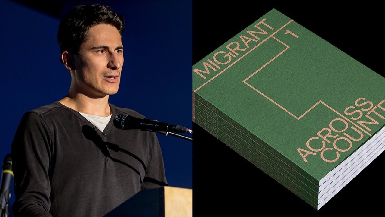
“We wanted to show that migration has, of course, to do with the movement of people, but also goods, information, money, even plants and landscapes, and how all these different aspects interconnect with each other.”
Transcript: May contain minor errors or formatting inconsistencies.
[Applause]
hi everybody thanks for the nice introduction. And so yeah today I'm going to speak mainly about migrant Journal but first of all I'm Christopher as he already said I'm 50% of offshore studio and the other 50 percent come from Isabel she's originally from Germany I'm from Austria we've met in Zurich where we've both studied at University of the of of the arts and well from there on after graduating we kind of went in two different directions Isabel went to Germany to work on freelance and self-initiated projects I went to Italy for a year.
But it back in 2015 I think it was we kind of ended up again in Zurich and met up for some coffees and I kind of rediscovered that we have a similar interests in in how we approach design so we kind of discovered that we want we don't want to only work on commercial commissions we also want to do self initiated projects we also want to do publishing projects we are really interested in typography storytelling editorial design these kind of things. And we also want to do research and that means like research on an intellectual level maybe like politics economics social stuff but also on a visual level so we really wanted to experiment with how to create images with what methods we can create images how can we come up with new kinds of images so these are we the kind of spheres that we are kind of using and moving through when we are doing projects and sometimes they merge sometimes we're putting more emphasis on one aspect or one on one sphere. And I mean sometimes you know it's it's it's a matter of sometimes it changes from day to day or even from our two hours or you know sometimes the surfing industry aspect is bigger and then suddenly it's the publishing aspect of our work.
And we have we are through the last two and a half years we have worked for mainly cultural clients collaborated with them worked for them worked with them and created very much different stuff like identities websites publications etc etc so this was just a brief introduction to our studio what we do and maybe whatever kind of philosophy is but now I want to talk about a long long long term project that started in 2015 and it will continue until I think in the end of 2019 its migrant journal we've started it like I said two and a half years ago and during the height of the migrant crisis where a lot of people from Syria we're moving to Europe under like devastating humanitarian conditions and we were really irritated by the kind of discourse and discussions that were around and we thought they were really polemic and one-dimensional and we felt that. There was really a lack or yeah there was a missing voice in a way for a more in-depth conversation that. That's more true to the complexity of the whole theme.
So we came up with the idea of creating this publication project that we called migrant where we wanted to confer you propriate or also rethink the term migration and migrant we don't wanted to see it narrowed down on you know the refugee we really wanted to show that migration is something that of course has something to do with the movement of people. But also a lot to do with the movement of you know Goods information many even plants and landscapes and it's so much about how all these different aspects interconnect with each other.
So that's the idea for migrant Journal and every issue so it comes out every half a year that was the idea it's limited to six issues and every issue is focusing on one aspect of this huge theme so for example the first one that came out in when was it 2016 fog called across country focused on the countryside is the space of migration so for example we talked about and migrants from South America moving on trains through Goethe mala and Mexico - yes we talked about changing borders or shifting borders through climate change because they are defined through the water shade of glaciers and because they are melting the borders are shifting in the second issue wide capital we are talking about the movement of information the movement of money and the movement of resources like marble or gold in the first issue flowing grounds it's all about the spaces of the sky and the sea as spaces of migration.
So we are looking at you know how the whales move through the sea how do drains sorry how do drones move in the sky how do how do you. Actually see nomads live between Malaysia and Indonesia and the last issue the fourth one that it will be released this first day in New York actually it just came from the printer or it should have come from the printer but it didn't arrive on time. Anyway. That's another story.
That's the fourth issue it's called dark matters and it's all about the invisible and the illegal aspects of migrations which about you know human trafficking smuggling of goods drugs etc and I will talk about that a bit more in depth later so you know.
Now I'm saying all the time we we we and we is not only Isabel and me we was in the beginning sistema and Katerina Isabel and me Justinian as an urbanist and writer from Paris every lives in London Katerina is a Portuguese architect who lived in long as well moved to Bergen she's not part of the project anymore but two other editors Tomas and Michaela a part of our team now and basically what I want want to stay and show with this map is that we are all over the place nobody lives in the country where he or she holds a passport from and I think migration you know it's pretty much a part a strong part of our own biographies and that's also an interesting aspect for our project so when we've started this project in 2015 what we really wanted to do and challenge is we wanted to reconsider the relationship and the balance between editor editorial and design processes so we really wanted to kind of that's a hard word but destroy that kind of separation between these three years because often when you look at magazines there's editorial part and there are still design pardon you know the editorial part provides text and then it goes through graphic designers they do the layout and maybe some image editors provide some images etc and we thought in terms of storytelling and intensity of the stories we want to provide maybe that's not the best way to move forward so we really thought that we want to communicate a lot with each other. And we wanted to have a kind of process where the design informs that editorial decisions and the other way around so and one consequence of this was that Isabel and me were involved from the very beginning on into the making of this journal and what we saw there was we had this call for contributions you know we asked people to contribute with Twitter and other social media channels also from our different backgrounds and what we saw there is that the content was so heterogeneous it was so different like there were you know journalistic repechage is the essays there were scientific texts and then. There were I don't even want to talk about the image material that was like high-res like one gigabyte super photographs and then. There were like super low res CD photographs and then.
There were maps and infographics and just raw data where we could just do something with it. So it was really really heterogeneous and of course our challenge as a designer was to create something. That's coherent and that's strong as a series so what we did is we came up with this idea of using specs of an atlas as a kind of main concept for the journal so we really like that idea because you know an atlas there it's all about territory it's all about space how is it structured how how do people how do goods move through the space and so we use that as a basis so for example in the on the inside cover of the magazine you see this map of U and macro regions where all of our articles are kind of located so you see where they are also in like a small sub navigation there or it always stays where you are of course we also did that like huge in-depth research looking at maps and infographics for months which was really nice like beautiful maps of the sky beautiful maps of the sea and of the earth you know different layers of soil we looked at everything I think and in order to came up with an aesthetic and style for the infographics we wanted to use basically how the whole thing works is when you have the magazine there are 12 to 14 articles and around half of it are accompanied by these infographics and it's not also a listing and aesthetic thing it's also much about editorial choices there. And it's also much about maybe providing different points of entry for the reader because you know sometimes text can be very long very dry really dry or scientific sometimes it's hard to access them.
And then it's just nice to have a visual entry point for the reader and also which is another aspect that is great sometimes we want to emphasize some aspects of a topic that are not really emphasized in the text and then we use infographics in order to to show them to visualize them and most of the infographics Isabelle and I research ourselves so this is kind of our contribution as well to the to the journal you could say and another thing.
That's very important for the coherency of the whole project just as a custom typeface we've created it's called migrant grotesque and actually we are you know we are not trained type designers and sometimes that's a bit tricky especially psychologically in Switzerland where everything is like super perfect when it comes to type design super smooth and I mean this is this is our like second font that we did and it has some flaws in it.
But we try to improve it with every issue so it becomes better and better I would say and it has its own migration history in a way which is nice as well. And we use it we use it for the magazine we use it to start articles together with a metallic spot color that reflects the theme so for example this is across countries that we pick this browse shiny metallic brows that kind of references the color of soil and we created we use it to create some structure throughout the magazine so the spot color and the typography have really much the core of the identity of the project I would say and then you know it's not only about design elements in order to keep the whole thing together it's also about editorial elements so for example in the beginning we always have the editorial letter and that talks about the issue how we frame it why it's important to us. And we always do this kind of abstract illustrations for it so and the idea behind it is to set the mood or create an atmosphere that kind of soaks you in as a read of the of the journal and and sets the right tone for the articles that follow another another constant element that we have is a photo story and where we use only for photographs of captures and for the last issue dark matters or the current one I should say we have this great photo story from Java kawazu who documented petrol smuggling between Nigeria and and pinene and actually.
That's a really fascinating and interesting story because in Benin you have only six gas stations which are run by the state and only two of them work and they were to where you can buy petrol the petrol super expensive so what people do are started to do like cup not only couple but deck almost decades ago is going to Nigeria getting petrol from there and smuggling it back to been in and they are doing it on these motorbikes and they have these bottles around their body and of course. That's super dangerous. And sometimes there are you know flames and sometimes stuff explodes and people die so yeah the reputa is really focusing on how they get the petrol from from Nigeria to Benin and under what circumstances and actually yeah what like also what economic and political situations lead to that and also what may be interesting after the first two issues where we have to define a lot of you know layout stuff grids refine the typeface and that was almost like more set I would say after two issues and from the fruit issue on we could start to concentrate a bit more on playing around with imagery playing around with illustrations so for example these are spreads from the fruit issue what you see on the left top corner is an illustration but Erik acavano who illustrated story about about migration in the Mediterranean Sea of humans but also of jellyfish so we collaborate with illustrators but sometimes we also like on top right corner we just set up a little photo studio in our small studio and photographic coconut for a story which is about coconut migration or we play around with 3d programs for example like this one in the bottom right corner which is about for an article which is about infrastructures on the sea or we collaborate with photograph us who do more artistic things like this one on the Left which is actually these are this is an article about ice as a territory and how boundaries are defined in the Arctic which is like geopolitical challenging because you know ice is melting because of climate change so the borders are changing as well. And we thought these images so beautifully what's actually going on there through like melting this ice layer with water and they come from an Icelandic photographer who does photo tours for tourists who want to photograph Northern Lights and this kind of stuff and he's just a photo hobby photograph and in his spare time he's doing this kind of stuff beautiful stuff and last but not least the magazine is also is you know it's not only a flat object for us it's it's not only graphic object it's also has also a materiality it it's also tactile thing.
So we also play around with textures we have a kind of system where we use different embossing for the cover we always embed or the metallic spot color in the images as well. And I mean we all do this. And I think that's the last thing I want to say because I'm over time already we all do this to kind of intensify the the reading experience and you know we think and believe that an in-depth read is not only an intellectual in-depth read but also something that you can experience in depth on it and the tactile level on the visual level and so on. And so on.
So we really hope that this Mystics issues become kind of an archive if I would say that reflect the current decade decade of of migration and maybe in 10 or 20 years people pick it up in libraries and and use it to reflect about the challenges we had in in this decade thank you [Applause]
Latest Talks
-

Will Anderson and Ainslie Henderson
Bringing stop motion sorcery to BBC’s Small Prophets
Watch -

Amber Weaver
How does contemporary type design translate into the wider world?
Watch -

Murugiah
Why you should reject the formula and make art about things you love
Watch -

Marina Willer
Design thrives when you find poetry in the simple things
Watch -

Lizzy Stewart
The hundreds of drawings and writing-on-a-whim that goes into comic novels
Watch -

intra
The rewarding process of recognising the art in obscure everyday life
Watch