
Noël Leu is a Swiss type designer and co-founder of Grilli Type, known for his meticulous attention to detail in type design and for creating typefaces that are likened to minimalistic two-dimensional sculptures.
Grilli Type
Why typefaces are really minimalistic two dimensional sculptures
“Typefaces are not just letters; they are a collection of minimalistic two-dimensional sculptures.”
Transcript: May contain minor errors or formatting inconsistencies.
Gt stands of course for grilli type the renowned swiss foundry behind these and many more celebrated and often used typefaces founded by noel loy and thierry blancpain in 2009 the foundry has over the past decade cemented itself as a true leader in the industry now we're delighted to have noel joining us this evening to talk through how the studio was founded and to explain the process behind some of the foundry's most recognizable typefaces noel please turn on your audio and video so we can say hello as well hi hi there thanks for properly pronouncing my name excellent job thanks so much I I tried it's great to have you are you you're calling in from lucerne is that right yes and hometown and also corporate headquarters of greely type english amazing okay great well we're very excited about this so thank you very much for joining us on nice tuesdays online I'm gonna leave it to you to kind of share your screen and take us through some some amazing work really and again everyone else watching yeah if you have any questions for noel please do put them in the chat and I'll try and get around to them afterwards but yeah well over to you to yeah share your screen and start the presentation ♪
sorry that's right these are the yeah we're all used to with doing these things over this one's better okay that's perfect great it's amazing hello everybody and my name is noel as you know now. And I'm going to talk today a bit about grilli type and before I start going into projects I'll actually talk a bit about what greeley type is currently gritty type is a swiss type foundry but it. Actually started around a decade ago around here.
This is a burn switzerland at art school. And I studied there together with friend of mine thierry blancpain here and two of us when we were a little bit younger and together with other friends and fellow students we started grilling and grilling was initially the idea that we really were enthusiastic about the work we produced in art school.
And we wanted to have a platform where we could present that work because we we found it's a bit frustrating to just do all these projects and then keep them and just in the school context so with that platform we produced at this kiosk where we sold books and posters and magazines and fan scenes and we also decided we're going to sell typefaces so this was more than 10 years ago with the starting days of creely type and nowadays it's a bit different but it's always really important to point that out because often younger designers will ask you what you did and how you got in a position of doing interesting work. And I think it's often following just your passion and being very enthusiastic about it. Now in the current time.
This is how really type actually looks and it's the current setup of thierry lind myself tobias and katya and then we are working in a very remote team so actually really tight never met in person all of us together.
But we're trying to make that happen this year although it's a bit difficult and and we worked in the last decade and a bit more and on various projects I can safely say that you probably saw already some of our typefaces and this is also an interesting part about designing tight faces that your your design is traveling a little bit around the world. And it's being used in different contexts by different organizations and different brands and of course it also was being used by it's nice that before they did their redesign it makes me really sad that it's not a really typeface anymore and I will not talk too much about our client projects but I will talk a bit more about our own projects and where we're coming from in terms of design now it's at the start of how to explain a bit freely type is always our background being a swiss design studio and of course I'm showing here the classic swiss graphic design bible the great systems book by joseph miller brockman and and we see ourselves in the studio a bit in this tradition of swiss modernist and swiss minimalist graphic design and and what the swiss graphic design is in my mind is it's usually it usually follows a very clearly defined concept and the concept defines how you implement all the details and so it's basically a master plan and then all the pieces have to kind of fall in place and that's one thing.
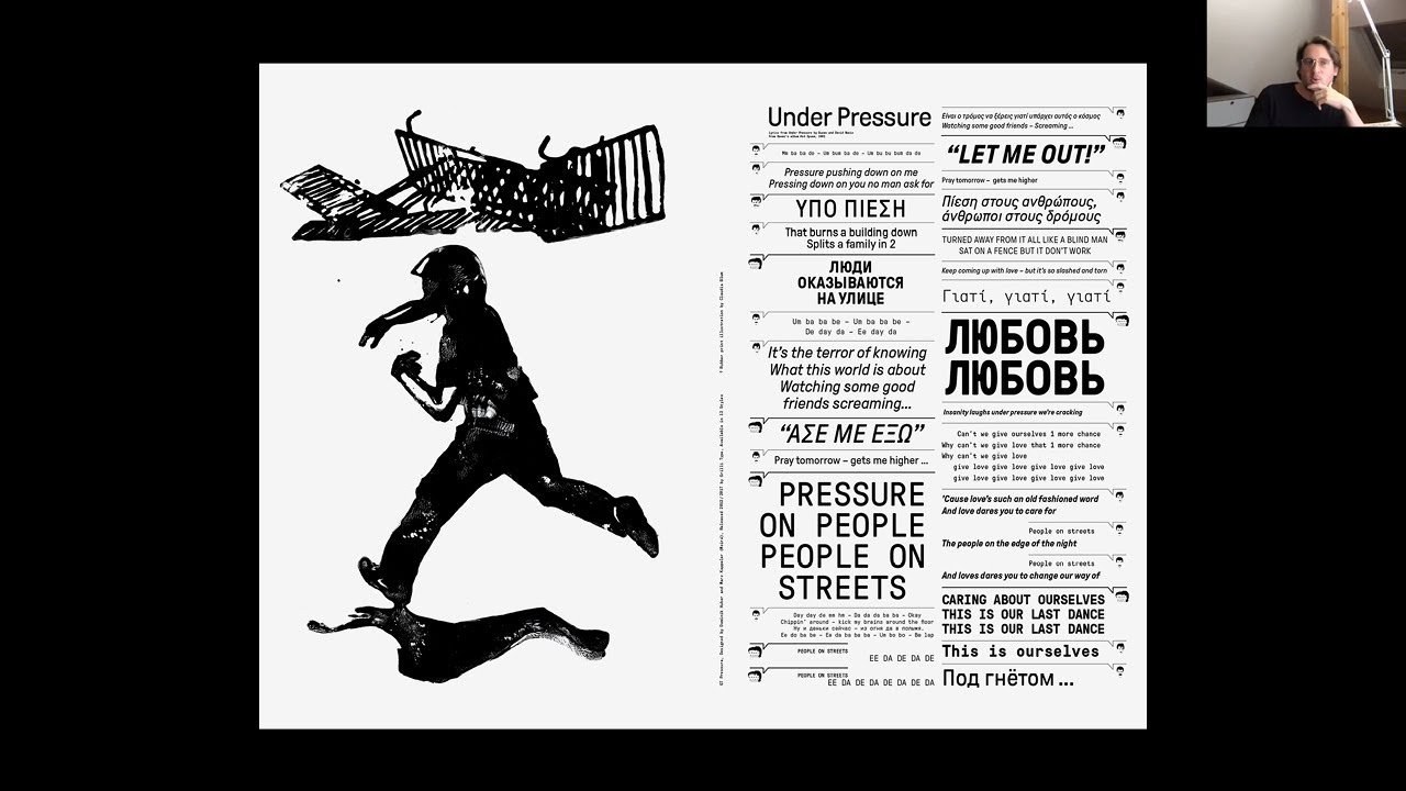
That's important and the other thing is obsession with detail if you're doing minimalist design or also like this with modernist design it's very often about details that matter and to give you an example of how much details matter I always like to show that is and this sheet I received from my local government and it was about local elections and they sent me with my boating documents also like this manual that. Basically instructed me of how I'm should properly tick the box and it really clearly also says that if you don't do it correctly your vote is going to be dismissed so this is like about the extent of how square switzerland is so if you want to ever visit the really hardcore detail obsessed square place please let me know and visit lucerne and so what is actually a typeface when it comes to type design I think details matter details and concepts both matter a lot when you're designing a typeface and sometimes if people ask me what is actually typeface or what is type design and to explain it simply it's basically a collection a collection of minimalistic two-dimensional sculptures and that you're putting in a sequence and then they these sculptures together they can convey a message and the typeface itself is a tool that you're using to do graphic design or you're using to do communication design so one aspect of the typeface that's always important is that it's a really finely crafted tool in our case we sometimes take I think up to 10 years and to really refine a typeface to the point where we think the concept is sound enough and the details are all perfectly implemented and since we're spending that much time on designing these typefaces we also like to educate our audience about how much thought and detail and care went into this design so we try to really take it to like basically the maximum you can go into details and that is one important aspect when you're designing a typeface you're designing a tool that somebody else then will use to do new design and that's one part.
That's really important but the other part of a typeface is the typeface is also a design piece in itself and it has not only kind of a technical quality but it also has an emotional quality typeface is kind of like a person it has its own characters so whatever design you will do if the typeface will have a strong influence on it and with our typefaces we spend a lot of time in building visual worlds where we think the typeface fitting into and we play a lot of attention to telling really the story behind the typeface into communicating its personality like is it the colorful typeface is it black and white is it funny is it serious and a lot of people I think know these mini sites we designed for the typefaces that are basically telling the story of the typeface and explaining it better to the audience and I will pick one typeface and in particular the our latest release gt flexa and show you a bit on on that example very quickly how we implemented that typeface into a website so the interesting thing about gt flexor is actually the way and typography is manifested and throughout history there's been many manifestations for typefaces or typography it's been chiseled into stone and there was a period where you could do typesetting with lead type setting and then that technology and faded a bit.
And then you had phototype setting and that this.
And then that changed into what we have right. Now is a digital type setting so a typeface the typeface actually completely left in a way the physical world and just became a kind of vector shapes and what I find really interesting about that is that it has no longer a solid shape it's more maybe like this or digital typefaces also could be a little bit like this something fluid something that can change its appearance and we really wanted to make that and the center of flex up to not have a solid tight face but a kind of a liquid type face and the way the typeface works is with the new font technology you can build a typographic space instead of a typeface so gt flexor has kind of three axis with weight and then the angle and you can just scale the typeface in this different axis so in a way flexor has no real shape it just flexes around hence the name of course.
And it's really interesting to play around also we created the mini site that explains a bit how the design happened the individual characters they were quite roughly designed it's quite the sturdy typeface and a lot of the decisions have been guided to make it usable and in different widths and weights and another thing that we found really interesting when releasing the typeface was responsiveness I mean nowadays we usually when we read something we read it on different devices in different formats and different medias and here some sketches I made I thought it would be interesting how could the typeface work for example on the watch or on the phone or on this on a big external screen and together with the and swiss animator josh schaub we kind of developed these animations that really show how this technology can be used also in an interesting other manner in design and we also did a little bit more playful kind of exercises with what would be interesting in design if the typeface can flex and what another thing that was really important for me when we released the typeface was to play with words of movement because the typeface is not static it should really convey this message of movement always on the go it can turn jump bounce dash and so on and the website we built this is already the last slide of my presentation and shows a bit the history behind the typeface the design space and you can also actually play around a bit with the typeface and make it do different kind of movements so I was trying to be very on time with 10 minutes I hope I managed to and fulfill the swiss cliche and I have here the last slide of my presentation to do some like himself advertisement if you're interested in anything I showed you and please go and visit our instagram twitter or visit the websites I showed you. And if you're really curious you can also just send me an email and I will take my time to respond to you thank you very much amazing thank you noel that was incredible yeah you can stop sharing now but such interesting stuff I feel like it's so rare to get that kind of insight into how you how you build a typeface like that so thank you for that we've got a few really interesting questions that have come through these were actually submitted before the event by people as they bought their tickets but one question came through was this person is a big fan of not just your font library but the way you approach licensing making font sets and beta versions available for creators to use and try out before licensing this person asks yeah what are your thoughts on the rest of the industry who often appear to restrict full use until licenses are purchased yeah feel free to be as I think the good thing is that I've been a design student myself and know how like how lack sometimes people deal with font so I mean I remember like my first year in art school I think someone dropped this zip file on the server that had like I don't know 20 and of course as a student you cannot afford you cannot really afford to license typefaces if you want to use them for a project.
So we came up with this idea of and providing free trial fonts is basically a reduced version of the actual typeface so like very simple philosophy try before buy and I think that's also kind of an offer for people not to just pirate the typefaces but to use the child fonts and then once the typeface is actually being used to then last properly license it yeah that makes sense yeah another question is just come in which is really interesting about kind of how you work with clients going into so much detail at what point do you share designs with a client and in a very busy world where clients want things immediately how do you then get the time you need to kind of perfect something because you clearly do spend a lot of time perfecting things well I think it's actually you know like most most of the time when we work with clients it's usually on behalf of an agency that has a client and then we're kind of the the partner of the agency and with typefaces I mean me in this design world or maybe graphic designers you know what the typeface is and my grandmother never really understood what I was doing and she thought it's just an excuse to for being unemployed and often even with clients they might not really understand why they should pay for a typeface or by having a particular typeface and I think and when clients work with us or design students it comes in really handy that we do a lot of educating in design and typography and we are very and keen on you know package only we're always packing everything up in a concept and where you can argue why certain decisions have been taken and in that case actually the details they help you to argue on behalf of the titans it's much more difficult if you just present some design but you cannot really talk about it or you cannot really argue why you took certain decisions right and one final question comes through from from kieran do you still start from sketching I guess using you know pen and paper or pencil paper or do you work straight from digital now it's always an often asked question.
And I I I use both actually. And I but I personally think in our age it's not really a different so much I have now an ipad and even though it feels a bit different to draw on the ipad pad I think it's still pretty similar so I I like that analog and digital they all kind of blur together fair enough okay well listen noelle thank you so much for for your time and thanks for joining us today it's fascinating to see yeah if you wouldn't mind turning your audio and video off
Latest Talks
-

Will Anderson and Ainslie Henderson
Bringing stop motion sorcery to BBC’s Small Prophets
Watch -

Amber Weaver
How does contemporary type design translate into the wider world?
Watch -

Murugiah
Why you should reject the formula and make art about things you love
Watch -

Marina Willer
Design thrives when you find poetry in the simple things
Watch -

Lizzy Stewart
The hundreds of drawings and writing-on-a-whim that goes into comic novels
Watch -

intra
The rewarding process of recognising the art in obscure everyday life
Watch