
Laura Callaghan
Drawing fictional film posters, organic shelves and election scenes in watercolour
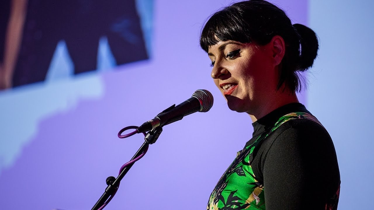
“All my client work is really informed by the personal things I do, and it tends to be the stuff that clients reference as well when they get in touch with me for projects.”
This is a bit long, sorry. Hello. I'm Laura, I'm an illus rower.
This is a recent-ish example of the kind of thing I do.
I was born in Ireland. I come from a small town called Tundaw, just halfway between Dublin and Belfast. Probably their best known cultural output so far is the course, so that's what I have to live up to.
So I moved to London in 2009 to study Masters in illustration at Kingston University prior to that I did a BA in Graphic Design in Dublin, but after being a three-week internship in the Graphic Science Agency, figured it wasn't really for me.
So I decided to give illustration a go. I was a bit green going in, I think, while I was studying and probably for two years after I graduated, I was going after children's illustration because I figured that's where the jobs and money were.
So I got a few other illustration jobs on the side and I think the thing that made me realize what sort of starting I wanted to work in and what sort of illustration I wanted to produce was women. I got a weekly illustration column with Stella, which is the Sunday supplement with the Telegraph. And it wasn't actually the commission itself, I mean it was very nice to go with the commission, but it wasn't the most interesting thing to do, it was just illustrating a catwalk image every week.
But I was working a full-time office job while I was doing this as well, so any spare time I had to draw, I wanted to draw things that I wanted to draw, which primarily was women and figurative drawings.
So I took the learnings from my work with Stella, so working in watercolor, working out with fashion and pattern, and just kind of adapted it for the kind stuff that I wanted to make.
So these are some illustrations from 2012, which are kind of more keeping with the style I work in now. So using pattern and clothing and decorative objects in the background as a kind of narrative device to tell the story. Yeah, sort of one-shot narratives, I guess. And these are some pieces from last year for a solo exhibition I did, a cakey outlet, which is called Aspirational, which is kind of showing the reality behind these inspirational quotes that you see on Pinterest and Instagram and the like.
So this is sort of where my work's at now. Really highly detailed and colorful and patterned and sort of half fashion illustration, half social commentary, kind of satire life, I suppose. And these pieces here are all watercolor paintings and personal work, which is really important to me.
I think it informs everything that comes after it. All my client work is really informed by the personal things I do, and it tends to be the stuff that clients reference as well when they get in touch with me for projects.
But I live in London and I need to play rent on it to eat, so I also do client projects. And a wide variety of ones, but so brand work, this is for a jewelry designer based in Germany last year. I've done some illustration for packaging, illustration for apparel, I also run my own shop, which is nice and a curse in such a time, so I make products for that. But my sort of bread and butter and the things that I get asked to do the most is editorial illustration.
So these are some recent kind of pieces I've done editorial. And that brings me on to what I'm here to talk about today, which was an editorial project I did for Sight Magazine, which is a magazine to company Sight, which is the weekly newspaper in Germany.
And they're quite well known for using a lot of interesting illustration and photography and sort of pushing their design a bit more. They're not afraid to use a cover like this for other than having photography on the front, which is nice and refreshing. And so I worked with them once in the past last year, they contacted me to do 13 illustrations for an issue about potatoes, which I'm a bit worried about.
But it was fun. Yeah, it was mostly food illustrations, so it was a little bit removed from what I used to do, but I really enjoyed working with them. So when Michael, the picture editor, got in touch with me to do another project. And I was all for it.
So this is the email I got sent initially. And so, yeah, the topic was the view on the world when women have the power.
I think that's a bad translation. What it really meant was if women were to make all the decisions, what would Germany look like, basically. And the initial brief was two cover illustrations and four illustrations in the space of a month, which would have been doable, but I was heading away from the end of the month, like story, but I had a bit of a back and forth and we decided that instead of doing three interior illustrations for the piece.
I was really interested in the topic. I mean, this kind of female, heavy, female funded world is what I do naturally in my work anyway. And drawing women and women's narratives is what I enjoy.
So I was comfortable with the subject and I'd done quite similar commission the previous year just before the election in America for pitchfork review, which was pretty much the same theme, actually. What would the world look like if women were in power? And I just wanted a very kind of naturalistic street scene. So yeah, it was in my wheelhouse.
So I wasn't given text as such because of the translation, I wouldn't have understood it. So he gave me three scenarios instead that they wanted illustrated, which would kind of track up the statistics that they had in the piece. And the first was a grocery store, just women's food habits, I guess, apparently we like organic products. And third-party products, we don't like to eat as much meat.
So this is how I always start my work. Generally, I do some quick thumbnail sketches, but for this brief, it was pretty prescriptive, so I just went straight to Inpex or up. And they were quite keen on using a limited color palette and sent through a previous piece that worked for their Donnerford Cut-Out Fest poster, which was intended as a screen print, so it was four color. I basically said, can we use this color palette?
But I don't really like repeating myself, so I went for something a little bit brighter. And while I was researching some packaging design for the grocery image, I came across this packet of Prarisa paste. I make a super-color scheme of all that basically, I thought it looked quite nice. Yeah, so the grocery illustration really appealed to me as well, because I like to do very high-detailed work and filling shelves with fictional products. It sounded good to me.
So I was looking at these packages, same-springs packets from the 1960s, 1960s and 70s, I think, just really nice graphic, reductive designs, and I sort of implemented those, so this was the final image. Yeah, with all the pattern and colour and everything that applied. I work in watercolor for my own work, but when it comes to client work, because there's so much back and forth and all the rest, it just makes sense to work digitally. And I mean, you can really layer on texture, and it's just quite impactful and graphic.
The second image was set in a cinema lobby, and it was about what kind of films women like to watch, apparently family films and rom-coms. Women, you're letting us all down! So in the rough state, I wanted to have a little bit of fun with it, so the characters are kind of more than 3D bored in her, probably minimum wage job and the background, so the people were waiting for someone to arrive at the cinema. And I came up with these fictional film posters, and like, it must be love, a rib off of Marley and me.
But I didn't actually consider, I mean, it happened with the grocery work as well, that of course it's a German magazine, and everything used to be translated to German, so I got really familiar with Google's translate, and they actually wanted to use real film posters in the background, so things were amended a little bit. So this is the final image for that.
And then the third one was a double page spread that was initially supposed to be a motorway scene, which I was driving because I hate drawing cars, more or less later, but instead it was set up as a street scene, and I suppose it was supposed to incorporate a lot of the different stats that were in the articles.
So there's an election poster and a stuffed nuclear power poster and organic food shop. Oh, I must have had that.
So this was probably the one that was the most back and forth on. In terms of composition and content, we had to move a lot around and make a lot of space in the end for where the text was going in the magazine, which is never fun to do, but there you go. Then midway through doing the final images, I was asked would I want to do some images for a site online as well, which I said yes, I would like to do both.
And I had Skype call with Faye and Paul, who worked for site online, just like a separate identity, and they sent me through the Spice Scary Looking Spice, they showed lots of different topics on it that they wanted illustrated, but actually, again, it was more, it was quite a perspective and to the point they were really clear on what they wanted. A lot of it was spot illustrations that were almost going to be used like an infographic, I guess. So here's a few of those.
So this one was to represent domestic violence, and it was for a portion on violence, basically, if women were in control and making the decisions, there would be less violence, but they wanted to highlight the domestic violence aspect of it.
So I had to figure out a way to do that, to make that obvious, but not too in your face or gruesome, I guess. So those are two options, and I just want to go in for it. Favorite text positions, what's next?
So again, this was quite straightforward, they sent me through little stick men in the position of the woman, but I thought maybe because the article was about women, it would be good to portray sort of from the woman's point of view, so very female focused, so it's doggy style, woman on top, missionary and oral. Yes, I was right. Then this was again to represent sort of films that women would choose to watch, and they sort of let me do whatever I wanted with this, as long as it was really clear what the topics were, like, instantaneously, so science fiction, historical films, romance and action.
And then the worst illustration to do for this much, they wanted to show the difference between the cars that women would choose and the cars that men would choose, so I had to draw loads of cars, which is never a thing, but they made it into this little nifty animation, which was quite cool. Apparently women like smaller cars and more aerodynamic looking cars, whereas men prefer bigger, boxier cars. I don't know why.
So, yeah, in total, I think maybe I dated 25 illustrations for the online edition, and this is my very erratic scroll from here, but this is how you look at the website. Yeah, so once it was published online, then actually got a chance to read the article with the help of Google Translate, which was nice. I just see what I had actually been illustrating, and I think the thing that struck me the most was not the differences between what the world would look like if women were making decisions, but the similarities. Overall, there wasn't actually that many differences, although from the comments section underneath the article, you would think it was the most insane thing in the world, so there would be making decisions.
But yeah, there you go. And that's the end.
Latest Talks
-

Will Anderson and Ainslie Henderson
Bringing stop motion sorcery to BBC’s Small Prophets
Watch -

Amber Weaver
How does contemporary type design translate into the wider world?
Watch -

Murugiah
Why you should reject the formula and make art about things you love
Watch -

Marina Willer
Design thrives when you find poetry in the simple things
Watch -

Lizzy Stewart
The hundreds of drawings and writing-on-a-whim that goes into comic novels
Watch -

intra
The rewarding process of recognising the art in obscure everyday life
Watch