
Kellenberger-White
Building a museum identity from steel bridges, paint splatters and public voices
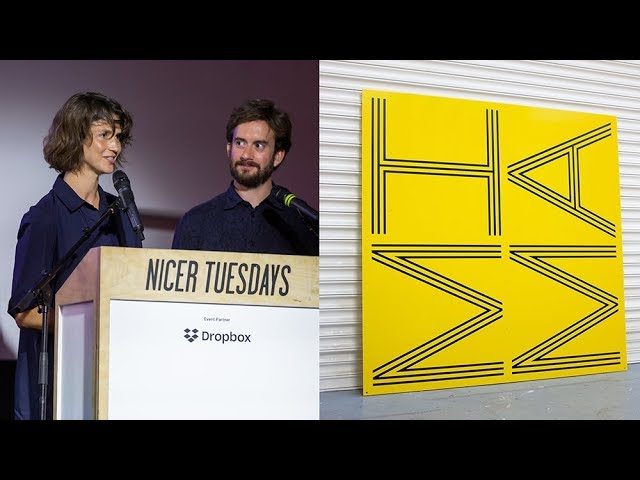
“We wanted the font to be loud and poster-like but still be playful with the way that the machine is working.”
[Applause]
hi everyone thanks so much for having us I'm Ava kalambaka co-director and the other half of Kellenberger white this is sebastian and this is our studio very close by we have a graphic design studio in old street and you can see we have a lot of books we like collecting things a lot of like leftovers from projects and materials that we are intrigued with and collecting in hope to use to Monday and Kellenberger is not just Sebastian me it's also it's the four of us imagine on the left and Tom on the right. And we don't always look that sad and yeah it's great it was a funny moment I was actually so pregnant in that picture that I couldn't get up anymore so some politely slide she's down with me thank you Tom and we do different works this is just a quick overview of we've done the identity for Goldsmith's Center for Contemporary Art. And we worked with assemble and the architects we also collaborating with on a new project.
That's just opening next week at the Wellcome collection called being human and we collaborate with artists like Elizabeth price on a project here in Berlin we do exhibition design and publications for the Barbican and we don't always just work for the public-sector real so there's two projects here for fashion. And identity for levity SH and then an identity for a lovely natural winemaker in East Sussex called tilling and wines and the project I'm going to talk about. So is it's really about our interest in process and in collaboration and the project that shows that to its most its best is Mima so we got asked to do an identity for Mema Mima is in middle sprat does anyone know Middlesbrough or is from there no no at all okay well I am honestly I haven't been there before we got the project as well.
So this is our first picture when we when we arrived there by train coming out of the Train this amazing poster of Middlesbrough must have been there forever we investigated in its like strange kind of instead of the parks being printed they have like layers of acetates of green acetates on top of it and and this is the building so from so in recent years Middlesbrough Institute of modern artists taken on this mission to be a useful museum so to look back we connect an art institution with a civic function and from the first day when we were there we were extremely impressed how that work it was a it was a day full of workshops that the museum was used and in so many different ways not just people going to see exhibitions they might have been exposed to extraditions by going to other things like learning workshops like kids workshops like what else have like language workshops it was really.
And then they have this communal free lunch on Thursday as well where different charities cook. So that was the beginning of this whole really quite an open brief to create an identity within a whole year.
So that's very unusual for us that we get this time. And I think that's really made this project so special there was not really.
There was a real trust in us in the real trust in showing what we in exposing what we are designing so part of the commitment was also showing to the public and to the people who worked there there's about 40 people work there and what we're up to it's a very open process with two exhibitions along the way. And we started with this workshop during our research we were really impressed by this John Ruskin thought of bringing making and thinking back together so really connecting the hand together with thinking so instead of just having a workshop talking around desks we we could we kind of connected that with a workshop online or printing so we had a whole day with all staff so it was about 42 stuff and that was exhibition. And invigilator to creators to learning and we yeah we learnt about printmaking so we were learned about liner cutting whilst talking about this very important question of how do we as a museum including us represent ourselves that was the question and these were the outcomes in the end of the day of these printed liner printed thoughts that were engraved into the the boards and and this formed the kind of this kind of work form part of our first exhibition showed the outcome.
But we also had these tables of our previous work that would really introduce our practice and field trips that we would do that round Hillsboro so photographs mainly and something that we were really struck by is this bridge in Middlesbrough called the transporter bridge she was built in 1911 I'm looking at the architecture of the Eiffel Tower and he was bringing in a kind of flourishing time of steel factory steel factory workers from one side to the other side of that River and we started just exploring it it's now more it's still in function but much more a visitor center with lovely people working there and guiding us through so this is us looking up from this gondola and this can perforate that metal is an elementary afterwards built into the identity and this is us looking down you can walk over as well if you don't have a car and yeah it's kind of it's beautiful and it's bleak at the same time it's where I'm later on at the opening scene was filmed and we we looked around and suddenly we saw the Sun splatters everywhere from kind of when the bridge was paint at the last time. And we walked around the transporter bridge and found these paint cans and the kind of visitor guides told us that it had just been painted and it was a nice and you could see all these layers that it had been painted so now it's in cornflower blue but it used to be yellow orange and we found out about this paint so called international paints and they exist around the whole world and they're they're used to paint riches and ships so we contacted that company and that was part of our exhibit in the first first exhibition as well.
So that can't become became our color palette so there's international pains like international orange is the paint for the Golden Gate Bridge in San Francisco and and we like that connection to other cities around the world kind of post-industrial cities around the world and and they international paint company they painted these first original 21 colors for us so here the paint samples that we exhibited and this was the the holding page for for Mima at this point so it's a kind of an interim identity and it brings together all these different things like the linocut typeface the paint splatters that we encountered and the color palette and now several take over and talk about print trim hello so print room is the second exhibition. And it was to last three months and it was going to be the main public consultation process that we're going to have in the branding projects and while it's kind of public consultation we're using all of the tools of exhibition making and we're thinking about pertinent themes about crowdsourcing co.design social engagement and we're also thinking about that very first workshop that we did together with the staff so how do you make a three-month exhibition where of everyone's Japanese wood carving and printing that's that's not going to happen so we we really wanted thorough engagement with everybody we wanted to make her a tool that was going to be really easy to to use and we wanted to invite people and use the marketing tools to invite people into the exhibition.
So we wanted to focus on the idea for print room which is in every kind of company office you know this photocopy room there's stacks of paper and you can reproduce things quite quickly and we wanted the exhibition to be about voice we had to build the exhibition so everything in the exhibition like the first one everything had to be made and it had been made with ideas that were being thought about intuitively on the research trips and the materials that we were finding these these pictures are some of our workshop visits this is a metal workshop and the paint booth the paint sprayers there's many of these in each city but is it was really good to talk to people about the projects engage people more with the project we ended up finding out more things which were were great like this paint booth place has an amazing Victorian bronze bell with paint splatter zones on it and they wouldn't let us use that any exhibition which was annoying okay. So print room this is the the machine it's a vinyl cutter and we found it because we spoke to some people who do some of the exhibition graphics who produced the exhibition graphics when we're doing other projects and they said this machine without the stamp without the scalpel blade and with a pencil is the type of draftsman tools that architects would use many many years ago. And we remembered then that. There was this facsimile drawing outside the transporter bridge museum showing how all of the mechanics were designed and we were remembering those so mechanical fonts that are still drawn by hand so we put the pen in and we could only fit a thin rollable pen because it was a pen that wasn't going to dry too easily in the 3-month exhibition the tools were there as part of the kit. And we can big marker on.
And we had we had to sort of peel off the project. And sort of buying the machine have it in the studio and just play about with it for some focused time. And we realized that we could make it we wanted to make posters out of this machine and we wanted the font to be loud and post alike that still be playful with the way that the machines working so we we created a funnel with multiple lines and the machine just when you're just watching it seeing these perfect circles and perfect lines as repla going on and on and on and the idea of the font being completely geometric and almost divorced from the hand was a really interesting idea so when then making the exhibition. And we're exploring how those International Marine colors can flood the room and then a grid a grid is really important in graphics and it shows a place for things to go and so the entire exhibition is 11 meters high it's a double storey space is a complete empty cube and there's four stations as a place to write and a place to this is the place to write and you we built a website where people could write and respond to questions we made so we did workshops with different departments about what questions would be interesting for people about art about museum about the city about color about design ingredients and you type these in and they change each day the questions and so the rooms gradually became more and more crowded with people's opinions about things on the opening we met a lady called Annie who emigrated from France and talked about how she first moved to Middlesbrough she traveled by boat and she she just remembers this time of coming to land the sunset is blue because of all of the chemicals and yeah this is most probably in the 70s and the rain coming off the clouds into the fields sheep and goats are eating it their fur is their wool is going pink so we asked her to put this in a small group of words to create a poster somebody else wrote Nemo is an oasis in a heavy-metal desert and we found out he's a folk singer who took four decades worth of mordy medium format film of the streets children factory workers around the space so the exhibition became more and more popular thousands of posters were made and people could take a copy away with them as well. And this font that we had made was being used by everybody it was becoming part of the environment and it was at this point this was the crux of the project this was where we knew a brand an identity mark could be formed that.
This is just a small film showing how the machine is working so the project was from that point about an expression about a typographic voice about these design ingredients that were forming a visual language that allowed Mima to be able to talk to everybody in a way that was the right accent the right character the way they they wanted to represent themselves but there's a whole series of brand assets that need to be created from stationary way finding marketing materials so the first thing I don't know why it is but a letterhead always seems to be one of the first things that you start testing a logo type we often have all of our work photographed by Thomas tank and he's become in a way a source of member of the studio because he he captures our work.
And we can talk about how things relate to each other. And sometimes this is an arrangement of forced arrangement and sometimes it's simply a walkthrough where he's walking through the stuff in quite a natural way but here you can see the the original printer impost is with seven lines and then we're condensing it into a three line and then a five line so these are the stationary parts and then we're having more functional conversations about budgets and resource and environmentally friendly papers and ways of using ink and then it's about how to make the things that you print tactile digitally so at this point the program had changed more the curators and learning departments had become more balanced and they were very strong and they were very closely related to each other the way that they programmed and the exhibition space that used to be just one artist became four and the what song guide this is a string of them.
This is a maybe a year's worth of four quarters and those 21 colors have been used in different combinations and we're making timetables to show this program so we have a seasonal timetable and then a weekly timetable and this hierarchy of events and the way that this typeface that we were making could really be legible and really be readable because it's an accessible museum but it's also trying to express itself as an accessible museum and we're not using any images and this what song guides that our artists led so all of the images are about process and the print process but they're showing the atmosphere and the energy that's happening on their main Community Day we then did further research trips really focusing on metal and signage about how wayfinding could happen so we revisited the transports of British Museum and the bridge itself we went past old British steel now owned by Tatro now sold on somebody else places and working again with the metal workers and the meanest staff in designing a series of things saying these are the message boards they're these two sided boards that can be wheeled around and contain lots of information and you spend a lot of time on the details of things the radiuses of things the way that something's painted and it reminded us of something that Middlesbrough is famous for its this it's not a Donecker babbit's and me'll that's like a piece of chicken with a bechamel sauce on.
And it's kind of we haven't even tasted it but unless the Rogers once said the spoon to the city ko kya alle cheetah which is about this philosophy of design where you focus on the very small things as well as the very big things. And we try to keep keeping that philosophy of flowing the visual language and the material languages through every item so these are the metalwork signs and then moments almost like the museum becomes a planner sets of old and interim moments so this is these are some signage on the door for the they use the Linotype typeface now.
This is the main entrance so all of that white stuff they saw on the glass has been removed and it's become more transparent and this is a sign it's a beautiful picture we like a lot about a sign about to be put onto the building you
Latest Talks
-

Will Anderson and Ainslie Henderson
Bringing stop motion sorcery to BBC’s Small Prophets
Watch -

Amber Weaver
How does contemporary type design translate into the wider world?
Watch -

Murugiah
Why you should reject the formula and make art about things you love
Watch -

Marina Willer
Design thrives when you find poetry in the simple things
Watch -

Lizzy Stewart
The hundreds of drawings and writing-on-a-whim that goes into comic novels
Watch -

intra
The rewarding process of recognising the art in obscure everyday life
Watch