
Joana Filipe And James Mason
Designing a Keith Haring exhibition through the gritty energy of 1980s New York
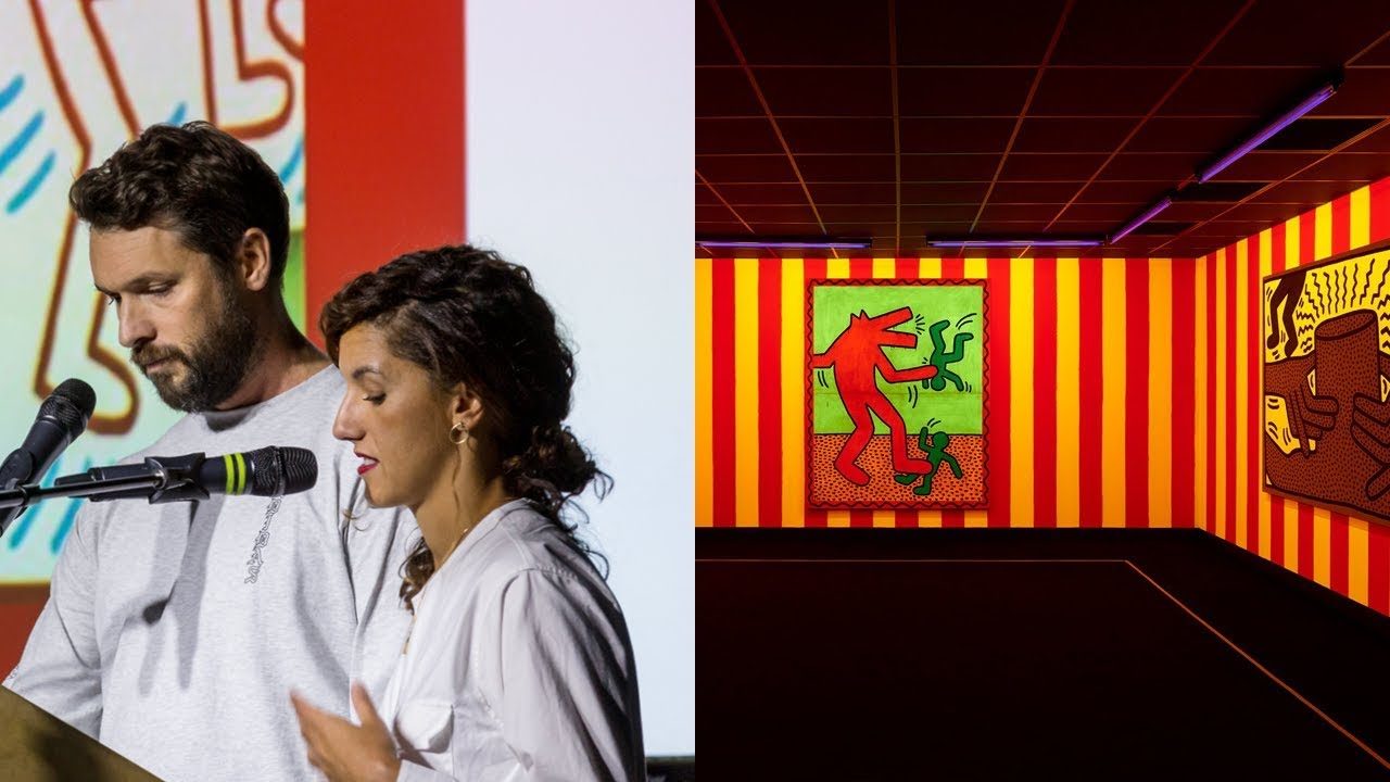
“We knew we couldn't just go completely crazy and we never wanted to be — there's a very big difference between set design and exhibition design.”
[Applause]
I'm James Mason I'm Joanna Filipe and together we are interesting projects we are a interior design compactus and recently we've done projects which includes exhibition design commercial and a little bit of residential so we're here tonight to talk to you about the tale of a poor Keith Haring project that we got a chance to work on.
And this was a huge thing for us this year and a big turning point but before we start we thought we'd want to introduce ourselves a little bit because we're quite new on the stage of design as interesting projects and we Joe and I met in 2015 we worked in a same studio we then collaborated together on projects from 2016 onwards so one would have a project the other one would employed it over one and started working that way.
But it's only been since 2019 beginning of this year that we've become that we actually merged and became interesting projects we try to we try to make sense of where we come from this was a very early sketch we thought there's nowhere we can show this.
But actually we can we come from two different routes all together I I did the educational I went to the educational system of going through University work for big agencies for about 15 years I actually did 10 years of retail and then realized I actually don't like shopping bit of a waste of time.
But then went freelance tried food and beverage did some offices and work for agencies great but always never really known what I was doing Joanna on the other hand I've come from Portugal from the art and sculpture scene worked at the VNA when she arrived in London and actually there's one project that I was working on which was an exhibition in in Geneva that I did and when we I showed it to China she said hello this is great this is what I do let's talk let's do stuff together.
So we did so we're very unusual partnership in the sense because I come from sculpture and my process of thinking every time I approach a project every time we get a brief we had this massive argument because James would start we're doing like a floor plan and get really like I need a floor plan I need these grids and I need all these things really straight and I'm like don't look at a computer I need to sketch I need to decide what material and what meanings and what we were actually we're responding to so we had these massive arguments and until the time we actually realized that the way we could solve this brief was by actually going on-site and working together on site and solving the problems on site so we literally moved the studio from where we were to the project.
And this is something that we we want to do more and more we try and do it every time we work on a project.
So I think it's gonna become a bit of our trademark as much as we can so we like to go on site and draw draw paint and draw lines and actually create our design together on this kind of common ground so we've been very busy this year and completed quite a few projects which we thought would just show you before it gets Keith Haring and we did so this is an exhibition design that we did for London College of Fashion and where we used some recycled rubber from shoes for like footwear this is a residential that we just completed this year which is actually on for sale right now a modern house if anyone is half a million to spare we can't afford it.
This is another exhibition of human stories which is a photography exhibition annual photography exhibition and most recently we work for this it's a really cool brand called stock X they're like a marketplace for limited-edition apparel and this space works as a little bit of retail and exhibition at the same time so let's flash back a little bit to February this year when the rent out the rent pushed us out of our Studios so at the same time me and James had decided that we were gonna merge our business and I was not going to be anymore sho'nuff leap design studio and I was going to be part of interesting projects and so we finally decided to merge and we lose the studio and have zero work really great time to start a business together.
And so James had the ideas like oh why don't we in contact at Liverpool we had just to give you a context we had lost the pitch last year and what happened was so he lost the pitch last year oh we don't get in touch and like maybe they'll have something we could pitch right and and I work at the VNA before. And this is what I knew you always usually lose three pitches and you kind of get the fourth yeah let's get in touch with him I'm sure if they have something we could just like be part of it so yes I like oh yeah we have so we spend the next two year the next two weeks working on this project and really really thinking about really thinking about that we were just gonna do this pitch but really just to impress them because for us this was just pitch number two so we we pretty much did what we wanted and for us this was like an exercise and exhibition design for us it wasn't really like oh we're gonna do an exhibition particularly because we know that type does not have like a super tradition unlike other museums the tradition of using exhibition designers but also because we know they're like really tied to their identity so we're like whatever we do is go is go it's always gonna be too much.
So we're like let's just do whatever we want so what I'm gonna do now is I'm gonna show you a few of the images of our pitch and a few of the images of the result and give you a little bit of context of how did we come about with the ideas and how did we solve this problem so the first problem we encounter is like okay we're pitching for this project our idea is we always spend time in a sir plans are the wrong dimensions and was like how do we solve this we've made a model and basically what we did is we like to solve this brief we like crank up the speakers with 1990s hip-hop music and spend the rest of the time just like immersing ourselves in culture so but just to give you an idea of how it works so the taste had a brief Ted had a brief prepared for us with a story of what they wanted to say so the brief basically gives you a set of works initial work.
So they give you a list of initial works that they want to show from Keith Haring and then they separate by section at least an ideal scenario what they want by section what they want to say and what they wanted to talk was basically this this this idea of like how Keith Haring comes from a subculture and becomes pop culture and also like so you have these like three Keith's that they wanted to make emergent as an exhibition it's like Keith Haring and like a pop artist Keith Haring like them the artist would like like as a political activist but also Keith Haring with like social responsibility so this is what this is the problem we had to solve and so we like watch all these documentaries and start watching like video clips of Keith Haring like being arrested on the subway by like doing all these drawings and just trying to get get news clips and try to understand what was the scene of New York's New York City in like late 70s beginning of the eighties and financially speaking New York City was in an absolute mess so they've lost loads of money there was no funding the city was brought in and the police forces are actually you like on strike they had a crack issue they I mean the crime was really high and and this was the bar I mean this was the backdrop I said these images are from these like quite famous photographers at the time and and this is what you saw it was like this like you know the subway was graffiti there was like they just have this like unglamorous vision of the city and basically.
Basically what we're trying to understand so on one side we have this energy and on the other side we have this like super cool and the ground scene of the club nights and this is what Haring was surrounded by so he was like you know hanging out with like Barbara Kruger and hanging out with Andy Warhol and at the same time you have these two energies of the city that were the context of his work and where is work was happening so the work was happening is creative work not only for him but for everyone else was happening outside of the space of the gallery was happening on this like underground scene in like in clubs and where they met up so when we had to think about the materials for the exhibition and just just to give you a hint you know we didn't have like a massive budget so started the brief we knew that we couldn't like just go completely crazy and we never wanted to be very like there's a very big difference between you know set design and exhibition design we never wanted to create like a scenario that it was too too much representing how he had it.
So we never wanted even though we've seen loads of images of his studio we've never wanted to recreate that we were just trying to like bring the city of New York into this space and so the so Keith Haring design like draws everywhere you know is we had to choose these materials that were very like I guess very connected to the sense of the city very like poor materials so we go for this galvanized galvanized material for for like chipboard for things that were very poor and very representative of this architecture that was changing there was very transient it was a transient New York but also connected to how Keith Haring himself was like also drawing so he was drawing everywhere he's drawing on carbonate is drawing on tarpaulins and he much preferred to like draw on these things. And in paper as well he only draws in canvas in like 1982 until he does like an exhibition. And it's interested in selling work up to that point completely and interested it was completely against this idea of like western artists you know Western world it was much more like challenging those values so for us that was super important to bring that to the context of the exhibition.
So in terms of how we've organized the space of the exhibition and thought about the architecture of the space I mean even though Keith Haring's work is like pop and fun because he has such an importance in his political activism we had to separate the serious Keith Haring from the more from the you know from the more I guess yeah performative artist and performative and more entertaining so we've separated separated this language of the spaces into way every time that the work was about social responsibility about engagement we placed the work in really open spaces to allow for that you know I guess to mimic that communication everyone and every time that the work was being created in a more performative space it was more intimate we would make we would like reduce the height of a space and we make it a bit more intimate so I guess that's how we thought about it this image was showing here is actually Keith performing at Club 57 for those who don't know Club 57 is this kind of like has nothing to do with club 54 by the way club 57 is like this school arts clue Arts Club place the only existed for like roughly five years. And it's basically where Keith Haring had the opportunity to express and create his work. But also meet other like-minded people take loads of drugs and and and and basically.
That's where they hang out like the artists were not showing work and galleries they were showing work in these credit works and these spaces so it wasn't it wasn't really.
So the intention of this space the way we've design it was not to be gimmick so we didn't want to recreate the space what club 54 looked like but we wanted to create some elements that conceptually would link you to that idea what club 54 so we kind of did this we included these like you know pasted posters because there was something. There was an element that we knew was there.
But also we created the seating and then the way the seating conceptually speaking you think we made this super large seating that could double up as it stage so we thought like okay conceptually these things someone sits but they could also use it as a performance so that was that was the idea we lowered we basically lowered the ceiling so you come from a political activism space really open and you go into like the idea of like going into the club going into this underground scene and it was a yeah and it was like I think that's what we were trying to do the the other space that for some reason everyone was like the only one is the one that we were more tied into what Keith Haring actually shown so this space is the dark room it was a space crew intentionally created to show Keith Haring's neon works and the thing about the space is that Keith Haring actually had made this when he showed these works at a gallery so he himself had recreated a scene of a club scene in a gallery to show the importance of this underground creative scene so both the curators and us were like okay we have to copy spend a little bit of time trying to figure out how do you do these neon colors and stripes and create this creative space in the middle of the gallery on the on the outside of the space that you just saw we wanted to what first of all we the sketches that you see here really we don't normally do the sketches we did that because we wanted to keep it in line with what how Keith would kind of do things they lose and that that kind of space in the middle it was a way to one have high walls to have a salon a convex way of displaying like Keith Haring we're doing it's exhibitions both so if you look at top left we really loved how Keith with draw around pipes and just take anything. That's existing and interest use it as part of his artwork so suddenly suddenly in terms of design once attire kind of include that in what we're doing so we create wanted to create this big object that came out of space almost like an intervention and you got a pipe that goes through through the top so we wanted to kind of build that object around the architecture of the space so the final result is not exactly high wasn't a sketch but we still managed to create this kind of high wall. And it kind of it was when you see it in perspective it kind of follows the roof and it would go around the columns as almost like it has nothing to do with the architecture and it was kind of in keeping with what how Keith of work is kind of this is it working around working right where you got color wise color was really important so we want to go super bold wants to respect his work and out the sense but his works so good we didn't want to overdo it and over over powers work.
So we each section would have a specific color well that was related to something that he did in a past or related some of his works and sometimes it would become a transition period so oh yeah.
So this is how I actually came out which is really nice and then here it was a way to kind of highlight a specific specific work.
So we liked the idea that we put red against the red why not and actually the creators were super cool on this because we just suggested all these ideas they're like yeah do it.
This is let's go for it and to be fair before the works came on we're looking at the colors going oh it bit too much.
And then the worst came over like whoo yeah good that came in on quite nicely who barriers so 80% because they Keith would draw on tarpaulin really fragile and can't we can't really preserve it.
So we had to put barriers and protective stuff around pretty much 70% of all the works but we did we didn't want to make it an afterthought so like okay let's just do something cool here.
So we really like he's kind of dogs to babies and we took as simply took the like a key clamp painted it but almost like in a precaution and within the scale of his object we even had a really cool idea that we're going to share of having like two secret Wiggly legs that was a likitha unfortunately if budgeting would allow but okay no worries the store looks good so this is these are the images of you know of Keith and this is we conclude on this by saying that it was really really fun working on his project because everyone involved I think what because the work was so positive and keith haring as a as an artist wants to be super inclusive it makes the whole work really really good that sounds like a rubbish word to say as as an end but it was good it was really good fun the exhibition is open till the 10th of November if you wanna go to live before we had never been to Liverpool before it's really cool here's a thank you thank you very much
Latest Talks
-

Will Anderson and Ainslie Henderson
Bringing stop motion sorcery to BBC’s Small Prophets
Watch -

Amber Weaver
How does contemporary type design translate into the wider world?
Watch -

Murugiah
Why you should reject the formula and make art about things you love
Watch -

Marina Willer
Design thrives when you find poetry in the simple things
Watch -

Lizzy Stewart
The hundreds of drawings and writing-on-a-whim that goes into comic novels
Watch -

intra
The rewarding process of recognising the art in obscure everyday life
Watch