
Lucienne Roberts is a graphic designer known for her belief that design can change the world. She co-curates and designs impactful exhibitions, such as the Wellcome Collection's Can Graphic Design Save Your Life?, which explores design's influence on human health.
Graphicdesign&
How plain cigarette packets, AIDS leaflets and A&E signs prove design’s public health power
“I believe graphic design can change the world.”
Transcript: May contain minor errors or formatting inconsistencies.
[Applause]
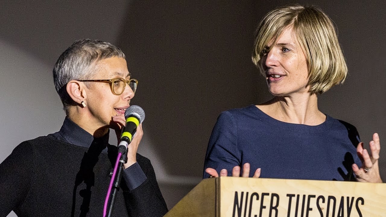
so small right I'm Lucien Roberts I run a studio in London called Lucien Roberts plus I'm on one half of graphic design and I'm Rebecca right I'm program director of graphic communication design at Central Saint Martin's and I'm the other half of graphic design and and I'm the tall one and Lucy's the small one I'm the optimist and the pessimist and that's one of the things we think makes us work.
And it's one of the things that kind of informs how we work and how we got a can graphic design save your life so by way of just a little bit of context and when I left College I was very idealistic I still AM actually even for a pessimist and I believe that graphic design can make the world a better place and I've always focused I think on work I hope does just that as a contribution as part of our investigation I've done quite a lot of writing and I suppose the key book I've written is called good and it's all about ethics and graphic design and that's where Becky comes in so one of the ways that Lucy and I connected was that she asked me to do some writing for some books that she was doing and I I don't think I realized I could write and I also didn't realize that there would be this connection in terms of an interest in subject matter so not just what graphic design is but more about its role and position in the world. And its value so a lot of the work that my studio does now is exhibition related and we've worked on three projects for Wellcome collection before and the world compilation is all about medicine and health and the exhibition spaces the remit of those is really to help the public understand more about medicine and health so we had a bit of an in with Wellcome collection.
But we'll talk about that more in a minute but first of all we'll talk to you about graphic design hands and the whole idea behind that.
So we felt that.
There was quite a lot of publishing by graphic designers for other graphic designers and we didn't need more of it. And we didn't need more glossy coffee table books about graphic design and what we really needed and what we couldn't see in the world of publishing around graphic design was books that demonstrated what graphic design does not just what it looks like or who it's appealing to but how it functions and the value that it brings so our first books we call graphic design and because you can always add a subject at the end any subject so because graphic design is about everything else isn't it.
So we had a literature book we've done maths we've done social science we've actually done religion as well but obviously for us a key key key subject would be health hence congrat design save your life and actually this title was really key to the project it wasn't the title that we started working with we actually had hearts and minds I think as our working title but really quickly we realized that we wanted a show that would appeal to non designers because this is one of our missions as graphic design and that we make work that kind of demonstrates the value of graphic design beyond our own discipline and we knew we needed a title that would invite people in and that would be provocative and we were delighted that welcome went for this because it's kind of bold and it.
And it lays its cards on the table is where we're making a case for graphic design but we're also we're talking about graphics we're not hiding that we're trying to promote that so long as the exhibition we've also published a book.
But we're going to be talking primarily about the show and one of the great things about welcome is that it has a remarkable archive so we knew we wanted to partner with welcome because we get access to this library this archive this museum of ephemera and and whole kind of catalogs of graphic design that weren't necessarily valued for what they're they're graphic design quality was it was because it was a marker of a particular kind of epidemic or illness or treatment so we were like kids in a sweet when we got into the archive we worked my studio produced the graphics for the show.
And we worked with Universal Design Studio who did the 3d and one of the key ideas behind the design was that each section when viewed in plan this is the model of the show is a symbol for the content of that particular section.
So we're going to kind of walk you through the exhibition now. And I think it's worth saying that when we went into the archives at welcome. And we had my dear of the kind of things we were looking for but we were overwhelmed by what we found so one of the big challenges in curating the show was deciding what we'd leave out and what we wouldn't include and to have a really clear rationale for what would make it in and the sections provided a framework for us.
So we spent a lot of sessions with big sheets of newsprint kind of working through different options and alternatives of sections and section titles so the show design includes this cut super graphic which is the the title of the show. And it's really there to remind visitors that.
That's the question we're asking and that they should look at each project against that question they should ask that question of each project.
So anyway. That's a view one way into the space and here's another.
But we're going to focus now on a few key projects so starting with our first section which is persuasion. And it looks like a cigarette when viewed from above and that's because it's all about smoking and smoking was important because it's us holding our hands up and saying as graphic designers we're as culpable in the proliferation of disease through our work to promote smoking as we are in the battle against it.
And it felt really important to be clear about that from the start. But inevitably one of the key exhibits in this section is the design of the unbranded cigarette packet first introduced in Australia in 2012 but of course now here too and one of the things we wanted to kind of reveal about.
This is that with their unbranded but they're still designed the unbranded is a design kind of set of restrictions and that includes the background colour so it's not just the font or the fat that you have to use lowercase for any information on the pack apart from the health warnings but it's also the background color and this was decided by a kind of piece of market research where the public were invited to decide which the least appealing color would be to feature on a cigarette packet and in case you were wondering its Pantone four four eight see the exhibition also features as does the book a set of stamps anti-smoking stamps produced throughout the world apart from most notably the UK in the USA and what's interesting about those is actually what they tell you about different regions different graphic languages that are used throughout the world and also images that might repeat but are interpreted in many in varied ways and I think one of the things that was a kind of delight in terms of the research was then discovering pieces of graphic design that were kind of real feats of labour this is an amazing project which is a tobacco Atlas which is published designed by an American design studio but the feat of information design and kind of statistical interpretation to present data which is really compelling in terms of that the battle against the the smoking lobby so this was designed by language Department every now and again you'll see in our slides that.
There are little quotes from people at the bottom and that's because in our book we asked all our designers to answer the question can graphic design save your life.
So there are a few quotes from them included the next section is education which looks like a question mark when viewed from above here's a view into the space again and this really focused on looking at the body the way in which graphic design and illustration have been used to educate and inform about the body so we include a key exhibit for us which was for its cons poster from the 1920s where the body is represented like a machine so it's a sort of metaphor with lots of little people inside doing things.
And we included this amazing publication called Planned Parenthood which was a comic book that was part of the reception message produced in the States in 59 nine called escape from fear and it's all about a wife saying darling darling I love you.
But I don't want to be pregnant and here's just a few sprays from the book that just give you an idea of some of the range of the content our hospitalization section obviously looks at hospitals it includes work. That's focused only in the interiors of hospitals we look at the design of ambulances the batten bow pattern that's used on the side of them.
But this is probably the most notes notable project that we include I think so this is worth us just pausing on because what we wanted to do by asking a question can rapid design save your life we needed to present a compelling case so that the audience would walk away saying yes it can and this was one project we felt did that because it had evidence so you may know if this project it's by Pearson Lloyd a design studio who are predominantly around product design actually in interiors but they answered a design call from the Design Council on the Department of Health to see if design could be used to reduce the incidence of violence in a any departments in hospitals in the UK and their research led them to understand that the big issue the big cause of the frustration which led to the anger which led to violence was a lack of information at timely points in your journey and they provided a system of information which was basically graphic design and by piloting that in to UK hospitals for a year the research found that violent incidents reduced by 50% 5 0 which is completely significant we also include projects by students this was a student ma project looking at how to depict pain and this shows some spreads from the book that also all about hospitals there are over 200 objects in the exhibition.
So we can't tell so we have to be really really quick 10 minutes already so medication.
This is probably my favorite favorite section it looks at the design around farms suta calls very loaded obviously we all know pharmaceutical companies make lots of money there are ethical issues there but obviously we include work produced by Gaia from the 50s and 60s which had a huge influence on me personally actually I cried when that went into the case but because it was so beautiful but but I thought that's but actually the pharmaceuticals what's interesting is that to depict what's in those packets clearly often requires a degree of abstraction because we can't see how medicines work. And it's probably why it's played into a lot of graphic designers strengths this book also made me quite teary this is about an antidepressant interestingly called no briam but it's again a work of real beauty but you know it's loaded because it was produced by Rush quite a large pharmaceutical company and we also look at corporate identity most noticeably here with Cheever which is an Israeli company where we explain the use of pictograms and color coding and we show the corporate identity manual which for the public you know the general public visiting the exhibition they have no idea that designers can be such control freaks now contagion was my favorite section and that was because it was looking at the role of graphic design in relation to epidemics so it's public health in a really direct way and one of the key pieces that we built this section around was the don't die of ignorance campaign from the 80s probably something that you only know from the history books but Lucy and I lived that period and it really brought back the the kind of impact of a campaign that was incredibly bold at communicating a public health message and it still I think the only public health campaign which has involved leafletting every household in the UK which is an interesting thing and one of the key exhibits for us is there's a mini gravestone which was used as a prop in one of the photography shoots which the designer still had in his garden and that sense of discovery was also it came through in some of some surprising ways so this is some more examples from the contagion section but just looking at the condoms there we just but there although there was an amazing collection in there in the welcome archive there were very many contemporary examples or really early examples and we ended up buying a lot on eBay including a world war ii army ration condom with cart the seller kindly included a notice saying not for use so the last section in the show is called provocation.
And it's about design that is intended to provoke a very particular reaction. And it looked like an exclamation mark when viewed from above probably the project that I found most touching actually was this book which was written and designed and all the images drawn by Katie Greene and it was telling the story own story of anorexia and her quote is the most poignant really in in terms of the book because when we asked in graphic design save your life she says that doing the book itself helped save her life. And we thought we should end on an image that made us smile and this is partly not just because of what the image is but of the designers ingenuity so you see here the round breasts are part of a an image from a Swedish Cancer Charity who did a an online video about checking your breasts and Facebook spotted this and censored the round breast image so it was taken down and the designers response was to make the breast square and that passed the test but cleverly of course this also gave great exposure a pun intended to the whole kind of campaign and I think that's one of the things that we learnt that designers aren't just kind of involved in the subtlety of message and they're kind of the sophistication of identifying audiences and a way of communicating the message they're really playful they're really clever and they deal with this unexpected relationship you get with any audience of you intend one thing and you get a response that's perhaps unpredictable so we believe graphic design can save your life thank you [Applause]
Latest Talks
-

Will Anderson and Ainslie Henderson
Bringing stop motion sorcery to BBC’s Small Prophets
Watch -

Amber Weaver
How does contemporary type design translate into the wider world?
Watch -

Murugiah
Why you should reject the formula and make art about things you love
Watch -

Marina Willer
Design thrives when you find poetry in the simple things
Watch -

Lizzy Stewart
The hundreds of drawings and writing-on-a-whim that goes into comic novels
Watch -

intra
The rewarding process of recognising the art in obscure everyday life
Watch