
Fraser Muggeridge
Why graphic design is detective work – chasing a forgotten foil through old French records
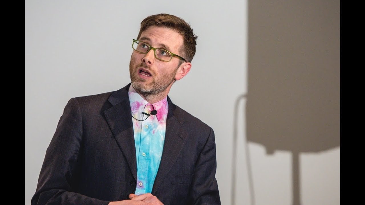
“I always want to find something out that hasn't been used much or is nearly dead and when you find that process you can kind of bring it back and produce something like this.”
[Applause]
thank you hello everyone thanks you got my name right this time well done congratulations what am I going to talk about I'm not actually going to talk about my work I do like talking about myself a lot.
But I'm not really going to talk about my work I'm going to talk about how we went on a bit of a journey in our studio how we discovered a technique and we tried to find out about it through I suppose investigation that doesn't necessarily mean Googling it through perseverance and I guess through sort of working together as a studio you know all the work we do at the studio which this is some of it is not all done by me. So it's very important to acknowledge the studio members and they're all sitting over there okay.
So this is a Chinese file block sample book it's pretty exciting for me when I get these samples because I think to myself is there going to be a foil block in the Chinese foil block sample that I haven't used before.
That's always the ambition right to find something new to find something new that maybe people haven't used before and as you can see there's lots of horses you can put your design through the holes and test what your design will work against that 951 and you know we use these foils and I suppose I got to a point where. I was bored of using them I've like seen a green one seen a red one seen a blue one I like these ones they're pretty cool I suppose also at the same time.
This is maybe about a year ago we really got into making gifts I don't know you guys make gifts but oh my God I just love making gifts and I love the fact things can move and we often used to sort of like show our work and show a book cover for example with a foil on it and make it as a gift and send it to our client and go look it's shiny and I suppose we got to the point where you know we started talk trying to do something new we like oh my God we just can't use foil block anymore can't we just do something else so you know we thought transparent foil transparent foil so the words catch me Daddy I think are in transparent foil which kind of gives a different effect then we sort of started faking it we started faking it so rather than actually doing any foil blocking we'd just like print a scan of a transparent foil on a cover to make out that it looked like it was foiled in a really weird way another weird example that we did last year for the serpentine Pavilion for the architectural Pavilion by sgas Cano and they I don't know if anyone saw it.
But it had this kind of weird foil this kind of not sure what it is it's like translucent or iridescent foil so we kind of mimicked the kind of same effect through overlays and then I suppose let's just look at that for a bit longer I was I sort of like sometimes like ask stupid questions in my studio and I suppose I said one day I said well wouldn't it be amazing if you could like design your own fo wouldn't that be amazing if you could design your own foil how brilliant would that be and Jules who is in the audience kind of showed me this.
And it's a rle cover and I've got it here. And I was like really Amazed by that I'm going to pass it round to the studio audience you can look at the GIF and this was a sort of series again you must excuse my French pronunciation because it's really bad but they were records apparently by Francis Bal and Pierre HRI and the translation of the top left says perspective 21st century so that was a kind of label and it was funded by Phillips on the right and you know I kind of saw this technique and I was like oh my God we must we must we must use this we must use this we must find out what it's called so we we we discovered pretty early it's called helor and we this is us taking pictures of it last Friday at the studio it's really hard to photograph this is our kind of film set here's another one do I have to press space for it to play Oh gone too far let's just go back this one should animate as well.
But it doesn't look like it is check out this one this one's even better l voage so have a look at it there you go oh there you go so it seems that the image has been designed seems the image has been designed the type kind of hasn't been designed sort of looks you know like you'd expect things to look in the 60s you kind of I don't quite know what the type is but it's probably some kind of version of helvetica so this was the inspiration for the invention.
This is a morphous butterfly which gives off the same kind of iridescent same kind of light shimmering due to the kind of structure of the actual butterfly and this was the inspiration for the inventor who was called Lou defay and he invented helor in 1930s oh my God it was used in a film apparently an unfinished film called Inferno by ory J clor apparently all this stuff was quite normal in the 60s you know we think we live in a kind of high-tech cool age but this stuff I don't think it was that surprising to have all this sort of shiny Spacey opar kinetic stuff kind of hanging ♪
around then of course in all true graphic design stories someone else ripped it off.
So this is the publisher Robert lafon they ripped off I've got some here oh my God I got quite a few books here feel like a magician oh so this was ripped off in the 70s and 80s and again quite blatantly you know the the the the publisher was quite open about kind of copying the idea and again you know we were just really curious about them like they're just really amazing aren't they have a look by the way I know exactly how many are here so please don't pinch them love this one check this one out.
So basically everyone that used to come into the studio we have a lot of people come to the studio on a daily basis there's some more here hang on it's really bright there you go have a look at that I'm going to give one to you.
So we have a lot of people coming to the studio and I would always show them I would always show them these books these records and I'd go oh my God how amazing is that and they would all go yes that's amazing what's it called and we would say hel for we would like we don't know anything about it really I suppose all we know or all we knew was that it was stopped in 2012 by the French printer the translation is central office of Imaging which I think is a really great name for a printer there's another one oh my God I'm running out of time okay.
So I showed it to Mark porson the Great Book seller book artist two weeks later in the post he sent me popey which was printed on the same technique I was like well. That's very nice of Mark pson to send me popy and then Luke at the studio realized that on the back. There is a mark GX prints GX foil so that was the clue to us.
So we basically rung them up and realized they still existed in England in hartfordshire and obviously they were very surprised to hear from us probably hadn't had a job in 30 years.
So we took the opportunity to we were designing a book for Christina M M and we thought you know.
This is the inside we thought well wouldn't that be amazing to reproduce that cover or this this image as a cover so we got a test made and again the technique involves handing braving so everything has to be done by hand so you send them a design they copy it with a really fine tool and produce this amazing effect and this is the book that we made as you can see it's glistening I have a copy here.
And I suppose what what I'm trying to you know the reason why I'm talking about this process is is that the whole thing isn't really about the design it's not really about what the thing looks like it's not about what type face you use it's it's really about an investigation into a process and sometimes I see the job or my job as a graphic designer as as a kind of private investigator you'll kind of go on a journey and you have to find things out. And I always want to find something out that you know hasn't been used much or is is is nearly dead and when you find that process you can kind of Bring It Back and produce something like this I do have one typographic question because I know Sarah's going to talk about type but I can't not do a talk and not talk about type I have a question for the audience what's the tight face sorry no we are going to be here until someone gets it right sort of nearly close in your pronunciation Chicago Chicago who said that amazing great well done you've won yourself a book well done oh I actually forgot to show you something I'll show you one more thing which also is amazing which why is everyone should always keep their running sheets I'm obsessed with running sheets look at the running sheet of that you get the running sheet in the post I'm afraid I can't give that way okay thanks very much [Applause]
Latest Talks
-

Will Anderson and Ainslie Henderson
Bringing stop motion sorcery to BBC’s Small Prophets
Watch -

Amber Weaver
How does contemporary type design translate into the wider world?
Watch -

Murugiah
Why you should reject the formula and make art about things you love
Watch -

Marina Willer
Design thrives when you find poetry in the simple things
Watch -

Lizzy Stewart
The hundreds of drawings and writing-on-a-whim that goes into comic novels
Watch -

intra
The rewarding process of recognising the art in obscure everyday life
Watch