
Erica Dorn
Designing tiny Japanese signs and sake labels for Wes Anderson’s Isle of Dogs
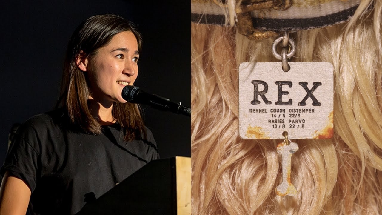
“Wes Anderson is a director that cares a lot about the authenticity of the details in his films — even though it might seem like sometimes his films are set in sort of almost fantasy versions of themselves, the details are always based in some kind of reality.”
[Applause]
hi my name is Erica and I'm a graphic designer and I've been a graphic designer for about nine years in London. And in that time I've done a lot of I've done a lot of illustration for various clients editorial advertising and I've also done a lot of branding for various agencies my longest employment was at an agency called wink creative but I've also done a lot of freelance work for various agencies and also for my own clients but I'm actually here to talk to tell you specifically about some work I did on a movie called I love dogs which some of you may have seen it came out in March this year it's a stop-motion project by Wes Anderson I get this a lot.
And I think it's a fair question because I haven't worked in the film industry before and you know there's not a lot of crossover to be to be fair the reason why the production were recruiting outside of the film industry for a graphic designer was because they were looking for a Japanese speaking designer and I was very lucky to have this particular skill because I was born and raised in Japan and one of my parents is Japanese so that got me a recommendation for a job and that gave me gave me the chance to go in for two weeks and show them that I could also actually do design as well yeah it's more than just about language I think fortunately Wes Anderson is a director that cares a lot about the authenticity of the details in his films even though it might seem like sometimes his films are set and sort of almost fantasy versions of themselves the details are always based in some kind of reality and I've come to know him as someone who's very interested not in just the language and typography of Japan but also the customs and traditions and very keen to to celebrate it these are sketches for the opening titles of the movie so I'd like to tell you a little bit about the role of the graphics department what we actually did they today well we got to work here which actually looks like some kind of magical land but it's actually in Bromley Bible which is around the corner of the area known as Isle of Dogs in London near Canary Wharf rumor has it that Wes got the idea for a film that could be called Isle of Dogs when they were shooting fantastic mr. Fox which was actually made in the same studio which was almost 10 years ago. Actually.
So I love dogs as a stop-motion animation and that means everything has to be made from scratch the sets are miniature dioramas and the props are tiny little models and the characters are puppets and our job is graphic artist is to design all the little details that make this miniature world feel more real and a lot of that is typography and you know also there's a lot of illustration. And some patterns murals and so on some of our graphics are really really small I mean it looks gigantic looking at it on this screen but the black sticker on the bottom is probably one of this.
Actually the smallest graphic that we've had to design and it's about one millimeter by five millimeters and we kept we had to print it over and over until it was not just a mush on the side of the phone some graphics are obviously very key to the story and they get you know front and center placement but there are others like like the detergent bottles in the back that also you know are designed with the same amount of care and the same kind of process that we put into the icky graphics and they're also they're just as important because for example this these detergent bottles in the back you know they're pink and they're blue and they set a really sweet tone for a scene which is the first moment of bonding between a boy and his dog on this island which is otherwise very industrial and barren so since we don't have too much time I thought I'd pick one of my favorite sets to talk you through a little bit about the process and how we go about designing for for a set this is the noodle bar you might not remember it because it appears for about a second on screen but it does appear three times in three different occasions but it's a very good example of this sort of you know how screen time can be completely disproportionate to the amount of hours that you put into to a set so the first thing we need to do is to come up with a list of the graphics we need to design and the first place you look is usually the script hears bit of the script about the noodle bar a crowd at a neon lit noodle shop so it tells us very little we think there might be a neon sign maybe just to tell you that sometimes the script is actually a really evocative useful part of this process I'm going to show you also the opening scene for mega Saki city and that's this one in the foreground the old district of wooden shrines red-light streets and jingling bicycles which gives us a little bit more of an atmosphere. And I think we can carry this through into the noodle bar because you know.
That's where the noodle bar is you know so a script can be visually quite rich it depends the next place we look is the concept drawing there's quite a lot of information there this was done by a concept artist and is someone who is working very closely with the director and they've done a lot of back and forth so we know that.
This is a pretty close depiction of what what was had in his mind which is really useful for us because sometimes it's really hard to tell what he's thinking so this is like a printout of what he has in mind and it gives us a lot of information so for example we know that there's going to be a lot of signage there are lanterns there sake bottles there there's a TV with some graphics on it so when you we know that we're going to be working with the 2d animation department who do all this stuff in the TV and also remember that.
There are characters so the the Dragons team who are kind of bosses family hang out here.
So they'll be wearing baseball jerseys as well the next step is to collect some references here are some of the references for this set the one on the bottom left is a scene from an Ozzy movie and a lot of our references come from these old movies from the 60s I think this era of cinema is kind of what inspired West to make this film in the first place so we have a lot of details coming from from cinema like from a zoo and Kurosawa but anyway I think the the bottom left image could work quite well for the main sign in our noodle bar so we're going to steal it.
But we are obviously going to create our own version of it. So that's also relevant to the film.
So this is the name I pitched for the noodle bar dude I can't which means Dragons Welcome House because this is where the mega saki dragons baseball team hang out. And so we send this we make it in color and we send it on along with the references and it goes through a revision process where you know he says well let's let's try that little bit of copy at the bottom instead of the top and so on.
And then when he's happy with it we scale it down to the actual size and send it off to the paint in model departments who actually make it into a real tiny backlit sign with practical lights and then we carry on.
And this naming process by the way is an exception to the list because everything that we name has to go through clearance so most of the the brand names in the movie are just generic things like bookstore and mahjong parlor and tobacco and so on these are the signs for the back alley of the noodle bar set this is another example of our original graphic compared to the reference there's always a reference for everything and these are the little tiny lanterns where the graphics have been applied so there's all our signage in action and the lanterns everything lit up.
And then the next thing we're gonna look at I think are those sake bottles and they're gonna be quite easy because we've already designed them for an earlier set which is the dog hole I don't know if you guys remember if you have very good memory you remember that the dogs live in a hovel made of bottles I bet you didn't know that these actually have labels on them.
But they do and luckily we got to use them again later for this we collected a lot of labels most of these are sake there's also a short two bottle down at the end but the first set that we sent over were all rejects so we had to start over and collect some more and these are the ones that we ended up with they're not at all what we thought we were going to end up with because they're very complex for props that are only going to be three centimeters tall.
But it's as I learned it's quite common for us to overcompensate for the size of things by packing more visual details into them than they would actually have in real life. So that they wouldn't look like miniatures I mean here are some of the final designs for the sake bottles and they do have fear and appear in a few places like the noodle bar and also there's a sake bar later on where Yoko Ono is having some of them.
So this sort of process of finding references and then creating graphics from based on them is is something.
That's applied to almost everything in the movie and we always work from existing reference whether it's from a shot in a 60s film or you know an image that we've what we've discovered or you know something that comes attached to a concept drawing that the concept artist used when when he did this whole process of finding references and creating images so that's a very brief introduction to what we've been up to the past two years I hope it's giving you a little bit of insight into what goes on behind the scenes and maybe sparked a bit of interest in in making graphics for film thank you you
Latest Talks
-

Will Anderson and Ainslie Henderson
Bringing stop motion sorcery to BBC’s Small Prophets
Watch -

Amber Weaver
How does contemporary type design translate into the wider world?
Watch -

Murugiah
Why you should reject the formula and make art about things you love
Watch -

Marina Willer
Design thrives when you find poetry in the simple things
Watch -

Lizzy Stewart
The hundreds of drawings and writing-on-a-whim that goes into comic novels
Watch -

intra
The rewarding process of recognising the art in obscure everyday life
Watch