
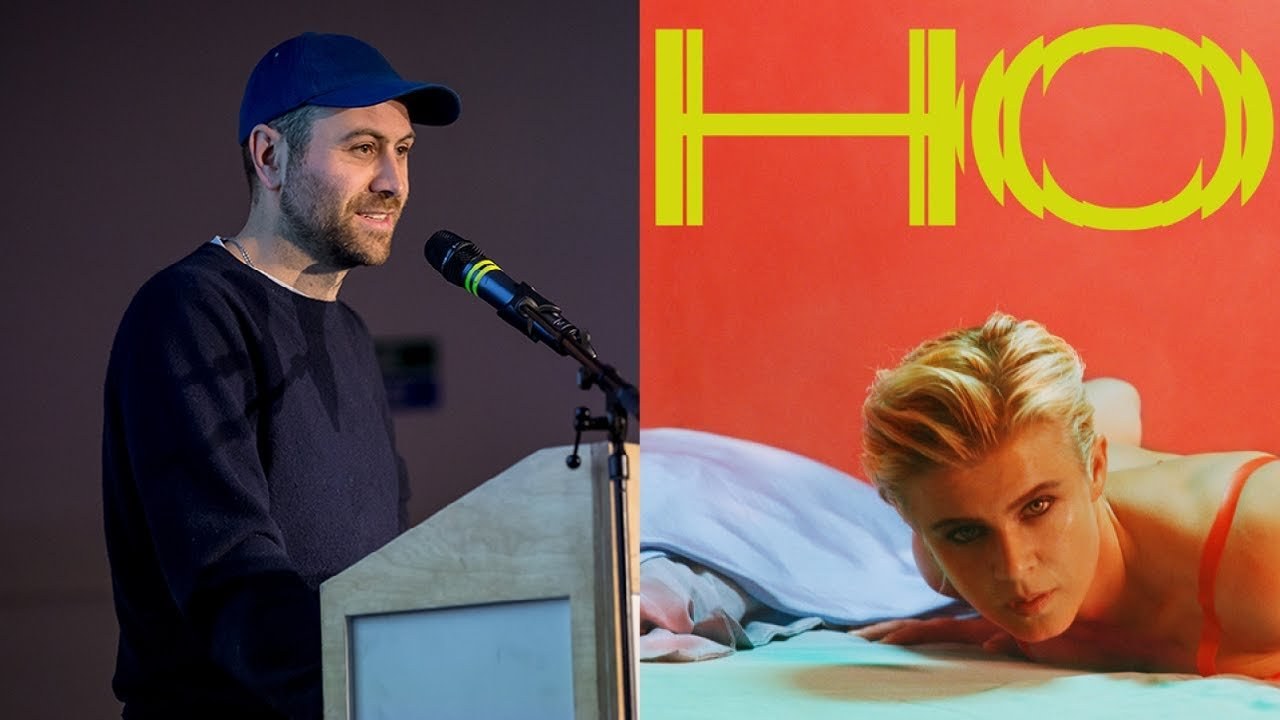
David Lane is an art director known for his work with multiple magazine titles such as Frieze and The Gourmand, which he co-founded. He specializes in translating emotional energy into imagery, particularly in his recent collaboration with Swedish singer Robyn on her new album.
David Lane
Behind the art direction of a pop comeback eight years in the making
“It’s not just about making things look good; it’s about translating emotional experiences into visual language.”
Transcript: May contain minor errors or formatting inconsistencies.
Very much yeah thanks so much for you invite and I've known that guys that started it's nice that from probably before they started it. And it's always been a really great resource and they've always supported my work and and it's a great community to be a part of so thank you.
So I'm an art director which is a pretty broad term really in my case I I come up with ideas for things.
And then those ideas become films or publications or still images or events or all sorts of things and the my practice breaks down roughly into three parts so I'm going to quickly talk through what they are and the stuff that I do and then I'm gonna talk specifically about one project which is launching this week I think may have launched already so this is the agency that I run the Associates is really about just all the great people that we work with and it's kind of intentionally quite smaller its core but for every project we collaborate with lots of brilliant people so do lots of campaigns for brands like Hermes in Paris I'm gonna try and go without the glasses I think this is some other campaigns I've done within an alley Catalina who I've been working with for a few years this was the last campaigns all about life drawing and we had a lot of fun creating these fictional characters from a foundation course life drawing class and the one before that was about gardening and also with more commercial clients like Nike this was good because I'm a Spurs fan and I was fun and I make films as well so sometimes I direct them myself this was a film series I did for Stella McCartney and this was a series of films for well one film for addy color and then sometimes I collaborate with other directors and and this is a film that just finished for a minute for Hermes again with a director called Columbine Goldsmith so it's really lovely working with different people depending on the project. And this the scale of this project and the fact that this was part of a bigger piece of creative direction.
And it was nice to collaborate with someone else and the studio also make publications so this was a poster magazine that I worked on for Selfridges and we commissioned lots of amazing people to make meg work for for the posters this was Harry Nelson two-fold and this was another publication for Nike all about running this was a lovely brief because they just said we want to make a magazine about running can you do it that was it subscribe and another publication for Pedder here a luxury department store and in Asia this is with Sean who I studied with and you might have seen some of his illustrations as well on the Hermes one of the Hermes campaigns and in all those instances a bit like the Nike project like where as I suppose earlier on in my career I used to be given stuff and make it move it around pages and make it different sizes and make it look nice more and more now we're kind of generating everything. And that's great because often when you're given stuff you're not into it. And we also do spatial work.
So these are some windows for Selfridges with moving curtains for Christmas we found out all the different ways that curtains could move and open and close and they had to be open for very exact percentages of the time because of the Apple Store behind it and they're very specific guidelines and then this was a spatial this is a paper sculpture in Dubai for Hermes so these are all individually laser-cut pieces of paper that were screen-printed with specific colors and hung in the space and I work with said designer called Rachel Thomas who is amazing and I collaborate with the lots and her team made sure that it stayed up and all looked right and a slightly sort of move around a little bit it was very light so as you walk past it would slightly move and it came from having a constant sight line into the into the store so if you imagine lots of pieces of paper like this when you're in in the front of any one of them you can see right through and and then the second bit of what I do is that is the gold one that I found it with my partner and in 2012 and with a really small team I still commissioned and collaborate on all of the editorial and visual aspects of the magazine so I still do all the covers here are the last two and the two before that was my favorite with cookie the the real actual Cookie Monster he has his own art director with a box of eyes it's brilliant and I still do the editorial design with with people that helped when you put so much effort of your own into something it's quite hard to let go almost feels like what's the point in doing it if you can't do it lots of bits yourself and then I collaborated with a really brave type designer he now has his own studio to redesign all the typography for the magazine and this was a little sampler we did for that.
And then the third bit of what I do is that I'm the art director of fries so I work in-house a day a week sometimes two days a week on the magazine and there's brilliant again a brilliant team they're really good designers and mostly work on the covers and this one on the your left is a recent Commission with Vivienne Sasson. And I commissioned a visual essay from her and the one on the right is an artist called Valeska Suarez and then these were earlier in the year this was for a special themed issue about altered states it's a nice excuse to do something that you shouldn't normally do when I started I did a redesign of all the magazines and so reworking all the grids and typography and so setting up guidelines to make it look good but also easy too easy for everyone to work with because it is you know quite a high-frequency editorial environment there's lots lots to do so it all has to work and again we work with different type designers to read you over typefaces and stuff for that.
And we also made space for some more visual Commission's which kind of sounds like a no-brainer for an art magazine but it's it's really difficult commissioning work for a magazine which is really frequent and talks about work. That's being made already and but it's it's starting to work and and the Vivian sassing cover was the first cover that's come from one of those Commission's I've been working on so also in the freeze family there's freeze masters which is a beautiful magazine and the design for this has changed but it is a slightly evolution from how it was before.
But it's such lovely content to work with because it's just full of beautiful beautiful things and the final magazine in the freeze family is is freeze weak and this comes out for each Art Fair and it's more just content relating to that to what's going on that week and it's a larger format publication. And I work with a few great people to put that one together recently so that's I'm quite busy I guess quite a lot of the time.
And then along with everything else in life it gets a bit much.
But it's it's brilliant and and being able to work with all these different people is just a real privilege so it's it's definitely worth it. And so I was going to talk today about specifically a project which launches this week and I used to do a lot of music stuff quite a long time ago.
And I hadn't done for a long time because it's it's really fun to do when you're young and it's quite hard to do to make work really for a job it's a big commitment and and I also think you have to be really into the artist that you're working with because it's such a kind of emotional investment and it was with the Swedish singer Robin so this is Robin this photographs by Liz Collins and was for the gentlewoman in 2014 and this was four years after her last album and four years before her current album so her first album for eight years called honey and I just sort of wanted to talk to you a bit about the process because you know lots people involved were all based in different places around the world she's been working and thinking about this album for eight years and there's so much like emotional energy and life experience that's gone into it. And we've all come along and we're talking about how to turn that into pictures and it was quite it was quite confusing and the label manager had amazingly taken these secret screen grabs of all our skypes that she shared for this one was especially funny with this little person just appearing nipple and of cutting her hair or a slug or something and and just all these other people on skype in other rooms having other conversations but it's it's such a challenge because Robyn is like her music is about her own personal experience and I guess she's known for making great club music that is also quite emotive and I'm quite a practical person and kind of into a logical solution. And I guess that's why she's a good pop singer and I'm a designer okay they're coming together of those those worlds along with everyone else was tricky but I think it forced us both to kind of me in the middle and make work that we wouldn't otherwise make so it's been really good this was an image that.
So the album's really all about sexuality and spirituality and you know being able to be really confident and vulnerable at the same time and these are all ideas that you can relate to but very hard to kind of turn into still images that convey that much thought and Robyn presented this image and it was really saying about the selfie and how representative that was of that idea.
There is this incredibly intimate moment that you know in a way you're just sharing with yourself like especially taken in bed in the morning that's not really a view that many people see unless they're very close to you. But also it's an image that you share with like loads of people around the world so she really felt it represented that idea and later on I'll show you how that kind of came to influence some of the other things that we made and we looked a lot at her heroes and you know people like Prince and Kate Bush and she's much further on in her career now and she's not making her first pop record like she's done quite a lot of successful albums and this is the first one for eight years.
So I thought it'd be really interesting to look at other people whose careers had that longevity and how they portrayed emotions in their own imagery so we did two photoshoots to put together all of the imagery we needed for the campaign of which that the actual music formats is only a little bit there's like all sorts of other uses and the first shoot was with the photographer Mokpo amazing he's amazing and I could talk for 10 minutes just about his work.
And this she was less about that kind of emotive point of view and more about launching herself back into the public domain and so these images were given out to press to use and we just wanted to convey that excitement of something new happening and also it was kind of for us as a team to like discover what worked and what didn't and we tried all sorts of different things messing around with lots of Robins recreating portraits of classical musicians and actually this this profile image was the first shot that we used that came out in the press and we picked it to mirror this image which was used on the first single and Robin kept going back to this kind of vars motif as a way of like describing you know both what was there and what isn't and classic faces silhouette making the negative space in Avars and the vast is following her around on her various secret gigs and live shows and things and the second she was with a photographer called hashish in and a stylist called tomorrow Rothstein he Robin had been previously collaborating with and coincidentally I just commissioned her g4 freeze and she did a piece called hot cops for us. There are two of the hot cops in this shoot was really much more intimate and focused and I guess we had the safety of knowing that we had this wealth of brilliant imagery from the first shoot and and that allowed Robin and the team to kind of concentrate on betraying the exact emotion that she wanted to come across in the album and that hadn't really been defined when we were doing that first shoot so you can kind of see it starting to appear here I hope I can show all of these images I won't be on the internet or anything is talk so it's also various pins to safe and onions to stay fashions when you're doing loads of different versions of retouching it gets really complicated so I'm sure there's going to be some moments of people publishing things they shouldn't she's like a really good fun she's just up for doing you know stuff that most people wouldn't be even if surrounded by people saying is that a good idea.
So I guess as well as being really sensual and personal like it's a dance record and whilst the imagery was taking care of that emotive side I really wanted the typography and the color palettes to talk directly of the club and she's the first to say that clubs are really part of her story and a lot of this album was conceived you know dancing at Pikes and I be fair and bear crying and she was deejaying there as well. And I think that's her thing I've realized it's kind of like amazing dance music that makes you feel a bit sad it's kind of a good combo so started looking at typefaces that were really just completely de Vaca t'v of that Club moment I mean there's this one on the left is from a 1960s and disco in in New York called Electric Circus.
And this obviously is a because of all has gender thing. And I played around for ages trying to get as tight right. And I get I've sort of realized that if you find something done by someone else that's better than you could do you should just embrace that.
So I stumbled across this which is by a French designer called Laura Jane and it only existed as a few sketches and then I work with her to kind of roll it out into a full alphabet for everyone to use across the campaign so Robins obviously Swedish so that comes with its set of various accents and record sleeves need a surprising amount of punctuation.
So we kept going back and demanding all these various things. And it's all built on this kind of underlying grid and this is slightly cropping the slide so you can't see it everything's locks together. And so it's not just the individual letters that move he really get a feeling that the whole page is being affected by the the sort of maths that's sitting behind it.
And then here's the first one of the remix singles and it was I was just really keen on making something where the typography had enough personality to hold the campaign without any imagery at all.
So this is the first single and you can sort of see the type and the image starting to like harmonize together a little bit and all feeling a bit fizzy and alive like something's gonna burst out I think sometimes like you can kind of design things too much. And it just makes it feel a bit static and with this I was really trying to just get the elements right get them down and try and keep the energy in them you know you can kind of fiddle around with things.
And it's diminishing returns and it. Actually gets the point where things are so designed they just start feeling really still and so really the time was spent on the bits not the compiling off those bits here's the the first single second single it saw the first one and we wanted everything to be in this kind of weird dreamlike world that was like partially reality and partially not and we kept talking about Twin Peaks and how that has this that amazing ability to occupy all these different spaces and you sort of lose track of whether it's real or not it's another one of the singles I think some of these haven't been released I did ask the question.
So I have done my due diligence and then here's the album cover and I to be completely upfront I fought for other images to be on here.
But I'm quite glad that I lost the fight because I've been seeing it on Spotify on my phone a lot.
And it's a really engaging strong image and it's also the image that's most directly linked to the things that we were talking about at the beginning so we'd sort of gone on this creative journey and come back to this this same image here's a gatefold so the 12-inch vinyl has a big gay fold and this was also used on some billboards and stuff and she was just keen not to retouch anything keep it really raw a lot of the images were like the best one was on a little digi camera so we use that and didn't use the film one and I think that all kind of comes together to help give it the energy that it's got here you can see the typeface working on the back of the vinyl and I think the colours are again all about kind of creating this life just at the tipping point of when something probably shouldn't work.
But it just about harmonizes enough to work.
So they're all intentionally quite awkward and this is like the sleeve that goes inside the 12 inch and then we did some big posters that pop out it's very over-the-top typesetting on all the credits and we just wanted to make something that people can put on their wall as well as have that big on Spotify so hopefully that's been a little bit of an insight into that project I know it was like five minutes so it's it's hard to get to deep but it's just come out this week so all this press is just starting to happen and she's getting amazing press people are really really digging the album and it's really nice to see all the different images that we created being picked up as different publications favorites but all kind of also working together as part of the bigger campaign which it was something else we really wanted to do just not make it feel like something that had been made in the day you know it hasn't has been made in 8 years we didn't have eight years.
But we wanted to reveal a bit of the process and show lots of different layers to the imagery so that's where we are thank you very much [Applause]
Latest Talks
-

Will Anderson and Ainslie Henderson
Bringing stop motion sorcery to BBC’s Small Prophets
Watch -

Amber Weaver
How does contemporary type design translate into the wider world?
Watch -

Murugiah
Why you should reject the formula and make art about things you love
Watch -

Marina Willer
Design thrives when you find poetry in the simple things
Watch -

Lizzy Stewart
The hundreds of drawings and writing-on-a-whim that goes into comic novels
Watch -

intra
The rewarding process of recognising the art in obscure everyday life
Watch