
David Bailey (BBC)
Designing a custom typeface to give the BBC one consistent voice online
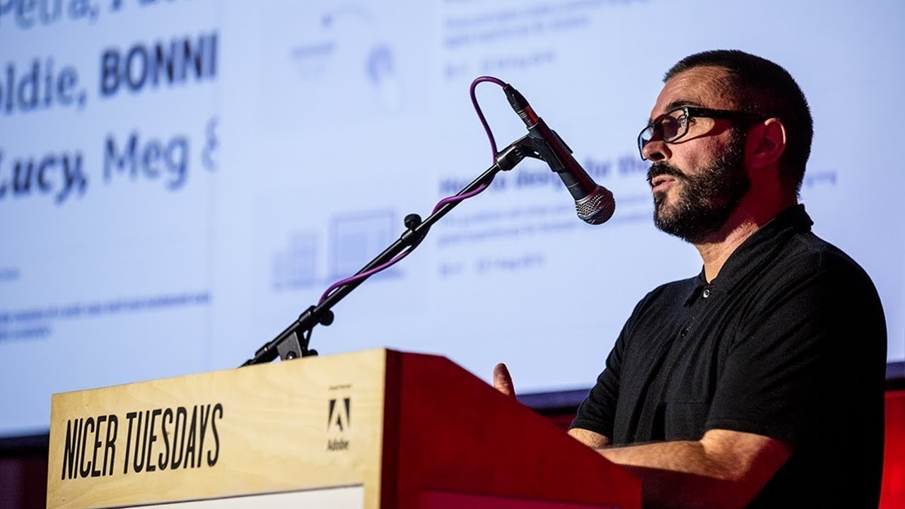
“Seeing general managers who have nothing to do with design getting nerdy about typography was a joy.”
Hi everybody right I've got just ten minutes to tell you about something really big and exciting for the BBC and that's a new typeface but I've only got ten minutes to do it in this is a project that I've been involved in now driven from day one and I'm really excited to tell you all about it. So I bet it cracking if I gallop forgive me. So yeah that's me.
So I'm creative director of user experience and design at the BBC more specifically I are I'm creative director of our global experience language which is our shared design framework with which we design and build the organization's entire online output what my team does specifically is we facilitate collect and publish all the great work that our designers do around the BBC and all of the different products and services what I mean by that is like a product or service might be children's or spor news whether we strip them back to guidelines and we publish them on our jal website which is BBC co dot u K so do they work more efficiently and consistently and spend more time innovating new experiences online that's a very quick explanation of what I do got any questions about that ask me afterwards the world that I came from is very different to the one I'm in now.
So I spent 16 years designing stuff like this I spent eight years with the designers Republic who were a very famous design studio during the 90s and the naughties and then I ran my own studio for a further eight years called kiosk which did more of this kind of work.
So this was all graphic design art direction and branding for music industry fashion gaming TV media all that good stuff but the level of craft that's involved in user experience design is no less than in this world it's just a different kind of practice it's more iterative and human-centered rather than instinctive and artistic so I inherited this global experience language this design framework and typographically our only offers two typefaces one is gill sans our Master Brown typeface the corporate font for the BBC this is a humanist typeface it's maybe if some of you know that means a humanist font is one that has fluctuating stroke widths in every character some kind of echoes the the calligraphic human touch and the other font that we use predominantly especially online is Helvetica this is what's called the grotesque font and this has got much more equal proportions it delivers information very clearly and succinctly without fanfare and because designers love this typeface me included and it's very popular and therefore there's a lot of it in the world. So it's ubiquitous it's everywhere and that means that if you kind of want to be invisible you would choose Helvetica now that one could argue that's the right typeface for the BBC and unbiased public service but we've got sort of bigger ambitions than that we need to be reaching out to a broad wider audience especially when we're in are such a competitive marketplace that were in that we found ourselves in now as everything.
That's going digital for us to remain vital and relevant and all those good things me to appeal to as many people as possible also these two fonts are quite different so here was an opportunity to bring about a more consistent typographic approach for the BBC speak with one voice across all of our different touchpoints we're not the first to do this. There are many organizations peer organizations that have done this successfully already they've they've commissioned and implemented their own type faces and that has strengthened their brand and improved their reading experience for their audiences something else I should say about Helvetica and that's the the font that we use for our reading experience is that it doesn't perform well on digital screens of today because it was designed a hundred years ago for print so we constantly get accessibility issues with with Helvetica here was a chance to improve that right.
So we had to prove this business case to the organization we had to take this idea to the to the Executive Board to Tony Hall and everybody else and we focused on three key things that the font needed to do that the organization would benefit from the first was legibility had to be more legible hence I was saying earlier about working better on digital screens it had to be more visually distinctive for this font to work properly really we should have a number of different styles so we were looking to Commission a font family a bit like The Guardian did with their Egyptian font so a range of personality and tonality and thirdly save money this is the BBC after all we're always looking save money and that was kind of easy to do because we pay licenses on a number of different typefaces Gill sans and Helvetica included but then there's an enormous amount of fonts which we pay licenses for for use across seasons and initiatives and campaigns and marketing etc so this was an opportunity to reduce that spend significantly by owning our own typeface so this was considered a no-brainer why aren't you doing this already they screamed well they didn't really but and this was a question that I'd been asking for a while and so we kind of got the green light to go ahead with this we put the call out to a number of different typeface designers in the UK all of whom were fantastic but Dalton Maag who are based in Brixton be going for about 25 years sort of ticked the most boxes for us they instilled the most confidence in our stakeholders of which there are a lot as you might imagine Bruno Mars runs that agency famous typography he really understood the challenge that we faced because he had done this sort stuff before for other media organisations and their portfolio spoke spoke for itself you know they're great at multilingual typeface design we were going to have to consider lots of languages they're great and legibility and readability so they designed the book early font for heaven's sake which is the font on the kindle and also they're good at distinctiveness ryo 2716 is just an example of that.
So we assembled a steering group like we got together like a group of key stakeholders from across the business so though from from executive general marriages through to engineers designers visual visual journalists accessibility specialists design researchers cetera et cetera and off we went to Brixton to don't Mark's studio to begin our education.
So they're great at telex or teaching you about typography you learnt so much we learned about its history its craft its importance but not just the aesthetics of type design but also how the brain cognitively absorbs words and letter forms and reads so we did a number of card sorting exercises where we explored the different themes around what Britishness is what are we also look to our typographic legacy as an organization and looked at different typefaces from around the world.
And interestingly unconsciously we saw selected three typefaces that were classic British functional typefaces that these rose to the surface we didn't know that was going to happen but they did so Baskerville and Charter of both serif typefaces we don't currently serve syrup serif typefaces up to this point so that was interesting and then GILF sans which is our master brand typeface that was familiar to us but all of these had opened counters lots of breathing space sharp connections there was a kind of a trend in a pattern that we were seeing and don't AMARG explained all this to us.
So anyway they gathered all this information and they went off and started working on a number of different concepts and they came back to us with seven different concepts which we had to whittle down amongst ourselves to three did we had two humanist typefaces and one grotesque typeface as well to choose from and we asked them to go away and work further into this.
So they did that they went away and looked at different languages language character sets that we would potentially be commissioning in the future Cyrillic sand Devanagari and Arabic etc and then they brought back to his prototype typefaces that we could test in our engineering systems and different technical platforms to make sure that they were working well we whittled these down to two so we had a grotesque and a humanist fonts that the race was on between these two styles of typefaces they exploded them out and gave us two of each of those for just a too-sami it wasn't easy we had every single character explained to us.
And we were all scrutinizing the detail it was fascinating was very nerdy but lovely I mean I love being nerdy about stuff and seeing general managers who have nothing to do with design getting nerdy about typography was a joy so yes so we eventually after much debate and furious conversation we settled upon one and this was the the prototype which we took forward to be developed further it's a humanist typeface and that's somewhat books the trend a little bit because most digital organizations seem to be creating grotesque typefaces and maybe that's because designers like Helvetica or they like that kind of style of typography but our stakeholders were leaning towards a humanist touch it was better for the reading experience it had a certain amount of Flair and classic appeal to it.
So we were very happy there was a there was an HR appropriate group hug and we went off and they don't mug went off and started and took the font into production and late this spring we took delivery of art of our new typeface and it's called BB series and we are delighted with it.
So I'm going to show you some pictures of it so here is the sans family from the different weights light through to extra bold we've subsequently commissioned a medium-weight that will sit between the regular and the bold and these are sort of their so again it's a it's a contemporary humanist typeface it has open counters sort of generous proportions lots of breathing space around every rector formula no this is in the fine detail and I realize that this font isn't exactly like wow look at that type as I've never seen anything like that before.
But that's kind of the point we weren't looking to make an enormous visual statement here we are the BBC where to appeal to everybody so it had to be it had to balance of contemporary form with function it's proof would be in its it's performance that would prove its significant server time so here's the serif family again those weights again and here's the range of choice that we now have we didn't have this before especially online and that's where all the BBC's go and remember we had just Helvetica regular or bold or if you were really kind of like looking to roll the bear out light so anyway yes so we have all this choice now.
And it's very exciting and our designers are tickled to get cracking here is who's the sans family in its complete state I'm sorry I'm rushing through this for type fans out there and the serif family and sport BBC Sport actually commissioned an extra family member a condensed sans so we've got a regular and a bold of that sport this summer some of you may have noticed rolled out in fact you had an article on this though it's nice that's it I'm hopeful hopeful that you all know about this already what am I in fact what am I even doing here all right BBC Sport rolled out this summer and they they harmonize their brand between the TV and online world because there was a disparity between the two and if they seize the opportunity to implement the sans font in their thing right launch so here's some pictures of that and they it's great and this is early days for the font but already we're seeing a kind of a modernity happening a real for us.
This is incredibly exciting I mean no to the late I you want most people won't really notice this but to us and to tight fans they will spot this.
And we've had really great feedback thankfully because we get a lot of negative feedback whenever anything changed to the BBC my goodness but it's going well and technically it's performing well as well we're running loads of user testing on it to collect the data to learn more about its how to best exploit its capabilities so yes that's where our and this sports launches lit a fire under underneath all of the other products and they're all. Now in planning and scheduling in and experimenting with wreaths to get it rolled out in their product so expect over the next 18 months to see news weather I player radio music all of those great products to come out and start using wreaths one final thing.
So we called it wreaths because john charles walsh and wreaths was the original creative director no wasn't the creative director for heaven's sake he was the original director general of of the BBC he in 1922 he he kind of pioneered he basically came up with the concept of independent public service broadcasting and his mission was to educate the masses and given that reading and writing is a fundamental component of learning for most of us it seemed fitting to take his name.
And infer I actually suggested the name but not for that reason I actually suggest it because I thought it had a certain elegance to it don't you think so that's what we called it brief and that's it if you want to know more about it there's going to be a film made about it which is going to go on our gel website I said you take a look at that if you can't wait for that this Thursday coming at the department store in Brixton myself and Dalton Maag will do a much deeper dive presentation about wreaths for those of you that might be interested so do come along and that's it thanks very much [Applause]
Latest Talks
-

Will Anderson and Ainslie Henderson
Bringing stop motion sorcery to BBC’s Small Prophets
Watch -

Amber Weaver
How does contemporary type design translate into the wider world?
Watch -

Murugiah
Why you should reject the formula and make art about things you love
Watch -

Marina Willer
Design thrives when you find poetry in the simple things
Watch -

Lizzy Stewart
The hundreds of drawings and writing-on-a-whim that goes into comic novels
Watch -

intra
The rewarding process of recognising the art in obscure everyday life
Watch