
Caterina Bianchini is a Scottish-born, London-based graphic designer known for her innovative approach to typography and poster design, blending conceptual thinking with vibrant color palettes.
Caterina Bianchini
Pause, reflect, appreciate: the three-step process behind charismatic poster design
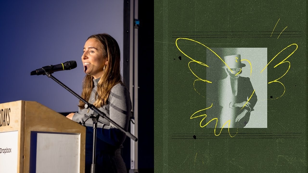
“I think of typography as if it was a person.”
Transcript: May contain minor errors or formatting inconsistencies.
[Applause]
hi everyone I'm not 100% I actually said that the type might not exist yet I think it's massive bold bold claim but you guys can let me know so tonight basically Bally instead of just talking about what I kind of do day today I wanted to talk more about what I do which I kind of see more as like my art and my hobby I actually run a studio in Hackney Downs and we're about a team of four to five people we work with sort of really big a lot bigger clients so people like diesel Reebok Nike those sorts of people and usually that's really more of the day-to-day stuff so it's amazing work it still is really really fun and exciting and it's always really sort of Art. And sort of concept driven but I suppose my poster work and what I do for the music industry and my EP work is something that I really care about.
And I feel is more expressive and kind of showcases more of my actual genuine style and it also allows me to experiment loads of typography so first of all I'll just going to show you a quick video that kind of Recaps some of our some of my posters and some of the work. That's in the book.
And then I'm going to talk you through how I sort of work on stuff and how I created the book ♪
hi cute it's me Sarah J it's wondering if you'd like to do it again ♪
hi it's me Sarah J again so basically I kind of use this process and everything that I do and it does funnel into my more sort of corporate work.
But it also does funnel into the way that I create posters the way I create my art.
And it's basically I coined at the art of seeing which is basically taken from two titles one which is ways of seeing by John Berger who is a famous art critic and the second art is design from Bruno manari who is a famous Italian artist and graphic designer and I have two books that I give to all my interns who come into the studio and I tell them they have to go away and read them. And it's usually these two books because they just really sort of adapted my way of thinking really allowed me to be more conceptual and really start to think a little bit more about everything that I did so step number one is pause for me an object is alive this cigarette this Matchbox contains a secret life much more intense than that of most humans I see a tree I get a shock as if it were something breathing talking a tree too is something human and this was a quote by Jean mirro and what I love about.
This is it just allows us to really appreciate and be mindful about the day-to-day things that we see something that we might take for granted like an amazing tree that's been growing for like 300 years you might walk past that and just think I've seen this every day it doesn't surprise me anymore but if you really stop and think about it it's absolutely amazing that this thing exists it's absolutely amazing what that tree has seen and everything that it's been through so I try to put this approach into how I create Concepts or how I come up with Concepts and quite a nice sort of example of this is to to think about a leaf and how I might explain a leaf to someone who's never seen it before.
So these are some sort of descriptive words so green it's curved and it's also sharp it's big and it's small it's vibrant it's got these connected lines running through it which are slightly lighter in color it's textured grows off a diagonal long thing bendy light and weight so this is if we were to say to that person take these descriptive words and now create something out of them create an image create a post or whatever concept what might that look like it could look like this we've got the curves we've got the sharp edges we've got the lines that are running through it that are slightly lighter it's growing off this diagonal long thing it's vibrant it could also look like this again it's green it's curved it's sharp it's got these lines in the middle that are slightly lighter in color it grows off a diagonal long thing or it might also look like this and again it has all the same attributes step number two is this idea of reflecting everything you can imagine is Real This was a Pablo Picasso quote and what I love about this quote is that it allows you to really see the the potential that something can have so if you are going to create this piece of work what might that look like how can you conceptualize it and how can you really think about it to create something new or even just something a bit silly a great example of this is Bruno manari and his forks and he he created this series of he used to do it with everything he'd see everything and kind of characterize it give it a personality make it into something new make it into a person give it this sort of human touch and what he did was he created these hand gestures out of all the spikes of the forks and by doing that he created little characters for each of these forks and I think that's again something that I try to put into whatever I do with my typography or with my illustration is I always tried to make it feel a bit charismatic or like a personality or like something is trying to shine through from it so just showing how we might use this or how we can actually create this in the studio taking a flower and then thinking about how that flower can evolve into lots of different things so using the petals using the stock using the leaves and how it can then be recreated into a whole Suite of different things how we can reimagine this object that we see every day so we've got a worm a frog caterpillar dragonfly and butterfly and I'm sure you could keep going and do it forever step three is appreciate and this is really after you've used those first two steps let's take a look back and really think about what we've created and how it feels and how it looks and and does it work.
And I think that this quote by Bruno manari is probably my favorite because it really feels like it doesn't really matter what other people think it doesn't need to be what's happening in graphic design right. Now it doesn't necessarily have to be abiding to the rules that are present in graphic design right.
Now if you like it and you truly believe in what you've created then it's something that is amazing a thing is not beautiful because it is beautiful as the he frog said to the she frog it is beautiful because one likes it. And I just think this is this idea of after going through those steps taking a step back re-evaluating and thinking do I love it or have I created this for someone else and that I think is the Core Essence of creating something.
That's amazing so now I want to talk to you a we bit about how I this microphone is actually really quite High I'm too short okay. So how I create my posters and I'd say I want to just take you through a couple of the I suppose the layers that go into it.
So the first one is always this idea of personification of type so thinking about typography thinking about if it was a little person or if it was a character or if it was something that was actually living and breathing how can you showcase that in the way that you use typography how can you showcase that in the way that you draw it.
So this is just something like silly things I sometimes do in my Sketchbook.
And it's just thinking about characters and what they might be if they were human or if they had a characteristic so this idea of this big bellied bee it's cheerful the boring bee because it just looks like a normal one the idea of the dancing bee it looks like it's pouting the slow bee it looks like it's almost like like sliming along like a little snail the fancy bee and the bouncing bee and then again just showcasing that across like different sort of different letters and how you can sort of personify this typography and then how this comes through in the poster work so for instance with this one for sub Club just by slanting the typography a little bit and and creating this Jos between the two type type type forms it creates this idea of fast movement it it kind of feels like the rhythm of the music it creates this buildup making Derek Carter into an Easter Bunny having this sort of powder up Sammy in lots of different positions creating this bouncing feel this sort of interactive feel building up typography allowing it to like overflow and then just sort of giving characters these lovely little like characteristics and personalities and making them look like they're dancing number two this idea of layers so how you can use type to sort of build up and create layers if you might not necessarily have illustration on the on the photograph on the postone and again just showcasing how I've done this in like my sketchbooks so silly little things for instance just like making like patterns out of the t's all aligned or the A's all aligned or trying to draw type with just one line rather than taking the pen off the page and then how that might manifest into my actual poster design so this idea of building up this idea of building up through the use of color how you could position typography so that it feels like it's sitting on top of each other it's building on top of each other creating again these sort of elongated and built up type and then having the ju position of that against really really thick color blocks just something as simple as again just building up with this color using these blocks showcasing that with pattern and color and then how we might use that if we just use typography and just by something simple like just turning around the flyer and multiplying it across a poster and using it in lots of different ways on the poster and then the third step is this idea of Charisma and I think that.
This is one of the main things I try to use in showcasing all my poster work. And it's something more like I'm trying to speak to the person. That's seeing it.
So I often do like silly things where I'll put all the information on the poster actually quite small. So that the person has to go up to the poster and interact with it and be drawn in initially by the the Bold sort of type or the pattern or the illustration and or the character that whatever has been used on on it.
And then they have to go up and actually interact with this piece of art and really focus on it and spend a little bit of time with it in order to get more information out of it.
And then showcasing that how that sort of comes about in my sort of Sketchbook work.
And I love sort of working with cartoons and and building up a sense of a like sense of human and character within everything that I do silly little things like playing with tape and how that can then create typography drawing faces onto typ typography to give it more of a humanist feel and then how that showcases in the poster work and how we can build that into the poster work so one of my longest running poster sort of collaborations or poster jobs has been with ax and wax and it's this underground nightclub night that's run in London and he just loves cartoon so anything that we do for cartoon is he just loves it. So it's an amazing sort of application of me being able to use my illustration style and my typography and also put it and use it into one and it's kind of created this amazing sort of book.
Now that we have on sale tonight with a section for Axe and wax that's nearly 100 pages long so it's absolutely massive and just showcasing how that Charisma comes for these posters whether it's this really bold typography combining that with cartoon and and combining that with like this sort of Illustrated element handwritten type like a massive fan of using multiple type type faces on a poster hand drawing lots of different type faces and using it on a poster using that again with some illustration so Tango is actually a football game that they play in Italy and they use this special type of football. And it looks like like this. Basically.
And I was trying to think about how I could create this football into a character so by using the duplication of the two and building into this little lovely little butterfly thing. That's flying into the into the flower and I think what I try to do is just make something a bit silly also with whatever I'm working on or however I'm producing something and give it that sort of edge of color I'm never like too scared to use color I enjoy doing it I enjoy drawing up my own typography and then trying to apply that. Actually into a digital realm is quite interesting taking it from the Sketchbook and pulling it into a computer showcasing this again on another one of the ax on wax posters how can we sort of create this feel of like this Duck's actually moving it's live it's creating this poster in real time.
And then how that Charisma comes through in the typography and the application of typography and how we can use color to enhance that.
So it's almost feels like these sort of One-Stop shop of all these bits and Bobs that have come together to create this massive visual that is essentially showcasing you what's going to be available on that night in this club all these different artists all these different DJs coming together with super eclectic Styles and tastes in one venue and again using buildup of color and how that can be produced to create something that feels like it's showcasing this diversity showcasing music and all the different people that go to music in feel different ways when they're in the nightclub and just by doing something simple as using color and diversifying that across the poster how it creates this sort of dynamic between the viewer and the poster and actually the night that they end up going to and then finally I wanted to finish on the poster that I did for my book. So thank you very much to it's nice that for this sort of prime advertising slot.
But we're basically we've made made a book in the studio and it showcases all the EP and poster work that I have done in 2018 it's 324 pages long it's got 19 sections and it Heroes sort of and celebrates the design process by showcasing the used and the unused designs that I've sent out to clients so it's super interesting in the sense that it's not necessarily just the work that the client chose it's everything.
That's come out of my Sketchbook and how that's evolved into the final product and this was the result I just want to finish on my three steps which is pause reflect and appreciate thank you very very much [Applause]
Latest Talks
-

Will Anderson and Ainslie Henderson
Bringing stop motion sorcery to BBC’s Small Prophets
Watch -

Amber Weaver
How does contemporary type design translate into the wider world?
Watch -

Murugiah
Why you should reject the formula and make art about things you love
Watch -

Marina Willer
Design thrives when you find poetry in the simple things
Watch -

Lizzy Stewart
The hundreds of drawings and writing-on-a-whim that goes into comic novels
Watch -

intra
The rewarding process of recognising the art in obscure everyday life
Watch