
Ben Langsfeld is Buck’s group creative director, known for leading the studio's significant rebrand through a highly collaborative process that embodies the collective identity of its team.
Buck
Why the best creative work has a tonne of fingerprints on it
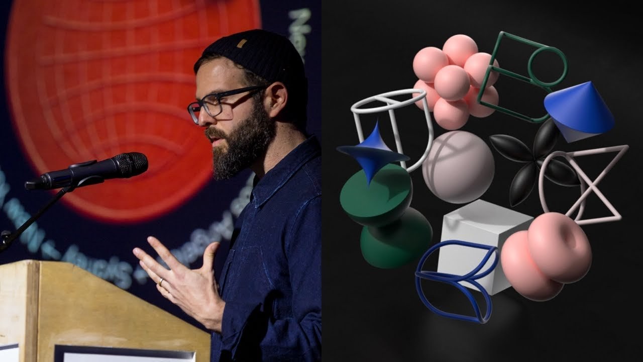
“Everything we do has a tonne of fingerprints on it, and we like it that way.”
Transcript: May contain minor errors or formatting inconsistencies.
[Applause]
my name is Ben Langston as he said I am a group creative director at buck and I've been working at buck since the beginning back in 2003 I remember we were working in us. There were 10 of us in a small little office in Koreatown in LA and now we are 250 people and growing and we holding passports from 26 different countries we've got offices in three cities as he said New York Los Angeles and Australia and we've got a lot of room to play lots of square feet for those of you aren't familiar with us we are a global creative company since 2004 we've been building a home for some of the most amazing talented dreamers makers and doers we are super collaborative and everything we do has a ton of fingerprints on it.
And we like it that way. And we can make stuff like this ♪
[Applause]
so this was part of our most recent rebrand and that's sort of what I'm here to talk about with you guys today it was a massive effort across all of our studios and I had the opportunity to lead it which was awesome but what was so interesting about it wasn't necessarily what we made it was the process and I think it's really much a reflection of who we are as a studio the challenge is that everyone at buck is super curious in a lot of different things.
And we're interested in pretty much everything we've always thought of ourselves as style and process agnostic and we're just always looking for a better way to do it whatever it might be and and that curiosity is contagious. And so for me it was about creating a you know a brand that we could have all of our studio connect to in some way.
And then that way we could do it all together but before I get started a little bit about me my curiosity has led me to my tool of choice which is cinema 4d and I predominately use it for pitching and sketching at this point super interesting geometric forms systems he was like an early brand exploration super into cloth and dynamics a lot of technical live-action soft bodies look dev but as I've you know been there longer I'm a little bit more removed from the box and my newest tool of choice is I've taken the super deep dive into modular synthesis so this is sort of my my new sketchbook but as as far as buck is concerned my curiosity has led me in a ton of different directions throughout my career my curiosity in our culture led me to take ownership of all of the retreats and sort of get-togethers that we've had over the years this one we went to a camp up in the Catskills in New York and all the offices came together we Michael for a few days was magical my fascination with interiors and our production process led me to taking ownership of building out all of our offices that we've ever had I think we look like 4:00 in New York at this point so that's been you know a huge challenge to try to have way that balance between an open floorplan communication and being actually it would get some work done but my most unique curiosity I've always been fascinated with the way we as Buc present our work whether it's in pitch decks presentations or our website in fact I've you know taken ownership of every buck website that we've ever made here's no one wanna dug up that was that we built fully in houses one of the first ones we built in-house which was really exciting and I really like this one it had a lot of legs lasted a while but eventually it just started the show of the work a little bit small screens had gotten bigger so we had to update that and that was the big thing which we figured out in this version of the website I was dedicating more screen size to things.
But there was an issue here in which case the projects were all presented in the same way. There was always a movie at the top and then there's some images and then some looked and some processed stuff so it was very formulaic and the jobs that we've been taking on recently have been you know really broadening in terms of what we're doing so sometimes there's no movie in our delivery so it seemed to become a bit of a challenge so we set out on the new site to to achieve that.
And we knew we wanted to tell two stories different way I mean knew that we wanted to have this sort of pin board homepage that showed a little bit of a glimpse into our life that buck and sort of what we're up to so trying to sing a little bit like what we're doing rather than what we've done and it was working but we found that all of the projects were again like we weren't really showcasing them and living up to the potential of their projects and a lot of people called it a motion graphics graveyards of sorts so it was like really not celebrating the work. And we even had some people in the company asking do we even need a website so we were like alright let's take a step back let's go pencils down and let's just think about this for a second when we realize it wasn't necessarily a website problem it was like a brand and positioning problem we needed to sort of tell people and show people and behave differently to show and signal the change that we've gone through in the last couple years.
So we made a brief and you know we had to do a lot of these things show our growing capabilities have a flexible format and also sort of expand and be a little bit more personal as weeks go into our own projects so we didn't audit we looking at color we'd wanted to sort of see how we use color and we used all of them. So that didn't really help and then our logo we've always loved it it's been our little trusted friend through the years.
But we started to use it in a lot of different ways because when people got free time we just want to experiment with it. And we realized we were just really going crazy and the more we've been doing a lot of brand work we're always telling our clients like consistency consistency consistency and it was obvious that we just hadn't gotten our own memo so we started with a blank page we wanted to sort of see and have an open mind as to like what it would be if if we were much different and we looked very different so we tried it.
And it felt like a revolution it was there were some interesting stuff but it really didn't you know tie back to some of our roots and what we would it got us there. And I think we still held on to that which was this guy he we are named after Buckminster Fuller we his design philosophies are still super relevant to us today we think of him as like the ultimate generalist he was a thinker and I do really hard to label what he does and that's a lot like what we think of ourselves but what sticks with me about him is his passion for systems and this idea of synergy of like working together so our our logo always was sort of built on this framework of a system of formal shapes that come together representing all of the unique perspectives and all the views of the artists that work at our studio in a way that shows this sort of like you know coming together and here they are here the shapes that we decided to choose for our new logo and when put together they make this it was really a culmination and showing this diverse collective coming together.
So we tested it against some of our work you know we have a wide range we're super playful but we're also pretty serious sometimes so we just had to make sure I was gonna work in that setting we also need to make sure that we can come up with a way to use color in a way that was meaningful to the work.
So we tested it against all of the different colors of artwork and you know picking a color from it too to put next to the logo all worked really well.
And then a big moment for us was talking about behavior and we developed this idea of a brand behavior continuum where we need to both support our client work since that's sort of like our one of our biggest focus is but then also lead and be a little bit more expressive and irreverent for the work that we're sort of entering into like our own projects and so as we set out to you know do all of our communication it was so helpful to just to have this this continuum to work across so everything we made fit perfectly within there and you could really define a brief easily and effortlessly do an artist who wanted to take ownership of something. And so something like our pitch decks they need to sit back we're often very much embedded inside a companies as a sort of extension of their team and so we need to sort of almost become their brand so you know we pick a color from their brand and we pull back.
And we sort of let the work be forward our collateral very much straight forward it's sort of like in the middle and then the website we were able to open up a little bit. And we sort of answered the question of do we need a website by saying yes because it's it's really the only way for us to take control of the conversation we can really show the work the way we want we can talk about the work we want to be doing and we can also attract the kind of people that we think are gonna fit into our culture a brand expression can be a little bit more adventurous we'd come up with a you know a bunch of like starter color palettes that when we're doing our homework you can just sort of have somewhere to go that's easy effortless and then when we get into our own content you know it's guys the limit you can do it everyone is from our app slapstick if you guys haven't seen it so as you can see yeah it falls across the continuum from left to right like being more supportive and then also leading and being more expressive and that was really helpful we were doing things like the brand expressions for the launch where we knew we had some guidelines some rules some like sort of lanes for artists to play and so they could take their own curiosity and really run with it so you can sort of see an example of that on the Left we've got a you know more rigid talking about the shapes talking about the coming together logo sort of build up.
And then you on the right you've got using those same forms but abstracting them being a little bit more playful with them and you know essentially having a lot of fun in a controlled way we chose Mabry because we loved that it also worked across that continuum and it also had this glyph set that we were super into because it could really add a lot of personality and we ended up even building out all of the make a whole new set of glyphs that we could use in our communications and have fun with them my favorite is the bottom right here.
This is Adam or cookie either one we could use them for UI stickers these might show up on giffy you know around our website but then one day it happened we were about two weeks away from finishing the website and I get this document from an artist who had essentially redesigned the entire website and based it on this four column grid that was super tied to our four letters or a logo and it was just awesome so as we usually do with the best ideas we pivoted and we went back to square one on the build and we went in this direction. And this became the backbone of the entire system and we knew that another you know part of it is like telling those unique stories I was talking about earlier that we knew that the the people closest to the work were the ones that we're gonna have to tell those stories it couldn't just be like one member of a team or someone else it had to be the creative leads on every project.
And if a couple of artists really identified that that was going to be a pain point that was going to be a little bit of like a clog in the process so they built this prototype in figma where we were able to all work in this document at once with a few key examples and this sort of list of modules that they get used to tell their own story and that. There were some points where we had like over 40 creatives in here digging around crafting their stories asking for help getting feedback it was like the most magical thing you can actually spy on people and figma you can see what they're working on it's so fun but it was just like a testament of helping how much people cared about this that they would go ahead and build an entire prototype just because they felt like they needed to on top of their original workload we had artists who were so fixated on like the rules and the standards that they built out like a hundred page guidelines that include like sonic guidelines so that everything's done in the key of B obviously you know we made tool kits pitch decks contracts bids we made a brand Center everyone sort of took that on themselves to go contribute and be part of this process to build this brand it's beautiful this is a social media toolkit we know that like there's not a lot of time in between our projects so we had to come up with a system that we could really flexibly make have conversations and stories and tell unique stories and come up with a run of show like could it really help communicate things quicker and faster even ripe with a grid and some image guidelines it snaps to the grid and it was awesome.
And then you know we wanted to find a way to feature and sort of celebrate our talent and artists and so we came up with some ways to do that as well as ways to show our process and our D since a law that had sort of come down off of the main project pages because we were telling stories a little differently but this was a way for us to really showcase that and know thoughtful way we even had artists who were so in love with it they wanted to make like a physical manifestation of the brand and so we're calling this the rotator and it's a sort of wheel that you can you know it's tactile you can rotate it feels amazing when you do it here's some early prototype of them playing with it it can kind of like adjust the playhead of an animation.
And sort of see it coming and going in real time we've also you know another artist took the mabry glyphs and started playing with his and in OpenGL and and got that really playing really nicely and that became part of the rotator as we sort of got things immersed in there.
So this the most the most beautiful part about this project for me wasn't necessarily what we made it was really how we made it in the process that we went along on that we had all of our artists who are so connected to it that they could sort of use their own individual personalities to make what in the end was a brand that really felt like us and by us.
So I'll just end with a little bit of what we made ♪
awesome I'm Dan thanks oh thank you you [Applause]
Latest Talks
-

Will Anderson and Ainslie Henderson
Bringing stop motion sorcery to BBC’s Small Prophets
Watch -

Amber Weaver
How does contemporary type design translate into the wider world?
Watch -

Murugiah
Why you should reject the formula and make art about things you love
Watch -

Marina Willer
Design thrives when you find poetry in the simple things
Watch -

Lizzy Stewart
The hundreds of drawings and writing-on-a-whim that goes into comic novels
Watch -

intra
The rewarding process of recognising the art in obscure everyday life
Watch