
Atelier Brenda is a graphic design studio represented by designers Nana Esi and Sophie Keij, who explore themes of collaboration and identity in their work. They reveal the unique personality of their design practice through engaging talks and projects.
Atelier Brenda
Designing protest, feminism and football through playful typography and handwritten manifestos
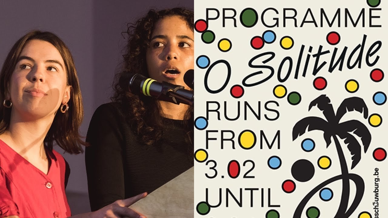
“Brenda is not a person; she's a representation of collaboration and creativity.”
Transcript: May contain minor errors or formatting inconsistencies.
[Applause]
good evening everyone we will try to speak our best English thank you for the introduction.
So we are actually Brenta only the silence of to approach this as an interview so it was Brenda Brenda is actually a made-up character so s34 is was kind of a joke but we decided to do that because it was an alter-ego for both of us and the name comes from Brenda Walsh which was a character in Beverly Hills 90210 yes okay. So she lost her voice but who are members that's Sophie and I we collaborate together.
But we also collaborate with other people and designers and one designer that we often collaborate with is a mini bakov because she needs to be mentioned here she and us worked together for the beautiful belly which is our main client for the moments do you believe in shells yes we do keep on experimenting and then you will find interesting things how did you start or the influenced by anything yes how did you start by anything so yes we started out as three friends when we were still studying at school.
And it was kind of a way of expressing our dream worlds and the things that we're going on as you can see here is a random collage the first thing we did was an underwater scene party kind of thing and people liked it.
So they continued asking us for different projects one of those was curated events where you can see an installation we made different installations based on archival stuff from our childhoods is that a dish you could link with graphic design yes we like mussels and sausages I have faith that you enjoyed working with recently typefaces you enjoy working with recently yes the epics matrix designed by Robin Eckert's we use this for the base publish the cultural house in Brussels they asked this assignment because they wanted to announce to go paperless so we wanted to exaggerate and made a very long texts letter this is a detail of the faxed letter so it's very long because they also have to communicate in three languages we started implementing this type in other things as well from the beer score booth this is for the cafe and the logo which resembles like the open science of night shops posters and coffee then we have the teachers of typeface that was designed by studio triple this is also gonna be four books identity last its display phones that resembles that's a mixture between acne gothic architecture and seaweeds these are the details of printed matter of that season also many focuses so we started using the letters as shapes and building blocks as poetic shapes and also as images by transforming them to symbols then another side face itself modern design by Lucas to be huh we used it for an exhibition design frog for yoga class which is a very famous Belgian rider that died ten years ago we created we chose this typeface because it's should suggests handwriting and for us it was kind of poetic cue we combine this with the sharp coat esque we will say something about that later this is another view of the exhibition.
And then another typeface is Clifton designed by young Mina I don't know if I pronounced it right this was for a live recording of nurhachi in in London and he's a New Age musician from 70s we used to self modern year again but it's more like a secondary typeface but the Clifton we chose because it has like this brilliant and exotic era and the South Water and again for its poetic appearance and then the last time example would be for the football festival that's happening now at the beautiful book we used here again the shark oDesk designed by Lucas sharp from shark tied together with three other designers and the Clifton again for a secondary phones the first step of the design process was making scarves and so we made a set of six different scarfs with seven colors to keep it as broad as possible then we designs the frontier of the building with some symbols and icons that are linked to football using the colors and introducing the two typefaces this is a detail of downstairs and upstairs bar and then.
This is prints it's matter so you have a folded flyer with one sides the poster sides and the other side is the calendar why not can you discuss a project in detail yes to continue with the beautiful this is the facade so it's very important because it's in the middle of the century in Brussels everybody's passing by so it's very important that we use this.
And we will as many people might have to notice last year. There was a lot of conversation about diversity and feminism in January there was a huge women's March that took place in Brussels but all over in the world and the beautiful book exploring this subject for six months under the title of the Futurist feminist first we start designing posters with quotes the idea was to create different layers of diversity this is a sketch we didn't use this but because our client also tops it was to Rachael feminists which it was we didn't want to use images first to avoid stereotypes the only thing that we wanted was to use handwriting which refers to individuality and protest these are the first sketches that we made the idea was that we had like a logo that changed constantly but then we delivered it to the client and they used one logo and it put it on the heads and then suddenly it was everywhere this was not our intention because we wanted like lots of logos the best reverb they would manifest which you can see here to make clear we the program was about it was not only about feminism but like a lot of minorities which you can see we decided to use the supporting hood test which is also attacked by Lucas Libby ha it's we used it because we think it's playful and young and it's terminal and they have like lots of glyphs like you can see it and here you can see it in the f we started spraying the focused angle on the manifestos and then food here's an example of it and they wanted it to be on the facade in the summer when the Buick was closed and people thought it was real so they thought it was retrenched but it was us and afterwards we had to make a digital version of it for a folder that were also a poster and one side and on the other side a calendar so we made a spray in Photoshop CT tails here's another example of some printed matter this is a flyer for the big conversation and here you can see the calendars outside we also put the words from the manifest on the windows in vinyl and we put some purple spray behind us as the season progressed there was need for images suddenly we like as we mentioned we wanted to avoid that.
But they really wanted it.
So we started to mesh up images from the program with our own images and drawings and this is the result we put a frame around so it became posters and we also glued those posters on separate walls during the events we also made flags and we use those those images together with type for advertisement as you can see here say to young aspiring desires we thought it would be funny to wait a year and take a sabbatical so you can arrest us before he starts to end what would you say [Applause]
Latest Talks
-

Will Anderson and Ainslie Henderson
Bringing stop motion sorcery to BBC’s Small Prophets
Watch -

Amber Weaver
How does contemporary type design translate into the wider world?
Watch -

Murugiah
Why you should reject the formula and make art about things you love
Watch -

Marina Willer
Design thrives when you find poetry in the simple things
Watch -

Lizzy Stewart
The hundreds of drawings and writing-on-a-whim that goes into comic novels
Watch -

intra
The rewarding process of recognising the art in obscure everyday life
Watch