
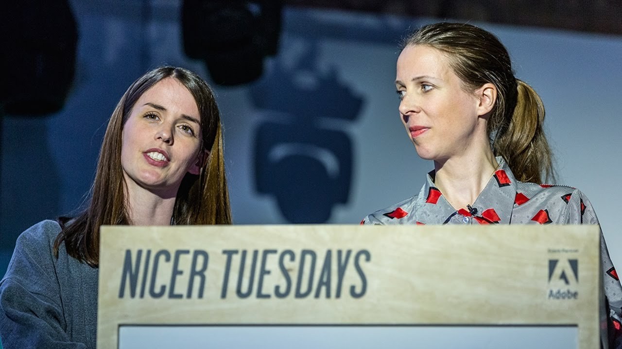
Kirsty Carter and Emma Thomas are the co-founders of graphic design studio A Practice for Everyday Life, known for creating beautiful publications for galleries and publishers. Their work, particularly their recent project for Tate Britain's David Hockney show, reflects a deep connection to their Yorkshire roots.
A Practice For Everyday Life
How a Sheffield typeface and shifting scale shaped a Hockney retrospective book
“Design is not just what it looks like, but how it feels – it should resonate with the heart as much as the eye.”
Transcript: May contain minor errors or formatting inconsistencies.
[Applause]
I'm Kirsty hi I'm Emma so we're practice for everyday life KY and I started out our graphic design partnership at the Royal College of Art and since then that was well almost 14 years ago and since then we're now a studio of seven people we're actually just based around the corner here in bethl Green in an old furniture Workshop and from there we work with artists curators institutions museums companies the world over so up here we've tried to condense the last 13 years into one slide just to give a for those of you who may not know us a quick introduction of the type of projects we work on but as mentioned earlier in the introduction we're going to focus on one of our projects a really recent project. That's just been published the David hne exhibition catalog for his show his retrospective at the tape Britain we're going to quickly talk you through this but with lots of stories and anecdotes along the way because it was quite an entertaining collaboration between us him and the publisher yeah we're super excited to be invited to work on it by the Tate it's we've been big fans of hotney for years. Actually. And we always wanted to do a book for him.
So it was it was a dream project for us really my first encounter with Hackney's work was through a place called salts Mill in Sal in West Yorkshire I grew up in West Yorkshire and salts Mill had the biggest collection of hotney work when salts mill first opened in 1853 it was the biggest Factory in the world. And in yorksh loads of people are still connected and work with the textile industry in fact my great-grandfather. Actually worked at saltz Mill as a Dyer and actually most of my family Were Somehow in the in the cloth trade so when salts Mill closed down in the 80s we all knew about it really I grew up in a little place called blubber houses so there some pictures of it here it was pretty remote part of the world really so when salts Mill closed down we all kind of yeah we heard that it was changing into a gallery so we kind of drove across to visitor CU generally we didn't really go to galleries it it was really my first experience of seeing Contemporary Art the drawings etchings and paintings and those sort of immersive photo collages of hotney made a massive impression on me the way he was doing these drawings paintings collages and Landscapes it really inspired me to do drawing print making and collaging as well. And introduced me to I guess what the idea was of being a graphic artist which is what hotney saw himself as as so so I'm going to talk a little bit more about the publication specifically one of the first things we when we were talking about when we got commissioned it's like okay like what's the feeling of this book how is it going to present itself and one of the most obvious things to us.
This is like Charisma as a he's a beautiful man he's got lots of energy and there was so many portraits of him online and actually it was quite a task because at the time he was putting together this as they call it a Mo publication enormous book he was quite distracted with that in his Studio were like begrudgingly giving us images and we actually presented the whole first set of spreads with our own research online we got a Works list and just had to Google every image and actually it's funny because some of the portraits we used ended up being the ones that made it into the print so it was quite a different way of putting together first presentation to the tape and we also like this idea of because it was a retrospective he had quite it was quite I think being doing a retrospective as an artist is actually quite a tough task when you're alive because it's sort of a it's like going to your own funeral at the private view or something.
But we really like this idea that you go through the book.
And we used gradually when you see these portraits in the book you see him aging and how he and how he's just remained very kind of characterful and great you know we used loads of these sort of full bleed images in the book I mean the images are fantastic materials to work with u and then the first this opens the softback version of the book. And we liked that this one and then when you open the book this first spread here they both have these swimming pools and one is really in the beginning the time in California and the next one is much more recent work.
But they both have the same subject actually that work in particular he was developing a series for the exhibition.
So we didn't really know what that first work would be for a very long time.
So we had this idea. And it was like hoping that something would and it was just this really lovely circular moment so each chapter opener is a is like a close-up detail and really introduces that series I guess the curators felt it was also really important to understand how hotney painted and how his techniques changed over time so each each of these really sort of opened up we really agreed that.
This is the best way to introduce the works by sort of seeing these these full and closeup and really working with the scale yeah.
So throughout the whole catalog we worked with this scale so trying to sort of represent the biggest paintings were the things we created at large format and the smaller drawings were smaller but obviously there was such a difference in size that was quite difficult to realize but I think we kind of got there yeah actually we've been trying to do that for years for an artist but generally artists do work at extreme scales but hawne somehow he generally Works quite large except for his drawings so we could apply this principle of scale throughout the book.
And then typography I mean this is a sort of like for those who have worked in publishing it's one of the hardest tasks to get a type only cover out there especially for a big Blockbuster show like hotney so we knew that if we were using type in a way that it would have great importance that we had to fight quite strongly when you open the book up we wanted this sort of presence of the opening chapters to be on their own and the type to singing to itself rather than it being in Jos of text and image which there was so much to go in this book it was a real fight but we got there.
And then the tip faces we used one was Bureau got condensed or compressed and fact what's nice about buo buug grot condensed it's actually a typ face sorry next slide it's it's actually based on a type face that was developed by a Foundry in the 1800s and there a Foundry called Stevens and Blake and they're based in Sheffield and they're one of the biggest foundaries celebrated in in Britain and in England and we really like this relationship that the county that David hogne was born born in was Yorkshire and we were using a Yorkshire type face and it's actually got a very sweet history it's its original foundings was an engineer company and then they they opened later as a Foundry and it was the combination of a silver smith and a and a mechanic called William garnet and a tool maker called John Ste Stevenson.
And then it was financed by this guy called James Blake we love this typ face I'm sure you all do it's quite well known but and then yeah as I mentioned earlier the kind of this this this moment of being able to put it on the cover in that way was a a real real joy we thought we it's a classic thing you present it thinking it would never get through and then the curators just fell in love with it and just kept pushing it the whole way through it is just on the hard copy there's a softb copy as well.
But that's it thank you [Applause]
Latest Talks
-

Will Anderson and Ainslie Henderson
Bringing stop motion sorcery to BBC’s Small Prophets
Watch -

Amber Weaver
How does contemporary type design translate into the wider world?
Watch -

Murugiah
Why you should reject the formula and make art about things you love
Watch -

Marina Willer
Design thrives when you find poetry in the simple things
Watch -

Lizzy Stewart
The hundreds of drawings and writing-on-a-whim that goes into comic novels
Watch -

intra
The rewarding process of recognising the art in obscure everyday life
Watch